Hello, I'm Magnolia (or well, Magz) and I'm finally starting the art school assignments, I've had some serious problems with my personal laptop ( really slow, touchpad doesn't work, keyboard doesn't work) for really long and I bought this course some months ago, I'm starting anyways though after i got better peripherals.
Photoshop often lags really hard : (
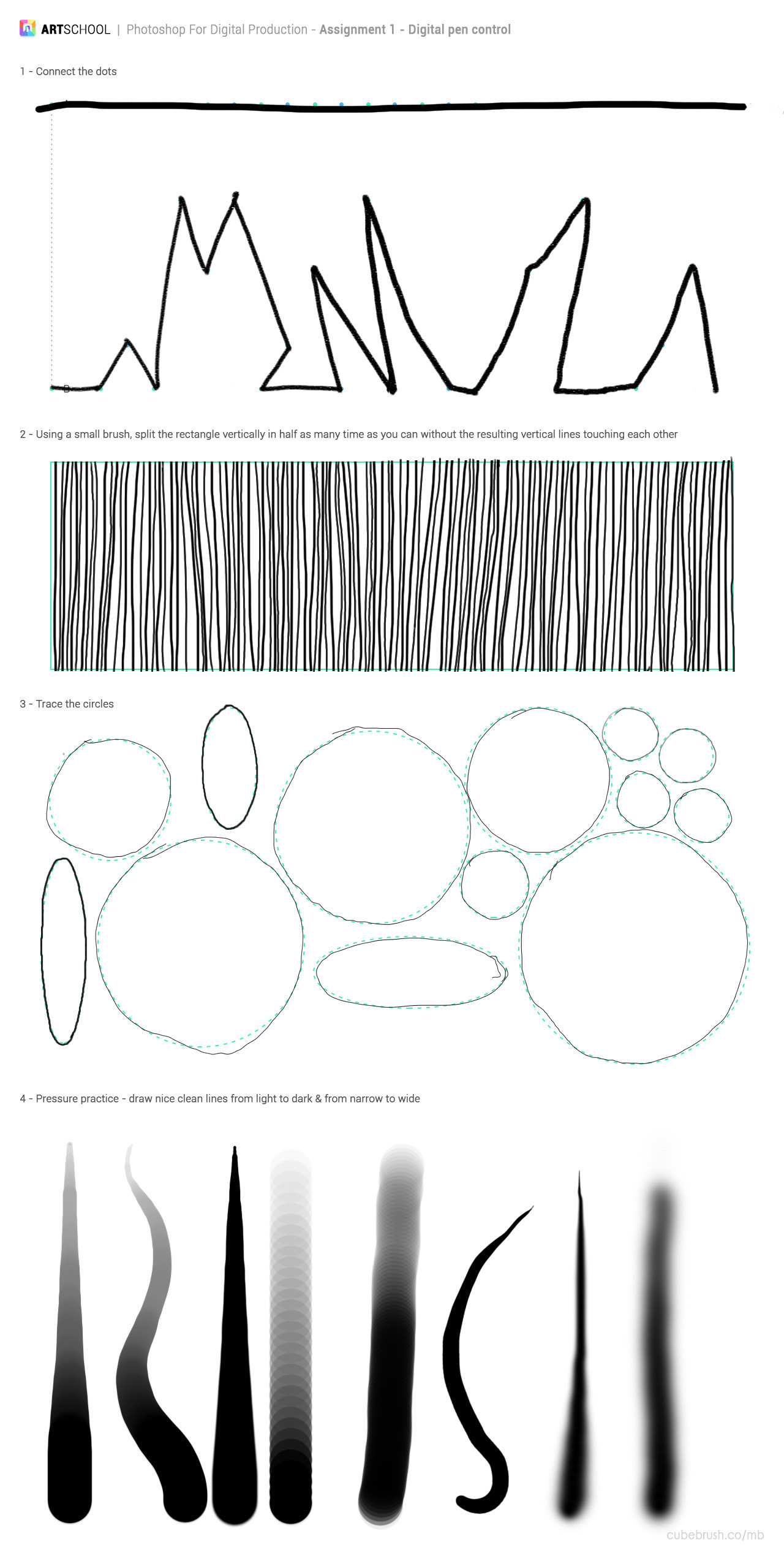
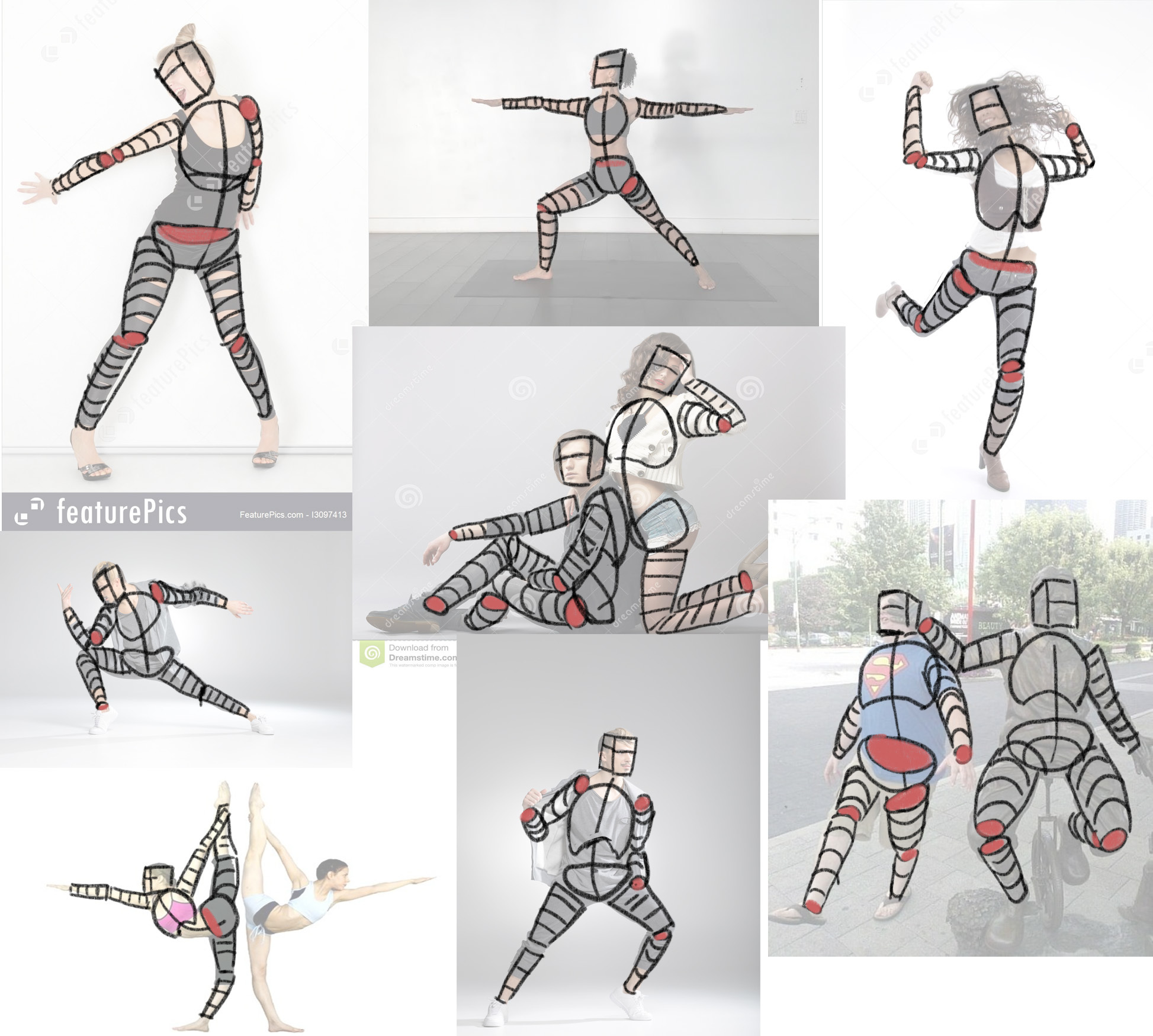
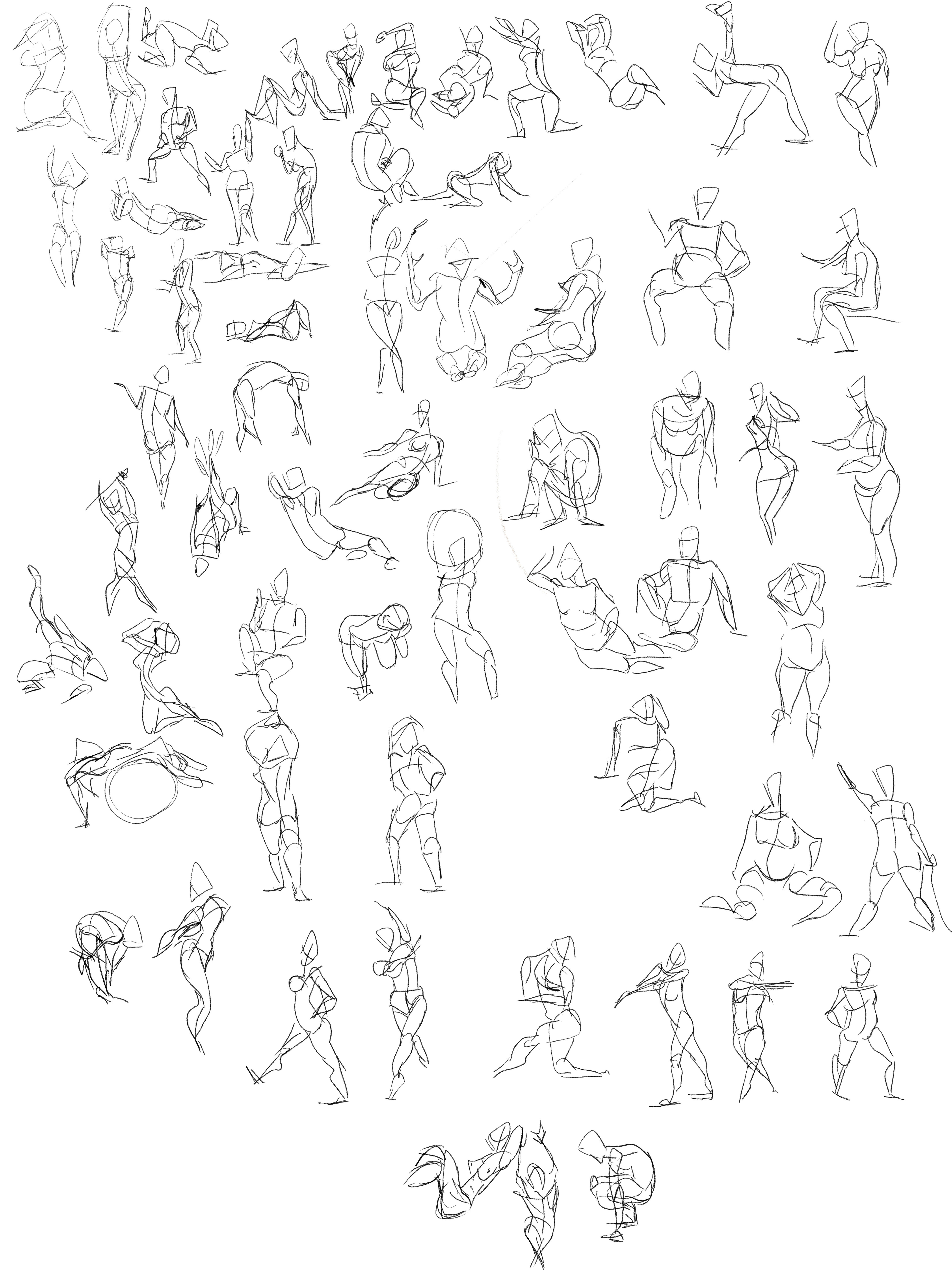
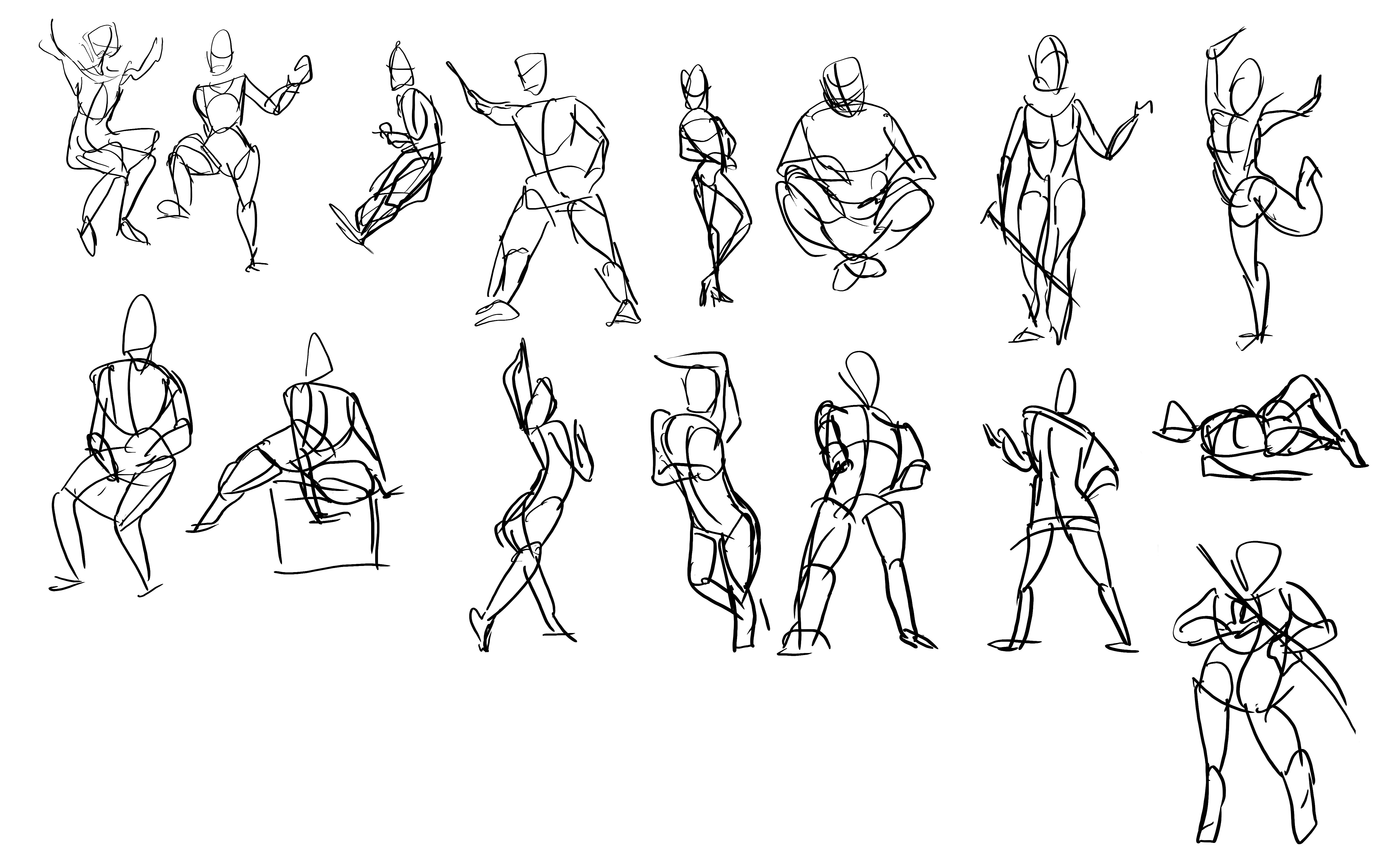
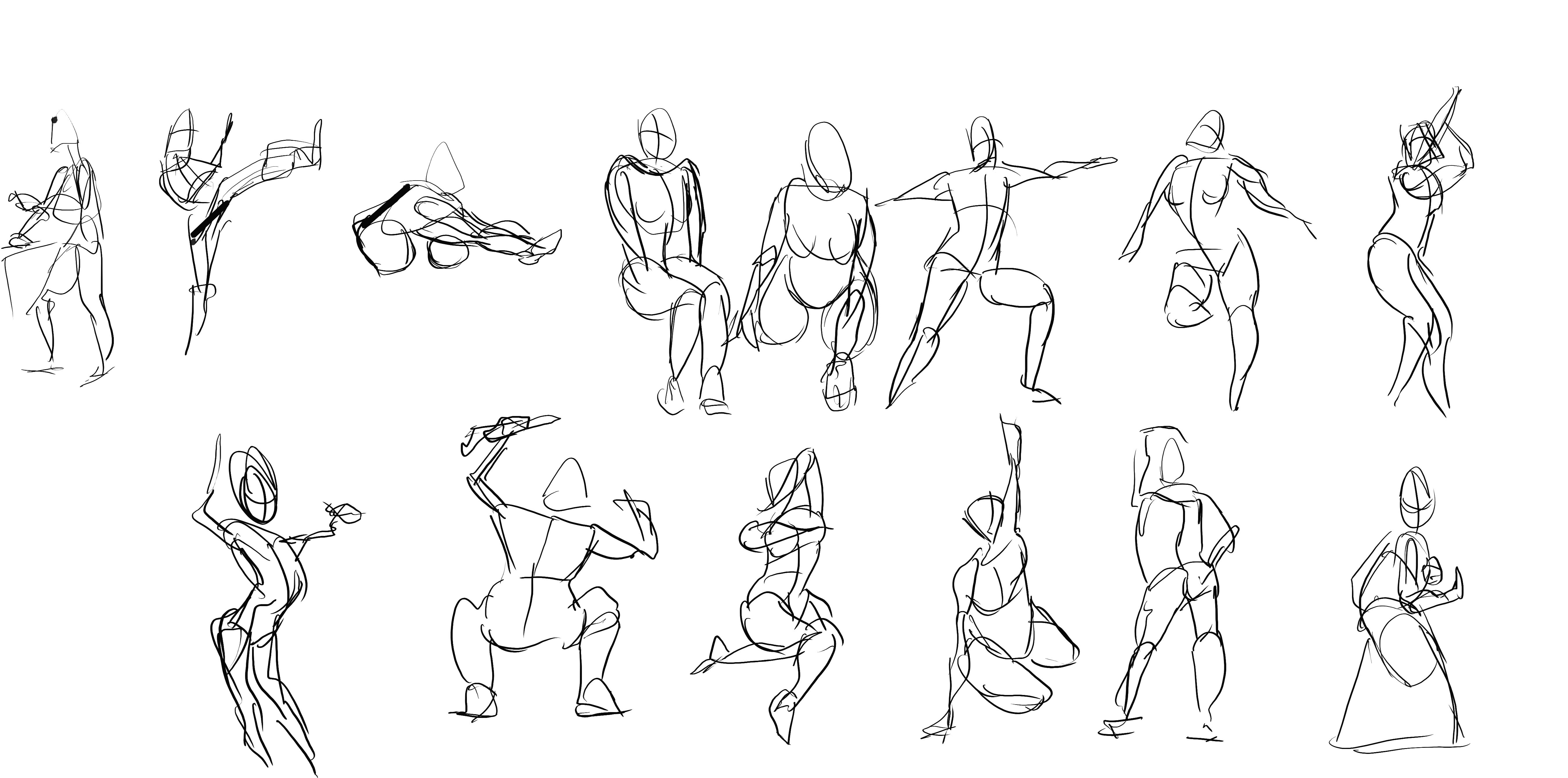
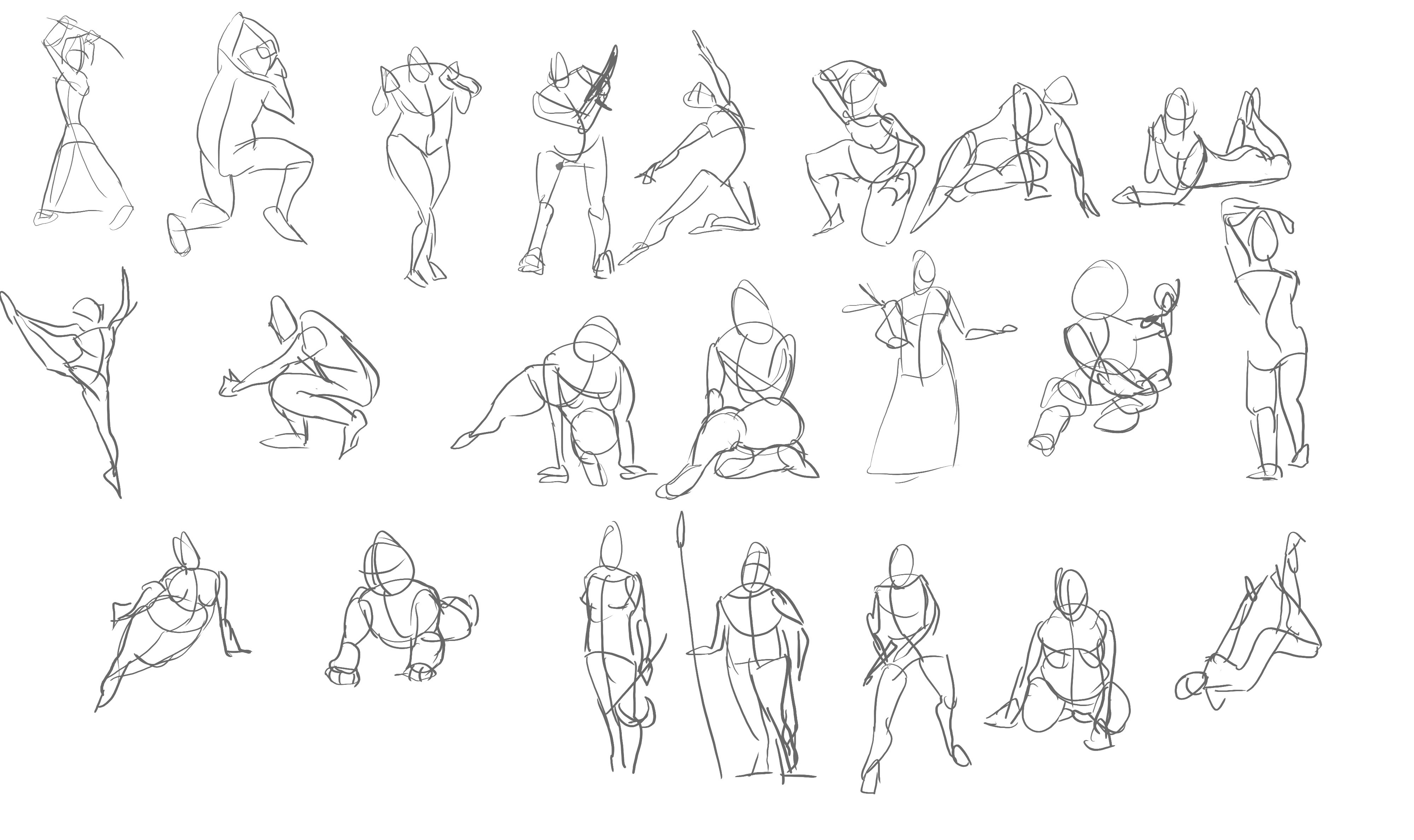
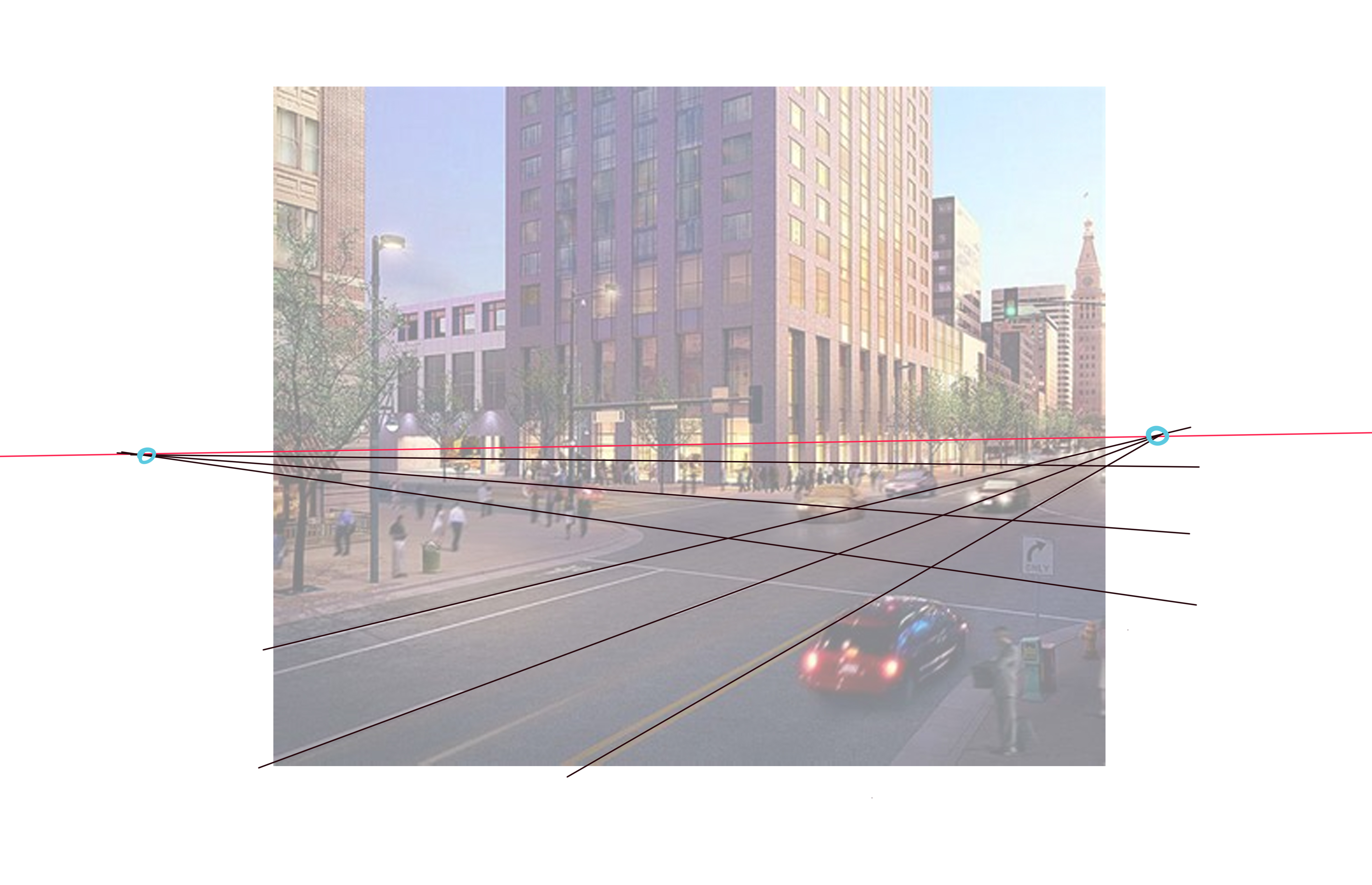
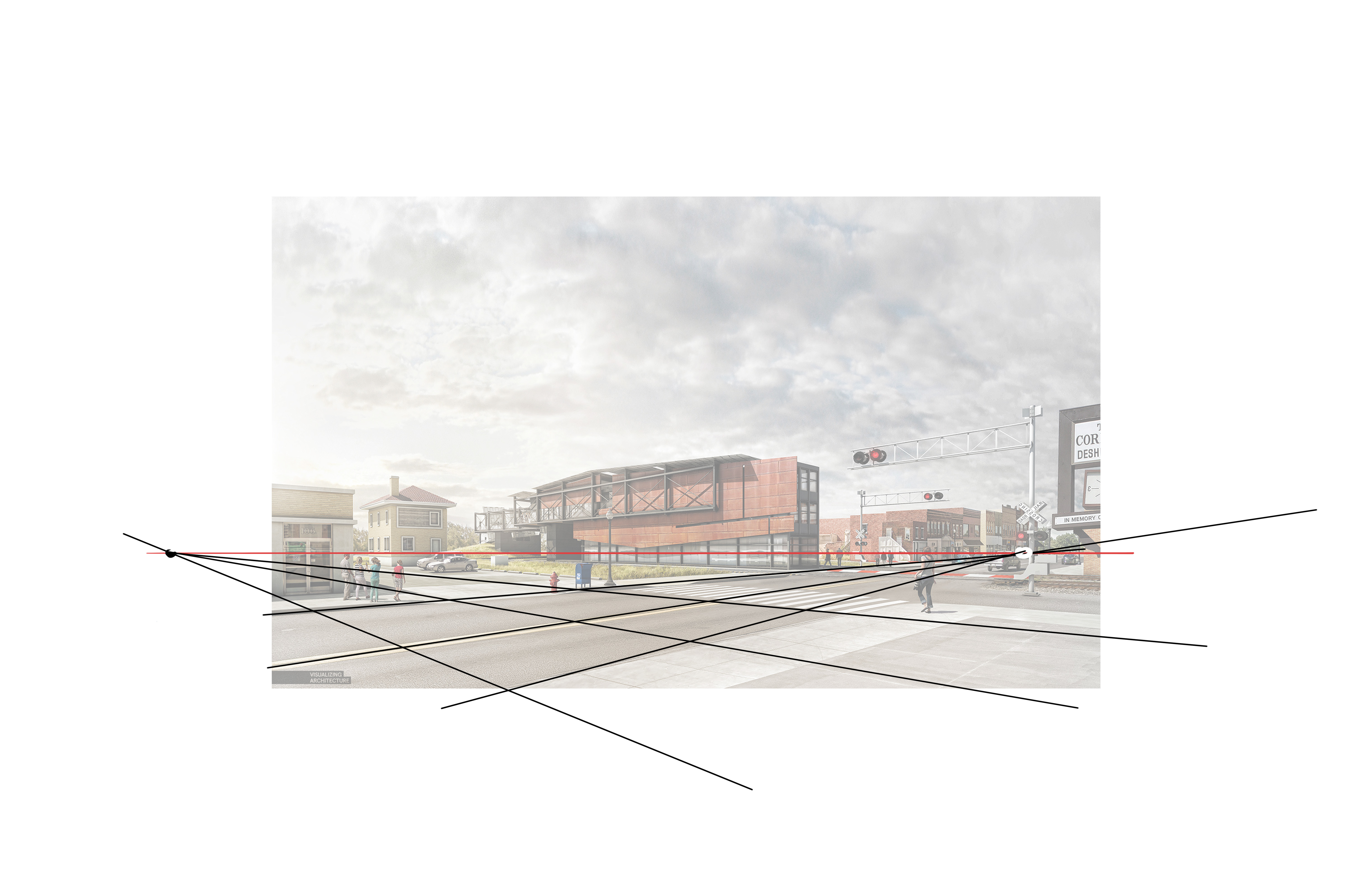
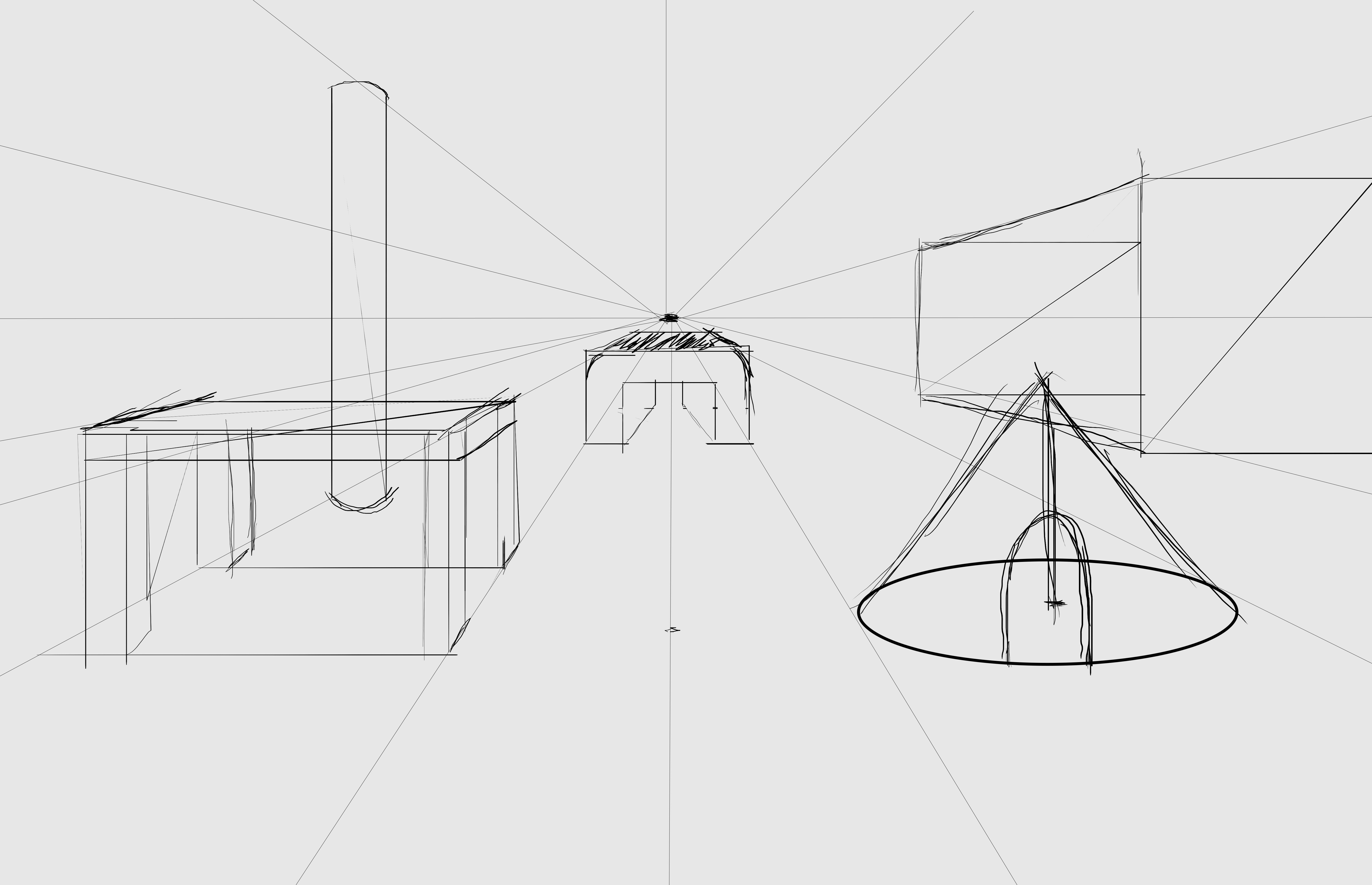
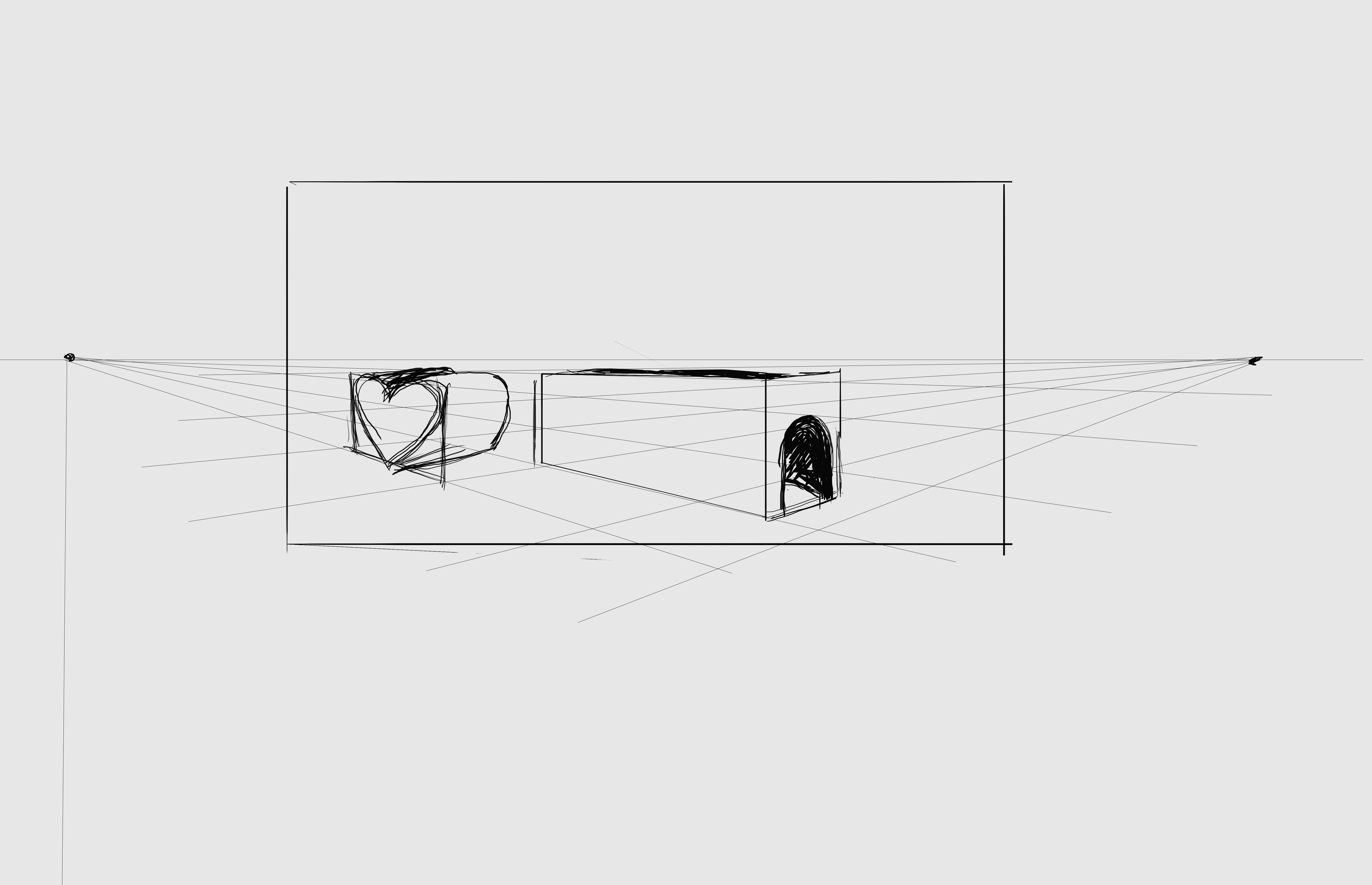
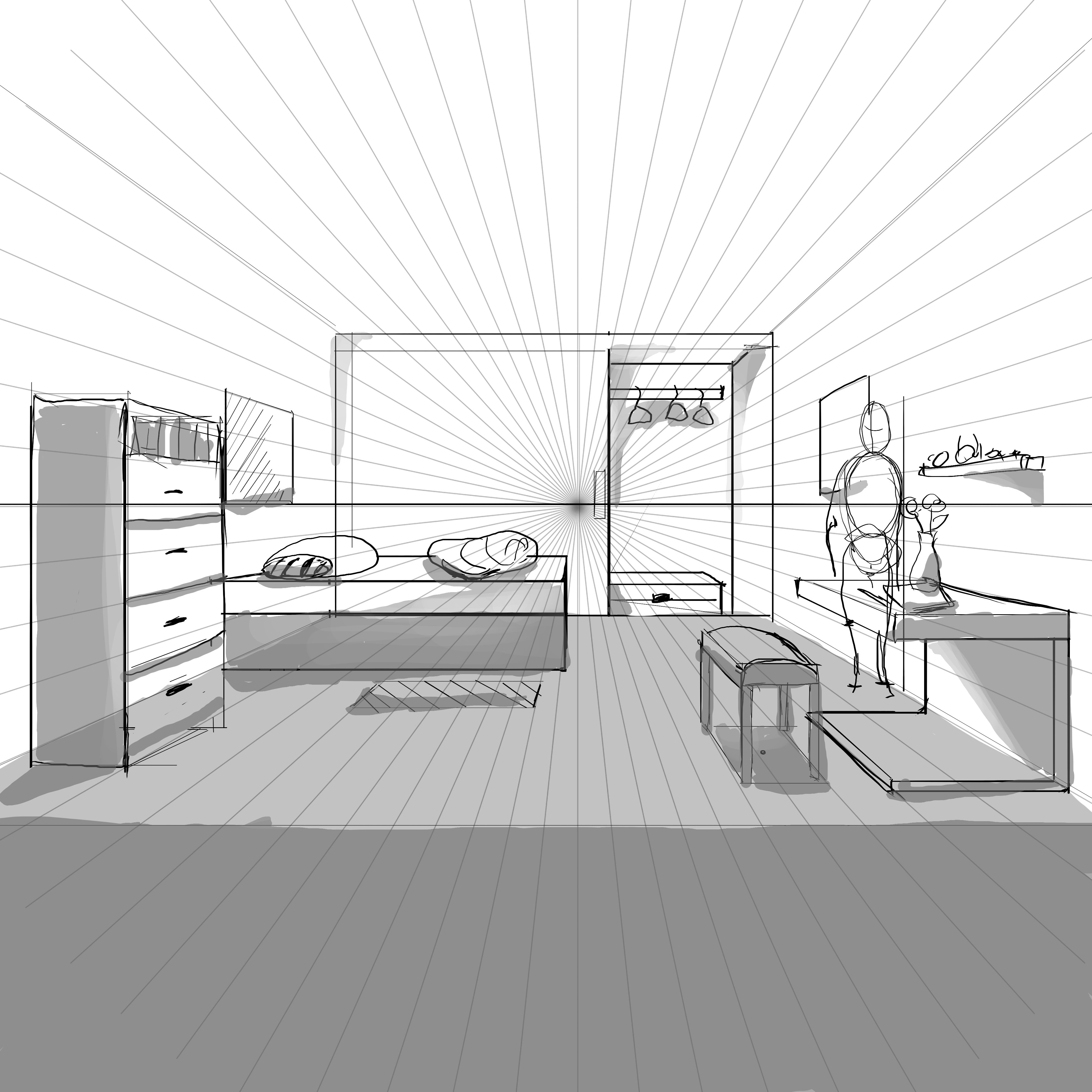
After doing the pen control assignment I realized that "connect the dots" wasn't some kind of puzzle. I started while watching the digital production video before getting to the assignment instructions, so i actually made it harder for myself.
It just so happens I have problems with dexterity, i need to practice