


 Thank you! I finally cleaned that up. Meanwhile started 3 more ..I have a habit of taking too long to finish a piece, then I lose interest in it and just start something else. I found 8 from recently i started and abandoned, that are decent enough to not delete, but not finished. There’s also been a number of drawings I felt I “outgrew” - became better before I finished them, and it would be easier to start from scratch than fix them. Anyone else thinking that?in24.4k
 Lady Death Fanart Collectible: Part 6 Polypaint and base Hi, it’s time to share with you another part of the process to create this fanart piece. Polypaint As this is my first collectible fanart I didn’t have previous experience with polypaint so I tried my best and played a bit with it.I wanted to give a ghostly and eerie look to Lady Death, she is beautiful and deadly, but at the end of the day she is a woman that died and was reborn at hell as an avenging spirit, that’s why I gave her skin tone a bluish very cold tone.As you will see I gave myself some creative freedom to deviate from the traditional color scheme that this characater has in comics and illustrations.To add a bit of sensuality by painting some freckles on the face and the chest. The dark nature of this character was the perfect excuse to gave her a kind of goth make up, very dark shadows around the eyes, blue lips and fingernails. I know that the original character includes sexy red lips but I wanted this girl to have a sexy but at the same time creepy look, that’s why we can see some thin veins emanating from her eyes. The biggest chromatic change I did for this character is at the hair. Lady Death has a characteristic white weavy hair but in my fanart I decided to gave her a very saturated blue color.The reason behind this wasn’t only an aesthetic choice. I want that the face area strongly pulls the attention of the viewer so this area needed a stronger contrast. Another reason is that I want her to have a more modern look, as I mentioned before, I’m strongly attracted to women with goth/punk look. I gave myself half an hour or more to analyse the work of experienced sculptors that create collectibles and I discovered that the use of darker values on the skin is often applied to create a greater sense of volume and three-dimensionality. I found that areas with heavy ambient occlusion are the perfect places to paint with darker colors in order to increase the separation between different forms. Even though she has a bluish skin tone, I used a bit of warmer hues in areas that, in real life, tend to go towards red and pink, this is very obvious in the nose, cheeks, and knuckles. Thinking with a logical mind it’s completely absurd to have warmer tones on the body of a zombie like creature but I didn’t want to limit myself by using only blue tones, it looks boring and artificial. In real life these colors are created by blood vessels in areas where the skin is very thin. ** Scythe **for her weapon I applied a cool gray with some warmer variations, this color scheme is influenced by the work of H.R giger. Base I’d like to talk about the design for the base which, to be honest, I forgot to develop along with the character.My main idea with the base is to show that Lady Death inhabits a very sterile and arid land, at the end of the day she is at hell.You can see a that she walks over dirt and rocks, a sign that she’s surrounded by death and loneliness. As part of the landscape we can see some bones and skulls to reinforce the idea of lack of living creatures, yet we can see three hands that try to reach her legs.This hands represent that all creatures are subordinated to her power and seek an evil blessing with a simple touch of the princess of the damned.1- The hand with skin burns represents the souls of those who are newcomers to hell, tortured souls that suffer for the sins comitted on earth.2- The hand with greenish rotten skin and pustules is the reminder of the decay that has infected the souls of those who have been trapped and have forgotten their humanity3- Last but not least, the hand of a demon shows that even dark creatures and entities bow before her presence. The cherry on the top, at least in my vision, are the simese twins that emerge from the ground, this malevolent creatures remind us that in hell there’s only perversion and any trace of innocence is lost. Thanks for reading till this pointI’m really happy to be very close to finish this creative journey, last but not least it’s mandatory to talk about splitting the sculpture in several pieces to be printed, this will be my last entry before showing the final rendered images. See yaMay Zbrush be with youin1.5k


 memory 2min gartic phone, used ref 2m gartic, used ref for pose 2min gartic 2min gartic 2min gartic 2min gartic memory memory memory memory study memory memory memorymemory memory memory memory memory memory study memorystudy study stylized left memory, right study study memory memorymemory memory memory memorymemory memory, porportions r offmemory memorystudystudy memorymemorymemory memory memory memory memory memory memory memory, right leg is a bit broken The feeling of only getting 1 - 3 likes on a social media post will never not be discouraging. But nothing is discouraging enough to make me quit drawing. I think the strategy of drawing a lot of stuff and waiting a while to post is good though rather than posting it immediately and then feeling that sadness on the next set of drawingin


 studies studies juri study imagination, how I feel before a speech imagination imagination study something I drew for my presentation also drew this for my presentation, didn't fix the one hand being bigger than the other imagination + study study studies study study, I need to fix the face a bit based on screenshot from anime but in my style study. except for the eye study studies studies study. changed some things tho imagination imagination imagination study studies, except top right samurai based on anime screenshot wolverine studies, changed some of the poses a lil, not very good at all, but first time i drew the character ever. semi study studies study imagination imagination imagination , for first time ever i tried to draw over 3d model for middle pose, I dont like the result tbh, but it makes it much easier than coming up with it from memory.imagination, except right figurestudies imagination + studies, coming up with action poses r hard, these are not dynamic enough, I will redraw better ones in future. imagination , imagination imagination study, except for eye imagination imagination imagination doodles except for the two chrollos imagination storyboard thumbnail, idk if i ever shared this. my storyboards end up being a little detailed since i usually just draw in one layer.in22.3k


21 days later
I've been trying to study color the last weeks, since I'm a motion and graphic designer I know about color and how it reacts, I know the schemes and all that technical stuff, BUT when I want to paint I have noticed that my values are not great -actually kind of flat-. They are all mid tones. I really don't know why, my guess is that it scares me, I don't know how to manipulate color when is "pixel" and it can be mixed to get other tones in order to have shadows and lights.
This is my first attempt on coloring a face.
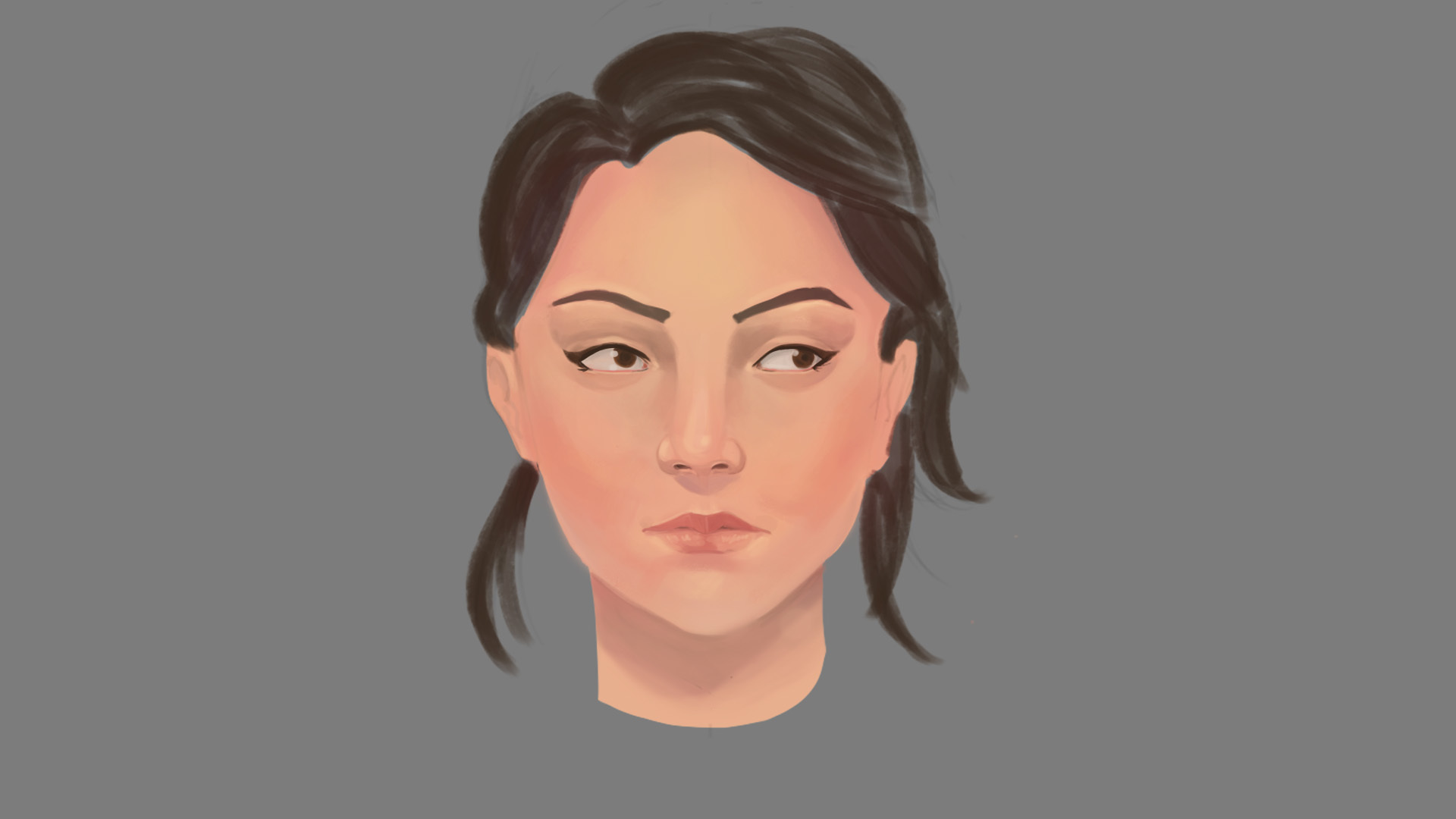
And when I started painting I realize that parts of the face that you don't see when you just do a linear drawing. So I practiced a bit with some pictures to study the parts of the face. I started with the structure of the eye, and I could see parts like how the eyelids get some shadows and light.

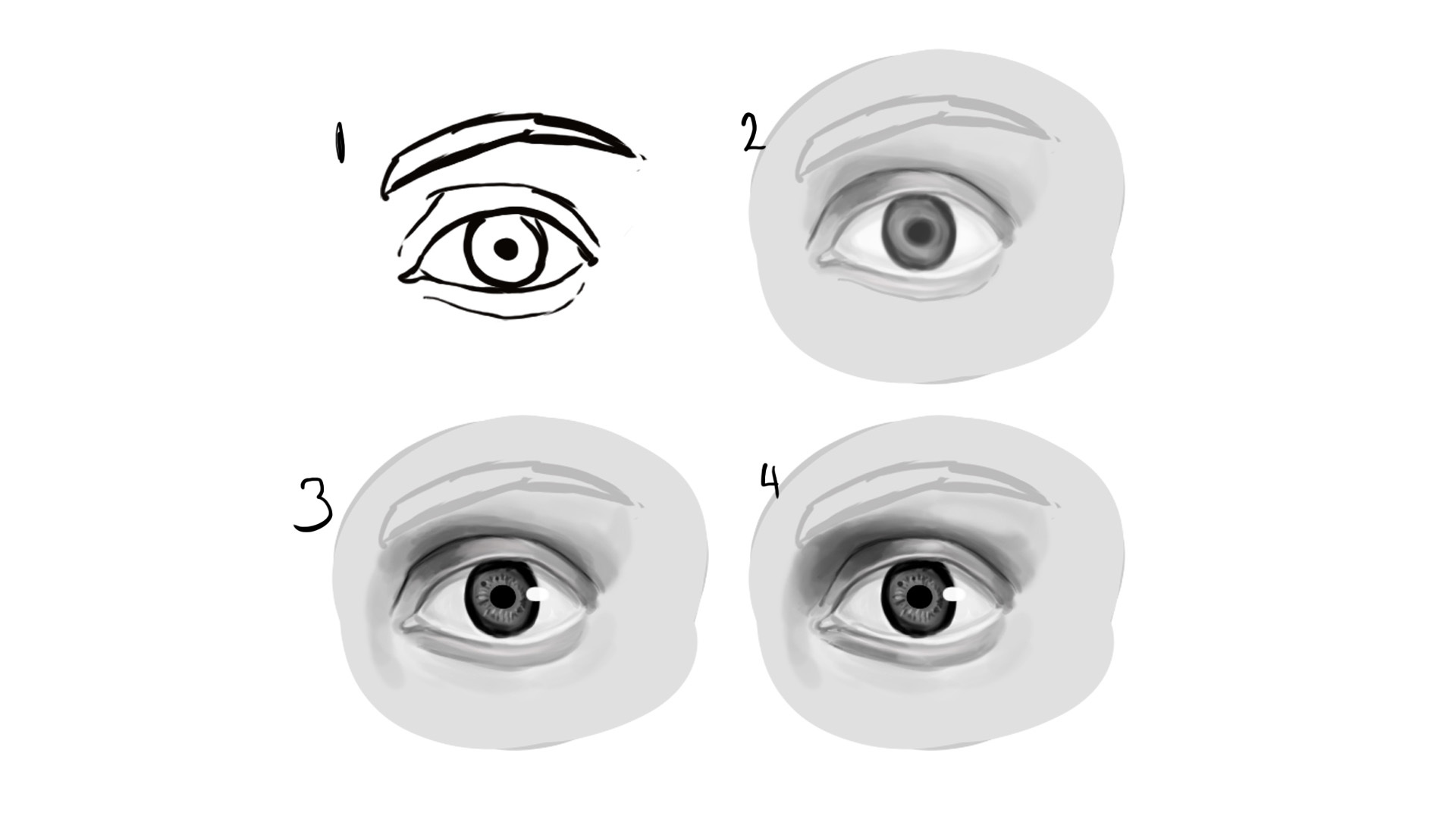
With the studies, I practice painting an eye. And I could see the improvement on form and values. I will keep practicing on the anatomy so I can later on bend or break its rules.
I'd like to improve on values to get a better understanding of color. Any tips are highly appreciated. Feedback is really important for me to see the mistake I've made.

10 days later
It's been fun so far the progress I've made. These 2 last weeks I've been focusing on faces, taking one part at the time. Also in my values, the first update on this blog I have no idea how to use values on drawings.

This is a comparison between a drawing about 6weeks ago and a drawing I made last weekend.
Any tips are highly appreciated. Feedback is really important for me to see the mistake I've made.
I think what you're doing to improve is good.
I'd suggest study value, and head separately for now. Because you're trying to study 2 things at same time. And that's very hard when you're beginning.
Maybe still life or simple form rendering for value, and some head construction for portraits. After becoming bit comfortable at those you can combine them.
Thanks for the feedback! Actually, I have a "comic-manga" background, big eyes and weird bodytype. I've been trying to get away from that style. So the first thing that I did was studying anatomy properly so I can get all of the proportions right.
What I'm focusing right now is value. I had some practice with simple forms, but the problem is when I have to color. I know there are techniques to color from gray values but they are bit different - red is similar to blue in gray values- So I'm learning to see values in gray first.
Suggested Topics
| Topic | Category | Replies | Views | Activity |
|---|---|---|---|---|
| Fly high, conquer and paint | Art Blogs | 16 | 3.6k | Jul '17 |
| Andias Art Blog | Art Blogs | 22 | 7.6k | Apr '17 |
| NesoKaiyoH’s Book of Probably mostly angels and dragons | Art Blogs | 21 | 5.7k | May '20 |
| Castonia’s Artblog | Art Blogs | 247 | 42.5k | Jan '21 |
| Whythree’s Sketchbook | Art Blogs | 3 | 1.6k | Oct '17 |