• Gave myself 5 days to do something. This is what I managed to do. I'm trying to get better at illustrations, but I have patience to work on something for 3 days maximum :( Splash_Process.jpg5000x3140 2.21 MB Splash_Process-6.jpg3896x2429 2.83 MB concept list char copy.jpg5388x3000 1.7 MB
    20.8k
  • Did a character concept for a course.https://www.artstation.com/artwork/P6gm3y - more:) list1.jpg3541x1920 2.82 MB
    20.8k
  • Day 4: Star Wars May The 4th =] Queen Padmé Amidala in my art style! First time drawing her and I really enjoyed making this one! Used watercolours, ink pen, acrylic markers and gold paint for accents on my Canson mix media sketchbook. I hope you like it!
    82.4k
  • A creature design from a while back
    by
    6.7k
  • Here is some more recent stuff, I need to make more body studies
  • It's been a while and god, it is so cringe to go through all previous messages xDmy study.
    20.8k
  • Thank you! I finally cleaned that up. Meanwhile started 3 more ..I have a habit of taking too long to finish a piece, then I lose interest in it and just start something else. I found 8 from recently i started and abandoned, that are decent enough to not delete, but not finished. There’s also been a number of drawings I felt I “outgrew” - became better before I finished them, and it would be easier to start from scratch than fix them. Anyone else thinking that?
  • Lady Death Fanart Collectible: Part 6 Polypaint and base Hi, it’s time to share with you another part of the process to create this fanart piece. Polypaint As this is my first collectible fanart I didn’t have previous experience with polypaint so I tried my best and played a bit with it.I wanted to give a ghostly and eerie look to Lady Death, she is beautiful and deadly, but at the end of the day she is a woman that died and was reborn at hell as an avenging spirit, that’s why I gave her skin tone a bluish very cold tone.As you will see I gave myself some creative freedom to deviate from the traditional color scheme that this characater has in comics and illustrations.To add a bit of sensuality by painting some freckles on the face and the chest. The dark nature of this character was the perfect excuse to gave her a kind of goth make up, very dark shadows around the eyes, blue lips and fingernails. I know that the original character includes sexy red lips but I wanted this girl to have a sexy but at the same time creepy look, that’s why we can see some thin veins emanating from her eyes. The biggest chromatic change I did for this character is at the hair. Lady Death has a characteristic white weavy hair but in my fanart I decided to gave her a very saturated blue color.The reason behind this wasn’t only an aesthetic choice. I want that the face area strongly pulls the attention of the viewer so this area needed a stronger contrast. Another reason is that I want her to have a more modern look, as I mentioned before, I’m strongly attracted to women with goth/punk look. I gave myself half an hour or more to analyse the work of experienced sculptors that create collectibles and I discovered that the use of darker values on the skin is often applied to create a greater sense of volume and three-dimensionality. I found that areas with heavy ambient occlusion are the perfect places to paint with darker colors in order to increase the separation between different forms. Even though she has a bluish skin tone, I used a bit of warmer hues in areas that, in real life, tend to go towards red and pink, this is very obvious in the nose, cheeks, and knuckles. Thinking with a logical mind it’s completely absurd to have warmer tones on the body of a zombie like creature but I didn’t want to limit myself by using only blue tones, it looks boring and artificial. In real life these colors are created by blood vessels in areas where the skin is very thin. ** Scythe **for her weapon I applied a cool gray with some warmer variations, this color scheme is influenced by the work of H.R giger. Base I’d like to talk about the design for the base which, to be honest, I forgot to develop along with the character.My main idea with the base is to show that Lady Death inhabits a very sterile and arid land, at the end of the day she is at hell.You can see a that she walks over dirt and rocks, a sign that she’s surrounded by death and loneliness. As part of the landscape we can see some bones and skulls to reinforce the idea of lack of living creatures, yet we can see three hands that try to reach her legs.This hands represent that all creatures are subordinated to her power and seek an evil blessing with a simple touch of the princess of the damned.1- The hand with skin burns represents the souls of those who are newcomers to hell, tortured souls that suffer for the sins comitted on earth.2- The hand with greenish rotten skin and pustules is the reminder of the decay that has infected the souls of those who have been trapped and have forgotten their humanity3- Last but not least, the hand of a demon shows that even dark creatures and entities bow before her presence. The cherry on the top, at least in my vision, are the simese twins that emerge from the ground, this malevolent creatures remind us that in hell there’s only perversion and any trace of innocence is lost. Thanks for reading till this pointI’m really happy to be very close to finish this creative journey, last but not least it’s mandatory to talk about splitting the sculpture in several pieces to be printed, this will be my last entry before showing the final rendered images. See yaMay Zbrush be with you
    1.5k
  • memory 2min gartic phone, used ref 2m gartic, used ref for pose 2min gartic 2min gartic 2min gartic 2min gartic memory memory memory memory study memory memory memorymemory memory memory memory memory memory study memorystudy study stylized left memory, right study study memory memorymemory memory memory memorymemory memory, porportions r offmemory memorystudystudy memorymemorymemory memory memory memory memory memory memory memory, right leg is a bit broken The feeling of only getting 1 - 3 likes on a social media post will never not be discouraging. But nothing is discouraging enough to make me quit drawing. I think the strategy of drawing a lot of stuff and waiting a while to post is good though rather than posting it immediately and then feeling that sadness on the next set of drawing
  • Urban Dragon Girl Wip Urban Dragon Girl_wip1.jpg5000x5000 1.11 MB
  • Long time no see! New artworks produced lately
    6.7k
  • studies studies juri study imagination, how I feel before a speech imagination imagination study something I drew for my presentation also drew this for my presentation, didn't fix the one hand being bigger than the other imagination + study study studies study study, I need to fix the face a bit based on screenshot from anime but in my style study. except for the eye study studies studies study. changed some things tho imagination imagination imagination study studies, except top right samurai based on anime screenshot wolverine studies, changed some of the poses a lil, not very good at all, but first time i drew the character ever. semi study studies study imagination imagination imagination , for first time ever i tried to draw over 3d model for middle pose, I dont like the result tbh, but it makes it much easier than coming up with it from memory.imagination, except right figurestudies imagination + studies, coming up with action poses r hard, these are not dynamic enough, I will redraw better ones in future. imagination , imagination imagination study, except for eye imagination imagination imagination doodles except for the two chrollos imagination storyboard thumbnail, idk if i ever shared this. my storyboards end up being a little detailed since i usually just draw in one layer.
    by
    22.3k

I started the 3PP assignment; I'm liking how it's going so far, but I'm realizing how distorted things are going to get because I didn't account for staying enough within the confines of the vanishing points. It doesn't seem to be that bad, but I had to put a wall up on the left side to account for any potential issues adding objects on that side of the piece might create.

Aside from that, this is the first time I've tried to do a full scene from imagination (using references of course). It's taking a long time to draw and get used to, but it's nice to finally take the jump into creating something from scratch.

I still have a lot of work to do (the vase on the right) and details to add. Also, I'm playing around with potential colour schemes to break things up. Let me know if you have any suggestions :smile:

This is looking solid so far! The front arch looks awesome.

The left lamp seems farther from the entry-way then the right lamp. I think it should be moved over to the left a little to match it. Also, the barrel looks a little flat. I'm guessing the red line is the eye level, so the curves in the middle of the barrel should curve up more.

Hope this helps! Can't wait to see the finished product.

Thanks Lesley, that's a great point! I'll move the lamp over when I go to finish them up and put some more work into that barrel.

Here's today's work! Been more busy with work, so not able to practice as often as I have been.
I warmed up with some 5 value studies (https://www.youtube.com/watch?v=9W80Lz0PNSI) referenced by @ziggydas on another blog. Afterwards, worked on my 3 point perspective and tried to block in some values inspired by the warmup. I'm trying to keep things pretty simple because I'm not too familiar with how two light sources interplay.
Let me know what you think and what could use some work!

15 days later

Hey guys,

I stumbled across a Marco Bucci video today on colour (https://www.youtube.com/watch?v=FtQA9_vtREU) and decided to do something completely different today. Here's a piece that started with a snake, but I'm happier with how the mushroom came out. I'd like to make the snake look more defined and deep, but not sure how to go from here. Having fun with this!

The mushroom looks great indeed, right out of "Alice in Wonderland" :smile:

Trying facial features out again today - here's an eye. How can I improve?

The lower-left corner of the iris has a great structure! :smile:
Just my "grain of salt" here :smile: For me, the tear duct looks a little bit too round and short, the iris isn't perfectly round (the pupil is not in the exact center). But I guess the biggest improvement would be the shading of the eyeball. There should be shades all over the eyeball directly under the lid and some in both corners of the eye to make it look round :smile:
Hope this helps?

You could also try to block in the shapes for the eyelashes instead of drawing every single eyelash itself!
And also as Julia already pointed out, you might want to spend a little more time on giving the eye more of a 3d look, because it still looks a little flat.
I have a short video here by Angel Ganev, he explains both things I mentioned pretty well.


Hope that helps! :smile:

Thanks guys! I took some time to try all of your suggestions (minus the eyelashes since I already drew them, but will keep in mind for future eyes!). Not sure if the intended effect was achieved; it's still a bit flat, but I think I'll iron that out more as I go.

@mau.wamp That video's super helpful, thank you!

Hope you don't mind me doing a quick and dirty paint over :wink: 
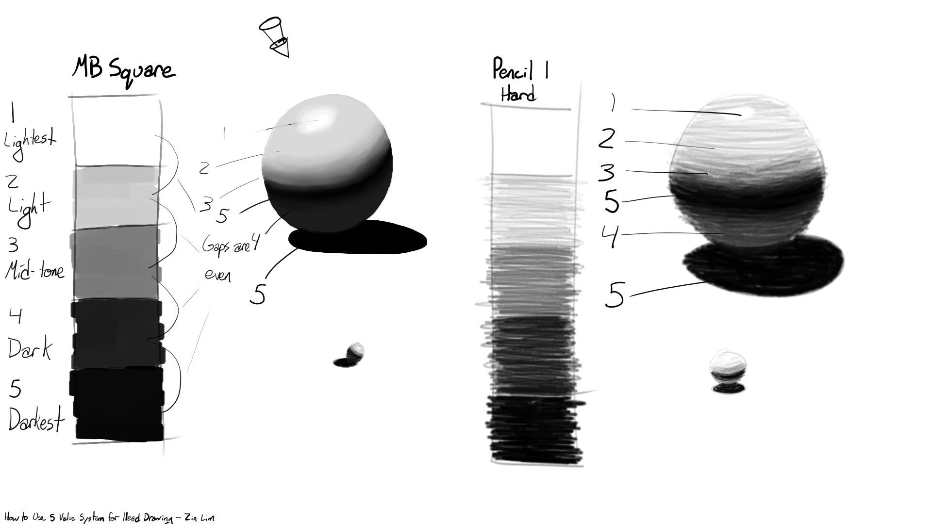
This is suuuuper rough.. but I hope you'll see what I meant when talking about the rounder eyeball shading...

Ahh, I see what you mean now! I could certainly use some more shadow under the top eyelid like you've shown.

I should have explained the reason I've been keeping the right side light on shadow, which is because in my reference, the light source is coming from the right. (This is going to highlight how far off my colours are from the original skin tone :grin: )

Does it work if this is the case?

Ahh I see, makes more sense now! :smile: In this case, I'd recommend variances in the shadow (darker near the tear duct) and still some shadows below the lid :smile:

Well, it seems like everyone moved on lol. There's a lot of improvement with the second one you painted.

I spent a couple hours on this though so I'll just share it anyway :sweat_smile: Would've helped to have that ref earlier, but I found some of my own! Like Julia I couldn't help doing a paint over.

The main issue I saw was the skin tone and overall light environment. With the colors you used it would probably be night time or early morning, which would give you cooler/blue tones. Because of that I painted it with a weaker light source in mind and got rid of the strong highlight.
Be careful with your references if you're studying. The one you used looks photoshopped in order to make the iris stand out, so the shadows, colors and lighting might be off.

Back to the painting, I think you did a great job keeping the direction of the light in mind. The shape of the lids were good, the upper one just needed to rounder and pushed up a bit. I think the main things that are getting in your way are colors and technique.

This artist and video helped me a lot with rendering and getting familiar with the shape of the eye.

Hope this helps!

Thanks so much for your time on this, Lesley! You given me a mini tutorial in eye-making. You raise some great points about skin tone and lighting; I'll look at this often for tips when I'm stuck!

Here's some gesture drawings from the past two days. The figures (2 minute) got better as I made my way to the bottom left corner; the heads were referenced from the gallery banner at the top of the forum in case they look vaguely familiar - not mine at all!