


thanks for that solid look, i def appriciate it.

 Thank you! I finally cleaned that up. Meanwhile started 3 more ..I have a habit of taking too long to finish a piece, then I lose interest in it and just start something else. I found 8 from recently i started and abandoned, that are decent enough to not delete, but not finished. There’s also been a number of drawings I felt I “outgrew” - became better before I finished them, and it would be easier to start from scratch than fix them. Anyone else thinking that?in24.6k
 Lady Death Fanart Collectible: Part 6 Polypaint and base Hi, it’s time to share with you another part of the process to create this fanart piece. Polypaint As this is my first collectible fanart I didn’t have previous experience with polypaint so I tried my best and played a bit with it.I wanted to give a ghostly and eerie look to Lady Death, she is beautiful and deadly, but at the end of the day she is a woman that died and was reborn at hell as an avenging spirit, that’s why I gave her skin tone a bluish very cold tone.As you will see I gave myself some creative freedom to deviate from the traditional color scheme that this characater has in comics and illustrations.To add a bit of sensuality by painting some freckles on the face and the chest. The dark nature of this character was the perfect excuse to gave her a kind of goth make up, very dark shadows around the eyes, blue lips and fingernails. I know that the original character includes sexy red lips but I wanted this girl to have a sexy but at the same time creepy look, that’s why we can see some thin veins emanating from her eyes. The biggest chromatic change I did for this character is at the hair. Lady Death has a characteristic white weavy hair but in my fanart I decided to gave her a very saturated blue color.The reason behind this wasn’t only an aesthetic choice. I want that the face area strongly pulls the attention of the viewer so this area needed a stronger contrast. Another reason is that I want her to have a more modern look, as I mentioned before, I’m strongly attracted to women with goth/punk look. I gave myself half an hour or more to analyse the work of experienced sculptors that create collectibles and I discovered that the use of darker values on the skin is often applied to create a greater sense of volume and three-dimensionality. I found that areas with heavy ambient occlusion are the perfect places to paint with darker colors in order to increase the separation between different forms. Even though she has a bluish skin tone, I used a bit of warmer hues in areas that, in real life, tend to go towards red and pink, this is very obvious in the nose, cheeks, and knuckles. Thinking with a logical mind it’s completely absurd to have warmer tones on the body of a zombie like creature but I didn’t want to limit myself by using only blue tones, it looks boring and artificial. In real life these colors are created by blood vessels in areas where the skin is very thin. ** Scythe **for her weapon I applied a cool gray with some warmer variations, this color scheme is influenced by the work of H.R giger. Base I’d like to talk about the design for the base which, to be honest, I forgot to develop along with the character.My main idea with the base is to show that Lady Death inhabits a very sterile and arid land, at the end of the day she is at hell.You can see a that she walks over dirt and rocks, a sign that she’s surrounded by death and loneliness. As part of the landscape we can see some bones and skulls to reinforce the idea of lack of living creatures, yet we can see three hands that try to reach her legs.This hands represent that all creatures are subordinated to her power and seek an evil blessing with a simple touch of the princess of the damned.1- The hand with skin burns represents the souls of those who are newcomers to hell, tortured souls that suffer for the sins comitted on earth.2- The hand with greenish rotten skin and pustules is the reminder of the decay that has infected the souls of those who have been trapped and have forgotten their humanity3- Last but not least, the hand of a demon shows that even dark creatures and entities bow before her presence. The cherry on the top, at least in my vision, are the simese twins that emerge from the ground, this malevolent creatures remind us that in hell there’s only perversion and any trace of innocence is lost. Thanks for reading till this pointI’m really happy to be very close to finish this creative journey, last but not least it’s mandatory to talk about splitting the sculpture in several pieces to be printed, this will be my last entry before showing the final rendered images. See yaMay Zbrush be with youin1.5k

 memory 2min gartic phone, used ref 2m gartic, used ref for pose 2min gartic 2min gartic 2min gartic 2min gartic memory memory memory memory study memory memory memorymemory memory memory memory memory memory study memorystudy study stylized left memory, right study study memory memorymemory memory memory memorymemory memory, porportions r offmemory memorystudystudy memorymemorymemory memory memory memory memory memory memory memory, right leg is a bit broken The feeling of only getting 1 - 3 likes on a social media post will never not be discouraging. But nothing is discouraging enough to make me quit drawing. I think the strategy of drawing a lot of stuff and waiting a while to post is good though rather than posting it immediately and then feeling that sadness on the next set of drawingin

 studies studies juri study imagination, how I feel before a speech imagination imagination study something I drew for my presentation also drew this for my presentation, didn't fix the one hand being bigger than the other imagination + study study studies study study, I need to fix the face a bit based on screenshot from anime but in my style study. except for the eye study studies studies study. changed some things tho imagination imagination imagination study studies, except top right samurai based on anime screenshot wolverine studies, changed some of the poses a lil, not very good at all, but first time i drew the character ever. semi study studies study imagination imagination imagination , for first time ever i tried to draw over 3d model for middle pose, I dont like the result tbh, but it makes it much easier than coming up with it from memory.imagination, except right figurestudies imagination + studies, coming up with action poses r hard, these are not dynamic enough, I will redraw better ones in future. imagination , imagination imagination study, except for eye imagination imagination imagination doodles except for the two chrollos imagination storyboard thumbnail, idk if i ever shared this. my storyboards end up being a little detailed since i usually just draw in one layer.in22.6k

Term 2 perspective 2 homework. I didnt want to do the wall, or a bridge. But i made sure to do the essentials, 3 points of perspective, and kept my canvas in an area that would not distort to heavily. I left in my construction lines. I may have taken the render a bit far, but i decided to have it be my weekly instagram post so I pushed in an extra hour. Self imposed deadline like it was one of many concepts and didnt get super deep with details. 3 hours total.
I like it! Looks really neat 


I have never done 4 pt perspective this is a little weird to wrap my brain around. the first 40 min or so I was frustrated because I wanted to put the broom at an angle that wasn't straight with the grid and i didn't know how to calculate it. to i though about the angle the bottom bristles were, made a plane and the worked my way up. the second one is just freehand on the grid practicing wheels and boxes, someday i want to be able to do vehicles and I know I have to start small and get my brain used to thinking about these volumes properly.


trying to apply the scott robertson method of learning to draw vehicles to the 3 point perspective assignment. again wrapping my brain around this in the beginning was tough, but less so than the last time, YAY progress. and by the last exercise i was feeling pretty good. I started with a bottom floor plane in blue. then created a center plane in green to describe the orthographic or side view. Finally working from the center using red i ended creating the modeling planes, making a symmetrical form.

last bit of perspective done. I did not go too long on this because the female form is a weak point for me and i did not want to be guessing. the perspective and proportions i think are pretty good...maybe the feet are out too much. Marc used the male for this, and others that I've seen have also used the male. If any women or men that can point out my mistakes I would really appreciate it
So I did a side by side and a bit of draw over to help point out a few issues.
The very first thing I noticed was the head, there's no perspective applied to it. Proportionally it's fine but we should be seeing it from below. Almost to the point where the jawline is a flat line or even pointing up.
Next was the shoulder/hip ratio. If this figure wasn't in a curved perspective this would be fine, the hips are as wide as the shoulders. But because this figure is in perspective the hips should be noticeably wider. Exaggerating those proportions is something that can really sell the perspective.
A minor thing was the breasts. At the angle we're seeing them and their size we should see more of the underside where they rest against the rib cage. The nipples also need to be a bit higher.
The legs look good but could be tapered more as they move away from horizon line.
Finally, on the arms the muscles of the triceps are located right underneath the delts. I drew where they should be on your figure (the size is exaggerated a bit) .
Okay, that was a lot of stuff. 4 point perspective is really complicated and drawing the figure in that perspective even more so, it's something that I still have trouble with. Your other assignments look good and you have a good grasp of perspective, so I think that you'll get this down with some practice.
If you have any questions, need some clarification on something or want me to look at another assignment don't hesitate to ask

Heyoooo,
Come here to take a look at the 4-point perspective assignment, but @MattD already nailed it! 😅
I'll just echo a few things he said:
* Exaggerating on the proportions really help on the perspective: that is so true. Honestly, the first thing I noticed on your assignment was how the cylinder wasn't really "that bent". If you notice on @MattD's example, the cylinder is really wide at the horizon but really thing/small on the edges. Maybe adjusting that base could also help you create a figure with more of that perspective.
- Both head and feet look "normal":
This wouldn't be a bad thing in and of itself, but since we are talking about perspective, we should be seeing the face from a "downwards" perspective (so we could almost see under the chin) and the feet from an "upwards" perspective.
One thing that really helped me draw the face was this Sinix Design video:
I think that's it from my side 
Hope that was helpful! Keep up with the amazing work tho! Keep them coming 😬👍
@dangras-almeida @MattD thank you both so much for coming to critique this. Matt I didnt expect a whole drawing, geez thanks man. I will take what you both said to heart. I honestly should recheck my notes from the class. im have a suspicion some of my measurements i wrote down may be wrong. or like matt said i am just not interpreting them correctly in perspective. and yeah Dan, my cylinder was very tame and should have been way more aggressive. thank again guys, this was a HUGE help.

This one come pre-captioned for our teacher, and anyone else who has any thoughts. @dangras-almeida I watched that Sinix video before tackling my heads. it helped . thank you.
Your Oni Clan packaging is hilarious! Did you make that up?
Only because you asked for feedback on that one, I'll offer this: be careful with the Photoshop effects like glow, drop shadow, bevel, etc. (On the ghost)
They have their uses for sure (for example Marc has a YouTube video about shading where he uses a layer effect in an interesting way, can find it if you haven't seen already). But typically people use them right out of the box. It's fine for learning, but in real designs, not good. (I can explain why if wanted, just wanted to keep this brief.)
That Sinix video is awesome, what a good teacher! They look fun to draw, I think I'll try tol 😄
LoL yeah the ONI brand is my IP. It is an acronym for Old Ninjas Inc. Yeah the ghost done in that method was purely an experiment using the methods from the class. It was an interesting take on the tools, but I wouldn't ever normally use those effects for professional work, at least not in that method. Thank you for the feedback.

exploring some tree techniques for concept art.
Goals: Isometric view - vary tile space in x,y,&z - create custom leaf brush for each tree - tree for different biomes.
owww I love drawing plants  that's the thing I was doing before get to know Marc's videos hahah Are you following a specific class or a tutorial video? I'm pretty curious about that, they looks awesome! Great perspective
Keep going
it was a tutorial on some photoshop methods concept artist use, the homework was to create 3 trees. and 3 custom leaf brushes. I added the parts with the isometric view, and tile size. I am also invested in courses from Trent Kaniuga. He is a working concept artist, and former co-worker of Marcs from back at their Blizzard days. Trent was in concept, while marc was in modeling. My goal is to get into the concept art and design field. So I have been combining a bit of the homework from both of these great guys lessons. ...... and truly thank you for the compliment. I have been drawing robots and ninjas etc. for so long, plants ate new to me, but I have really been enjoying it a bunch! 
Ohh yes the portfolio template reminded me something hahaha I watch Trent's videos on YouTube, would you recommend his couses? I never thought about that really seriously because I don't know if the design field is for me but, if you give a good feedback, maybe I could think about that
yeah his content is definitely geared towards people looking to get into concept art and design. But if that is your jam, his content is top notch. His box sets have so much content, you end up paying less than 2$ an hour for all you get. I bought the current 2020 box set and every month he keeps adding content, and continues to until the end of the year. It is at a discount price until the end of the year, and once the set is complete he re-prices it to the normal price. Currently I think its about 70 hrs of content for $80 and its only July so another 5 months worth of tutorials will still be added. You buy the box set for the year and you get everything he puts out. Like I said, if concept art and design is your jam, Trent's packs are one of the best deals out there, and the quality of content is also one of the best for that field.

some practice rendering in preparation for finishing the magic tree concept project.
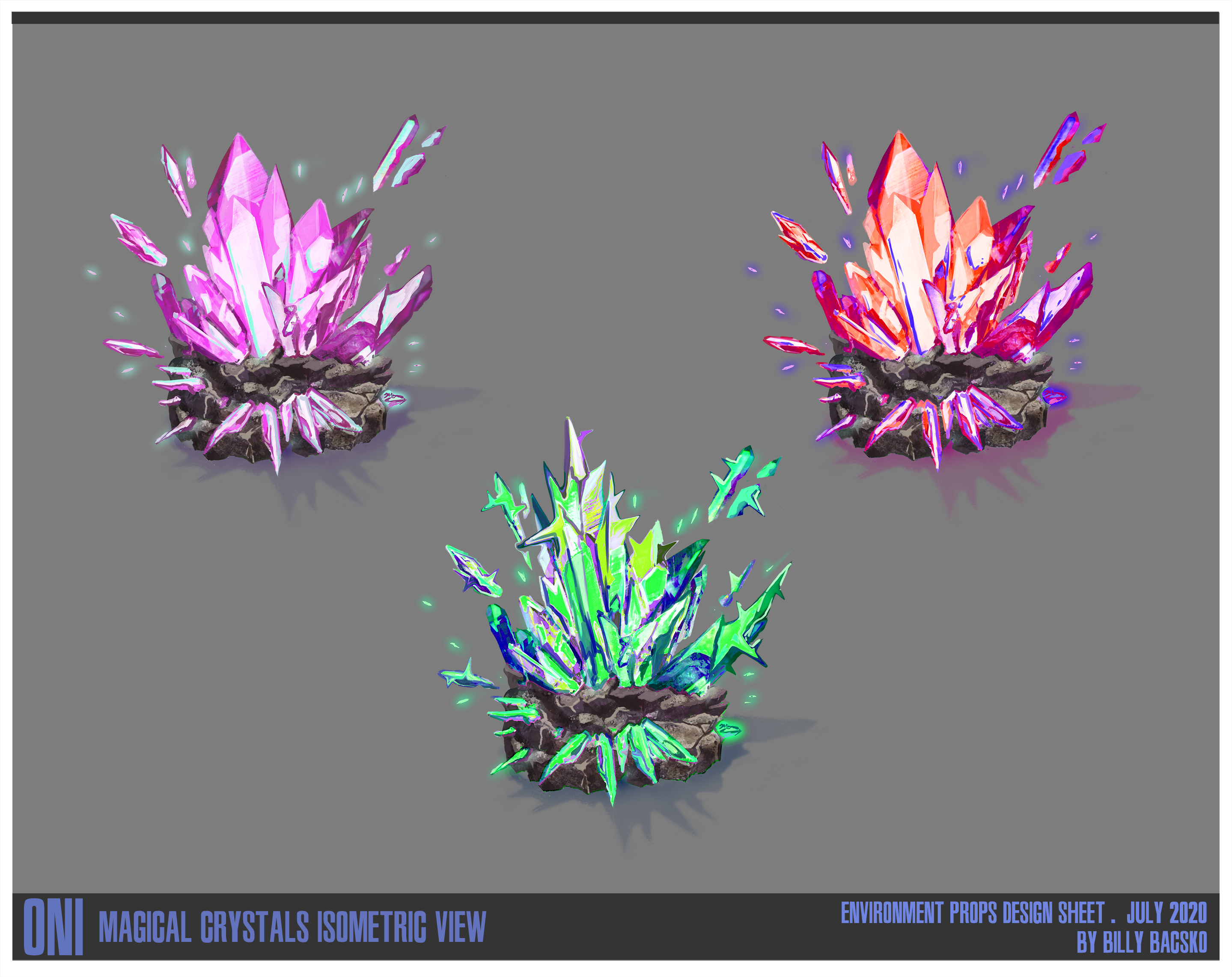
3 variants designs for some crystals. More exploration for final stage.

My final design for some magical trees, possibly for some isometric game. The Pine tree looks as if the crystals were very aggressive, and maybe plan to take over or cover the whole tree. The Bonsai I feel has a symbiotic parasite that is causing crystal flowers to bloom. And finally the maple has been surrounded and the roots have internalized the magic, and now the tree bears crystal fruit. This was a fun problem solving project. I set constraints on the tile size for each tree. Created custom leaf brushes for each. Improved my visual library and confidence in rendering materials. And finally explored how each crystal I had created would affect each type of tree. I am about to start term 3, and I thought this project would be some good prep for me going into ZBrush. I would like to incorporate 3D into my next concept design study.