So, anyway, today I have started the lesson of nude figure drawing from Topic 1 and I would like to show you some studies that I did, hope you enjoy!
If you notice something that doesn't work please let me know!
Have a nice day 


So, anyway, today I have started the lesson of nude figure drawing from Topic 1 and I would like to show you some studies that I did, hope you enjoy!
If you notice something that doesn't work please let me know!
Have a nice day
Heyho, Chiara!
Nice to meet you! Thats a great goal you have, definetly keep us updated on your progress!
The first assignement looks nice, good job.
Cheers,
Mau
Hey @chiara.arcidiaco,
Welcome to the forum 😀
I hope you have a great time with all the lessons and with Art School. It is definitely super fun and if you keep at it, you'll see progress in no time.
Just as @mau.wamp, your first assignment looks great. Just keep the updates coming 😬👍
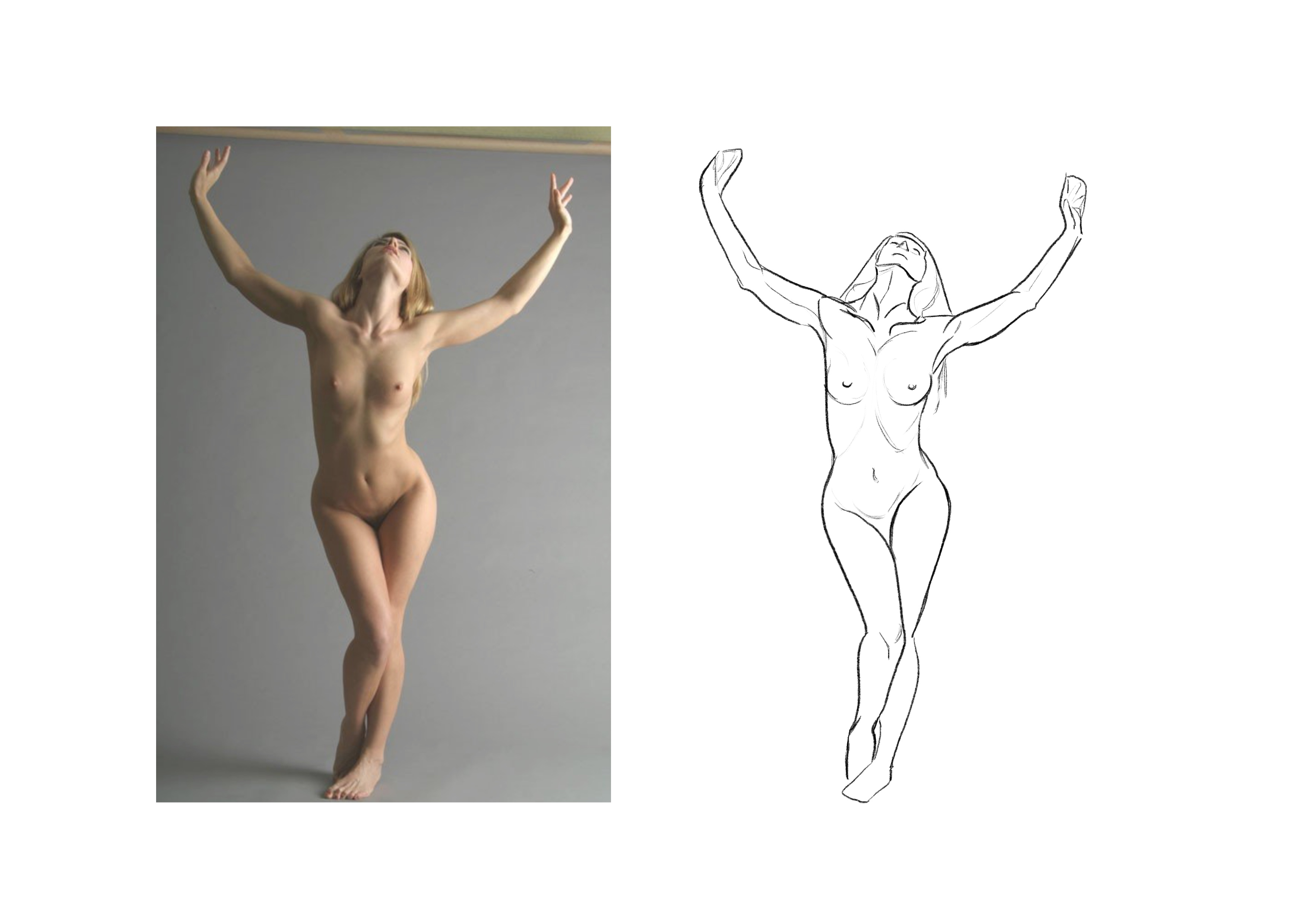
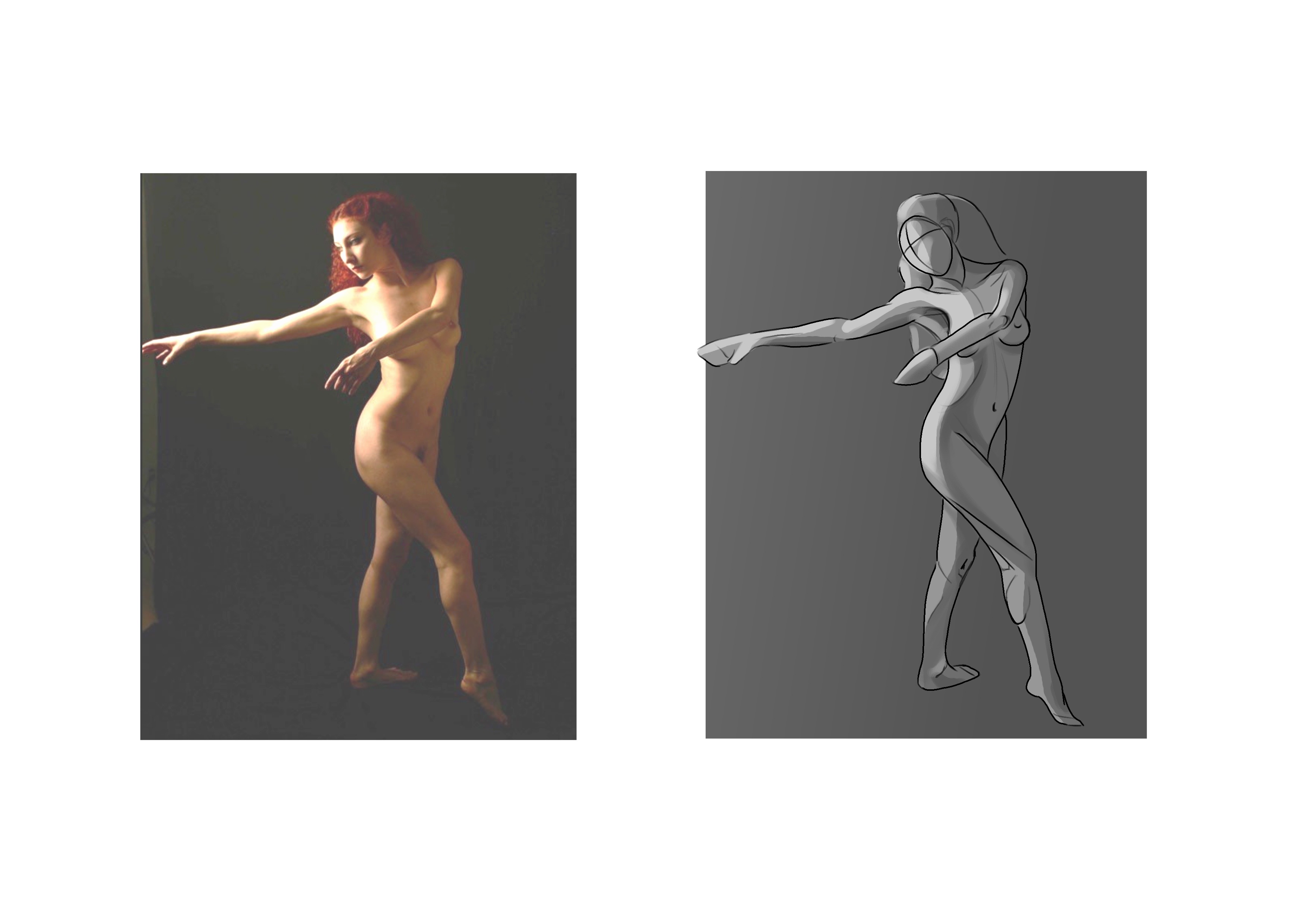
Here we are again  Today I continued my figure drawing studies and I approached the proportion topic for the first time, so I tried to replicate the image in the video lesson in order to understand how the proportions work (I have to admit that I use the symmetry tool but tomorrow I would not cheat, I swear
  )
)

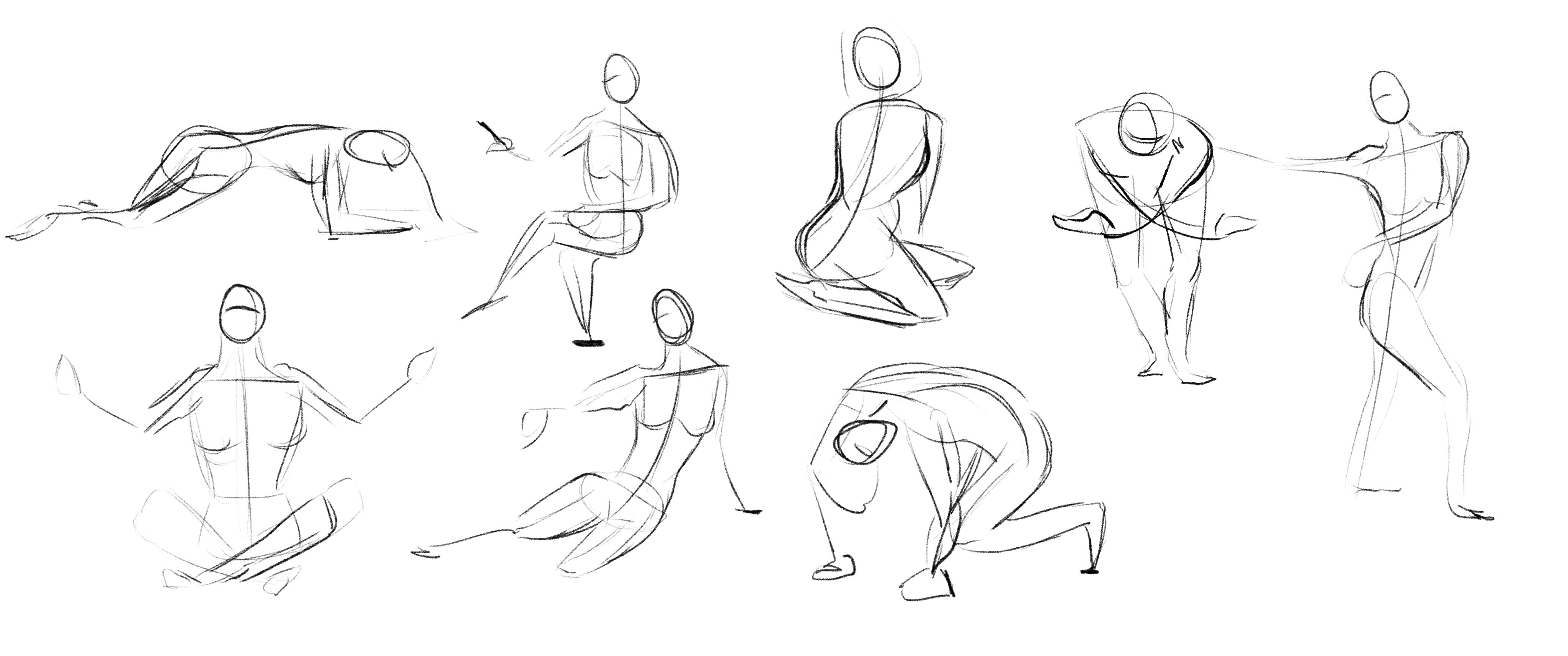
Than I went back to the basic structures. I have to say that I had difficulties in drawing the box shape for side reference, if someone could give me some tips I would be so glad about that 
In this case I tried to use the oval shape and I have to say that it works pretty well. Than I tried to draw the structure without the model below and to add some details, let me know what you think about it! Have a good day 
Hey Chiara,
Congrats! These turned out amazing 👍
In the grid proportions piece: don't worry about having used symmetry, but I do recommend trying a few times without it so you can train your eye on how to achieve that yourself. The woman figure is really, really good! The man figure feels a bit blocky (with a lot of hard edges) and the forearm appears to have a weird shape that follows the pelvis. But other than that, you nailed it 😬👍
About the basic structures: it's actually a nice thing that you were able to go to the circles instead of the blocks in this case, it just adds to your "set of tools" being able to use whatever you need depending on the situation, and the result here is awesome! Congrats.
Keep the updates coming!
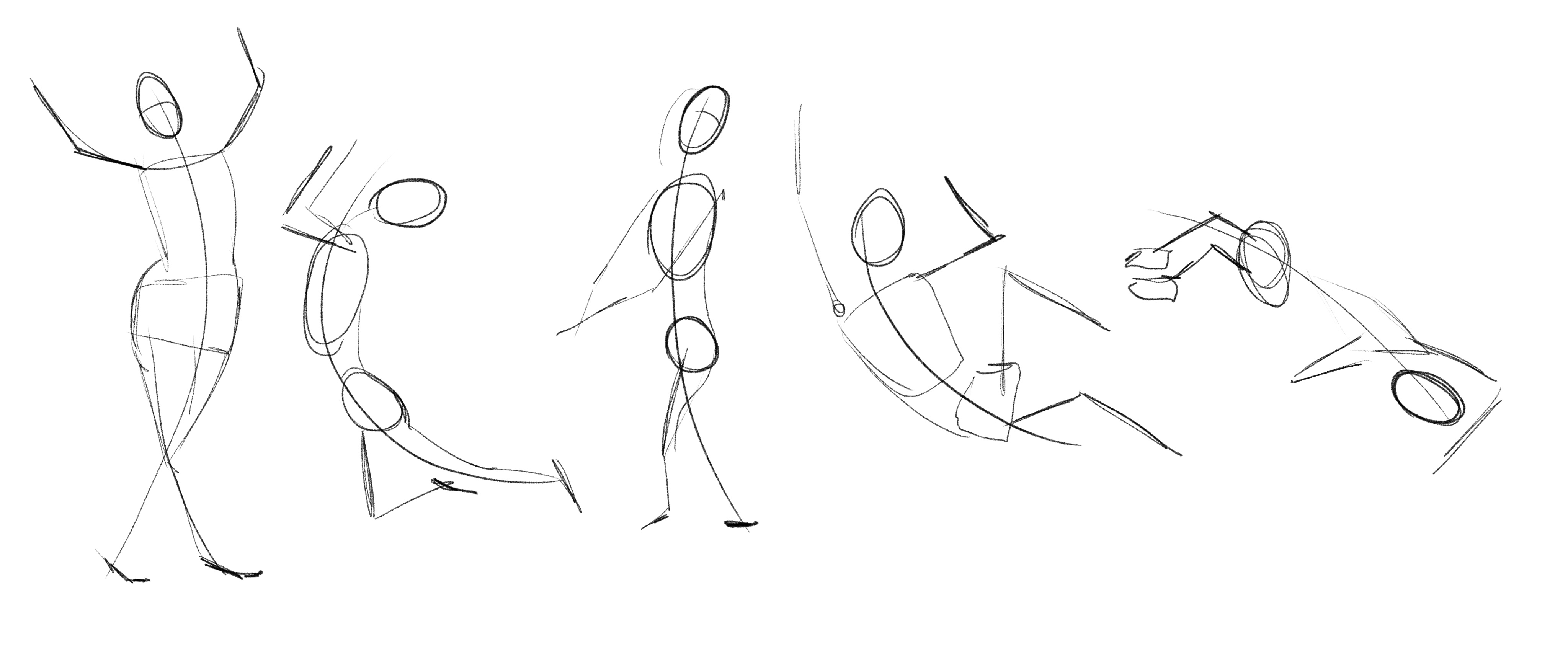
Hi guys!  Today I have finished the nude figure drawing lesson approaching the gesture drawing, even if I was struggling at it that I had so much fun! I didn't think that it could be possible hahah
I had so much struggles most of all because I continue tracing over and over lines and the final result is very messy, but this one turned out well.
Than I try to do something different with male/female figure studying the side and back view. My figures are always a bit blocky (most of all the male figure) but I have to say that I learned a lot this time.
The only thing that I have to say is that the side view in both figures doesn't convince me al all, tell me if I'm not the only one to think about it 
Also I don't like the female face at all, but in this case I tried to focus more on the body than on the face.


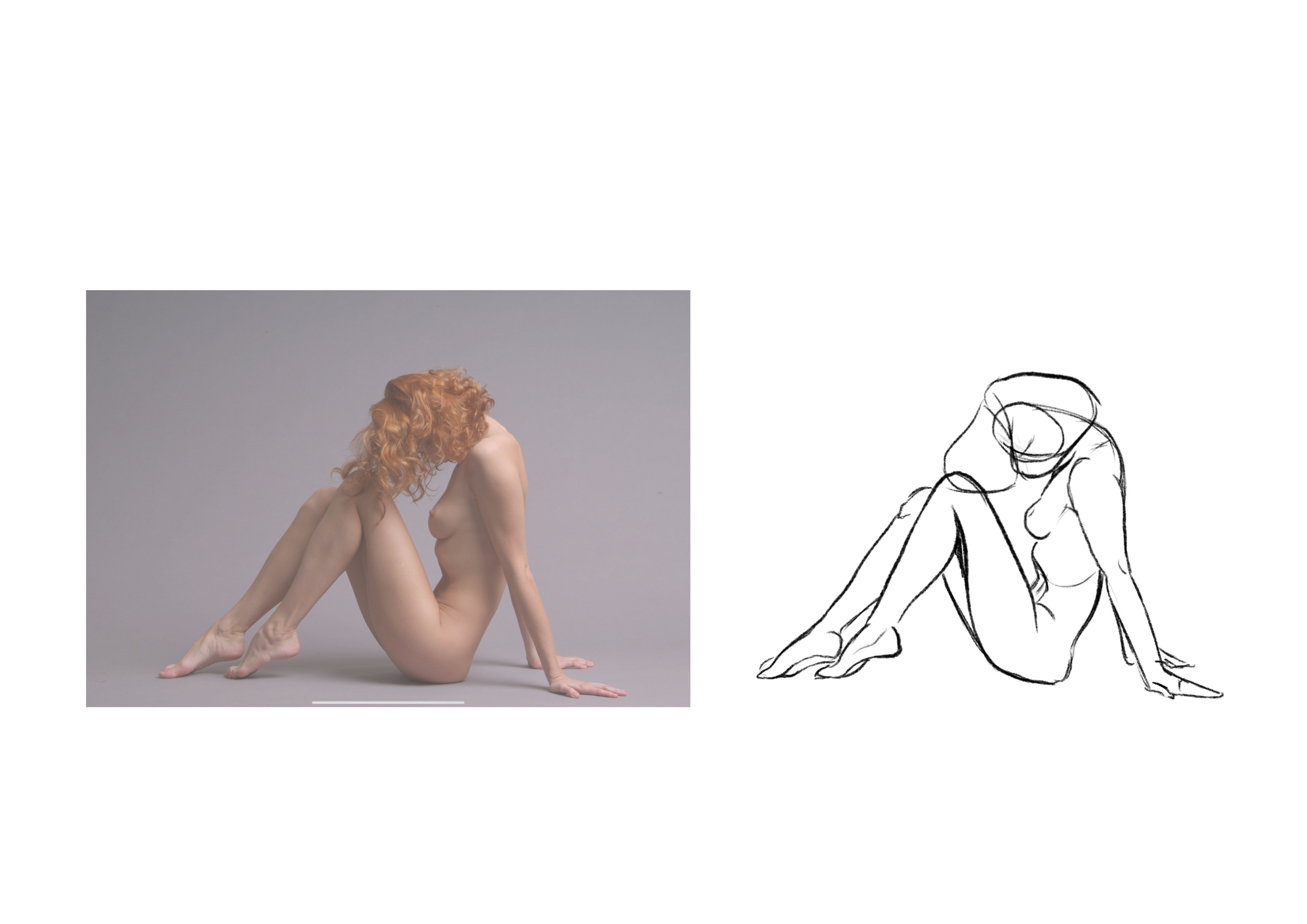
Last but not least I did a study figure trying to measure correctly every part of her body.
I had troubles using the pencil so I decided to trace lines in order to know esactly where I had to draw, and then I slide my drawing over the model to adjust it a little bit. I have to say that I am pretty happy about the final result, but of course I admit that I cheat a little bit
Have a good day!!
Looking good so far. Keep up the great work
Good evening! Today I worked on gesture drawing and I think that I get better in every session, pretty happy about that even if I have to work a lot with that.
This is one part of my 30s and 1m sessions
I also worked on figure drawing trying to use fluidify as less as possible. The first one is a 20 minute sketch and in the second one I spent a little bit extra time to figure out a polish lineart (I don't like it really much, I also don't know which brush I prefer) and try to add the background and a little bit of shadow and highlits. That was really random I have to say hahah due to the fact that I don't have studied that chapter yet, but I would appreciate some comments from you on what I could have done better.
Than I approached the perspective for the first time and I tried to do some quick studies in order to understand how it works.
Hi Today I started working on the 1-point perspective assignement and here is a quick sketch, just to understand what I want to put in this room.
I have to admit that I'm not feeling comfortable at all with this topic, but I hope to get better soon.
I had problems doing the ceiling part and I tried also to give depth at the window but I couldn't manage it. Let's try tomorrow
If someone could give me some advices or notice and tell me if something doesn't work I would appreciate it  Have a nice day!!
This is my second try with this room. I'm happy about having fixed the roof problem but the pipe that I put looks a bit akward 

Hey Chiara, this is looking really nice, I like the addition of the earth in the background!
When it comes to that pipe, I think what makes it look 'awkward' are those intersecting lines. The way you have them right now makes the form look like its almost semi-circular rather than a cylinder. Try drawing through the object, make those intersecting lines a complete circle (or ellipse for this example) and then draw your final clean lines over the top. You'll see that those intersecting lines should look like they continue around the form and not finish at the boundaries of the viewer.
Here is what I mean

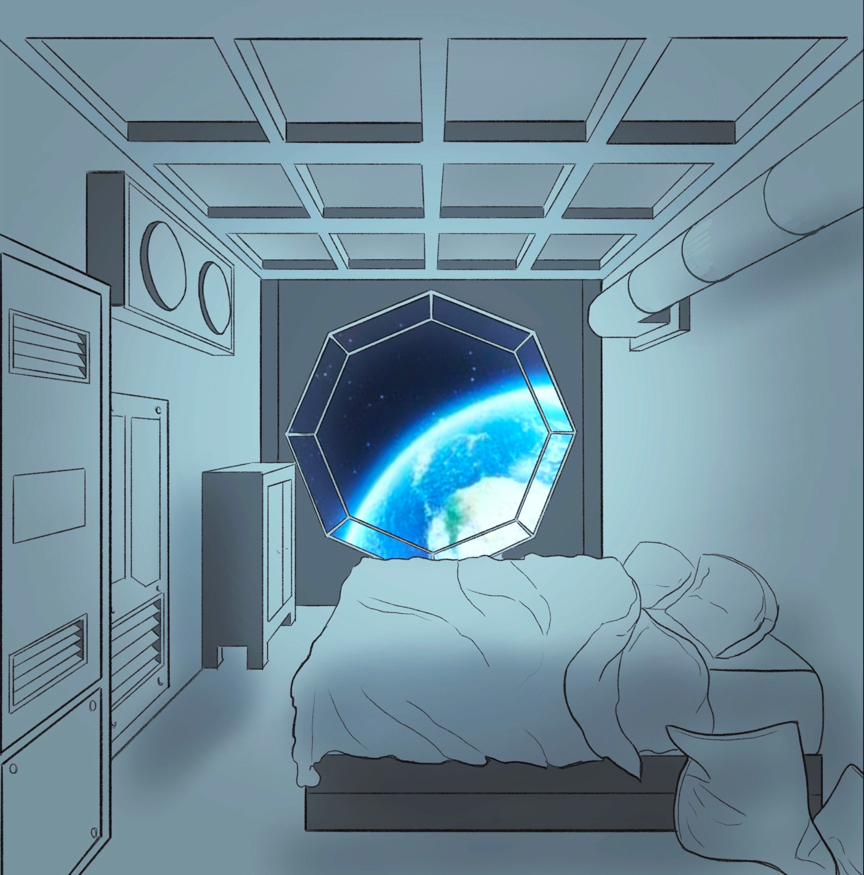
Also something else I noticed while doing the drawing that wasn't imediately obvious at first, was that we are looking at the pipe from below so therefore we see the intersection from underneath. So we see more of the underside and less of the top.
Hope this helps