• Gave myself 5 days to do something. This is what I managed to do. I'm trying to get better at illustrations, but I have patience to work on something for 3 days maximum :( Splash_Process.jpg5000x3140 2.21 MB Splash_Process-6.jpg3896x2429 2.83 MB concept list char copy.jpg5388x3000 1.7 MB
    20.8k
  • Did a character concept for a course.https://www.artstation.com/artwork/P6gm3y - more:) list1.jpg3541x1920 2.82 MB
    20.8k
  • Day 4: Star Wars May The 4th =] Queen Padmé Amidala in my art style! First time drawing her and I really enjoyed making this one! Used watercolours, ink pen, acrylic markers and gold paint for accents on my Canson mix media sketchbook. I hope you like it!
    82.4k
  • A creature design from a while back
    by
    6.7k
  • Here is some more recent stuff, I need to make more body studies
  • It's been a while and god, it is so cringe to go through all previous messages xDmy study.
    20.8k
  • Thank you! I finally cleaned that up. Meanwhile started 3 more ..I have a habit of taking too long to finish a piece, then I lose interest in it and just start something else. I found 8 from recently i started and abandoned, that are decent enough to not delete, but not finished. There’s also been a number of drawings I felt I “outgrew” - became better before I finished them, and it would be easier to start from scratch than fix them. Anyone else thinking that?
  • Lady Death Fanart Collectible: Part 6 Polypaint and base Hi, it’s time to share with you another part of the process to create this fanart piece. Polypaint As this is my first collectible fanart I didn’t have previous experience with polypaint so I tried my best and played a bit with it.I wanted to give a ghostly and eerie look to Lady Death, she is beautiful and deadly, but at the end of the day she is a woman that died and was reborn at hell as an avenging spirit, that’s why I gave her skin tone a bluish very cold tone.As you will see I gave myself some creative freedom to deviate from the traditional color scheme that this characater has in comics and illustrations.To add a bit of sensuality by painting some freckles on the face and the chest. The dark nature of this character was the perfect excuse to gave her a kind of goth make up, very dark shadows around the eyes, blue lips and fingernails. I know that the original character includes sexy red lips but I wanted this girl to have a sexy but at the same time creepy look, that’s why we can see some thin veins emanating from her eyes. The biggest chromatic change I did for this character is at the hair. Lady Death has a characteristic white weavy hair but in my fanart I decided to gave her a very saturated blue color.The reason behind this wasn’t only an aesthetic choice. I want that the face area strongly pulls the attention of the viewer so this area needed a stronger contrast. Another reason is that I want her to have a more modern look, as I mentioned before, I’m strongly attracted to women with goth/punk look. I gave myself half an hour or more to analyse the work of experienced sculptors that create collectibles and I discovered that the use of darker values on the skin is often applied to create a greater sense of volume and three-dimensionality. I found that areas with heavy ambient occlusion are the perfect places to paint with darker colors in order to increase the separation between different forms. Even though she has a bluish skin tone, I used a bit of warmer hues in areas that, in real life, tend to go towards red and pink, this is very obvious in the nose, cheeks, and knuckles. Thinking with a logical mind it’s completely absurd to have warmer tones on the body of a zombie like creature but I didn’t want to limit myself by using only blue tones, it looks boring and artificial. In real life these colors are created by blood vessels in areas where the skin is very thin. ** Scythe **for her weapon I applied a cool gray with some warmer variations, this color scheme is influenced by the work of H.R giger. Base I’d like to talk about the design for the base which, to be honest, I forgot to develop along with the character.My main idea with the base is to show that Lady Death inhabits a very sterile and arid land, at the end of the day she is at hell.You can see a that she walks over dirt and rocks, a sign that she’s surrounded by death and loneliness. As part of the landscape we can see some bones and skulls to reinforce the idea of lack of living creatures, yet we can see three hands that try to reach her legs.This hands represent that all creatures are subordinated to her power and seek an evil blessing with a simple touch of the princess of the damned.1- The hand with skin burns represents the souls of those who are newcomers to hell, tortured souls that suffer for the sins comitted on earth.2- The hand with greenish rotten skin and pustules is the reminder of the decay that has infected the souls of those who have been trapped and have forgotten their humanity3- Last but not least, the hand of a demon shows that even dark creatures and entities bow before her presence. The cherry on the top, at least in my vision, are the simese twins that emerge from the ground, this malevolent creatures remind us that in hell there’s only perversion and any trace of innocence is lost. Thanks for reading till this pointI’m really happy to be very close to finish this creative journey, last but not least it’s mandatory to talk about splitting the sculpture in several pieces to be printed, this will be my last entry before showing the final rendered images. See yaMay Zbrush be with you
    1.5k
  • memory 2min gartic phone, used ref 2m gartic, used ref for pose 2min gartic 2min gartic 2min gartic 2min gartic memory memory memory memory study memory memory memorymemory memory memory memory memory memory study memorystudy study stylized left memory, right study study memory memorymemory memory memory memorymemory memory, porportions r offmemory memorystudystudy memorymemorymemory memory memory memory memory memory memory memory, right leg is a bit broken The feeling of only getting 1 - 3 likes on a social media post will never not be discouraging. But nothing is discouraging enough to make me quit drawing. I think the strategy of drawing a lot of stuff and waiting a while to post is good though rather than posting it immediately and then feeling that sadness on the next set of drawing
  • Urban Dragon Girl Wip Urban Dragon Girl_wip1.jpg5000x5000 1.11 MB
  • Long time no see! New artworks produced lately
    6.7k
  • studies studies juri study imagination, how I feel before a speech imagination imagination study something I drew for my presentation also drew this for my presentation, didn't fix the one hand being bigger than the other imagination + study study studies study study, I need to fix the face a bit based on screenshot from anime but in my style study. except for the eye study studies studies study. changed some things tho imagination imagination imagination study studies, except top right samurai based on anime screenshot wolverine studies, changed some of the poses a lil, not very good at all, but first time i drew the character ever. semi study studies study imagination imagination imagination , for first time ever i tried to draw over 3d model for middle pose, I dont like the result tbh, but it makes it much easier than coming up with it from memory.imagination, except right figurestudies imagination + studies, coming up with action poses r hard, these are not dynamic enough, I will redraw better ones in future. imagination , imagination imagination study, except for eye imagination imagination imagination doodles except for the two chrollos imagination storyboard thumbnail, idk if i ever shared this. my storyboards end up being a little detailed since i usually just draw in one layer.
    by
    22.3k

I took the Robotpencil Mentorship about 2 years ago and I took the Uartsy Character Art Bootcamp almost a year ago.

I started streaming in Nov of 2017 and started to gain a viewership in Jan 2018.

With my hard work I've been able to get on to Inprnt. And I've done a few commissions.

I'm no where near being a professional (which is pretty much what I've been told with the rejection letters I've received from different game companies), but I'm still working on it.

I'm not typing any of this to brag, I just don't know how keep people regularly informed on what I've been up to and I'm caught inbetween doing fan art / drawing erotic for money and trying to make time to actually make a game art portfolio.

On occasion I'd like to post some print ideas or WIPS on images like this because it will help me sell some work, but I will be focusing a lot on making portfolio pieces.

At this point if I don't here from a game company, then I'm seriously considering just making a game, since that's worked for some people.

I've spent some time learning how to make some completed illustrations, but I've never gone through the full process of going from a general concept to making a finalized piece.

For the next 1.5 - 2 months I'll be posting progress shots of a Game Environment project that I'm working on.

I came up with this idea of a Pastel Colored Game Room. Here's a general asset sheet that I'll be using to reference the style of the room and use to ground my designs and here's the first pass at a pastel colored fight stick.

I'm currently learning how to use BSP objects in unreal so I can model out the basic layout of the room and then insert my assets in to unreal engine. I've done concept art and made game assets before, but this will by first first time piecing everything together.

My goal is to make a completed asset sheet that would help a modeler to understand the style of the room and to also model out and render the room itself, using Unreal Engine.

Pastel Fighstick Top (I'll use this same psd when creating my texture map)

WIP for Asset Sheet (with color palette ideas)

Maya Screen Shots of Fightstick Model

I won't be designing / customizing every asset to this level, (where this asset feels more customized to the person living in this room), but I wanted to get something kind of unique for my first asset since I figured it would help me start to nail down the style that I'm going for for this room.

One Problem I've noticed with my asset sheet is that I'm just referencing the objects that I'm drawing instead of trying to design them so that they look more stylized. I'll be spending this week concepting the general layout of the room and trying to nail down the style for all of the assets I'll be modeling for this project.

16 days later

I'm at a point where the majority of my assets have been blocked out and I can start uploading more progress shots. Although one issue I'm having right now is nailing down the style. I might do a small preliminary project to experiment with NPR textures and see about trying to push my shapes a bit more.

I think I might get the style I'm going for when I move on to texturing, but I'm still not sure. Guess I'll just have to keep working on an asset or two to nail down my look.

Here's a composite of an arnold render next to my target color scheme. It's still not quite the style I'm going for, but I'm not sure if I'll have to simplify the hard surface look by using Zbrush, or if I'll have to change up my shapes and focus more on vertex color.

I didn't plan on using Arnold for my renders, but I figured it might be okay for a proof of concept. Although after looking at the renders I got, I've learned that I should just go straight to Substance.


I'll UV this and then see about getting the style in Substance. If it's still not right, I'll have to check my shapes and maybe go in to Zbrush to try and simplify.

Alright, I'm finally ready to start concepting on top of my grey box renders.

A few reminders for the next time I design an environment like this.
1) Use an extremely basic renderer
2) Block out more basic shapes

Granted I had the idea for what I was going for already, so It's okay that I blocked out this space and then started painting, but if I'm trying to do more exploration, the way I created this space is very limiting.

But that's okay, I'll just remember this for the next project.

Palette_1

Palette_2

Palette_3

Palette_4

Base

Even though I'll be painting / concepting on top of the value based render, I want to get an idea of what my color palette is going to look like before I start texturing, that way I can make sure each asset feels like it belongs in the room.

1 month later

Wow almost a month since my last post.

Well I guess that's okay since I've making a lot of progress. (Not on this project, but I've been making progress)

I think like anyone else that works on 3d projects I get a bit hesitant to move on to the UV phase of a project, which is where I'm at for this room project, so in order to get myself in the mood for this Environment, I started working on a character.

For whatever reason this made more sense about a month ago.

I'll show some more progress on the environment by the end of this week, but here's what I've been up to for the past month.

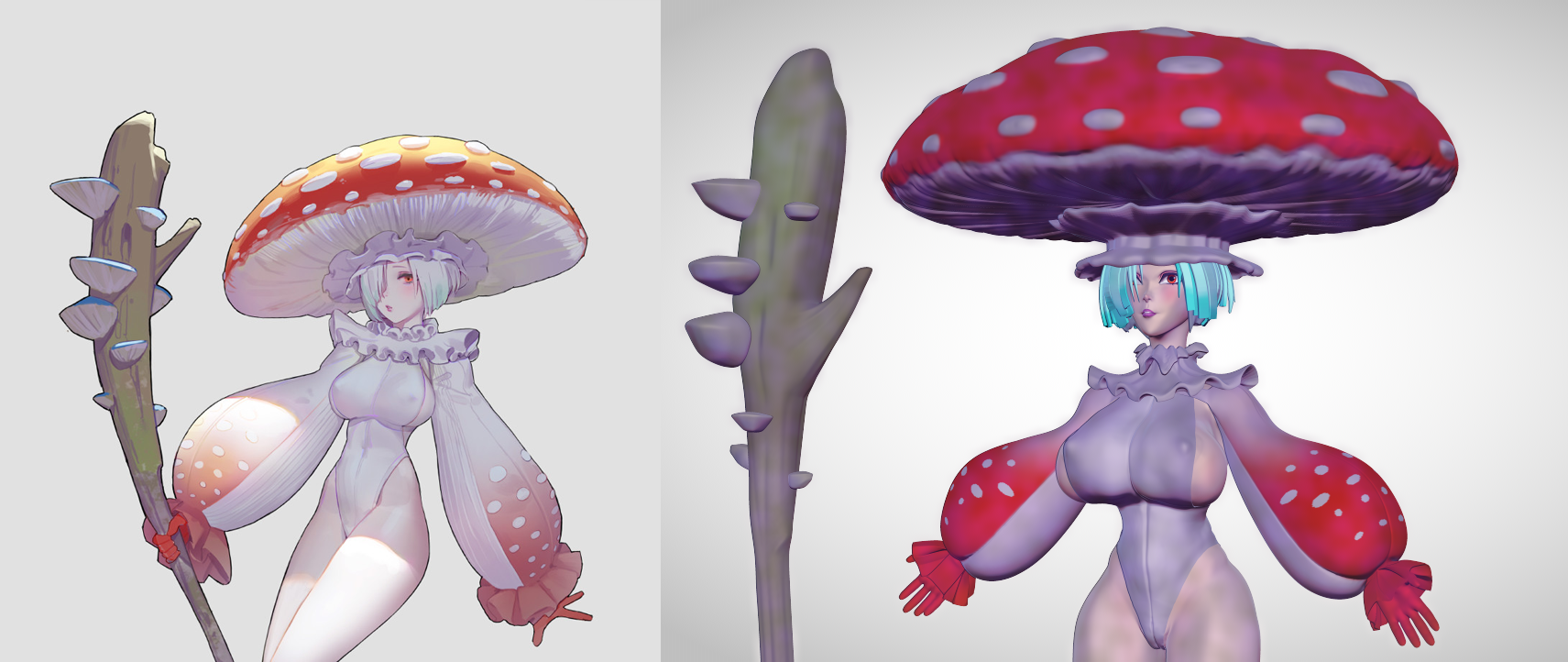
The concept artist for this character is Tim Löchner
Here's the original concept:
https://www.artstation.com/artwork/Lqyzv

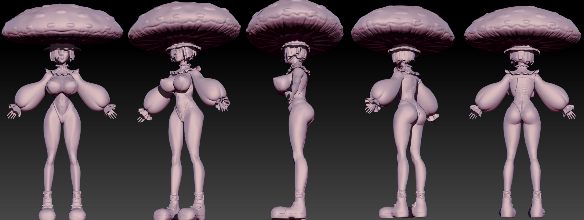
I was working on a blockout for another character sculpt back in December and stopped it because I didn't feel like finishing the rigging process for that character.

I've never gone through the FULL character art process on my own, from the
blocking out of a sculpt to rigging and animating and I wanted to do that this year.

While I was rigging my 1st character I thought it would be a good idea to also make a modular PBR environment, which is why I started the Pastel Game Room Project.

Basically I'm trying to catch up with all of the current standards for Game Design and 3d art this year, (excluding VR). I mean it's a good time to get this stuff down now, since Ray tracing should be the new standard in about a year or two.

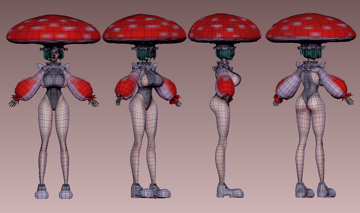
After getting my blockout for my environment, I started this character, which I do not plan on putting in a game engine, but instead I'll just set them up for 3d Printing, since the retopo phase will take less time.

Then I'll get this base ready for own character art piece and print out a series of characters I've had an idea for for a while.

I'm just glad I have a base mesh that worked for both characters. Even though it's such a pain in the ass to work in 3d because of how long it takes to block things out, I'm actually really glad I spent the time making my own base mesh:

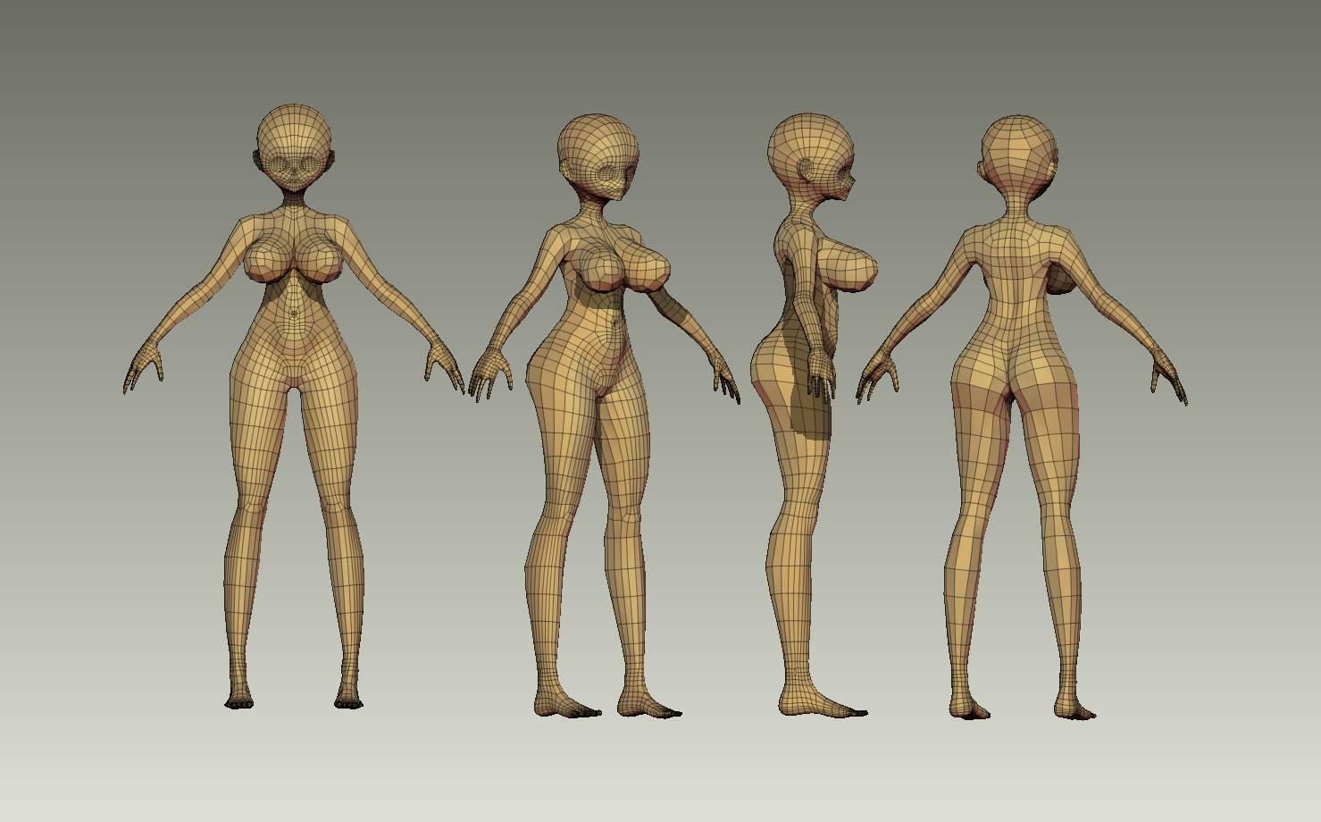
It's a bit dense, but it's a great starting point for making high poly anime sculpts (which is what I wanted for my projects).

Also I remember why I decided to go back to doing character art in Zbrush, after NPR textures went live and saw some of the renders that people could get with Zbrush's tools, I figured I could use Zbrush to make prints and continue improving my character art skills.

I'll probably post a few more renders by the end of this week too. I'm feeling really motivated to experiment.