• Gave myself 5 days to do something. This is what I managed to do. I'm trying to get better at illustrations, but I have patience to work on something for 3 days maximum :( Splash_Process.jpg5000x3140 2.21 MB Splash_Process-6.jpg3896x2429 2.83 MB concept list char copy.jpg5388x3000 1.7 MB
    20.9k
  • Did a character concept for a course.https://www.artstation.com/artwork/P6gm3y - more:) list1.jpg3541x1920 2.82 MB
    20.9k
  • Day 4: Star Wars May The 4th =] Queen Padmé Amidala in my art style! First time drawing her and I really enjoyed making this one! Used watercolours, ink pen, acrylic markers and gold paint for accents on my Canson mix media sketchbook. I hope you like it!
    82.7k
  • A creature design from a while back
    by
    6.7k
  • Here is some more recent stuff, I need to make more body studies
  • It's been a while and god, it is so cringe to go through all previous messages xDmy study.
    20.9k
  • Thank you! I finally cleaned that up. Meanwhile started 3 more ..I have a habit of taking too long to finish a piece, then I lose interest in it and just start something else. I found 8 from recently i started and abandoned, that are decent enough to not delete, but not finished. There’s also been a number of drawings I felt I “outgrew” - became better before I finished them, and it would be easier to start from scratch than fix them. Anyone else thinking that?
  • Lady Death Fanart Collectible: Part 6 Polypaint and base Hi, it’s time to share with you another part of the process to create this fanart piece. Polypaint As this is my first collectible fanart I didn’t have previous experience with polypaint so I tried my best and played a bit with it.I wanted to give a ghostly and eerie look to Lady Death, she is beautiful and deadly, but at the end of the day she is a woman that died and was reborn at hell as an avenging spirit, that’s why I gave her skin tone a bluish very cold tone.As you will see I gave myself some creative freedom to deviate from the traditional color scheme that this characater has in comics and illustrations.To add a bit of sensuality by painting some freckles on the face and the chest. The dark nature of this character was the perfect excuse to gave her a kind of goth make up, very dark shadows around the eyes, blue lips and fingernails. I know that the original character includes sexy red lips but I wanted this girl to have a sexy but at the same time creepy look, that’s why we can see some thin veins emanating from her eyes. The biggest chromatic change I did for this character is at the hair. Lady Death has a characteristic white weavy hair but in my fanart I decided to gave her a very saturated blue color.The reason behind this wasn’t only an aesthetic choice. I want that the face area strongly pulls the attention of the viewer so this area needed a stronger contrast. Another reason is that I want her to have a more modern look, as I mentioned before, I’m strongly attracted to women with goth/punk look. I gave myself half an hour or more to analyse the work of experienced sculptors that create collectibles and I discovered that the use of darker values on the skin is often applied to create a greater sense of volume and three-dimensionality. I found that areas with heavy ambient occlusion are the perfect places to paint with darker colors in order to increase the separation between different forms. Even though she has a bluish skin tone, I used a bit of warmer hues in areas that, in real life, tend to go towards red and pink, this is very obvious in the nose, cheeks, and knuckles. Thinking with a logical mind it’s completely absurd to have warmer tones on the body of a zombie like creature but I didn’t want to limit myself by using only blue tones, it looks boring and artificial. In real life these colors are created by blood vessels in areas where the skin is very thin. ** Scythe **for her weapon I applied a cool gray with some warmer variations, this color scheme is influenced by the work of H.R giger. Base I’d like to talk about the design for the base which, to be honest, I forgot to develop along with the character.My main idea with the base is to show that Lady Death inhabits a very sterile and arid land, at the end of the day she is at hell.You can see a that she walks over dirt and rocks, a sign that she’s surrounded by death and loneliness. As part of the landscape we can see some bones and skulls to reinforce the idea of lack of living creatures, yet we can see three hands that try to reach her legs.This hands represent that all creatures are subordinated to her power and seek an evil blessing with a simple touch of the princess of the damned.1- The hand with skin burns represents the souls of those who are newcomers to hell, tortured souls that suffer for the sins comitted on earth.2- The hand with greenish rotten skin and pustules is the reminder of the decay that has infected the souls of those who have been trapped and have forgotten their humanity3- Last but not least, the hand of a demon shows that even dark creatures and entities bow before her presence. The cherry on the top, at least in my vision, are the simese twins that emerge from the ground, this malevolent creatures remind us that in hell there’s only perversion and any trace of innocence is lost. Thanks for reading till this pointI’m really happy to be very close to finish this creative journey, last but not least it’s mandatory to talk about splitting the sculpture in several pieces to be printed, this will be my last entry before showing the final rendered images. See yaMay Zbrush be with you
    1.5k
  • memory 2min gartic phone, used ref 2m gartic, used ref for pose 2min gartic 2min gartic 2min gartic 2min gartic memory memory memory memory study memory memory memorymemory memory memory memory memory memory study memorystudy study stylized left memory, right study study memory memorymemory memory memory memorymemory memory, porportions r offmemory memorystudystudy memorymemorymemory memory memory memory memory memory memory memory, right leg is a bit broken The feeling of only getting 1 - 3 likes on a social media post will never not be discouraging. But nothing is discouraging enough to make me quit drawing. I think the strategy of drawing a lot of stuff and waiting a while to post is good though rather than posting it immediately and then feeling that sadness on the next set of drawing
  • Urban Dragon Girl Wip Urban Dragon Girl_wip1.jpg5000x5000 1.11 MB
  • Long time no see! New artworks produced lately
    6.7k
  • studies studies juri study imagination, how I feel before a speech imagination imagination study something I drew for my presentation also drew this for my presentation, didn't fix the one hand being bigger than the other imagination + study study studies study study, I need to fix the face a bit based on screenshot from anime but in my style study. except for the eye study studies studies study. changed some things tho imagination imagination imagination study studies, except top right samurai based on anime screenshot wolverine studies, changed some of the poses a lil, not very good at all, but first time i drew the character ever. semi study studies study imagination imagination imagination , for first time ever i tried to draw over 3d model for middle pose, I dont like the result tbh, but it makes it much easier than coming up with it from memory.imagination, except right figurestudies imagination + studies, coming up with action poses r hard, these are not dynamic enough, I will redraw better ones in future. imagination , imagination imagination study, except for eye imagination imagination imagination doodles except for the two chrollos imagination storyboard thumbnail, idk if i ever shared this. my storyboards end up being a little detailed since i usually just draw in one layer.
    by
    22.5k

A lot has happened so wasn't able to do much with art. but back at it till next weekend when another break is gunna happen. Life sucks some times...
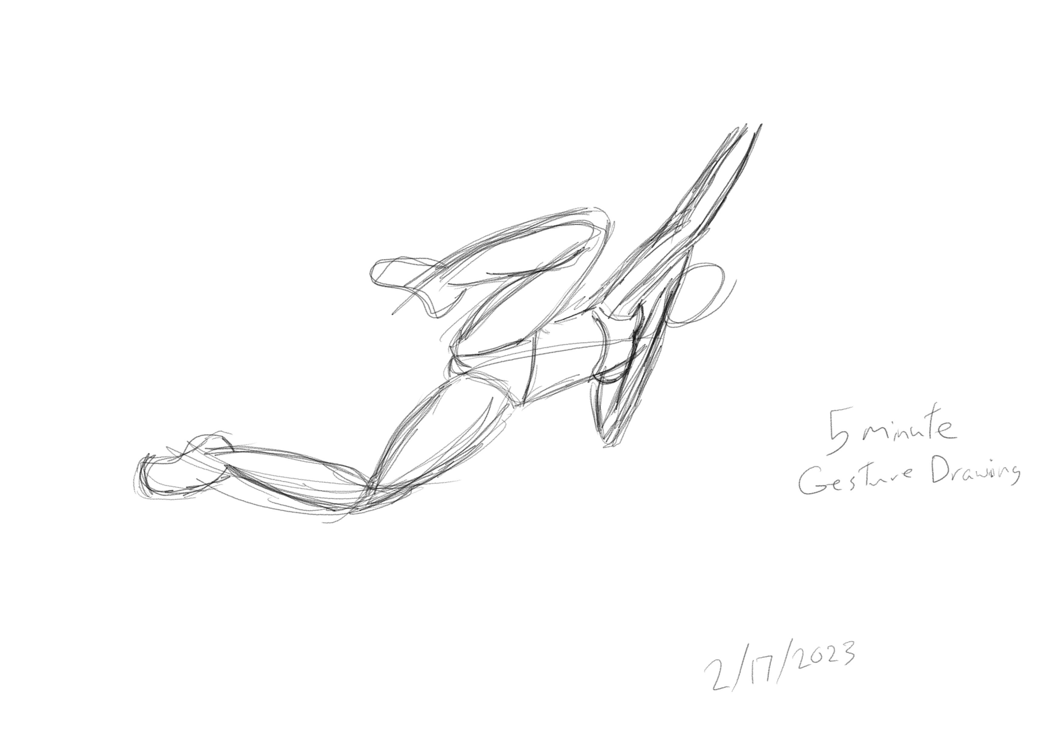
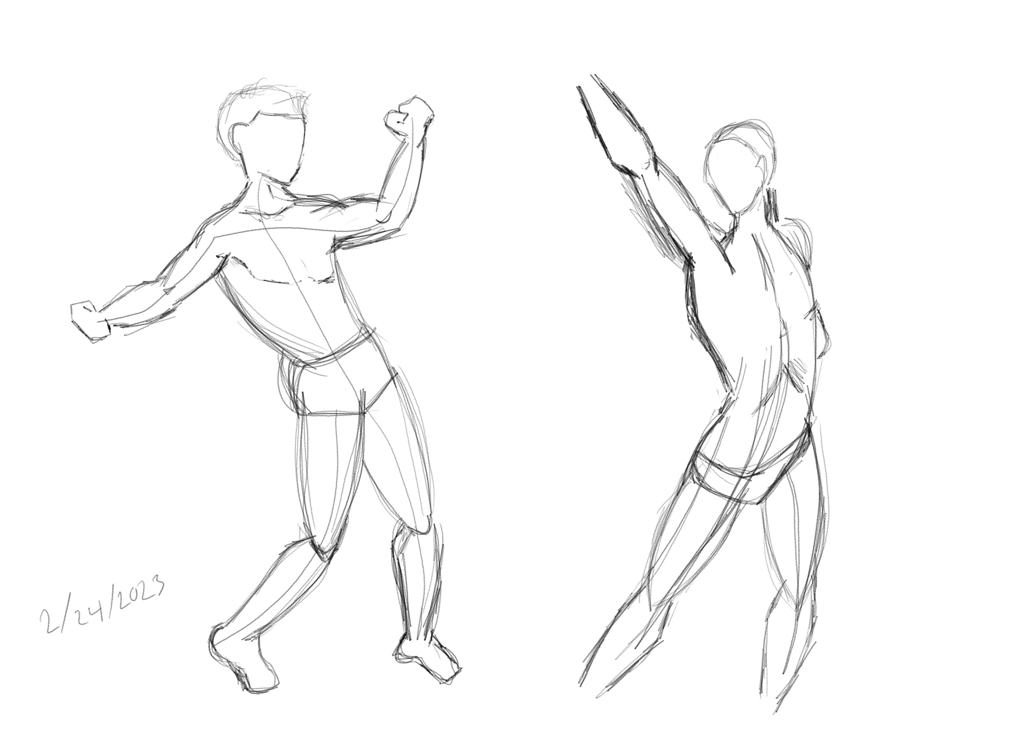
But heres todays work-
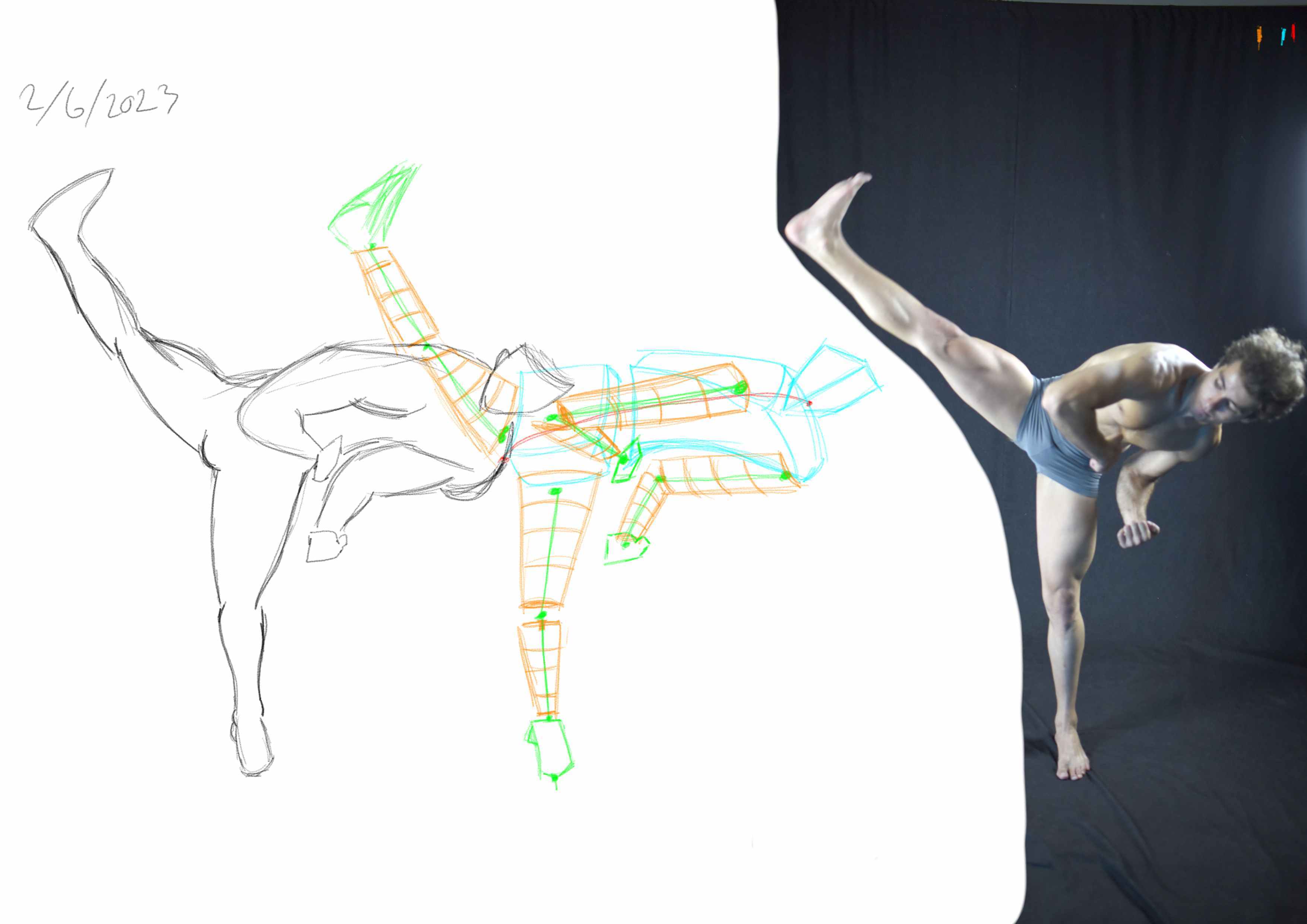
Attempt 1- made it way to wide with the shapes, so the proportions are way off and had the wrong angle on the head and different parts.

Attempt 2- A little better closer on the correct proportions but some of the angles need to be a bit sharper.


The improvement is slow but becoming more apparent each time. One Step at a time. but I have been able to see the improvement step i take to redue and adjust how i look at things.

Nice work! Keep it up. Iterating like that over the same fogure can be very helpful, especially as you are aware of mistakes and asking yourself questions along the way and not just mindlessly stroking the canvas (which, tends to happen a lot - it’s easy to fall into the trap of just going through the motions and making it a mechanical exercise and not a mental one!)

Cheers!

Still Working on the proportioned poses,

here's try one for the day-

here's try 2-

The thing I realized the most as I was doing the exercize was that I wasn't putting enough of the curvature of the body to really show the correct proportions. thats why between try 1 and 2 its such a large difference in body length. This exercize is what im having the hardest time with in term 1.
Any Suggestions?

Nice one. I sometimes do both gesture and proportions study on one same figure. You can try doing the gesture in one layer, then draw the figure on top, try suggesting rather than drawing all the lines. When you do the gesture it gives a good idea of what to really emphasize with your line work

Cheers

Thanks @snakker I decided to do a gesture drawing session for a quick 30 minutes, and the comparing them to the proportions ive done previousley and what a vissible difference. I'll do a gesture proportion exercise later. after i feel a bit more confident with the gesture exercize. but here it is, i did 15 at 30 seconds. 7 at 1 minute. and 3 at 2 minutes.


I used the gesture drawing app that Marc recommends in the course video. What a helpful tool.

Hey! nice progress man. Honestly, the best advice is to keep practicing more and more.

The fact that there's already progress between your tries 1 and 2 means you have a critical eye for your own work and have been able to make corrections.

That being the case, one piece of advice that has helped me a lot on regards to proportions and structure, as simple as it sounds, is to flip the image horizontally as you work on it.

I know there's a lenghty explanation for what it does, but basically, it allows your eye to view the same art piece with a "fresh perspective". Kinda like tricking your brain into thinking it's looking at a different piece of work. This allows you to quickly identify misproportions to correct them.

Try to setup a shotcut for this flip action (or just look up what the shortcut is), and do it frequently as you work on your next first try.

Once the image looks well proportioned flipped back and forth, then you know you got it right!

Keep practicing and going through the terms. I'm barely on term 2 myself and already there's a lot more to learn on regards to human proprotions and perspective!

set up a new duration for gesture drawing exercises and i have to say it ended up better then I thought it would. did a 2 3.5 and a 5 minute draw,


Still needs work but its coming along, not great proportionately but as far as form and shapes i feel like its progressing. gunna do my best to make it more acurate!

Nice work, just keep at it, keep iterating and analyzing what can be improved then try applying what you learned you will improve fast that way!

Do try to minimize fuzzy lines as they are hard to read, in its place, try analyzing first, measuring a bit maybe ghosting the stroke (like flying over the canvas) before hitting the canvas and placing your mark. Doesn’t have to be fast from the get go, I can tell ya my gestures were a struggle the first few times so I stopped doing them fast and just eased into it by being a little more analytical and giving myself a little more time to think - of course that meant some of my gestures were incomplete and I had to move on, but you learn from it and gradually improve

In gestures its best (according to various artists) to summarize all the action in what seem like C S and straight marks. Line weight can also help convey the feeling of movement using marks that taper at both ends and are heavier at the middle

Ofcourse all of this advice is just my opinion. - a beginner’s opinion still and there is definitely no real right or wrong eay to do any of this :stuck_out_tongue:
Cheers!

Nice! You can definitely feel the flow on these. I think a few straight lines and sharper corners at the knees for example, would add more dynamism

Cheers!

Heres a couple for today. Trying to meld all that I have been working on together. they turned out more proportionate to the reference images which I'm happy about.


I think a few more and I ready to move on. Well to the perspective part anyway well still working on the findementals