


 Thank you! I finally cleaned that up. Meanwhile started 3 more ..I have a habit of taking too long to finish a piece, then I lose interest in it and just start something else. I found 8 from recently i started and abandoned, that are decent enough to not delete, but not finished. There’s also been a number of drawings I felt I “outgrew” - became better before I finished them, and it would be easier to start from scratch than fix them. Anyone else thinking that?in24.4k
 Lady Death Fanart Collectible: Part 6 Polypaint and base Hi, it’s time to share with you another part of the process to create this fanart piece. Polypaint As this is my first collectible fanart I didn’t have previous experience with polypaint so I tried my best and played a bit with it.I wanted to give a ghostly and eerie look to Lady Death, she is beautiful and deadly, but at the end of the day she is a woman that died and was reborn at hell as an avenging spirit, that’s why I gave her skin tone a bluish very cold tone.As you will see I gave myself some creative freedom to deviate from the traditional color scheme that this characater has in comics and illustrations.To add a bit of sensuality by painting some freckles on the face and the chest. The dark nature of this character was the perfect excuse to gave her a kind of goth make up, very dark shadows around the eyes, blue lips and fingernails. I know that the original character includes sexy red lips but I wanted this girl to have a sexy but at the same time creepy look, that’s why we can see some thin veins emanating from her eyes. The biggest chromatic change I did for this character is at the hair. Lady Death has a characteristic white weavy hair but in my fanart I decided to gave her a very saturated blue color.The reason behind this wasn’t only an aesthetic choice. I want that the face area strongly pulls the attention of the viewer so this area needed a stronger contrast. Another reason is that I want her to have a more modern look, as I mentioned before, I’m strongly attracted to women with goth/punk look. I gave myself half an hour or more to analyse the work of experienced sculptors that create collectibles and I discovered that the use of darker values on the skin is often applied to create a greater sense of volume and three-dimensionality. I found that areas with heavy ambient occlusion are the perfect places to paint with darker colors in order to increase the separation between different forms. Even though she has a bluish skin tone, I used a bit of warmer hues in areas that, in real life, tend to go towards red and pink, this is very obvious in the nose, cheeks, and knuckles. Thinking with a logical mind it’s completely absurd to have warmer tones on the body of a zombie like creature but I didn’t want to limit myself by using only blue tones, it looks boring and artificial. In real life these colors are created by blood vessels in areas where the skin is very thin. ** Scythe **for her weapon I applied a cool gray with some warmer variations, this color scheme is influenced by the work of H.R giger. Base I’d like to talk about the design for the base which, to be honest, I forgot to develop along with the character.My main idea with the base is to show that Lady Death inhabits a very sterile and arid land, at the end of the day she is at hell.You can see a that she walks over dirt and rocks, a sign that she’s surrounded by death and loneliness. As part of the landscape we can see some bones and skulls to reinforce the idea of lack of living creatures, yet we can see three hands that try to reach her legs.This hands represent that all creatures are subordinated to her power and seek an evil blessing with a simple touch of the princess of the damned.1- The hand with skin burns represents the souls of those who are newcomers to hell, tortured souls that suffer for the sins comitted on earth.2- The hand with greenish rotten skin and pustules is the reminder of the decay that has infected the souls of those who have been trapped and have forgotten their humanity3- Last but not least, the hand of a demon shows that even dark creatures and entities bow before her presence. The cherry on the top, at least in my vision, are the simese twins that emerge from the ground, this malevolent creatures remind us that in hell there’s only perversion and any trace of innocence is lost. Thanks for reading till this pointI’m really happy to be very close to finish this creative journey, last but not least it’s mandatory to talk about splitting the sculpture in several pieces to be printed, this will be my last entry before showing the final rendered images. See yaMay Zbrush be with youin1.5k


 memory 2min gartic phone, used ref 2m gartic, used ref for pose 2min gartic 2min gartic 2min gartic 2min gartic memory memory memory memory study memory memory memorymemory memory memory memory memory memory study memorystudy study stylized left memory, right study study memory memorymemory memory memory memorymemory memory, porportions r offmemory memorystudystudy memorymemorymemory memory memory memory memory memory memory memory, right leg is a bit broken The feeling of only getting 1 - 3 likes on a social media post will never not be discouraging. But nothing is discouraging enough to make me quit drawing. I think the strategy of drawing a lot of stuff and waiting a while to post is good though rather than posting it immediately and then feeling that sadness on the next set of drawingin


 studies studies juri study imagination, how I feel before a speech imagination imagination study something I drew for my presentation also drew this for my presentation, didn't fix the one hand being bigger than the other imagination + study study studies study study, I need to fix the face a bit based on screenshot from anime but in my style study. except for the eye study studies studies study. changed some things tho imagination imagination imagination study studies, except top right samurai based on anime screenshot wolverine studies, changed some of the poses a lil, not very good at all, but first time i drew the character ever. semi study studies study imagination imagination imagination , for first time ever i tried to draw over 3d model for middle pose, I dont like the result tbh, but it makes it much easier than coming up with it from memory.imagination, except right figurestudies imagination + studies, coming up with action poses r hard, these are not dynamic enough, I will redraw better ones in future. imagination , imagination imagination study, except for eye imagination imagination imagination doodles except for the two chrollos imagination storyboard thumbnail, idk if i ever shared this. my storyboards end up being a little detailed since i usually just draw in one layer.in22.3k


Practice on February 1.
I drew the flower basket in my university library. It is a WIP.
This is a Tetra Pak left by a customer in a convenience store. 
Practice on February 3.

21 days later
It is another piece of work in my portfolio.


I'm behind schedule. I really want to make more one or two works, and then apply for a job. But I only have two works that can be publicly displayed, the others are works from my last job and cannot be made public.
Drawing more works can fully demonstrate my ability, but it will take more than a month. However, I hope to start looking for a job as soon as possible.
This have been bothering me and making me in over my head. 
3 months later

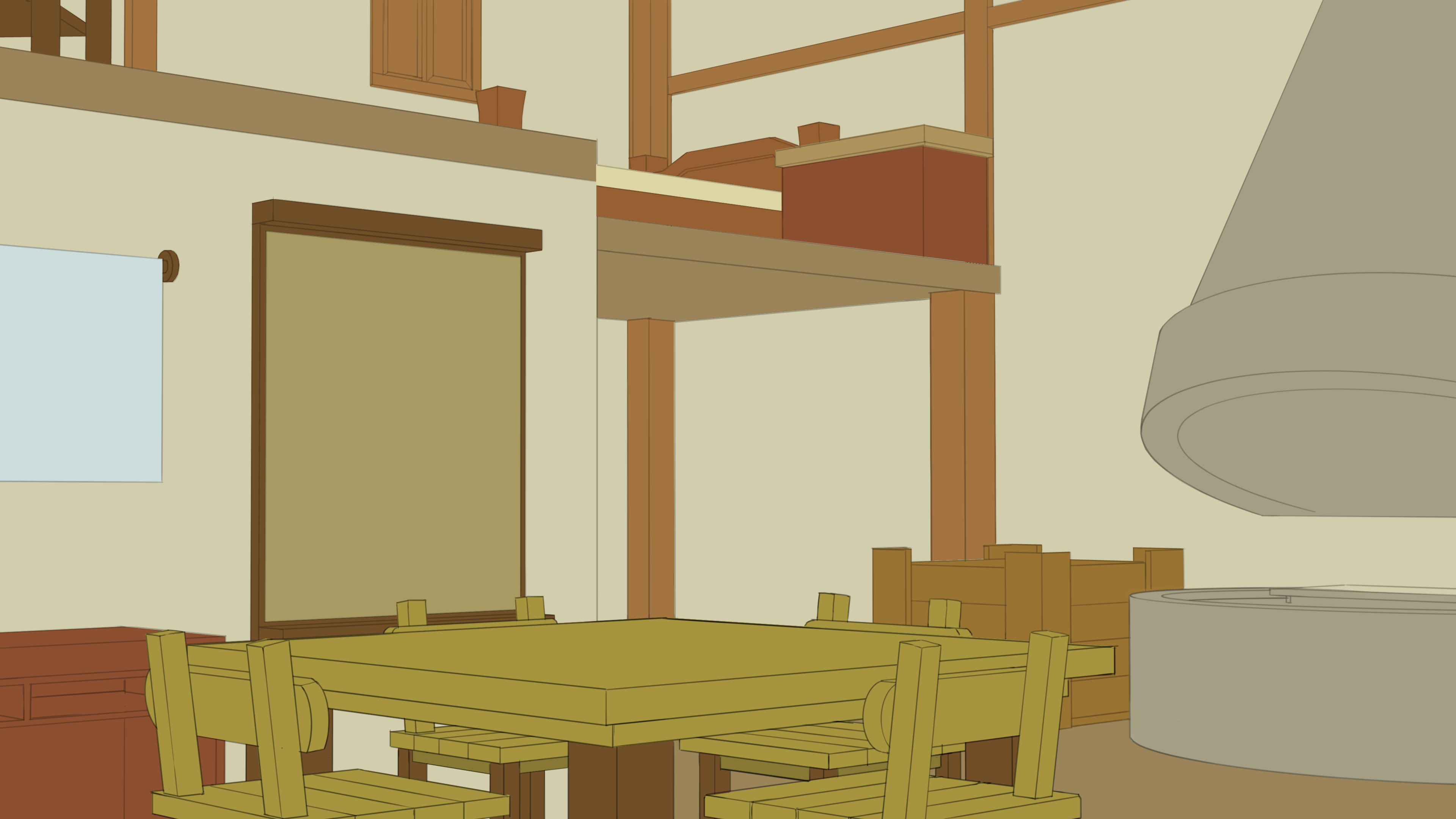
Jia-Jun's House
This is a painting for my personal project "The Mysterious Journey of Jia-Jun" in 7-Peccata (a creative project at Plurk) which is co-creation by an artist and a writer - you can watch the full novel content (zh-tw) here www.plurk.com/p/ock03c .
It's okay. Jobs are hard to get. You've got a great process there for making backgrounds and scenes.

Do more of this with the same assets. Imagine that you are a director with a camera that has to film people. Where do you put the camera stand? How do you frame the person or persons?
What does it look like at night time? What about when a fire is lit? This is Very hard to do. But you did it. It is very advanced.
Keep changing the lighting and camera angle. This will make you a better artist with compositions. Imagine being a fly on a jar and looking at the table where two people are sitting. Their characters can be framed by the shelf behind them or by the fire place. This is a very powerful process to have. I don't know if you understand what you have here. This is great.
You should make more of these using the same room asset, not just the one scene that you show here. So cool! Add some more life and look like people live there.
This is also really good.
You have taken the theories presented in studio ghibli and applied them. This is where you need composition practice. This is nice but we need something that tells a story. Something to look at. Like a witch walking, or a scarecrow jumping, A tree, a pink flower, or a castle walking in the background. 
Jobs will come. You might find that you will have better ideas than what they will ask for. I can see it in your work.
Hello @brohawx .
Thank you for your suggestion and feedback. This is very helpful to me. When I was painting these two works, there was a kind of obstacle that I couldn't make them better, which bothered me.
Your suggestion provided me with inspiration for modifying them. Thank you so much!
I will say, storytelling is definitely a big plus to have and can elevate a piece from simply be nice to look at to being interesting and meaningful. It doesn't have to be anything complicated or complex, but a character (or multiple ones) doing something, a few objects that tell us something about the scene or an unusual element can all contribute to make a piece that look fine look more interesting.
Seeing what you posted you definitely have what it takes to make really cool pieces, so keep going 

Theft case in casino
New painting ! The work describes about the protagonist Jia-Jun had fun in the casino. But something bed happened to her and she was beckoning to the waiter for help.
This is a painting for my personal project "The Mysterious Journey of Jia-Jun" in 7-Peccata (a creative project at Plurk) which is co-creation by an artist and a writer - you can watch the full novel content here https://www.plurk.com/p/oef476 .

Hello @cedricgo, thank for your feedback.
Honestly, when I drawing these two artwork, I thought that there should be no characters in the scene, because applying for the job of drawing the scene setting was my goal at that time.
Although the job titles are written "concept art", the work content is about drawing scenes, texture, props, etc. If there is a need to draw characters, then the job title will be written "character design". So at the time, I thought it was enough to focus on the scene in my profolio, and there was no need to draw characters.
Is my thinking wrong?
I'm not sure if I want to apply for "concept art", whether it should focus on setting the scene, or focus on the storytelling?
Okay, I see. If these are meant to be environment designs or concepts then it might not be as important than if they were meant to be illustrations. And I believe you're right. If you're going to be an environment or prop artist, you'll probably not work on characters, although it might depend on the studios.
With that said, I think there can still be room to add a bit of storytelling without adding characters. As brohawx said in his comment, there could be a flower, tree or castle with a little something special on the outdoor scene. As for the room one, you could have things on the table that tell us a little bit about the people who live there.
In the end it depends if you want to go more into concept art or illustration. For illustration, the storytelling is going to be a more important thing to focus on. But if it's for concept art, then what you have might be fine. Although I guess adding a little extra spice to your work to impress art director is never a bad thing 
But I think you're doing good so far. You're showing good skills,so I think whichever path you'll pick you'll manage to succeed 👍
The following is my workflow. I hope to get feedback on the workflow. I have been working on this artwork for over 14 days, and I hope to get some quicker ways to complete it.
Step1.
Looking for reference, and composition by Blender.

Step2.
Finding more reference to draw the lineart. Item first.

Step3.
Making a color scheme. Although I have never been to a casino, through the photos, most of the decorations are mainly yellow and red.
I think the reason for color scheme is the same as McDonald's - the use of red and yellow makes people feel excited and anxious, promoting consumption.
Protagonist Jia-Jun's seat moved one to the right to avoid her being obscured by the arm waiter raised.

Step4.
Setting slot machine.

Step5.
Detailing every object. When necessary, I will customize the textures, such as ceilings, carpets, railings, etc.

Step6.
Add more detailed people, props and lights.
Wrinkle of clothes is the most difficult, I spent a lot of time on it.
哈哈,没想到能碰到中国人,你已经做的很不错了,支持一下你的作品,你还是学生吗。
I see. Thank you very much for your suggestion. I also agree with brohawx said. I think adding more storytelling will make the scene look better! So I have already planned to do it. I hope these two work are better, and process will continue to be posted here. 


Suggested Topics
| Topic | Category | Replies | Views | Activity |
|---|---|---|---|---|
| Jay’s 10k Mission | Art Blogs | 0 | 725 | Nov '17 |
| Kayseur’s Artblog | Art Blogs | 4 | 783 | Nov '16 |
| It’s an art blog or something | Art Blogs | 240 | 44.3k | Aug '19 |
| Joximus’ environment art blog | Art Blogs | 14 | 2.6k | Mar '20 |
| Yasico- Art journey | Art Blogs | 2 | 450 | May '24 |