• Gave myself 5 days to do something. This is what I managed to do. I'm trying to get better at illustrations, but I have patience to work on something for 3 days maximum :( Splash_Process.jpg5000x3140 2.21 MB Splash_Process-6.jpg3896x2429 2.83 MB concept list char copy.jpg5388x3000 1.7 MB
    20.8k
  • Did a character concept for a course.https://www.artstation.com/artwork/P6gm3y - more:) list1.jpg3541x1920 2.82 MB
    20.8k
  • Day 4: Star Wars May The 4th =] Queen Padmé Amidala in my art style! First time drawing her and I really enjoyed making this one! Used watercolours, ink pen, acrylic markers and gold paint for accents on my Canson mix media sketchbook. I hope you like it!
    82.5k
  • A creature design from a while back
    by
    6.7k
  • Here is some more recent stuff, I need to make more body studies
  • It's been a while and god, it is so cringe to go through all previous messages xDmy study.
    20.8k
  • Thank you! I finally cleaned that up. Meanwhile started 3 more ..I have a habit of taking too long to finish a piece, then I lose interest in it and just start something else. I found 8 from recently i started and abandoned, that are decent enough to not delete, but not finished. There’s also been a number of drawings I felt I “outgrew” - became better before I finished them, and it would be easier to start from scratch than fix them. Anyone else thinking that?
  • Lady Death Fanart Collectible: Part 6 Polypaint and base Hi, it’s time to share with you another part of the process to create this fanart piece. Polypaint As this is my first collectible fanart I didn’t have previous experience with polypaint so I tried my best and played a bit with it.I wanted to give a ghostly and eerie look to Lady Death, she is beautiful and deadly, but at the end of the day she is a woman that died and was reborn at hell as an avenging spirit, that’s why I gave her skin tone a bluish very cold tone.As you will see I gave myself some creative freedom to deviate from the traditional color scheme that this characater has in comics and illustrations.To add a bit of sensuality by painting some freckles on the face and the chest. The dark nature of this character was the perfect excuse to gave her a kind of goth make up, very dark shadows around the eyes, blue lips and fingernails. I know that the original character includes sexy red lips but I wanted this girl to have a sexy but at the same time creepy look, that’s why we can see some thin veins emanating from her eyes. The biggest chromatic change I did for this character is at the hair. Lady Death has a characteristic white weavy hair but in my fanart I decided to gave her a very saturated blue color.The reason behind this wasn’t only an aesthetic choice. I want that the face area strongly pulls the attention of the viewer so this area needed a stronger contrast. Another reason is that I want her to have a more modern look, as I mentioned before, I’m strongly attracted to women with goth/punk look. I gave myself half an hour or more to analyse the work of experienced sculptors that create collectibles and I discovered that the use of darker values on the skin is often applied to create a greater sense of volume and three-dimensionality. I found that areas with heavy ambient occlusion are the perfect places to paint with darker colors in order to increase the separation between different forms. Even though she has a bluish skin tone, I used a bit of warmer hues in areas that, in real life, tend to go towards red and pink, this is very obvious in the nose, cheeks, and knuckles. Thinking with a logical mind it’s completely absurd to have warmer tones on the body of a zombie like creature but I didn’t want to limit myself by using only blue tones, it looks boring and artificial. In real life these colors are created by blood vessels in areas where the skin is very thin. ** Scythe **for her weapon I applied a cool gray with some warmer variations, this color scheme is influenced by the work of H.R giger. Base I’d like to talk about the design for the base which, to be honest, I forgot to develop along with the character.My main idea with the base is to show that Lady Death inhabits a very sterile and arid land, at the end of the day she is at hell.You can see a that she walks over dirt and rocks, a sign that she’s surrounded by death and loneliness. As part of the landscape we can see some bones and skulls to reinforce the idea of lack of living creatures, yet we can see three hands that try to reach her legs.This hands represent that all creatures are subordinated to her power and seek an evil blessing with a simple touch of the princess of the damned.1- The hand with skin burns represents the souls of those who are newcomers to hell, tortured souls that suffer for the sins comitted on earth.2- The hand with greenish rotten skin and pustules is the reminder of the decay that has infected the souls of those who have been trapped and have forgotten their humanity3- Last but not least, the hand of a demon shows that even dark creatures and entities bow before her presence. The cherry on the top, at least in my vision, are the simese twins that emerge from the ground, this malevolent creatures remind us that in hell there’s only perversion and any trace of innocence is lost. Thanks for reading till this pointI’m really happy to be very close to finish this creative journey, last but not least it’s mandatory to talk about splitting the sculpture in several pieces to be printed, this will be my last entry before showing the final rendered images. See yaMay Zbrush be with you
    1.5k
  • memory 2min gartic phone, used ref 2m gartic, used ref for pose 2min gartic 2min gartic 2min gartic 2min gartic memory memory memory memory study memory memory memorymemory memory memory memory memory memory study memorystudy study stylized left memory, right study study memory memorymemory memory memory memorymemory memory, porportions r offmemory memorystudystudy memorymemorymemory memory memory memory memory memory memory memory, right leg is a bit broken The feeling of only getting 1 - 3 likes on a social media post will never not be discouraging. But nothing is discouraging enough to make me quit drawing. I think the strategy of drawing a lot of stuff and waiting a while to post is good though rather than posting it immediately and then feeling that sadness on the next set of drawing
  • Urban Dragon Girl Wip Urban Dragon Girl_wip1.jpg5000x5000 1.11 MB
  • Long time no see! New artworks produced lately
    6.7k
  • studies studies juri study imagination, how I feel before a speech imagination imagination study something I drew for my presentation also drew this for my presentation, didn't fix the one hand being bigger than the other imagination + study study studies study study, I need to fix the face a bit based on screenshot from anime but in my style study. except for the eye study studies studies study. changed some things tho imagination imagination imagination study studies, except top right samurai based on anime screenshot wolverine studies, changed some of the poses a lil, not very good at all, but first time i drew the character ever. semi study studies study imagination imagination imagination , for first time ever i tried to draw over 3d model for middle pose, I dont like the result tbh, but it makes it much easier than coming up with it from memory.imagination, except right figurestudies imagination + studies, coming up with action poses r hard, these are not dynamic enough, I will redraw better ones in future. imagination , imagination imagination study, except for eye imagination imagination imagination doodles except for the two chrollos imagination storyboard thumbnail, idk if i ever shared this. my storyboards end up being a little detailed since i usually just draw in one layer.
    by
    22.4k

I finally started with term 6! I had some complications so I was a little late with this week's assignments.

I started by doing exercises with various shapes.

I also practiced with lightning, but I'm not sure if it looks that good, I think I need to keep practicing.

For the next assignment I used one of my old perspective practices .I realized that there were a lot of things that needed to be fixed, so I took the time to add some details and made the lineart less thick. I think those small changes made a big difference (˶ᵔ ᵕ ᵔ˶)

And then I added better lightning to set the scene in a day and night environment. The night version is my favorite, but I wish I had changed the color of the couch for the day version.

And I made a new character design! I don't have a name for him, but I thought he could be a tattoo artist.

I tried to make his design look cyberpunk, but I'm not sure I succeeded, I'm not a big fan of that style so it was a bit complicated. But I really like futuristic masks, so I tried to give him one!

I had the idea of ​​putting elf ears on him, but I thought it would be a lot more interesting if it was a device. At first I thought about making them into earphones, but I liked the idea of ​​making them into hearing aids much more. Although I think there are some hearing aids that can do both, so maybe both ideas work perfectly fine lol.

The redraw looks so much better! There are a few small details that make a huge difference, like the edge of the pot or the additional volume on the rocks. The character looks good, can't remember another character that has "elf like ears" from a device. I guess I've seen some characters have cat ears or bunny ears like this, but not elf ears.

Hello! I finished week 2 so here are my assignments!

First, figure drawing exercises!

And for the second assignment I had to create 7 different drawings focusing on the principles of art. I didn't have time to make them very detailed, so I focused on getting my ideas across.

I want to explain a little bit about why I choose to do each of them.

Proportions: I did the sketch for this drawing a few weeks ago and I thought the idea was pretty good. The fairy was supposed to feel a lot closer than the mermaid, but I think I should have adjusted her scale a bit more.

Emphasis: I had the idea but not sketch, so I took the opportunity to make it a reality. The focal point of the piece is the pupil, so I wanted everything else to be in very similar colors and give the feeling of nighttime.

Variety: I wasn't sure what do to with this one, but when I thought about variety I felt that drawing many different flowers would be a good idea. And the little caterpillar is just there to keep the flowers company.

Repetition: Not really a big fan of the drawing, I think I could have made something better. I found some very good examples on this principle, but I didn't want to make geometrical shapes, so I tried making mushrooms.

Balance: This one was a little hard to think about, I didn't really want to make something symmetrical so I searched for more examples of it. I understood that the most important thing was the arrangement, so I tried to divide the drawing into two parts, the sky and the ground.

Movement: I always struggle with adding movement to my drawings so this was painful. I did the sketch a few months ago, but because it was hard to add movement I never finished it. I'm not sure if I did a good job with it, but I'll keep learning and hopefully I'll get better in the future.

Harmony: I really didn't knew what to do with this lol. I first understood it as color harmony, but then I realized it was probably a mix of all the other principles and I really didn't have any more ideas, or any other drawings that could fit the subject. If I'm honest, I think the proportions drawing has better harmony, and also includes other principles!

17 days later

Hello! The past few weeks were a little busy, so here's my work for week 3 and 4!

I'm not really a big fan of mecha so I couldn't think about a lot of media that included these. But after searching for a while I remembered some designs that I thought were really cool, and the search helped me understand that probably what makes them look so interesting are the details and lots of geometric shapes.

I also tried making my own designs.

The first one is supposed to be a submarine, but I wanted it to look like a crab so it could collect things at the bottom of the ocean, and the blue color works to blend with the color of the water.

The second one was a little harder to make. I think I wanted it to look like a golem, but maybe I should have changed the legs to be thicker and wider. I used the colors of the construction workers' safety vest because I thought this could be a mech used to lift heavy things, but I think I didn't make its purpose clear visually.

I made the next one as an animal/mech hybrid so I wasn't thinking a lot about its functionality.

The inspiration is a snail, but I added a big eye to make it look more alien. I wasn't really sure what to do with the shell, those usually have very different designs in nature, but because I like pointy shells I decided to imitate that shape. The way that snails move is really hard to replicate when making a mech, so I decided to give it caterpillar tracks (it's that how it's called?)

It was fun working with things I would never normally draw, but I found it difficult to come up with ideas. ദ്ദി ༎ຶ‿༎ຶ )

Cooked with the crab design and the mech studies are clean. Awesome

These look great man! I realize using real world animals and stuff is common when creating mechas, I wonder what references where used to create some of the ones from these series. I think they combine things from different sources.

The crab is probably my favorite. Looks cool, practical and menacing.

22 days later

Hello again! Holidays were a little hectic but I hop everyone had a good time! I was going to share my latest assignments for term 6 a couple of days ago, but I forgot (◡_◡) so I wanted to at least get it done before the New Year.

I made another mech as well! This one was really fun to do because I wanted the main piece to be shaped like a skull head, and I think that's probably the best part of the design. It took me a little longer to build the other body parts, but I think I did a good job overall.

With the next assignment I tried to add artificial lighting into my old perspective practice. I used the night environment because I thought my idea would look better that way, and it was pretty fun! I don't really like creating environments so I've never tried to do this before, but I did my best to get the lighting right.

Since the first time I made this drawing I wanted to add fire to the fireplace and make the cauldron look full, so this practice fulfilled my wish lol.

I also wanted to share a drawing I made for Christmas! I went to see a Nutcracker show a few weeks ago and wanted to create something inspired by it.

I've been wanting to learn a bit about composition so I'm trying to do drawings with more characters and more movement. I also wanted to finish it quickly so my hand was a little sore for a few days, but I'm glad I tried something that a few months ago I would have thrown away because I thought I couldn't do it.

I hope everyone has a good end of the year, and next week I will start with term 7!

I've already thought about the things I want to do in the next few weeks, and I'm really excited to share my next ideas! ദ്ദി(。•̀ ,<)~✩‧₊

21 days later

Happy New Year everyone! (even though it's almost February) I finally started with term 7 so here's what I've done so far.

I took the time to work on the colors and shading of the characters, but it was a bit difficult because the main illustrations had a lot more details and textures.

But I had a better time while studying the environments. I didn't want to focus on every single small detail, but I wanted to capture the overall vibe.

My favorite is definitely the one with the bottle, I think it's something I would love to create myself.

I'm not the best with materials, but I always wanted to try making these spheres.

I enjoyed making the ice and wooden spheres, although the latter gave me a bit of difficulty, but I had a harder time trying to get the texture of the meat and glass.

I'll probably do another one of these later, I want to keep practicing with the materials.

It was a lot of fun working on this medieval armor, I took the time to make it as similar as possible and I think it ended up looking pretty good.

I think I learned a lot after spending so many hours working on it, especially that metal is really hard to replicate, but not entirely impossible if you lock in lol.

I've also been working on my personal project since the beginning of the year, so these days I will finally be able to share it. I've changed my mind a lot about the content over the past few weeks, so right now I'm just trying to make the story as coherent and magical as possible.
ദ്ദി ˉ͈̀꒳ˉ͈́ )✧

Love the painting of the medieval armor

Hello! I finally started working on my personal project and I think I finally have a good story to share here with all of you.

I changed my mind a lot during the past weeks while trying to develop the story, and even though I don't have every single detail completely clear, I have already written the main points and I feel that they are good enough for what I want to do.

I thought about just writing my ideas down, but felt it would be better if I drew them and that took a lot more time, mainly because I'm not a graphic designer and I'm not sure how to make logos lol


The title is Candy Zone! (for now, I haven't thought of anything better.)

A story about four girls trying to survive a zombie apocalypse caused by a crystal parasite used in candy!

I wanted this project to be a lot more fun and colorful than common stories about zombies that are usually a lot more horrifying. I love horror, but I also love really cute things, so why not mix the two?

The logo on the far left was my first idea, the one in the middle is the one I like the most and with the last one I was trying something different but I wasn't completely convinced.

Summary:

A crystal containing properties similar to sugar is discovered in an underground mine, giving rise to popularization of a small candy company on the verge of bankruptcy called "Aprico" and the creation of new and more addictive candies in a city known for its Halloween celebrations.

On Halloween day, tourists and locals enjoy the many different events, such as a circus performance, a baseball game, a small music presentation, and a Halloween parade, alongside the delicious candy. But as night falls it becomes apparent that something is wrong with the people, crystals begin to form inside and outside their bodies, turning them into zombies with a very high appetite for sugar, sweets, but especially anyone who has consumed the new and special kind of candy.

As the days go by their desire for sugar gets more lethal, and in greater numbers they can become an overwhelming threat for anyone they come across.

Background of the city:

"The city of Monteclaire is surrounded by mountains and is known for its extensive and colorful forests, this being the main attraction for many tourists for its various activities such as hiking, mountain biking, or camping. During the fall, the city comes alive with its numerous Halloween decorations, giving rise to important events such as the candy exhibition and the Halloween parade.

With the increasing popularity of the candy company “Aprico” a greater number of tourists are expected during these dates to try their newly launched sweets at their multiple stores. They will also be participating at the annual Monteclaire candy exhibition to showcase their new innovations, share their knowledge on crystalline sugar, and the process of making candy with this recently developed ingredient."


I want the story to be set in the early 2000s, so I wrote this thinking it might be a travel blog review.

The photos are from a trip I took in early October three years ago. I haven't drawn the city or any places yet, but the photos show what I want the surroundings to look like.

I don't know why I thought Montclair was the name of a cake, but apparently it's not true??? I named the city "Monteclaire" because it seemed like the name of a sweet, but now I'm starting to think maybe I should choose something else (。· v ·。) ?

Some places of interest could be: the Halloween parade street, the Aprico store, the stadium, a cemetery, a police station, a circus, or even a state fair, but those are just ideas for now.

Crystalline Sugar

A new type of sugar found in an underground mine near the city of Monteclaire. Quite similar to normal sugar, except for the conditions in which they are grown, the taste it's much more addictive, and the crystal is a type of parasite that gets stronger with the uncontrolled consumption of it, finally taking over the body of the consumer after some time.

The world has been experiencing a sugar shortage for several years now, with production decreasing due to climate changes, droughts, and restrictions, so candy companies have been desperate to find something that can replace sugar.

The discovery of the crystalline sugar is a great achievement that paves the way for the discovery of many more mines like this one in various states of the country and abroad, opening up new possibilities for mining companies seeking to profit from this new product.


I'm still debating what kind of candy they should sell, but I want it to be really sweet.

When I was trying to think on a name for the candy company I wanted something short and that had good pronunciation, so I ended up with "Aprico" I think it sounds very nice, and maybe their specialty is apricot flavored candy. (╭ರ_•́)

I wanted the logo to give antique vibes, and I thought that adding the fruit would make it really cute, but I had a lot of trouble trying to figure out how to do it. Hopefully I'll learn more about logo design as I continue working on this project.

Zombies

The infection process can be very slow or very fast. Consuming anything made with crystalline sugar immediately infects the host. The parasite travels through the body until it eventually reaches the consumer's brain, where it can remain dormant for a long time, awakening only if more crystalline sugar is consumed, this process can take months or years depending on the individual. Bites are the fastest most effective way to infect people, and it would only take a couple of hours until the final stage of infection was reached.

The zombies have an uncontrollable craving for sweets, but especially those made with crystalline sugar. In the weeks previous to Halloween due to the large amount of candy around, those already infected start developing aggressive behavior towards others, culminating in chaos on the last night of October.

Most parts of the body of the zombie become crystallized. Crystals grow on the inside replacing almost every organ, except for the brain and the nervous and circulatory systems, which now work to the parasite's advantage. The crystals are what make the body move even when it is lifeless, and depending on the damage that the brain has received, zombies can become more lethal or intelligent. Crystals on the inside end up acquiring different shades of purple.

Depending on where the crystals appear, they can become a weakness for the zombie. If they appear in their eyes the visibility is much lower, if they appear in the ears then the sense of hearing diminishes, and if they appear in the mouth or throat they may be unable to make sounds. The crystals on the outside can have various colors, and can cover the entire body or just a small part of it.


This project was highly inspired in a mobile game I played years ago called "ZombieGirl-Zombie growing game" and the zombie designs were one of the things I liked the most. They could be really pretty and cute, but sometimes a little disturbing, and since I didn't want to go down the path of turning zombies into something nightmarish, I ended up making then more cartoonish.

But perhaps that could change in future development, it's not entirely out of the realm of possibility.

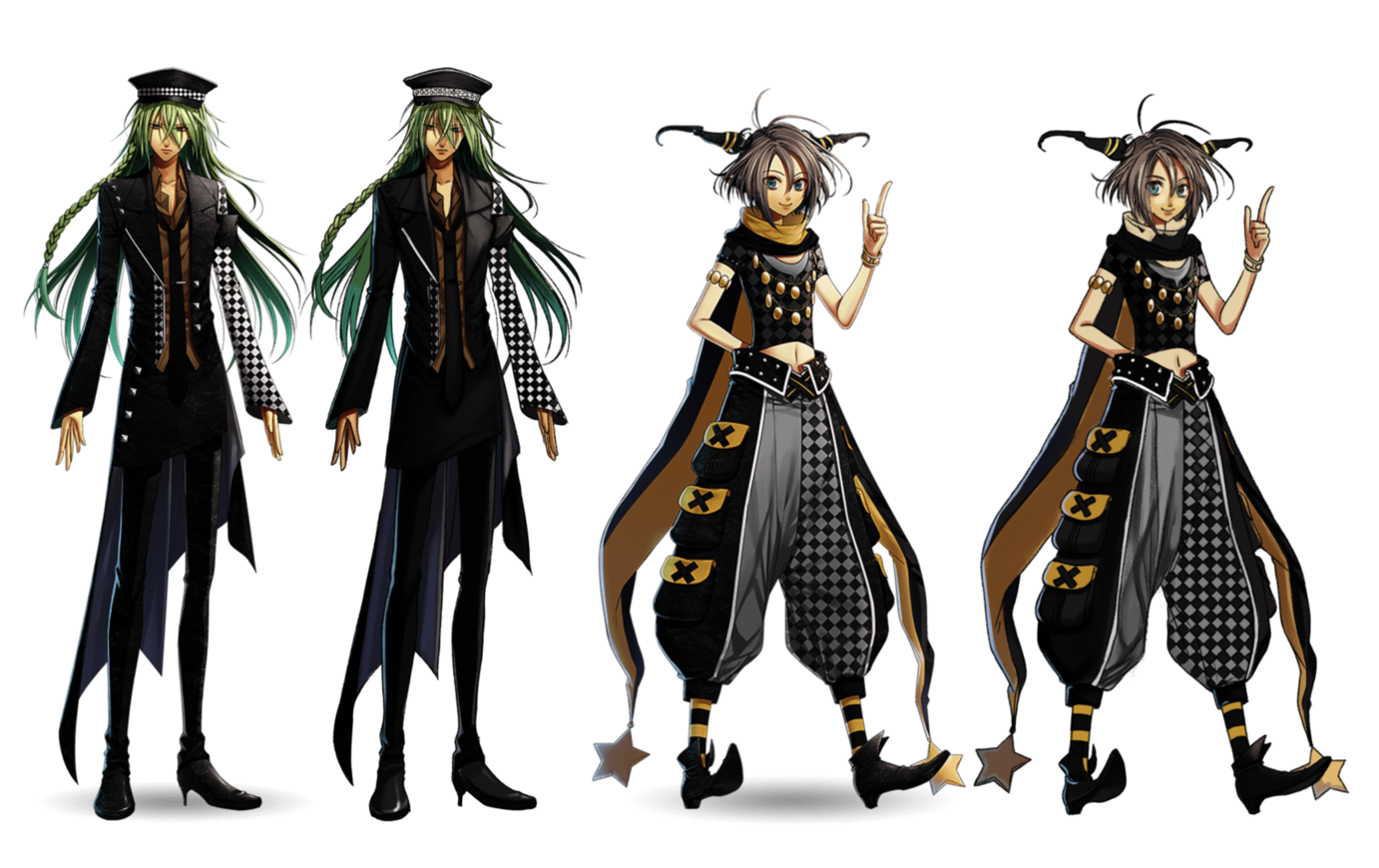
Because the story takes place during Halloween I have the freedom to make many types of costumes for the zombies, but the ones I made this time are simpler.

I made these props just to have a better vision of my main characters.

I haven't thought much about their background yet, but I'll share a few things about them:

  • Hazel: Reserved and inexpressive most of the time, except when she’s performing alongside Daphne and their band. Her family only includes her and her dad. Genevieve’s childhood friend, but rarely talk to each other now.

  • Genevieve (Ginny): A very energetic girl that loves pink and baseball, very kind to everybody around her, and has a great sense of survival that helps her with any emergency. Her family includes her grandma,her mother, as well as her cat. Has a lot of friends and knows Adeline and Daphne because they are neighbors.

  • Daphne: Very creative but also mischievous, loves to play guitar and compose songs. Her family includes her mom and dad, big sister Adaline, and younger brother.

  • Adeline (Ada): A 26 year old police officer who holds a great love for her family, the oldest of the girls and Daphne’s big sister. Has a boyfriend called Elliot who’s also a police officer (probably).

I'm still not sure about the ages of the other 3 girls, I think they would be finishing high school or starting college, but I haven't decided yet.

I also have designs for three of them except for Hazel, which has been giving me trouble, so probably the next thing I'll share will be the main characters, or I'll try to draw the city.


And that's everything I have for now!

I've had the idea for this project since last year, but I've actually wanted to do a zombie story for quite some time.

Other ideas I had were a love story between a wish fairy and a human girl, or the daily life of aliens working in a restaurant. The first one is a very recent idea that came to me in a dream, and the second idea, despite being more worked out, I still have many doubts about how to make the characters and their adventures, so I ended up choosing the zombies.

I'll take it easy now that I'm starting to make this project, the companion guide has helped a lot since the beginning, but I want to do a good job with this and not feel pressured about it, I also want to revisit old exercises, and make some more art! ٩(^ᗜ^ )و ´-

Very cool idea you got. The logo in the middle is also my favorite, but I'd swap the underlayer of the first logo with the second one to sell the idea of it being about zombies. You could also include a zombie hand reaching for the heart possibly? Kind of like this

I'm not a graphic designer, so I can't stand here giving you tips. Besides that, I think your idea on the zombies is cool and definitely inspires. Awesome