• Gave myself 5 days to do something. This is what I managed to do. I'm trying to get better at illustrations, but I have patience to work on something for 3 days maximum :( Splash_Process.jpg5000x3140 2.21 MB Splash_Process-6.jpg3896x2429 2.83 MB concept list char copy.jpg5388x3000 1.7 MB
    20.9k
  • Did a character concept for a course.https://www.artstation.com/artwork/P6gm3y - more:) list1.jpg3541x1920 2.82 MB
    20.9k
  • Day 4: Star Wars May The 4th =] Queen Padmé Amidala in my art style! First time drawing her and I really enjoyed making this one! Used watercolours, ink pen, acrylic markers and gold paint for accents on my Canson mix media sketchbook. I hope you like it!
    82.7k
  • A creature design from a while back
    by
    6.7k
  • Here is some more recent stuff, I need to make more body studies
  • It's been a while and god, it is so cringe to go through all previous messages xDmy study.
    20.9k
  • Thank you! I finally cleaned that up. Meanwhile started 3 more ..I have a habit of taking too long to finish a piece, then I lose interest in it and just start something else. I found 8 from recently i started and abandoned, that are decent enough to not delete, but not finished. There’s also been a number of drawings I felt I “outgrew” - became better before I finished them, and it would be easier to start from scratch than fix them. Anyone else thinking that?
  • Lady Death Fanart Collectible: Part 6 Polypaint and base Hi, it’s time to share with you another part of the process to create this fanart piece. Polypaint As this is my first collectible fanart I didn’t have previous experience with polypaint so I tried my best and played a bit with it.I wanted to give a ghostly and eerie look to Lady Death, she is beautiful and deadly, but at the end of the day she is a woman that died and was reborn at hell as an avenging spirit, that’s why I gave her skin tone a bluish very cold tone.As you will see I gave myself some creative freedom to deviate from the traditional color scheme that this characater has in comics and illustrations.To add a bit of sensuality by painting some freckles on the face and the chest. The dark nature of this character was the perfect excuse to gave her a kind of goth make up, very dark shadows around the eyes, blue lips and fingernails. I know that the original character includes sexy red lips but I wanted this girl to have a sexy but at the same time creepy look, that’s why we can see some thin veins emanating from her eyes. The biggest chromatic change I did for this character is at the hair. Lady Death has a characteristic white weavy hair but in my fanart I decided to gave her a very saturated blue color.The reason behind this wasn’t only an aesthetic choice. I want that the face area strongly pulls the attention of the viewer so this area needed a stronger contrast. Another reason is that I want her to have a more modern look, as I mentioned before, I’m strongly attracted to women with goth/punk look. I gave myself half an hour or more to analyse the work of experienced sculptors that create collectibles and I discovered that the use of darker values on the skin is often applied to create a greater sense of volume and three-dimensionality. I found that areas with heavy ambient occlusion are the perfect places to paint with darker colors in order to increase the separation between different forms. Even though she has a bluish skin tone, I used a bit of warmer hues in areas that, in real life, tend to go towards red and pink, this is very obvious in the nose, cheeks, and knuckles. Thinking with a logical mind it’s completely absurd to have warmer tones on the body of a zombie like creature but I didn’t want to limit myself by using only blue tones, it looks boring and artificial. In real life these colors are created by blood vessels in areas where the skin is very thin. ** Scythe **for her weapon I applied a cool gray with some warmer variations, this color scheme is influenced by the work of H.R giger. Base I’d like to talk about the design for the base which, to be honest, I forgot to develop along with the character.My main idea with the base is to show that Lady Death inhabits a very sterile and arid land, at the end of the day she is at hell.You can see a that she walks over dirt and rocks, a sign that she’s surrounded by death and loneliness. As part of the landscape we can see some bones and skulls to reinforce the idea of lack of living creatures, yet we can see three hands that try to reach her legs.This hands represent that all creatures are subordinated to her power and seek an evil blessing with a simple touch of the princess of the damned.1- The hand with skin burns represents the souls of those who are newcomers to hell, tortured souls that suffer for the sins comitted on earth.2- The hand with greenish rotten skin and pustules is the reminder of the decay that has infected the souls of those who have been trapped and have forgotten their humanity3- Last but not least, the hand of a demon shows that even dark creatures and entities bow before her presence. The cherry on the top, at least in my vision, are the simese twins that emerge from the ground, this malevolent creatures remind us that in hell there’s only perversion and any trace of innocence is lost. Thanks for reading till this pointI’m really happy to be very close to finish this creative journey, last but not least it’s mandatory to talk about splitting the sculpture in several pieces to be printed, this will be my last entry before showing the final rendered images. See yaMay Zbrush be with you
    1.5k
  • memory 2min gartic phone, used ref 2m gartic, used ref for pose 2min gartic 2min gartic 2min gartic 2min gartic memory memory memory memory study memory memory memorymemory memory memory memory memory memory study memorystudy study stylized left memory, right study study memory memorymemory memory memory memorymemory memory, porportions r offmemory memorystudystudy memorymemorymemory memory memory memory memory memory memory memory, right leg is a bit broken The feeling of only getting 1 - 3 likes on a social media post will never not be discouraging. But nothing is discouraging enough to make me quit drawing. I think the strategy of drawing a lot of stuff and waiting a while to post is good though rather than posting it immediately and then feeling that sadness on the next set of drawing
  • Urban Dragon Girl Wip Urban Dragon Girl_wip1.jpg5000x5000 1.11 MB
  • Long time no see! New artworks produced lately
    6.7k
  • studies studies juri study imagination, how I feel before a speech imagination imagination study something I drew for my presentation also drew this for my presentation, didn't fix the one hand being bigger than the other imagination + study study studies study study, I need to fix the face a bit based on screenshot from anime but in my style study. except for the eye study studies studies study. changed some things tho imagination imagination imagination study studies, except top right samurai based on anime screenshot wolverine studies, changed some of the poses a lil, not very good at all, but first time i drew the character ever. semi study studies study imagination imagination imagination , for first time ever i tried to draw over 3d model for middle pose, I dont like the result tbh, but it makes it much easier than coming up with it from memory.imagination, except right figurestudies imagination + studies, coming up with action poses r hard, these are not dynamic enough, I will redraw better ones in future. imagination , imagination imagination study, except for eye imagination imagination imagination doodles except for the two chrollos imagination storyboard thumbnail, idk if i ever shared this. my storyboards end up being a little detailed since i usually just draw in one layer.
    by
    22.5k

@HANDRO thanks for the feedback, it's always welcome.

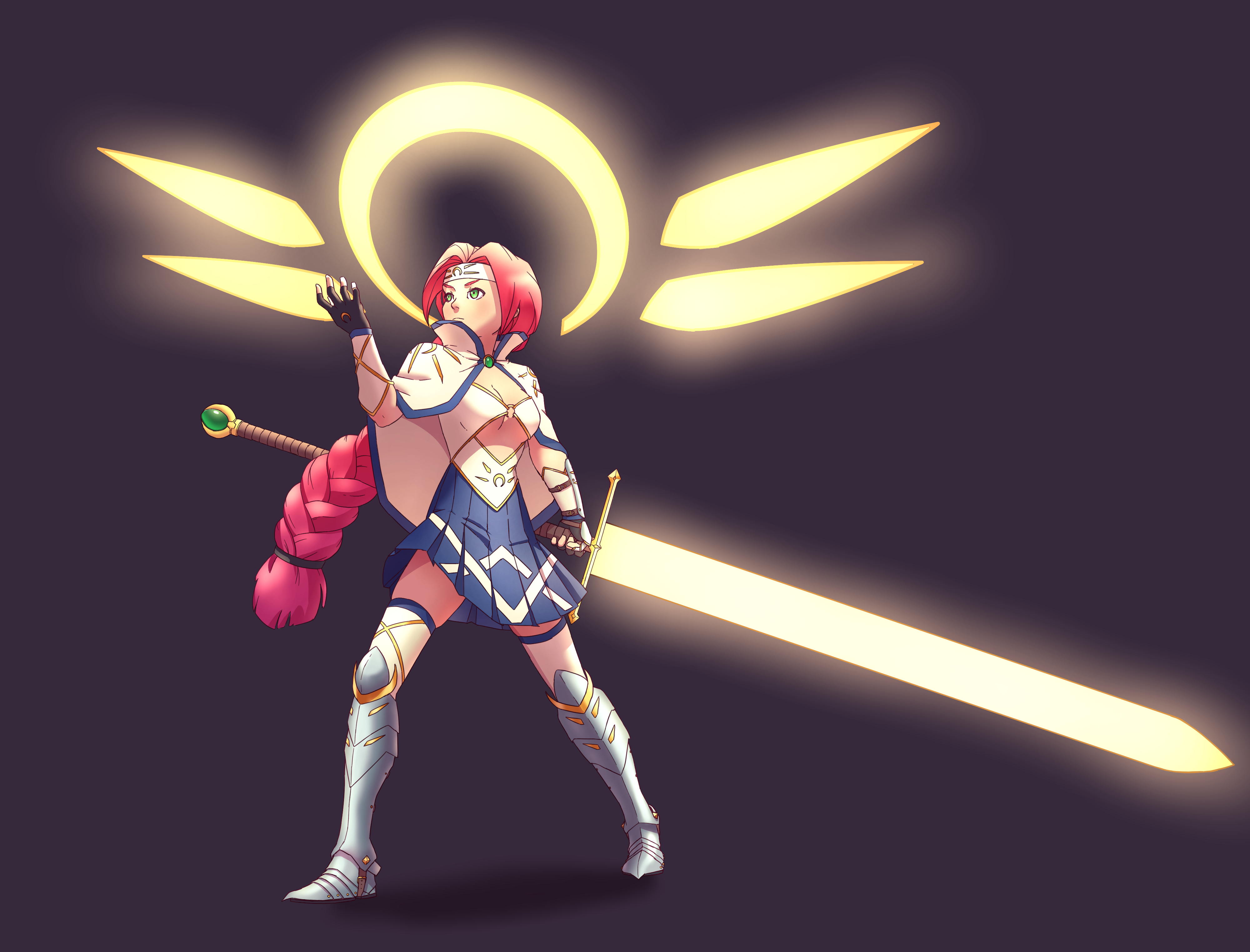
I'll probably keep working on this today but I figured I'd post a progress shot since I think I've more or less finalized my line art. I ended up moving her entire stance backward a bit since it looked a little off balance and she was going to fall over backward. Fixing the shin guard on her left leg helped as well since the perspective makes it look more like her leg is going back away from the viewer. Other than that I added the dress frills and made it flow a bit more all the way around the character. I'm really happy with how this is turning out because I've always found big flowing dresses a bit daunting.

She definitely seems more grounded in her stance now. The shin guard really makes a difference too.

I've been scared of approaching dresses too. maybe ill give it a shot too. :smile:

If you like the aesthetic then I'd say go for it! However, it probably wouldn't hurt to do a couple actual studies beforehand, I'm sure that would have helped me but I'm dumb :smile: .

This is turning out SO GOOD! Congrats on the progress.

And since you fixed the shin guard and the back leg, her stance feels a lot better, indeed.
My only feedback (if I may) so far is the shadow on the sword. The part closer to the guard feels like your making another plane, which makes the sword lose the nice edge you had before.

Other than that, amazing so far. Can't wait for the final shot!

Well I think I'm more or less finished with this one. I'm fairly pleased with the results, I tried a lot of new things this time 'round so I definitely feel like I leveled up a bit.

I love how it turned out, I really like the colors :heart_eyes: ! Awesome concept, is super interesting!

Just one thing, i'd recoment to draw the floor. U can do it just with a line or with a blur to simulate a shadow. It will give weight to the character and it will pop it up a little more!

Well I think I'm finally done with this one. Her left wrist is no longer dislocated thanks to Marc pointing that out and I've also widened the shiny areas on the armor so that it looks a bit more rounded. As a final touch added a bit of a shadow as @choixee recommended which does seem to help a bit.

Happy to hear it helped! :muscle: The texture and the light on the armour is just georgeous, it looks super ossom :heart_eyes: !

I started working on the next term's anatomy stuff and the forearm muscles sure are a lot to wrap your head around. I definitely need to do more studies and look up extra references for this. I think my skeleton is a little bit too tall so I'll probably squish him down a bit tomorrow.

Cool stuff! :smile:
Why is this little monster so shocked by it? :wink:

@Julia_J he's actually a japanese mascot character named mukku and that's just how he looks. Perpetually shocked. :frowning:

So today I realized I didn't really have anything to submit for tomorrow's feedback session and instead of doing more copying of arm anatomy drawings I made this.

I wasn't really planning to finish it today but it all kinda came together faster than I was anticipating. I did try to keep it a little more simple than some of my other stuff but I'm fairly pleased with the results and I suppose that's what is important.

I didn't really like where the old piece was so I more or less re-did the whole thing... I made sure my head was in the right spot this time and added a bunch more detail to the character as well. I've still got a few finishing touches to add but I think it looks significantly better than it did before.

hey hyoi, looks good however I did want to mention that left arm looks a bit awkward with how its bending from the perspective your using. it makes the sword seem super heavy. hope this helps.

The second iteration is, indeed, much much better! Not only the rendering but the refinements on the face are awesome!

Other than the left arm that @HANDRO already pointed out, it feels like her torso is also missing a few details. The way her left breast is connected with the body and clothing seems odd for some reason (maybe is my mind playing tricks on me).

And I'm also left wondering, if with the amount of glowing coming out from the sword and the top wings, if the lighting wouldn't be even more intense?

But again, amazing job on the new rendering!

I think I'm done with this. I went back and watched Marc's critique of my picture and it turns out he was saying the same thing as Handro about the arm. My brain for some reason thought he said to push it the other way... In any case it's better now I think. I also ended up softening some of the shadows and tried to add a bit more of a metallic texture to the gold and silver pieces.