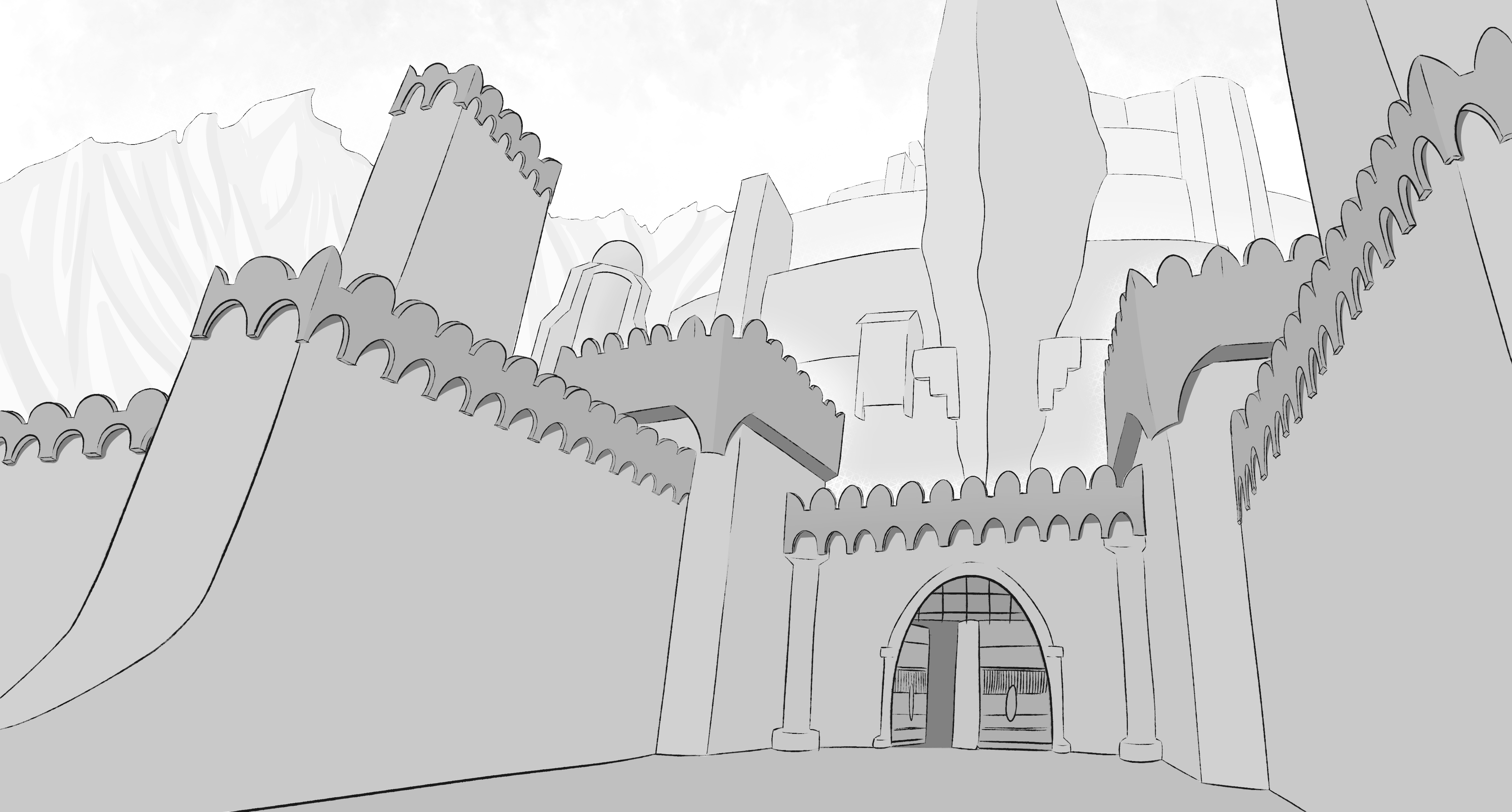
Tried the clip studio paint screen tones on this one to try and get that manga look (I think I over did it a little bit). Could spent more time adding details but I think for now the 3 point perspective concept is clear, so for me as a practice is already finished, might add some more details in the future but for now gotta keep going.

To get a clearer image enlarge it, for some reason when the website loads it for second time it looks pretty bad. Guess I wont use screentones for this course practices.
(based of a great minas tirith reference)
edit: Here is the same image without screen tones applied (it's as easy as toggling it on/off in csp, amazing):