- Thank you! I finally cleaned that up. Meanwhile started 3 more ..I have a habit of taking too long to finish a piece, then I lose interest in it and just start something else. I found 8 from recently i started and abandoned, that are decent enough to not delete, but not finished. There’s also been a number of drawings I felt I “outgrew” - became better before I finished them, and it would be easier to start from scratch than fix them. Anyone else thinking that?in24.4k
- Lady Death Fanart Collectible: Part 6 Polypaint and base Hi, it’s time to share with you another part of the process to create this fanart piece. Polypaint As this is my first collectible fanart I didn’t have previous experience with polypaint so I tried my best and played a bit with it.I wanted to give a ghostly and eerie look to Lady Death, she is beautiful and deadly, but at the end of the day she is a woman that died and was reborn at hell as an avenging spirit, that’s why I gave her skin tone a bluish very cold tone.As you will see I gave myself some creative freedom to deviate from the traditional color scheme that this characater has in comics and illustrations.To add a bit of sensuality by painting some freckles on the face and the chest. The dark nature of this character was the perfect excuse to gave her a kind of goth make up, very dark shadows around the eyes, blue lips and fingernails. I know that the original character includes sexy red lips but I wanted this girl to have a sexy but at the same time creepy look, that’s why we can see some thin veins emanating from her eyes. The biggest chromatic change I did for this character is at the hair. Lady Death has a characteristic white weavy hair but in my fanart I decided to gave her a very saturated blue color.The reason behind this wasn’t only an aesthetic choice. I want that the face area strongly pulls the attention of the viewer so this area needed a stronger contrast. Another reason is that I want her to have a more modern look, as I mentioned before, I’m strongly attracted to women with goth/punk look. I gave myself half an hour or more to analyse the work of experienced sculptors that create collectibles and I discovered that the use of darker values on the skin is often applied to create a greater sense of volume and three-dimensionality. I found that areas with heavy ambient occlusion are the perfect places to paint with darker colors in order to increase the separation between different forms. Even though she has a bluish skin tone, I used a bit of warmer hues in areas that, in real life, tend to go towards red and pink, this is very obvious in the nose, cheeks, and knuckles. Thinking with a logical mind it’s completely absurd to have warmer tones on the body of a zombie like creature but I didn’t want to limit myself by using only blue tones, it looks boring and artificial. In real life these colors are created by blood vessels in areas where the skin is very thin. ** Scythe **for her weapon I applied a cool gray with some warmer variations, this color scheme is influenced by the work of H.R giger. Base I’d like to talk about the design for the base which, to be honest, I forgot to develop along with the character.My main idea with the base is to show that Lady Death inhabits a very sterile and arid land, at the end of the day she is at hell.You can see a that she walks over dirt and rocks, a sign that she’s surrounded by death and loneliness. As part of the landscape we can see some bones and skulls to reinforce the idea of lack of living creatures, yet we can see three hands that try to reach her legs.This hands represent that all creatures are subordinated to her power and seek an evil blessing with a simple touch of the princess of the damned.1- The hand with skin burns represents the souls of those who are newcomers to hell, tortured souls that suffer for the sins comitted on earth.2- The hand with greenish rotten skin and pustules is the reminder of the decay that has infected the souls of those who have been trapped and have forgotten their humanity3- Last but not least, the hand of a demon shows that even dark creatures and entities bow before her presence. The cherry on the top, at least in my vision, are the simese twins that emerge from the ground, this malevolent creatures remind us that in hell there’s only perversion and any trace of innocence is lost. Thanks for reading till this pointI’m really happy to be very close to finish this creative journey, last but not least it’s mandatory to talk about splitting the sculpture in several pieces to be printed, this will be my last entry before showing the final rendered images. See yaMay Zbrush be with youin1.5k
- memory 2min gartic phone, used ref 2m gartic, used ref for pose 2min gartic 2min gartic 2min gartic 2min gartic memory memory memory memory study memory memory memorymemory memory memory memory memory memory study memorystudy study stylized left memory, right study study memory memorymemory memory memory memorymemory memory, porportions r offmemory memorystudystudy memorymemorymemory memory memory memory memory memory memory memory, right leg is a bit broken The feeling of only getting 1 - 3 likes on a social media post will never not be discouraging. But nothing is discouraging enough to make me quit drawing. I think the strategy of drawing a lot of stuff and waiting a while to post is good though rather than posting it immediately and then feeling that sadness on the next set of drawingin
- studies studies juri study imagination, how I feel before a speech imagination imagination study something I drew for my presentation also drew this for my presentation, didn't fix the one hand being bigger than the other imagination + study study studies study study, I need to fix the face a bit based on screenshot from anime but in my style study. except for the eye study studies studies study. changed some things tho imagination imagination imagination study studies, except top right samurai based on anime screenshot wolverine studies, changed some of the poses a lil, not very good at all, but first time i drew the character ever. semi study studies study imagination imagination imagination , for first time ever i tried to draw over 3d model for middle pose, I dont like the result tbh, but it makes it much easier than coming up with it from memory.imagination, except right figurestudies imagination + studies, coming up with action poses r hard, these are not dynamic enough, I will redraw better ones in future. imagination , imagination imagination study, except for eye imagination imagination imagination doodles except for the two chrollos imagination storyboard thumbnail, idk if i ever shared this. my storyboards end up being a little detailed since i usually just draw in one layer.in22.3k
We can get many things from studying a photograph. Texture, Anatomy, Material, Composition, Color Theory, Atmospheric perspective, and Mood just to name a few.
This is a close up portrait shot. And when a photographer works he/she uses many of the same communicative theories that we apply to digital paintings to give the viewer a focus.
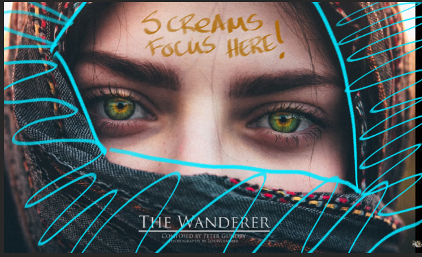
Close up shots are very likely going to focus on the eyes.
Photography is limited, in a sense, if you've ever tried to compose with light.
Edit: Added
A camera has to "turn up the light" (to be simple) to get information from the shadows, which "blows out" the light.
It has to "turn the shadows way down" (again to be simple) to see information in the bright light, but lose information in the shadow in turn.
Since our focal point is in the eyes in your reference, its in the light part of the photo.
Therefore the darks are 'lost', as they have less information in them than the areas of light.
Which makes us focus where we are supposed to.
For Example here's a photo capturing the information in the bright light.
If it was the other way around we would see a very different picture.
However there is also HDR photography where you have to recognize that the photo has information in both light and dark.
Painting for a long time was the only thing that let us do this where we could see something that looked like it did in real life. Where we can focus on both light and dark. But for compositional purposes we want to control where the viewer looks so we would use these tools of losing information in darks or lights to make the viewer focus where we wanted to. To communicate what we want.
This is done purposefully for mood, and can depend on the setting, but it helps the composer tell the story.
Now that the lesson is out of the way. On to your study.
You've done a great job. Tons of detail can be hard and distracting but you really focused in here on what was important. The added strokes that you made add information and interest yes. But does it take away the purpose of the study? Ask yourself that question. "Did I take away from this photograph what the photographer wanted to communicate?"
Less information in the darks, saturated skin tones, duller complementary colors in the cloth that frames the face it tells our eyes "Look here!"
That's why we have instagram filters.
When we compare, we see that you've added information in the darks, actually made it duller colors in the focal point's shadow when it should be more saturated to attract our attention there. Then you have some warm colors on the cloth framing the face when they should be cooler to create contrast. This makes the face 'pop' with contrast more.
So quick airbrush paintover to illustrate the points here. Not a complete study by any means.
I think that about wraps it up. I think you learned a lot and should be proud of your work. Now you can look at life and photography more like a composing painter. Great job!
Woah! This is such a great feedback! Thank you very much brohawx! Again xD
I got what you tried to explain to me and I definitely learned a lot from this study.
The images that you drawn on to show me the light/dark areas with the different level of details on them + the theory, helped a lot. Your explanation is simple and concise. I really appreciate the time and good will you put on this.
Much love brother! <3
Sure thing. It helps me remember these theories too when I write them down to share.
Now that you've been shown this you will start to see it everywhere. "Oh hey the information is in the dark." , " Oh hey this information is in the light only." But you will also see people breaking this somewhat Hudson River Illustration school rule to stand out. It doesn't mean they are wrong though.
Edited - re wrote some things to be clearer.
Suggested Topics
Topic | Category | Replies | Views | Activity |
---|---|---|---|---|
Please rip my work apart | Art Critique | 2 | 916 | Oct '19 |
Critique and Feedback Appreciated | Art Critique | 2 | 1.3k | Apr '21 |
Help an amateur out! | Art Critique | 3 | 1.6k | Nov '17 |
Someone critic my portfolio ? ![]() |
Art Critique | 10 | 3.0k | Feb '18 |
Framed Painting - Need your help! | Art Critique | 4 | 1.2k | Mar '19 |