Welcome back @deivcalviz !
Can't wait to see your art again 
Best of luck and inspirations !


Welcome back @deivcalviz !
Can't wait to see your art again
Best of luck and inspirations !
Very busy with gaming.. lol.. here's my chosen champion of darkness. Will render this now. Thanks for looking!

Something cool I missed again! Really great work dude
Very cool character - I like the colour palette you chose and can't wait to see her in action ^-^
Nice! I really love your design I do feel that she could use a complemantary colour besides the green in the design, I think it would probably make the details pop out more. Can not wait to see how you will progress 
Thank you very much! I feel like I'm also missing out on the other entries. I will check around for your works!
I can't wait for the illustration too! I want to make her feel as epic as those MTG planeswalker artworks.
Thanks for the feedback! I actually want her colors to be simple and minimalist, maybe like Malificent or Hela so I will stick with this simple color scheme.
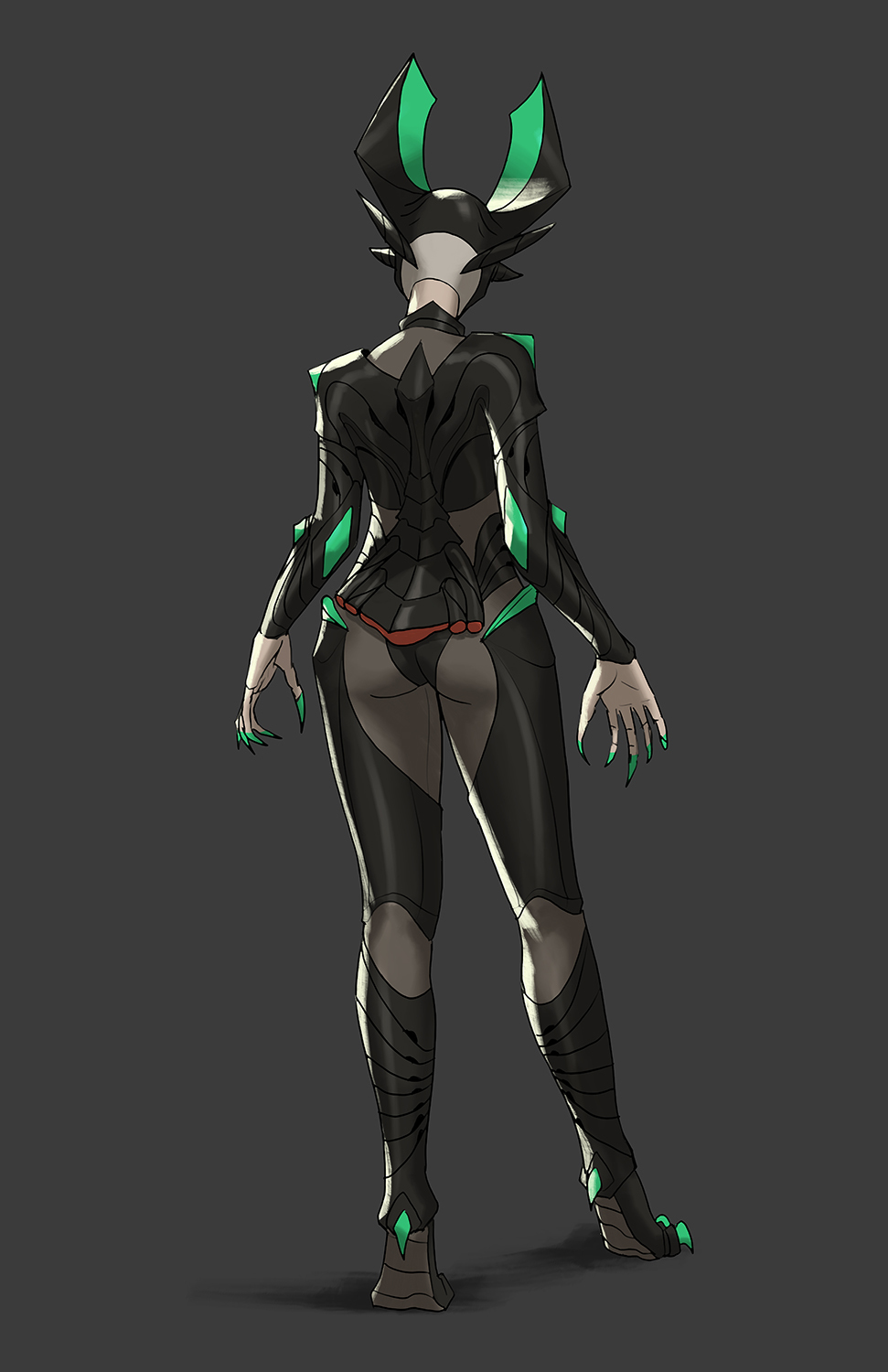
Here is the finished front view! I'm doing the back view now. I like this so far but feel free to crit.
I have been playing starcraft 1 and 2 lately and I feel like I was influenced by Kerrigan a bit. Other than that, I also saw some epic korean artworks from sangsu-jeong so I'm definitely influenced by them. I think it's perfectly fine to take inspiration from existing stuff and make it your own.
Bad ass work dude! And it's true there's a bit of Kerrigan vibes in her but like you said it's fine to have influences
Great work! Really distinctive silhouette and shapes overall, and simple, effective color palette. I really like how you've tightened up the details in this last post. The striping/piping on her shoulders and upper arms is my favorite detail here.
Are her "fins" - on the top of her head and end of her tail - solid or would they be semi transparent. I'm just wondering if it would look cool to see some of the tentacle behind her head showing through those fins above her head. Just a thought...
Anyhow, great work, looking forward to seeing what you do with her for the full illustration. Good luck and have fun! 
Awesome! Can't wait for the illustration !
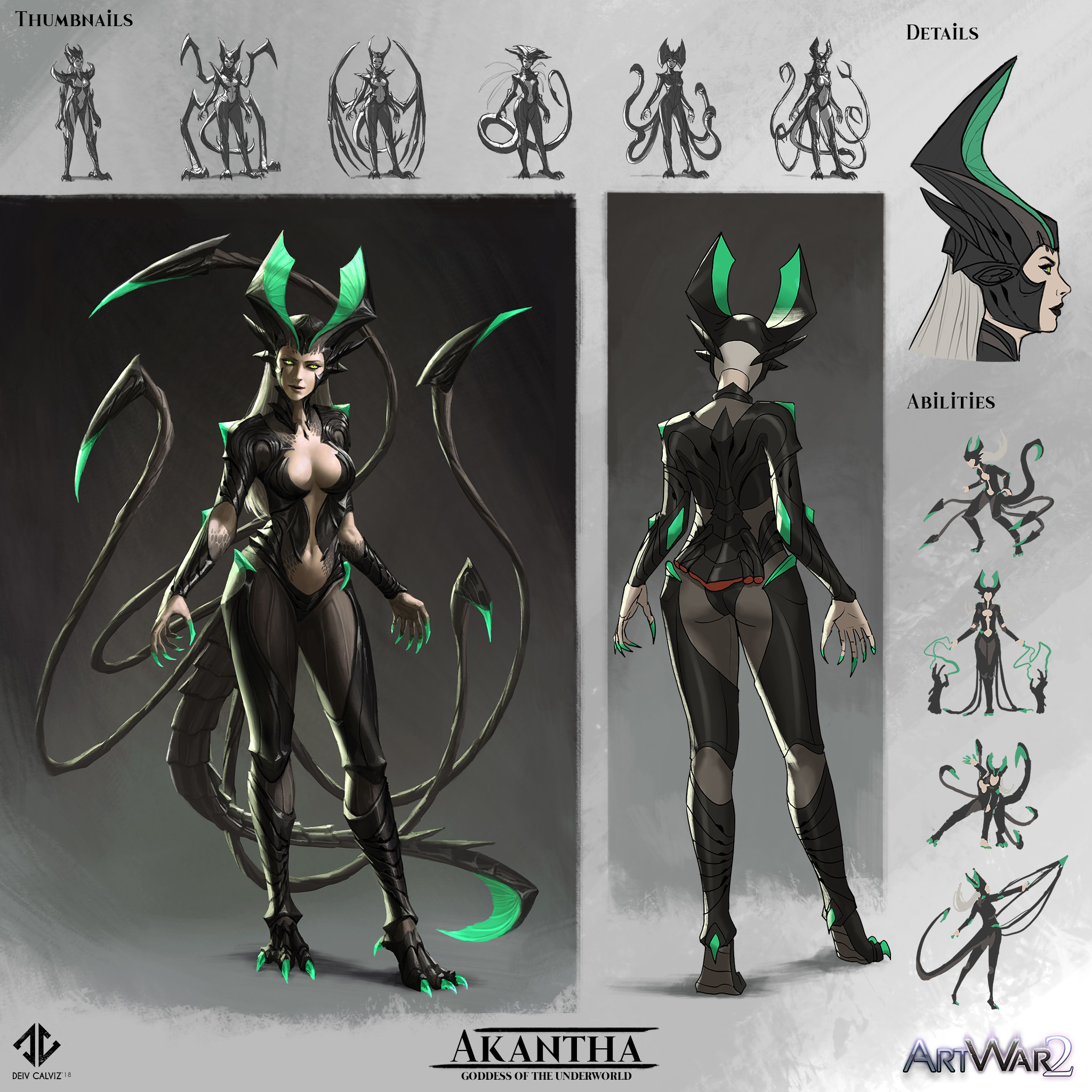
In my opinion B has the most interesting pose, but all 3 version seem a little bit unbalanced - maybe you should switch the claw or whatever is in the foreground to the right bottom corner to get a counterweight for the character and also not to hide her that much. Otherwise I would use C - with her hand and the fireeffect in the centre there is a good focus but here I think as well that the claw in the foreground takes to much space. Oh and I like the background of A most 
Either way I like the color and the light scheme of your illustration and can't wait to see your progress ^-^
To provide a contrasting opinion, i like B the least out of all three.
To me, B's pose says "look, I've got shapely curves, look at how sexy I am," while A is much more standing proud, like she's going to defeat you in battle. The raised leg is nice in C, but otherwise, it's not clear what she's trying to convey.
Anyhow, great mood in all of them and nice work on the character sheet!
Well I don't mind the "look I'm sexy" of B, if your body is weapon, you can use it x)
A is cool too, but I feel like C could work great, the pose need to be more fierce and dominant, stronger, (sorry i can't find the word i want it's quite annoying xD ) I hope you see what i mean!
Hope I could help and good luck for the artblock and computer being an ass (I know that too well man ) You can it !!!
@deivcalviz
Oh my god! You are far above my level, I would like to suggest something, yet I don't realy know that I would notice something that you would not... Your thumbnails, colors and gestures are just glorious!
As for the illustration, I personaly feel like B captures her as a mistress of demonic creatures, raveling in her power. C looks like she is a warrior/chieften/warmonger type (as for me it doesn't quite cut it). Tho I think I like A as well, she looks like she is in the middle of a battlefield ready to command her demonic creatures.
I would recomend you to realy think about somehow mixing A and B, that would capture her "mistress" vibe together with battleground situation.
Can I get some critiques and suggestions from you on my own work? I am perfectionist, so I am afraid to do something by myself rly (I'm rookie in graphic art atm, but I plan to grow bigger skill asap.)
I can't wait to see finished illustration, meanwhile I will continue working on my own project.
Keep it cool!