• Gave myself 5 days to do something. This is what I managed to do. I'm trying to get better at illustrations, but I have patience to work on something for 3 days maximum :( Splash_Process.jpg5000x3140 2.21 MB Splash_Process-6.jpg3896x2429 2.83 MB concept list char copy.jpg5388x3000 1.7 MB
    21.0k
  • Did a character concept for a course.https://www.artstation.com/artwork/P6gm3y - more:) list1.jpg3541x1920 2.82 MB
    21.0k
  • Day 4: Star Wars May The 4th =] Queen Padmé Amidala in my art style! First time drawing her and I really enjoyed making this one! Used watercolours, ink pen, acrylic markers and gold paint for accents on my Canson mix media sketchbook. I hope you like it!
    83.1k
  • A creature design from a while back
    by
    6.8k
  • Here is some more recent stuff, I need to make more body studies
  • It's been a while and god, it is so cringe to go through all previous messages xDmy study.
    21.0k
  • Thank you! I finally cleaned that up. Meanwhile started 3 more ..I have a habit of taking too long to finish a piece, then I lose interest in it and just start something else. I found 8 from recently i started and abandoned, that are decent enough to not delete, but not finished. There’s also been a number of drawings I felt I “outgrew” - became better before I finished them, and it would be easier to start from scratch than fix them. Anyone else thinking that?
  • Lady Death Fanart Collectible: Part 6 Polypaint and base Hi, it’s time to share with you another part of the process to create this fanart piece. Polypaint As this is my first collectible fanart I didn’t have previous experience with polypaint so I tried my best and played a bit with it.I wanted to give a ghostly and eerie look to Lady Death, she is beautiful and deadly, but at the end of the day she is a woman that died and was reborn at hell as an avenging spirit, that’s why I gave her skin tone a bluish very cold tone.As you will see I gave myself some creative freedom to deviate from the traditional color scheme that this characater has in comics and illustrations.To add a bit of sensuality by painting some freckles on the face and the chest. The dark nature of this character was the perfect excuse to gave her a kind of goth make up, very dark shadows around the eyes, blue lips and fingernails. I know that the original character includes sexy red lips but I wanted this girl to have a sexy but at the same time creepy look, that’s why we can see some thin veins emanating from her eyes. The biggest chromatic change I did for this character is at the hair. Lady Death has a characteristic white weavy hair but in my fanart I decided to gave her a very saturated blue color.The reason behind this wasn’t only an aesthetic choice. I want that the face area strongly pulls the attention of the viewer so this area needed a stronger contrast. Another reason is that I want her to have a more modern look, as I mentioned before, I’m strongly attracted to women with goth/punk look. I gave myself half an hour or more to analyse the work of experienced sculptors that create collectibles and I discovered that the use of darker values on the skin is often applied to create a greater sense of volume and three-dimensionality. I found that areas with heavy ambient occlusion are the perfect places to paint with darker colors in order to increase the separation between different forms. Even though she has a bluish skin tone, I used a bit of warmer hues in areas that, in real life, tend to go towards red and pink, this is very obvious in the nose, cheeks, and knuckles. Thinking with a logical mind it’s completely absurd to have warmer tones on the body of a zombie like creature but I didn’t want to limit myself by using only blue tones, it looks boring and artificial. In real life these colors are created by blood vessels in areas where the skin is very thin. ** Scythe **for her weapon I applied a cool gray with some warmer variations, this color scheme is influenced by the work of H.R giger. Base I’d like to talk about the design for the base which, to be honest, I forgot to develop along with the character.My main idea with the base is to show that Lady Death inhabits a very sterile and arid land, at the end of the day she is at hell.You can see a that she walks over dirt and rocks, a sign that she’s surrounded by death and loneliness. As part of the landscape we can see some bones and skulls to reinforce the idea of lack of living creatures, yet we can see three hands that try to reach her legs.This hands represent that all creatures are subordinated to her power and seek an evil blessing with a simple touch of the princess of the damned.1- The hand with skin burns represents the souls of those who are newcomers to hell, tortured souls that suffer for the sins comitted on earth.2- The hand with greenish rotten skin and pustules is the reminder of the decay that has infected the souls of those who have been trapped and have forgotten their humanity3- Last but not least, the hand of a demon shows that even dark creatures and entities bow before her presence. The cherry on the top, at least in my vision, are the simese twins that emerge from the ground, this malevolent creatures remind us that in hell there’s only perversion and any trace of innocence is lost. Thanks for reading till this pointI’m really happy to be very close to finish this creative journey, last but not least it’s mandatory to talk about splitting the sculpture in several pieces to be printed, this will be my last entry before showing the final rendered images. See yaMay Zbrush be with you
    1.5k
  • memory 2min gartic phone, used ref 2m gartic, used ref for pose 2min gartic 2min gartic 2min gartic 2min gartic memory memory memory memory study memory memory memorymemory memory memory memory memory memory study memorystudy study stylized left memory, right study study memory memorymemory memory memory memorymemory memory, porportions r offmemory memorystudystudy memorymemorymemory memory memory memory memory memory memory memory, right leg is a bit broken The feeling of only getting 1 - 3 likes on a social media post will never not be discouraging. But nothing is discouraging enough to make me quit drawing. I think the strategy of drawing a lot of stuff and waiting a while to post is good though rather than posting it immediately and then feeling that sadness on the next set of drawing
  • Urban Dragon Girl Wip Urban Dragon Girl_wip1.jpg5000x5000 1.11 MB
  • Long time no see! New artworks produced lately
    6.8k
  • studies studies juri study imagination, how I feel before a speech imagination imagination study something I drew for my presentation also drew this for my presentation, didn't fix the one hand being bigger than the other imagination + study study studies study study, I need to fix the face a bit based on screenshot from anime but in my style study. except for the eye study studies studies study. changed some things tho imagination imagination imagination study studies, except top right samurai based on anime screenshot wolverine studies, changed some of the poses a lil, not very good at all, but first time i drew the character ever. semi study studies study imagination imagination imagination , for first time ever i tried to draw over 3d model for middle pose, I dont like the result tbh, but it makes it much easier than coming up with it from memory.imagination, except right figurestudies imagination + studies, coming up with action poses r hard, these are not dynamic enough, I will redraw better ones in future. imagination , imagination imagination study, except for eye imagination imagination imagination doodles except for the two chrollos imagination storyboard thumbnail, idk if i ever shared this. my storyboards end up being a little detailed since i usually just draw in one layer.
    by
    22.6k

Name: Clarissa Ferguson (Clarie F.)
Email: ferguson.clarissa@yahoo.com
Website: https://www.artstation.com/clarissaferguson
@Twitter: N/A
@Facebook: https://www.facebook.com/clariesartpage/

Okay, guys! I am finally finished with both the concept sheet and the final illustration! I am so nervous, but thank you all for your feedback and motivation. I think being around such a nice and helpful community really encouraged me to keep going. I felt more accountable for my progress and I didn't want to let anybody down. I hope everything looks okay and that I followed the instructions correctly! Again thanks everyone for your helpful advice and comments, this was really fun to do! <3 <3 <3 :smile:

EDIT: Feb. 27, 2018: So, since the deadline is in March, I had some time to look through my work and see if anything needed changing, plus I received some really helpful feedback on things they noticed too. Enjoy!
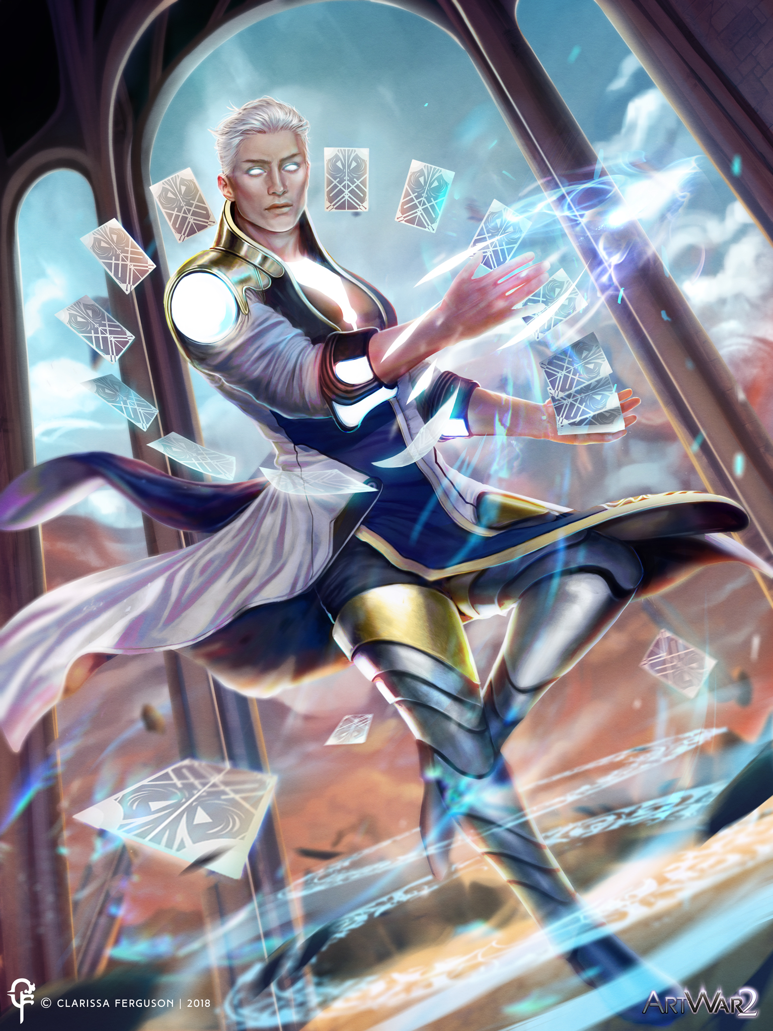
Concept Sheet

Final Illustration


My first original post below:

Name: Clarissa Ferguson (Clarie F.)
Email: ferguson.clarissa@yahoo.com
Website: https://www.artstation.com/clarissaferguson
@Twitter: N/A
@Facebook: https://www.facebook.com/clariesartpage/

Hello everyone! My username is Clarie F. but on the forums, for some reason, it is ferguson-clarissa, so I hope no one gets confused! Anyway, I wanted to try and enter the contest with a character I am working for the light-side! Eryl a humble guardian lol.

I am still trying to figure out what I want for this character, but I want his personality to be confident yet still humble. Strong composure and assertive! An ancient being from a long time ago, possibly one of the last few of his kind, peacefully trying to his life among the humans, never wants to a part of any conflict...not after what happened to his kind. However, this war was too massive for him to ignore and he needed to sacrifice peace to defend his new home.

So, here are a few concepts I had in mind that I really wanted to draw out, I am still not 100% on colors, or outfits (I apologize if they are really rough looking outfit designs) but hopefully everything will be resolved in later sketches.

Even his weapons I was unsure about, I think a sword is a very common weapon, so I wanted to experiment with other things like metal cards, or marbles, or a belt that turns into a weapon of some kind. Since he is a peaceful type character, I don't want him to be actually carrying visible or obvious weapons since he doesn't want to use his powers to hurt anyone, but in this war, he has no choice!

I hope I followed the rules correctly, if not please let me know XD. Thanks guys! What do you think so far?

There are 63 replies with an estimated read time of 9 minutes.

nice sketches! your style is really neat and your process is solid :smile:

Thanks! I'm glad these came out okay XD, I feel like these sketches came out kind of rough but I do try to be as clean as possible in the beginning.

Love your concept - light radiates from the inside ! Looking forward to seeing your final piece!

This looks interesting, can't wait to see more ! :smile:

Great sketches so far! I especially like the face and all of the hair-styles. Looking forward to seeing where you take this. Good luck and have fun! :+1:

Hello guys! I am not sure if this is the right way to do it, but I made some new little doodle ideas. I liked some of the ideas that I had in the first little layout of what I wanted. I apologize for all the black and white stuff, I usually start this way heavily before moving to colors. So I tried to render out some of the ideas I like here. As for how he uses the cards, I was trying to see how he could. He could put his energy into the cards (or even any other object, but he prefers his magic cards). He can make shields, use his cards as like magic shards maybe, and probably do other cool things with them just my imagination right now is tired @.@ but if you guys have any ideas that would be cool!

Looks nice! I like his true mode design :smile:
For the way he could use his cards take a look at Gambit from the Xmen and also Konan from Naruto she uses paper but that can give you more ideas maybe

Nice design work and the cards definitely give you a direction and focus. I agree with Robert, you should definitely look at Gambit, but not to get ideas from him but to make sure you don't inadvertently copy him and differentiate yourself as much as possible.

The glasses feel odd to me but that's because at the moment we have no context for the rest of his costume or temporal/spatial location. From your earlier costume sketches, I had assumed this would be a fantasy character, so the glasses feel out of place. If most of his costume looks contemporary than they definitely fit. If he comes off more as a fantasy character or a superhero then they might not.

As for process, absolutely no reason apologize for anything. It's not recommended to rush into color before you even have your design worked out. And there is no "one correct way" to develop a character. Some people start with story, some let the design dictate the story, some work from silhouette, some start with pencil sketches. And some people just start painting and evolve the illustration as they go. Just look around the other contest entries (you should!) and you'll see many different valid ways to progress. Yours seems perfectly conventional, no need to doubt if its "the right way."

Good luck! :+1:

Hey guys! I am still trying to figure out his powers, however, one of my friends suggested adjusting his hair a little bit more and adjusting his look as well. So I did subtle changes to his appearance and then I started to work on his outfits more since I have something forming in my mind so these are more detailed sketches of the outfits designs that are floating in my head at least.

I wanted his appearance to represent how he is, he is leaning towards more of a fantasy character (maybe even scifi, based on some of the styles of the outfits, but definitely a fantasy type character. I wanted him to appear clean, wear kind of bright colored clothing, I wanted him to appear approachable, but at the same time he doesn't look overall goodie-goodie bubbly, he still looks intimidating. Plus I wanted his energy to like show even when he is wearing his outfit, so some of the styles I made show his energy, because I would think if his energy is glowing or shining brightly it might shine through his clothes (maybe even burn through his clothes) so it might make sense to have an opening for him. What do you guys think? Any thoughts are welcomed!

I love everything about #2: The curvy sinuous collar and neckline, the oversized cuffs, and the asymmetrical flap in the front. Plus is shows the chest, which fits in with your desire to show his energy even when his clothing is on. I also like 3, for a lot of the same reasons: The cuffs and asymmetrical flap and the exposed chest. It doesn't have the fascinating neckline of 2, but it is more white, which feels more on the side of light. (I love the black in 2 and how it contrasts with the white, though I wonder if it'll read as too Dark?)
Anyhow, some nice stuff in all of them, but the elements I like in 2 and 3 seem the most original.
Cheers, and good luck, whichever you pick :+1: