• Gave myself 5 days to do something. This is what I managed to do. I'm trying to get better at illustrations, but I have patience to work on something for 3 days maximum :( Splash_Process.jpg5000x3140 2.21 MB Splash_Process-6.jpg3896x2429 2.83 MB concept list char copy.jpg5388x3000 1.7 MB
    21.1k
  • Did a character concept for a course.https://www.artstation.com/artwork/P6gm3y - more:) list1.jpg3541x1920 2.82 MB
    21.1k
  • Day 4: Star Wars May The 4th =] Queen Padmé Amidala in my art style! First time drawing her and I really enjoyed making this one! Used watercolours, ink pen, acrylic markers and gold paint for accents on my Canson mix media sketchbook. I hope you like it!
    83.2k
  • A creature design from a while back
    by
    6.8k
  • Here is some more recent stuff, I need to make more body studies
  • It's been a while and god, it is so cringe to go through all previous messages xDmy study.
    21.1k
  • Thank you! I finally cleaned that up. Meanwhile started 3 more ..I have a habit of taking too long to finish a piece, then I lose interest in it and just start something else. I found 8 from recently i started and abandoned, that are decent enough to not delete, but not finished. There’s also been a number of drawings I felt I “outgrew” - became better before I finished them, and it would be easier to start from scratch than fix them. Anyone else thinking that?
  • Lady Death Fanart Collectible: Part 6 Polypaint and base Hi, it’s time to share with you another part of the process to create this fanart piece. Polypaint As this is my first collectible fanart I didn’t have previous experience with polypaint so I tried my best and played a bit with it.I wanted to give a ghostly and eerie look to Lady Death, she is beautiful and deadly, but at the end of the day she is a woman that died and was reborn at hell as an avenging spirit, that’s why I gave her skin tone a bluish very cold tone.As you will see I gave myself some creative freedom to deviate from the traditional color scheme that this characater has in comics and illustrations.To add a bit of sensuality by painting some freckles on the face and the chest. The dark nature of this character was the perfect excuse to gave her a kind of goth make up, very dark shadows around the eyes, blue lips and fingernails. I know that the original character includes sexy red lips but I wanted this girl to have a sexy but at the same time creepy look, that’s why we can see some thin veins emanating from her eyes. The biggest chromatic change I did for this character is at the hair. Lady Death has a characteristic white weavy hair but in my fanart I decided to gave her a very saturated blue color.The reason behind this wasn’t only an aesthetic choice. I want that the face area strongly pulls the attention of the viewer so this area needed a stronger contrast. Another reason is that I want her to have a more modern look, as I mentioned before, I’m strongly attracted to women with goth/punk look. I gave myself half an hour or more to analyse the work of experienced sculptors that create collectibles and I discovered that the use of darker values on the skin is often applied to create a greater sense of volume and three-dimensionality. I found that areas with heavy ambient occlusion are the perfect places to paint with darker colors in order to increase the separation between different forms. Even though she has a bluish skin tone, I used a bit of warmer hues in areas that, in real life, tend to go towards red and pink, this is very obvious in the nose, cheeks, and knuckles. Thinking with a logical mind it’s completely absurd to have warmer tones on the body of a zombie like creature but I didn’t want to limit myself by using only blue tones, it looks boring and artificial. In real life these colors are created by blood vessels in areas where the skin is very thin. ** Scythe **for her weapon I applied a cool gray with some warmer variations, this color scheme is influenced by the work of H.R giger. Base I’d like to talk about the design for the base which, to be honest, I forgot to develop along with the character.My main idea with the base is to show that Lady Death inhabits a very sterile and arid land, at the end of the day she is at hell.You can see a that she walks over dirt and rocks, a sign that she’s surrounded by death and loneliness. As part of the landscape we can see some bones and skulls to reinforce the idea of lack of living creatures, yet we can see three hands that try to reach her legs.This hands represent that all creatures are subordinated to her power and seek an evil blessing with a simple touch of the princess of the damned.1- The hand with skin burns represents the souls of those who are newcomers to hell, tortured souls that suffer for the sins comitted on earth.2- The hand with greenish rotten skin and pustules is the reminder of the decay that has infected the souls of those who have been trapped and have forgotten their humanity3- Last but not least, the hand of a demon shows that even dark creatures and entities bow before her presence. The cherry on the top, at least in my vision, are the simese twins that emerge from the ground, this malevolent creatures remind us that in hell there’s only perversion and any trace of innocence is lost. Thanks for reading till this pointI’m really happy to be very close to finish this creative journey, last but not least it’s mandatory to talk about splitting the sculpture in several pieces to be printed, this will be my last entry before showing the final rendered images. See yaMay Zbrush be with you
    1.5k
  • memory 2min gartic phone, used ref 2m gartic, used ref for pose 2min gartic 2min gartic 2min gartic 2min gartic memory memory memory memory study memory memory memorymemory memory memory memory memory memory study memorystudy study stylized left memory, right study study memory memorymemory memory memory memorymemory memory, porportions r offmemory memorystudystudy memorymemorymemory memory memory memory memory memory memory memory, right leg is a bit broken The feeling of only getting 1 - 3 likes on a social media post will never not be discouraging. But nothing is discouraging enough to make me quit drawing. I think the strategy of drawing a lot of stuff and waiting a while to post is good though rather than posting it immediately and then feeling that sadness on the next set of drawing
  • Urban Dragon Girl Wip Urban Dragon Girl_wip1.jpg5000x5000 1.11 MB
  • Long time no see! New artworks produced lately
    6.8k
  • studies studies juri study imagination, how I feel before a speech imagination imagination study something I drew for my presentation also drew this for my presentation, didn't fix the one hand being bigger than the other imagination + study study studies study study, I need to fix the face a bit based on screenshot from anime but in my style study. except for the eye study studies studies study. changed some things tho imagination imagination imagination study studies, except top right samurai based on anime screenshot wolverine studies, changed some of the poses a lil, not very good at all, but first time i drew the character ever. semi study studies study imagination imagination imagination , for first time ever i tried to draw over 3d model for middle pose, I dont like the result tbh, but it makes it much easier than coming up with it from memory.imagination, except right figurestudies imagination + studies, coming up with action poses r hard, these are not dynamic enough, I will redraw better ones in future. imagination , imagination imagination study, except for eye imagination imagination imagination doodles except for the two chrollos imagination storyboard thumbnail, idk if i ever shared this. my storyboards end up being a little detailed since i usually just draw in one layer.
    by
    22.6k

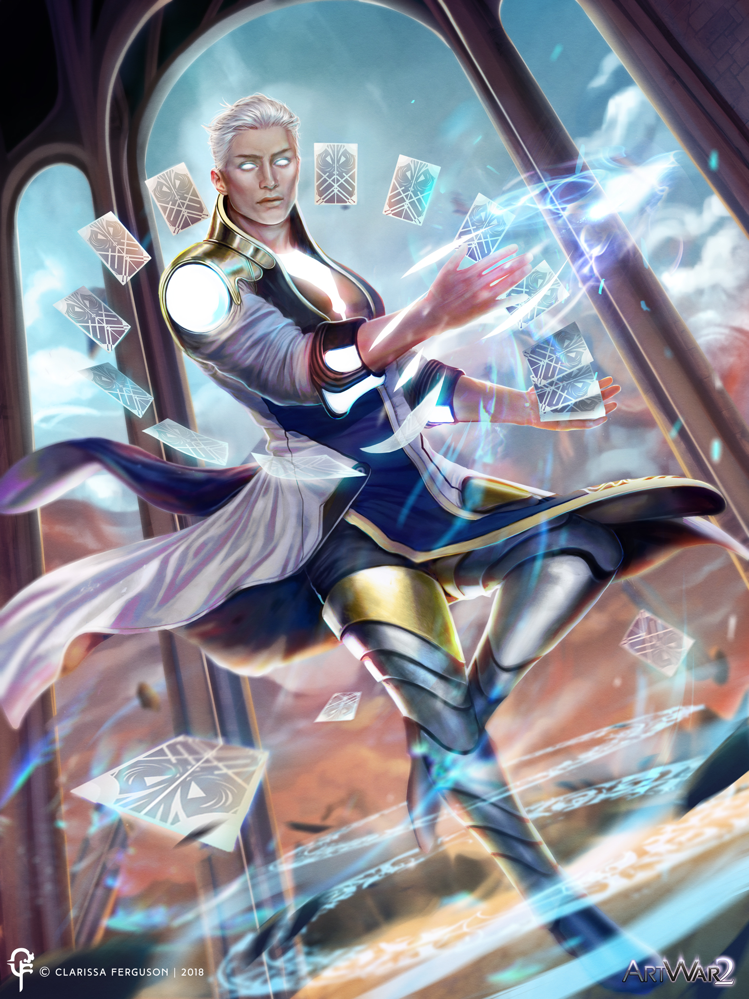
Alright guys I think i am finally finished with my illustration, now I just need to focus on my concept sheet, and show his outfit and everything <3 I am really nervous guys! But I usually am when it comes to contests XD, but I had fun working on this illustration, and I'd like to thank everybody that gave their feedback while I was going through the process of creating this character. If there is any final changes needed to be made I usually make sure I kind of separate all my layers and elements in group categories that way it is easier for me to make last minute changes with out having to paint over too much.

Once I complete the concept sheet, then everything will be at their normal dimensions and stuff XD.

So the deadline for ArtWar 2 is March 5 now! I am wondering if I should continue to work on it or not, but I don't want to mess up something though XD. What do you guys think? My submission is at the top of the thread!

You can still try to improve it and if you mess it up just don't tell us :stuck_out_tongue:
But I'm sure if you think you can make it better you can do it :smile:

Looking good! Great rendering on the illo and you sure packed a LOT into the Character sheet (which they requested!)

My main feed back for the character sheet would be to clean it up a bit. If your notes in the upper left panel are going to be half covered then just omit them altogether. Similarly, your "possible final design" note in the upper right panel made sense when you first posted it, but now that you actually have a final deign, you could omit that (or at least shrink it so it's not bumping up against the panel beneath it.

The main illustration is really dynamic. I feel like the cards get a bit lost on the background and a darker color for them might help them stand out more. If you were going to work on any part of the image with the extra time allotted, I'd suggest the face and skin in general. It's feeling a little matte, and the hand might need some more warm colors to show some subsurface scattering. Shouldn't there be a strong rim light under his chin from the light coming out of his chest? Anyhow, overall it's a solid piece, these are just some suggestions. Good luck with it! :+1:

I kind of see what you mean! Especially in the concept sheet, I wasn't sure how to put the pieces together XD. It was a big jigsaw puzzle for me. I'll clean it up some more for sure.

I agree with you on the light for the main illustration, I was a bit hesitant on if I needed to add more rim light to his chin or not, I didn't want the light to be too glaring ya know?

And sub-surface scattering, ah, science never liked me XD. I always have trouble with that sometimes.

Thank you so much for your feedback! If you didn't say anything I probably would have missed some of those things. Now I don't feel too scared to make a few changes!

No worries! As for sub-surface scattering, don't let the fancy sciency name throw you off: It basically just means places where the light shines through the skin and makes it look more red because it's shining through the blood in the thinner parts of our bodies, like ears and hands. It's like if you hold your hand in front of a flashlight, your hand looks really red because parts of your fingers are thin enough for the light to shine through them.
Like this:

Or this:

As for the character sheet, the rules "Squeeze everything onto this one sheet," but I don't think they mean that literally. You need to show you work, but not every single step of your work. Show enough to demonstrate that you went through the process, but not so much that it feels overly busy and noisy. I found it especially helpful to look at the character sheets of the five 2D winners from ArtWar 1: Doing so convinced me that I didn't need to render out my character front and back view to the same exacting degree as my main illustration, just enough to make it look good.

I didn't want the light to be too glaring ya know?

I think that you need the rim light under the chin because you've got a strong light source under it, so it should be accurate. But you've seen my entry, and it's fair to say I'm of the leaning that if you're on the side of Light then put light EVERYWHERE!!! So take my suggestion with the grain of salt it deserves! :smiley:

Thanks for all the help! I did go ahead and clean up my concept sheet a bit more and did some of the suggestions you mentioned for the final illustration.

Definitely for the subsurface scattering.

Now I guess it is time to see what happens! I am pretty nervous XD but I had fun though. Good luck to you as well! I actually loved your concept with Saturday Knight! So bubbly and colorful I love it! :smiley:

Post something!
Post something, please.
:ocean:

Oh? But I have posted some things, but I will post some more if you'll like! :smiley:

XD This is mainly just the concept sheet and illustration posted. I was told to post something, and I thought maybe I could show my final submission entries again! I already posted them at the top but now they are at the bottom too LOL

Here they are the finish product, I am not going to touch them >/< I think I reached the limit XD Good luck to everyone that participated I am excited to see the results :smiley:

Concept Sheet

Illustration

It looks absolutely stunning, great job! Congratulations!

Wow, wonderful final changes! The clean-up on the character sheet is an improvement, and the subtle changes to the art on the illustration - the subsurface scattering and rim lights and such, and the tightening up of everything - are all superb! I'm glad my post was useful. Are you happy with it? I'm happy with it! :smiley:
Anyhow, great work, good luck in the judging, and hope to see you next time around!

I am kind of jealous of your rendering when it comes to hair!
lovely composition and concept!
The only thing I would change would be the rendering on some metallic parts.
And by change, I mean adding some more reflections, nothing drastic.
Good job! :smile:

Yeah probably adding more reflections could work :D. And don't be jealous >/< but I really do like to render the hair. I try to take my time with it so it can look a bit more realistic and I want to get all the stray strands of hair too XD.

Thank you!