• Gave myself 5 days to do something. This is what I managed to do. I'm trying to get better at illustrations, but I have patience to work on something for 3 days maximum :( Splash_Process.jpg5000x3140 2.21 MB Splash_Process-6.jpg3896x2429 2.83 MB concept list char copy.jpg5388x3000 1.7 MB
    20.8k
  • Did a character concept for a course.https://www.artstation.com/artwork/P6gm3y - more:) list1.jpg3541x1920 2.82 MB
    20.8k
  • Day 4: Star Wars May The 4th =] Queen Padmé Amidala in my art style! First time drawing her and I really enjoyed making this one! Used watercolours, ink pen, acrylic markers and gold paint for accents on my Canson mix media sketchbook. I hope you like it!
    82.3k
  • A creature design from a while back
    by
    6.7k
  • Here is some more recent stuff, I need to make more body studies
  • It's been a while and god, it is so cringe to go through all previous messages xDmy study.
    20.8k
  • Thank you! I finally cleaned that up. Meanwhile started 3 more ..I have a habit of taking too long to finish a piece, then I lose interest in it and just start something else. I found 8 from recently i started and abandoned, that are decent enough to not delete, but not finished. There’s also been a number of drawings I felt I “outgrew” - became better before I finished them, and it would be easier to start from scratch than fix them. Anyone else thinking that?
  • Lady Death Fanart Collectible: Part 6 Polypaint and base Hi, it’s time to share with you another part of the process to create this fanart piece. Polypaint As this is my first collectible fanart I didn’t have previous experience with polypaint so I tried my best and played a bit with it.I wanted to give a ghostly and eerie look to Lady Death, she is beautiful and deadly, but at the end of the day she is a woman that died and was reborn at hell as an avenging spirit, that’s why I gave her skin tone a bluish very cold tone.As you will see I gave myself some creative freedom to deviate from the traditional color scheme that this characater has in comics and illustrations.To add a bit of sensuality by painting some freckles on the face and the chest. The dark nature of this character was the perfect excuse to gave her a kind of goth make up, very dark shadows around the eyes, blue lips and fingernails. I know that the original character includes sexy red lips but I wanted this girl to have a sexy but at the same time creepy look, that’s why we can see some thin veins emanating from her eyes. The biggest chromatic change I did for this character is at the hair. Lady Death has a characteristic white weavy hair but in my fanart I decided to gave her a very saturated blue color.The reason behind this wasn’t only an aesthetic choice. I want that the face area strongly pulls the attention of the viewer so this area needed a stronger contrast. Another reason is that I want her to have a more modern look, as I mentioned before, I’m strongly attracted to women with goth/punk look. I gave myself half an hour or more to analyse the work of experienced sculptors that create collectibles and I discovered that the use of darker values on the skin is often applied to create a greater sense of volume and three-dimensionality. I found that areas with heavy ambient occlusion are the perfect places to paint with darker colors in order to increase the separation between different forms. Even though she has a bluish skin tone, I used a bit of warmer hues in areas that, in real life, tend to go towards red and pink, this is very obvious in the nose, cheeks, and knuckles. Thinking with a logical mind it’s completely absurd to have warmer tones on the body of a zombie like creature but I didn’t want to limit myself by using only blue tones, it looks boring and artificial. In real life these colors are created by blood vessels in areas where the skin is very thin. ** Scythe **for her weapon I applied a cool gray with some warmer variations, this color scheme is influenced by the work of H.R giger. Base I’d like to talk about the design for the base which, to be honest, I forgot to develop along with the character.My main idea with the base is to show that Lady Death inhabits a very sterile and arid land, at the end of the day she is at hell.You can see a that she walks over dirt and rocks, a sign that she’s surrounded by death and loneliness. As part of the landscape we can see some bones and skulls to reinforce the idea of lack of living creatures, yet we can see three hands that try to reach her legs.This hands represent that all creatures are subordinated to her power and seek an evil blessing with a simple touch of the princess of the damned.1- The hand with skin burns represents the souls of those who are newcomers to hell, tortured souls that suffer for the sins comitted on earth.2- The hand with greenish rotten skin and pustules is the reminder of the decay that has infected the souls of those who have been trapped and have forgotten their humanity3- Last but not least, the hand of a demon shows that even dark creatures and entities bow before her presence. The cherry on the top, at least in my vision, are the simese twins that emerge from the ground, this malevolent creatures remind us that in hell there’s only perversion and any trace of innocence is lost. Thanks for reading till this pointI’m really happy to be very close to finish this creative journey, last but not least it’s mandatory to talk about splitting the sculpture in several pieces to be printed, this will be my last entry before showing the final rendered images. See yaMay Zbrush be with you
    1.5k
  • memory 2min gartic phone, used ref 2m gartic, used ref for pose 2min gartic 2min gartic 2min gartic 2min gartic memory memory memory memory study memory memory memorymemory memory memory memory memory memory study memorystudy study stylized left memory, right study study memory memorymemory memory memory memorymemory memory, porportions r offmemory memorystudystudy memorymemorymemory memory memory memory memory memory memory memory, right leg is a bit broken The feeling of only getting 1 - 3 likes on a social media post will never not be discouraging. But nothing is discouraging enough to make me quit drawing. I think the strategy of drawing a lot of stuff and waiting a while to post is good though rather than posting it immediately and then feeling that sadness on the next set of drawing
  • Urban Dragon Girl Wip Urban Dragon Girl_wip1.jpg5000x5000 1.11 MB
  • Long time no see! New artworks produced lately
    6.7k
  • studies studies juri study imagination, how I feel before a speech imagination imagination study something I drew for my presentation also drew this for my presentation, didn't fix the one hand being bigger than the other imagination + study study studies study study, I need to fix the face a bit based on screenshot from anime but in my style study. except for the eye study studies studies study. changed some things tho imagination imagination imagination study studies, except top right samurai based on anime screenshot wolverine studies, changed some of the poses a lil, not very good at all, but first time i drew the character ever. semi study studies study imagination imagination imagination , for first time ever i tried to draw over 3d model for middle pose, I dont like the result tbh, but it makes it much easier than coming up with it from memory.imagination, except right figurestudies imagination + studies, coming up with action poses r hard, these are not dynamic enough, I will redraw better ones in future. imagination , imagination imagination study, except for eye imagination imagination imagination doodles except for the two chrollos imagination storyboard thumbnail, idk if i ever shared this. my storyboards end up being a little detailed since i usually just draw in one layer.
    by
    22.3k

So happy to announce that I am finished with the character and final renders. It took me a long time and only a few hours short of the deadline, but I am very pleased to call this finished. Thanks everyone who commented and liked my stuff along the way.

Final render:


Final render close-ups:

Detail sheet:

My details:
Name: Jonas Roscinas
Email: j.roscinas@gmail.com
Website: www.jroscinas.com
Twitter: @JRoscinas
Facebook: Jonas Roscinas 3D Art

There are 58 replies with an estimated read time of 6 minutes.

I hope this is helpful. I'd say he already looks pretty bulky. I feel like he is a bit too short though. You can stretch him out a little and he'll keep his bulk. A good rule of thumb is to make him 7 heads tall. Even though he has a large helmet I would still recommend sticking to that rule.

Hahahahaha nice smiley face! I'm happy there is a mech in this fight.

Not too sure about the feathers on a mech, but it's too soon to judge.

Thanks very much, appreciate the paint-over, it gave me some nice guidance in what I want to do with my proportions.
Here's a little day 2 update, carrying out with the blockout and concepting stage in zbrush + like mentioned before sorting out the proportions.

Also I mis-worded the title slightly, it won't be a mech but a really buff mech-like armor on an angel. Sorry for the confusion. But who knows, as I am concepting on the go, this might even become a full fledged mech.

Hey I can imagen this being a mech with like holographic-feather wings. That could look pretty sick...

Thanks man very interesting idea, I'll have a play with that. Put a few more hours today, still working on the blockout, can't wait to dynamesh this and start working on more organic shapes. Helmet is definitely not final, just playing around with sharper shapes and silhouette.

If you're on team light I would recommend leaving the face exposed. It gives a more open and inviting vibe. You could also show some expression which would humanize him a bit more.

If you're on team dark I would recommend keeping him covered up. There's more mystery and aggression. Like how scary a great white shark is when you cant see its pupils.

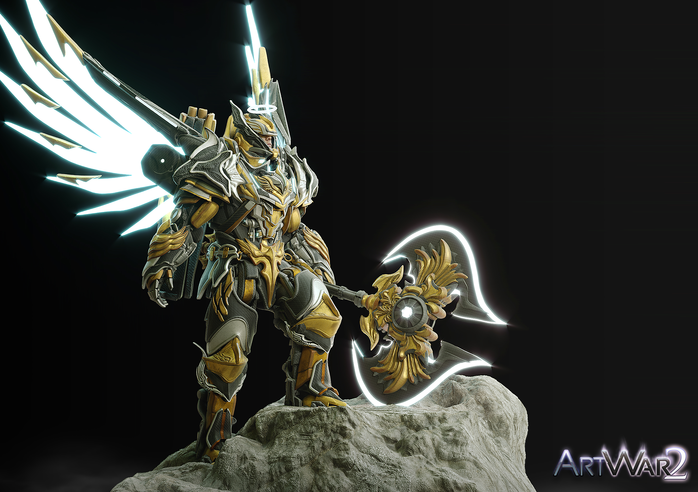
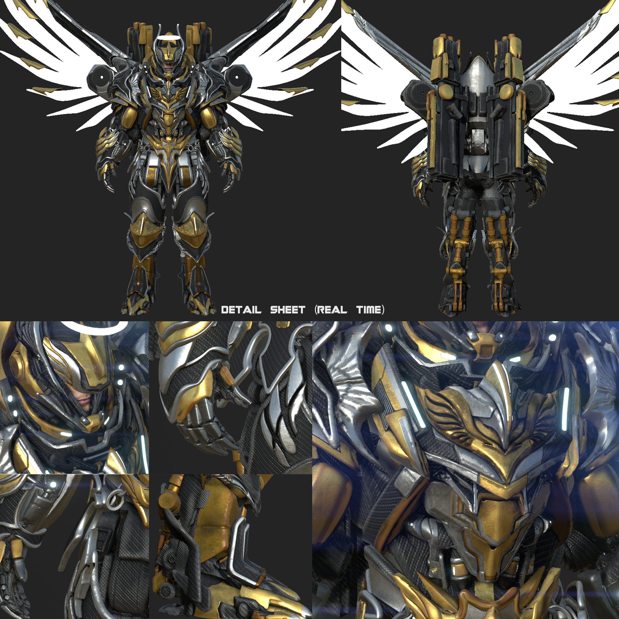
Either way you are going I am for the visor simply cause he feels like a badass personality either cocky or stoic, but not like a mother Teresa with the giving and the being liked. This is war after all. Ofc if he is a futuristic character the odds of him doing combat in lethal gas or none terrestrial planets means he would need a full mask. The other argument to be made is that if the future has the tech to make a full face helmet viable in combat then it would be a tactical disadvantage to not have it on.

If you wana go for the open face it is viable ofc. I would eliminate the helmet completely. Then he would be seen a moral booster a fears and fearless commander who's face alone inspires hope and courage in those around him.

Ultimately you need to keep your character in mind when deciding this what would he do if he was gearing for a fight or picking out his armor in the forge.

PS. This is all assuming he is on the light side. That's the vibe his armor gave me.

Thanks for the feedback very much guys, it truly goes a long way and helped me to get a better idea of what I want to do with this character and the design :smile:
Currently I made some changed. The wings are definitely not going to stay for a long time, I will probably experiment with fully opened/epic looking wings. Quickly dropped into keyshot using zbrush bridge, to see how the planes work with the light and understand better what I want to change in terms of the forms.

Oh I almost forgot. I also had some fun making these guns on the back, I'll figure out how to make them work exactly!


Even though the armor is no where near final, I will be changing the shapes a lot using dynamesh, I did a little overpaint. Highlights are where I want to put some accents, maybe gold or something along those lines. Dark/textured areas are where I want to have more noise/mechanical parts visible. The mid values are the resting areas. Didn't really touch the wings or cloths in this overpaint, just the armor. Mainly so that when I carry on modelling/dynamesh sculpting I know where I want to put more mechanical details and where to leave it more plain.