• Gave myself 5 days to do something. This is what I managed to do. I'm trying to get better at illustrations, but I have patience to work on something for 3 days maximum :( Splash_Process.jpg5000x3140 2.21 MB Splash_Process-6.jpg3896x2429 2.83 MB concept list char copy.jpg5388x3000 1.7 MB
    20.9k
  • Did a character concept for a course.https://www.artstation.com/artwork/P6gm3y - more:) list1.jpg3541x1920 2.82 MB
    20.9k
  • Day 4: Star Wars May The 4th =] Queen Padmé Amidala in my art style! First time drawing her and I really enjoyed making this one! Used watercolours, ink pen, acrylic markers and gold paint for accents on my Canson mix media sketchbook. I hope you like it!
    82.7k
  • A creature design from a while back
    by
    6.7k
  • Here is some more recent stuff, I need to make more body studies
  • It's been a while and god, it is so cringe to go through all previous messages xDmy study.
    20.9k
  • Thank you! I finally cleaned that up. Meanwhile started 3 more ..I have a habit of taking too long to finish a piece, then I lose interest in it and just start something else. I found 8 from recently i started and abandoned, that are decent enough to not delete, but not finished. There’s also been a number of drawings I felt I “outgrew” - became better before I finished them, and it would be easier to start from scratch than fix them. Anyone else thinking that?
  • Lady Death Fanart Collectible: Part 6 Polypaint and base Hi, it’s time to share with you another part of the process to create this fanart piece. Polypaint As this is my first collectible fanart I didn’t have previous experience with polypaint so I tried my best and played a bit with it.I wanted to give a ghostly and eerie look to Lady Death, she is beautiful and deadly, but at the end of the day she is a woman that died and was reborn at hell as an avenging spirit, that’s why I gave her skin tone a bluish very cold tone.As you will see I gave myself some creative freedom to deviate from the traditional color scheme that this characater has in comics and illustrations.To add a bit of sensuality by painting some freckles on the face and the chest. The dark nature of this character was the perfect excuse to gave her a kind of goth make up, very dark shadows around the eyes, blue lips and fingernails. I know that the original character includes sexy red lips but I wanted this girl to have a sexy but at the same time creepy look, that’s why we can see some thin veins emanating from her eyes. The biggest chromatic change I did for this character is at the hair. Lady Death has a characteristic white weavy hair but in my fanart I decided to gave her a very saturated blue color.The reason behind this wasn’t only an aesthetic choice. I want that the face area strongly pulls the attention of the viewer so this area needed a stronger contrast. Another reason is that I want her to have a more modern look, as I mentioned before, I’m strongly attracted to women with goth/punk look. I gave myself half an hour or more to analyse the work of experienced sculptors that create collectibles and I discovered that the use of darker values on the skin is often applied to create a greater sense of volume and three-dimensionality. I found that areas with heavy ambient occlusion are the perfect places to paint with darker colors in order to increase the separation between different forms. Even though she has a bluish skin tone, I used a bit of warmer hues in areas that, in real life, tend to go towards red and pink, this is very obvious in the nose, cheeks, and knuckles. Thinking with a logical mind it’s completely absurd to have warmer tones on the body of a zombie like creature but I didn’t want to limit myself by using only blue tones, it looks boring and artificial. In real life these colors are created by blood vessels in areas where the skin is very thin. ** Scythe **for her weapon I applied a cool gray with some warmer variations, this color scheme is influenced by the work of H.R giger. Base I’d like to talk about the design for the base which, to be honest, I forgot to develop along with the character.My main idea with the base is to show that Lady Death inhabits a very sterile and arid land, at the end of the day she is at hell.You can see a that she walks over dirt and rocks, a sign that she’s surrounded by death and loneliness. As part of the landscape we can see some bones and skulls to reinforce the idea of lack of living creatures, yet we can see three hands that try to reach her legs.This hands represent that all creatures are subordinated to her power and seek an evil blessing with a simple touch of the princess of the damned.1- The hand with skin burns represents the souls of those who are newcomers to hell, tortured souls that suffer for the sins comitted on earth.2- The hand with greenish rotten skin and pustules is the reminder of the decay that has infected the souls of those who have been trapped and have forgotten their humanity3- Last but not least, the hand of a demon shows that even dark creatures and entities bow before her presence. The cherry on the top, at least in my vision, are the simese twins that emerge from the ground, this malevolent creatures remind us that in hell there’s only perversion and any trace of innocence is lost. Thanks for reading till this pointI’m really happy to be very close to finish this creative journey, last but not least it’s mandatory to talk about splitting the sculpture in several pieces to be printed, this will be my last entry before showing the final rendered images. See yaMay Zbrush be with you
    1.5k
  • memory 2min gartic phone, used ref 2m gartic, used ref for pose 2min gartic 2min gartic 2min gartic 2min gartic memory memory memory memory study memory memory memorymemory memory memory memory memory memory study memorystudy study stylized left memory, right study study memory memorymemory memory memory memorymemory memory, porportions r offmemory memorystudystudy memorymemorymemory memory memory memory memory memory memory memory, right leg is a bit broken The feeling of only getting 1 - 3 likes on a social media post will never not be discouraging. But nothing is discouraging enough to make me quit drawing. I think the strategy of drawing a lot of stuff and waiting a while to post is good though rather than posting it immediately and then feeling that sadness on the next set of drawing
  • Urban Dragon Girl Wip Urban Dragon Girl_wip1.jpg5000x5000 1.11 MB
  • Long time no see! New artworks produced lately
    6.7k
  • studies studies juri study imagination, how I feel before a speech imagination imagination study something I drew for my presentation also drew this for my presentation, didn't fix the one hand being bigger than the other imagination + study study studies study study, I need to fix the face a bit based on screenshot from anime but in my style study. except for the eye study studies studies study. changed some things tho imagination imagination imagination study studies, except top right samurai based on anime screenshot wolverine studies, changed some of the poses a lil, not very good at all, but first time i drew the character ever. semi study studies study imagination imagination imagination , for first time ever i tried to draw over 3d model for middle pose, I dont like the result tbh, but it makes it much easier than coming up with it from memory.imagination, except right figurestudies imagination + studies, coming up with action poses r hard, these are not dynamic enough, I will redraw better ones in future. imagination , imagination imagination study, except for eye imagination imagination imagination doodles except for the two chrollos imagination storyboard thumbnail, idk if i ever shared this. my storyboards end up being a little detailed since i usually just draw in one layer.
    by
    22.5k

Hello @volenck , thank you for visiting my thread and giving your opinion. I am glad to hear your compliment. :smile:

The final phrase maybe not too far from my last image. Perhaps just balancing the color balance a little bit, and adding some details in here and there. However, all kind of suggestions are still opened, and I would like to hear and consider it if it makes sense.

9 days later

It looks absolutely gorgeous! My god I need to catch up! :smile:

I really like the silhouettes of the buildings, it's really a professional work. Plus those little details adds to the image a lot. I also like that where the sun light comes through the clouds it leads the eyes to the subject pretty effectively.

I'm not sure if that's a problem, but I've heard people talking about it's good idea bumping up the values because some people looking at at monitor besides daylight or strong lamp, in that case I think lot of the details would be lost. Actually that's what I'm struggling with the most.

Regardless your piece looks absolutely stunning! Also don't forget to post the high res image, As far as I know the min required resolution is 2048px for the shorter side of the image. ^^

It's a very good job so far keep it up !

Hello @flamer ,thank you for your kind compliment, I am glad to hear that.

I think i agree with your personal opinion, it will blur a lot of detail, especially in the foreground area if I bump up the value. However, it just my rough opinion, i haven't tried to open outside my pc. I guess try to look on the other side, it will enlarge my sight. So I am going to look in a laptop screen/ my smartphone outside my work room, and compare the result.

Currently, I have been working another deadline, so I will back to this one later. I also want to say thank you for your reminder. This original image larger than i have posted here, so the 2048 pixel it would not be big problem. :smile:

19 days later

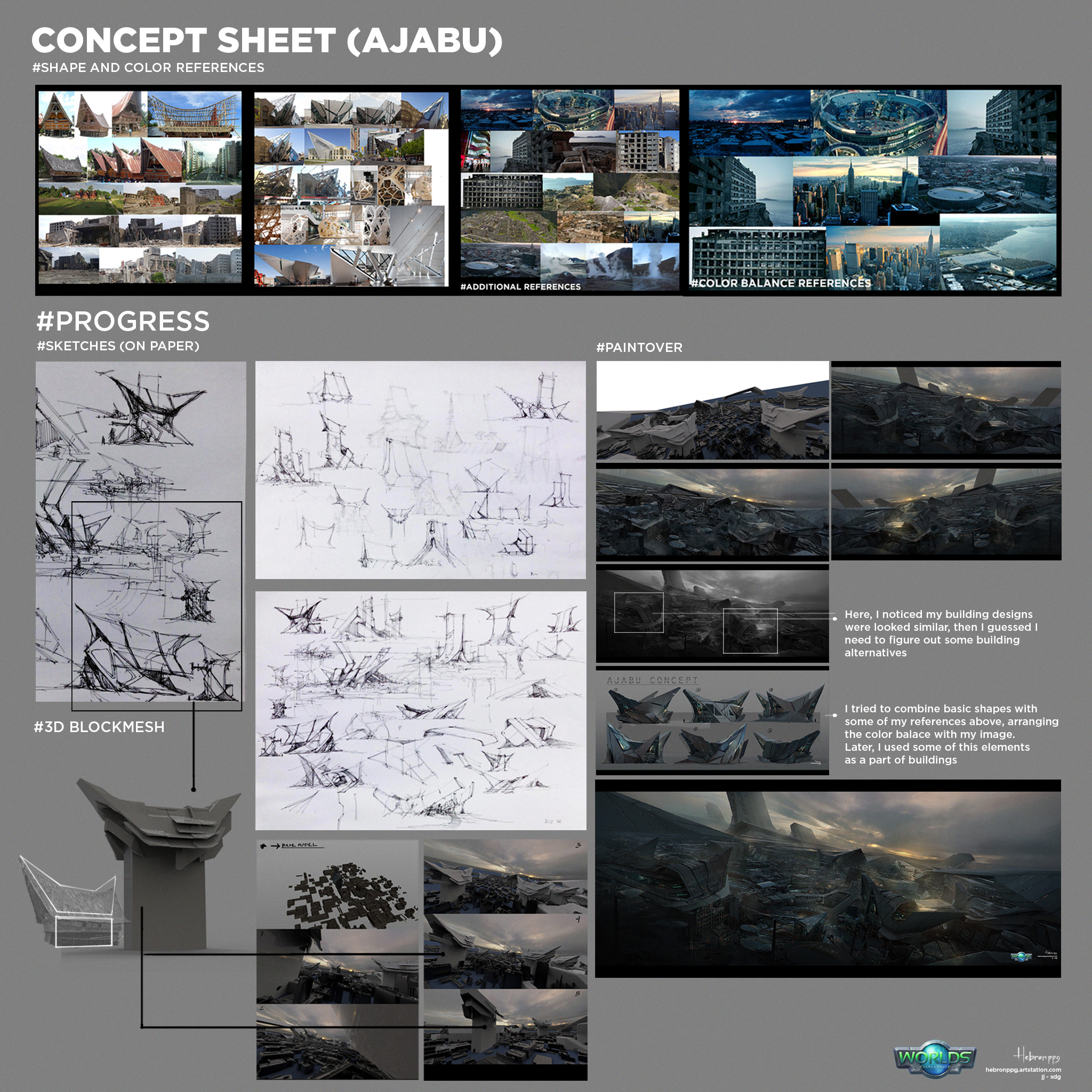
Hey guys, finally I have time to post my final..
So after I have read all your kind reply, then tried to consider some of your opinion, done a lot of trial and error I guess this is my final result.
Finally I want to say thank you and appreciate to you all who have visited my thread, in particular @jonatan-moonchild , @volenck, @flamer, who gave me useful inputs. I wish to see you again in next occasions or maybe in the next challenge.

So this is my FINAL. Below I also rewrite my concept story, so you don't need to go up.

AJABU
In the future, after a big war has been finished, there are survivors who save from big wars decide to build a new hope. Using the old ruined city as a base, they decide to build their home.
All in all, this is a new, an unfinished city, above the old ruins, where people who still have memories about how great their old days and deciding to build a new homeland (A- Jabu)

PS: Ajabu, personally I took this word from a local traditional language in Indonesia, Batak language. It is originally composed by 2 words A and Jabu ("A" means one, and "Jabu" means house). However, here I changed the meaning of house to a new hope/ home. :smile:

Wow, great job! I loved your sketches and the end result is also great! Maybe you could add some extra subtle lighting on the left, but since you decided to end it like that, it' still very solid as a piece. Good luck!

It's great to see the whole process and how you got to your end result. Wish you all the best man :smile:

Btw, I saw this in the rules: ''When you're done, add all your FINAL submission pieces to
your topic's first post and edit your topic title using this EXACT
format:
FINAL | WORLDS | 2D or 3D | Entry Name | Username''

I think you need to post your final pieces on the top if i'm not mistaken

Hope you win this man, your work is amazing - this has turned out incredibly well. Thanks so much for all the feedback and help :smile:

Man, this looks sooo realistic, I just can feel the atmosphere in the city. There is a bit tenseness but on the other hand it looks so calm. I like the way you imbed all elements, everything is tight. Wish you all the best in the contest!

You did great job here! I like overall mood of your image, composition, detailing - one of the strongest works in the Challenge, so... good luck! :smile:

Regards
Jonatan

@volenck
Thank you for your feedback too. I also wish u grow up and do better in the next challenge. Let me know if there is another prospective challenge.
PS: I have also looked at your final. It seems better than my first time visited there. I also hope our jury don't look too much about minor details. Wish u all the best too.

@jonatan-moonchild Thank you man. I also wish u can finish your thread. I am looking forward to seeing your final

@obra-kalla Welcome my thread. I am glad to see your opinion. Thank you

Woah it turned out really nice! And you got my advice too C: I'm so glad about it. ^^ This is truly a fascinating work. You put a lot of effort in it actually.
Nice and even when the contest ends keep at making really great enjoyable works like this! ^^ Good luck @hebronppg !

16 days later

Really Awesome work.