


Welcome to the Forum Fizzy, your doing great so far, keep it up, cant wait to see more ^^ 👍

 Thank you! I finally cleaned that up. Meanwhile started 3 more ..I have a habit of taking too long to finish a piece, then I lose interest in it and just start something else. I found 8 from recently i started and abandoned, that are decent enough to not delete, but not finished. There’s also been a number of drawings I felt I “outgrew” - became better before I finished them, and it would be easier to start from scratch than fix them. Anyone else thinking that?in24.4k
 Lady Death Fanart Collectible: Part 6 Polypaint and base Hi, it’s time to share with you another part of the process to create this fanart piece. Polypaint As this is my first collectible fanart I didn’t have previous experience with polypaint so I tried my best and played a bit with it.I wanted to give a ghostly and eerie look to Lady Death, she is beautiful and deadly, but at the end of the day she is a woman that died and was reborn at hell as an avenging spirit, that’s why I gave her skin tone a bluish very cold tone.As you will see I gave myself some creative freedom to deviate from the traditional color scheme that this characater has in comics and illustrations.To add a bit of sensuality by painting some freckles on the face and the chest. The dark nature of this character was the perfect excuse to gave her a kind of goth make up, very dark shadows around the eyes, blue lips and fingernails. I know that the original character includes sexy red lips but I wanted this girl to have a sexy but at the same time creepy look, that’s why we can see some thin veins emanating from her eyes. The biggest chromatic change I did for this character is at the hair. Lady Death has a characteristic white weavy hair but in my fanart I decided to gave her a very saturated blue color.The reason behind this wasn’t only an aesthetic choice. I want that the face area strongly pulls the attention of the viewer so this area needed a stronger contrast. Another reason is that I want her to have a more modern look, as I mentioned before, I’m strongly attracted to women with goth/punk look. I gave myself half an hour or more to analyse the work of experienced sculptors that create collectibles and I discovered that the use of darker values on the skin is often applied to create a greater sense of volume and three-dimensionality. I found that areas with heavy ambient occlusion are the perfect places to paint with darker colors in order to increase the separation between different forms. Even though she has a bluish skin tone, I used a bit of warmer hues in areas that, in real life, tend to go towards red and pink, this is very obvious in the nose, cheeks, and knuckles. Thinking with a logical mind it’s completely absurd to have warmer tones on the body of a zombie like creature but I didn’t want to limit myself by using only blue tones, it looks boring and artificial. In real life these colors are created by blood vessels in areas where the skin is very thin. ** Scythe **for her weapon I applied a cool gray with some warmer variations, this color scheme is influenced by the work of H.R giger. Base I’d like to talk about the design for the base which, to be honest, I forgot to develop along with the character.My main idea with the base is to show that Lady Death inhabits a very sterile and arid land, at the end of the day she is at hell.You can see a that she walks over dirt and rocks, a sign that she’s surrounded by death and loneliness. As part of the landscape we can see some bones and skulls to reinforce the idea of lack of living creatures, yet we can see three hands that try to reach her legs.This hands represent that all creatures are subordinated to her power and seek an evil blessing with a simple touch of the princess of the damned.1- The hand with skin burns represents the souls of those who are newcomers to hell, tortured souls that suffer for the sins comitted on earth.2- The hand with greenish rotten skin and pustules is the reminder of the decay that has infected the souls of those who have been trapped and have forgotten their humanity3- Last but not least, the hand of a demon shows that even dark creatures and entities bow before her presence. The cherry on the top, at least in my vision, are the simese twins that emerge from the ground, this malevolent creatures remind us that in hell there’s only perversion and any trace of innocence is lost. Thanks for reading till this pointI’m really happy to be very close to finish this creative journey, last but not least it’s mandatory to talk about splitting the sculpture in several pieces to be printed, this will be my last entry before showing the final rendered images. See yaMay Zbrush be with youin1.5k

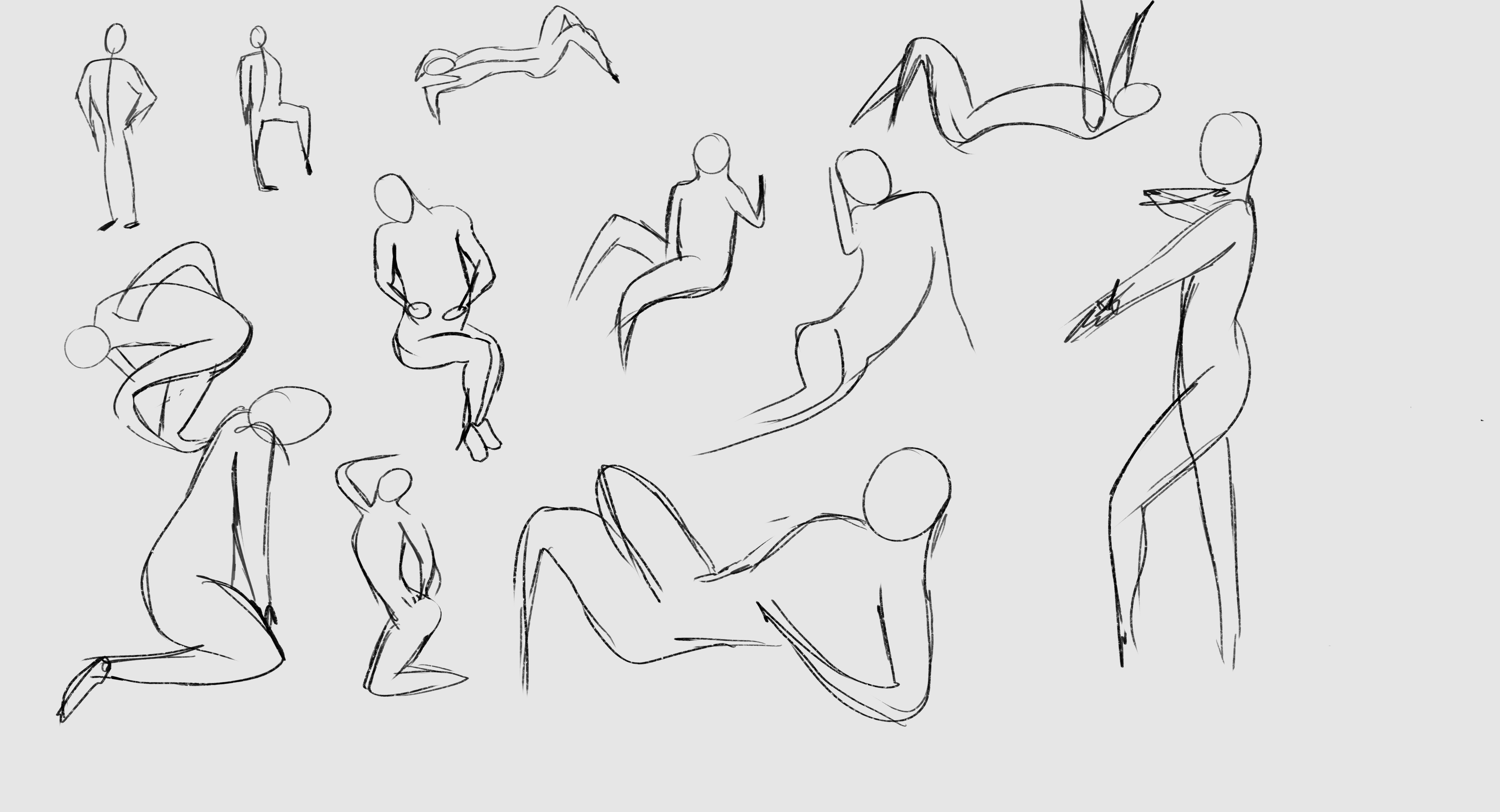
 memory 2min gartic phone, used ref 2m gartic, used ref for pose 2min gartic 2min gartic 2min gartic 2min gartic memory memory memory memory study memory memory memorymemory memory memory memory memory memory study memorystudy study stylized left memory, right study study memory memorymemory memory memory memorymemory memory, porportions r offmemory memorystudystudy memorymemorymemory memory memory memory memory memory memory memory, right leg is a bit broken The feeling of only getting 1 - 3 likes on a social media post will never not be discouraging. But nothing is discouraging enough to make me quit drawing. I think the strategy of drawing a lot of stuff and waiting a while to post is good though rather than posting it immediately and then feeling that sadness on the next set of drawingin

 studies studies juri study imagination, how I feel before a speech imagination imagination study something I drew for my presentation also drew this for my presentation, didn't fix the one hand being bigger than the other imagination + study study studies study study, I need to fix the face a bit based on screenshot from anime but in my style study. except for the eye study studies studies study. changed some things tho imagination imagination imagination study studies, except top right samurai based on anime screenshot wolverine studies, changed some of the poses a lil, not very good at all, but first time i drew the character ever. semi study studies study imagination imagination imagination , for first time ever i tried to draw over 3d model for middle pose, I dont like the result tbh, but it makes it much easier than coming up with it from memory.imagination, except right figurestudies imagination + studies, coming up with action poses r hard, these are not dynamic enough, I will redraw better ones in future. imagination , imagination imagination study, except for eye imagination imagination imagination doodles except for the two chrollos imagination storyboard thumbnail, idk if i ever shared this. my storyboards end up being a little detailed since i usually just draw in one layer.in22.3k
Hey Fizzy, welcome to Art School, a pleasure to be sharing this journey with you!
Assignments look more than good enough to familiarise you with the software, well done.
Looking forward to seeing how you do with the first drawing assignments. I think you'll find them fun!
Welcome to the forums Fizzy! Keep up the good work!
My first attempt at figure drawing... It's harder than i expected. Definitely a lot of room for improvement. Please tell me what i can do better.
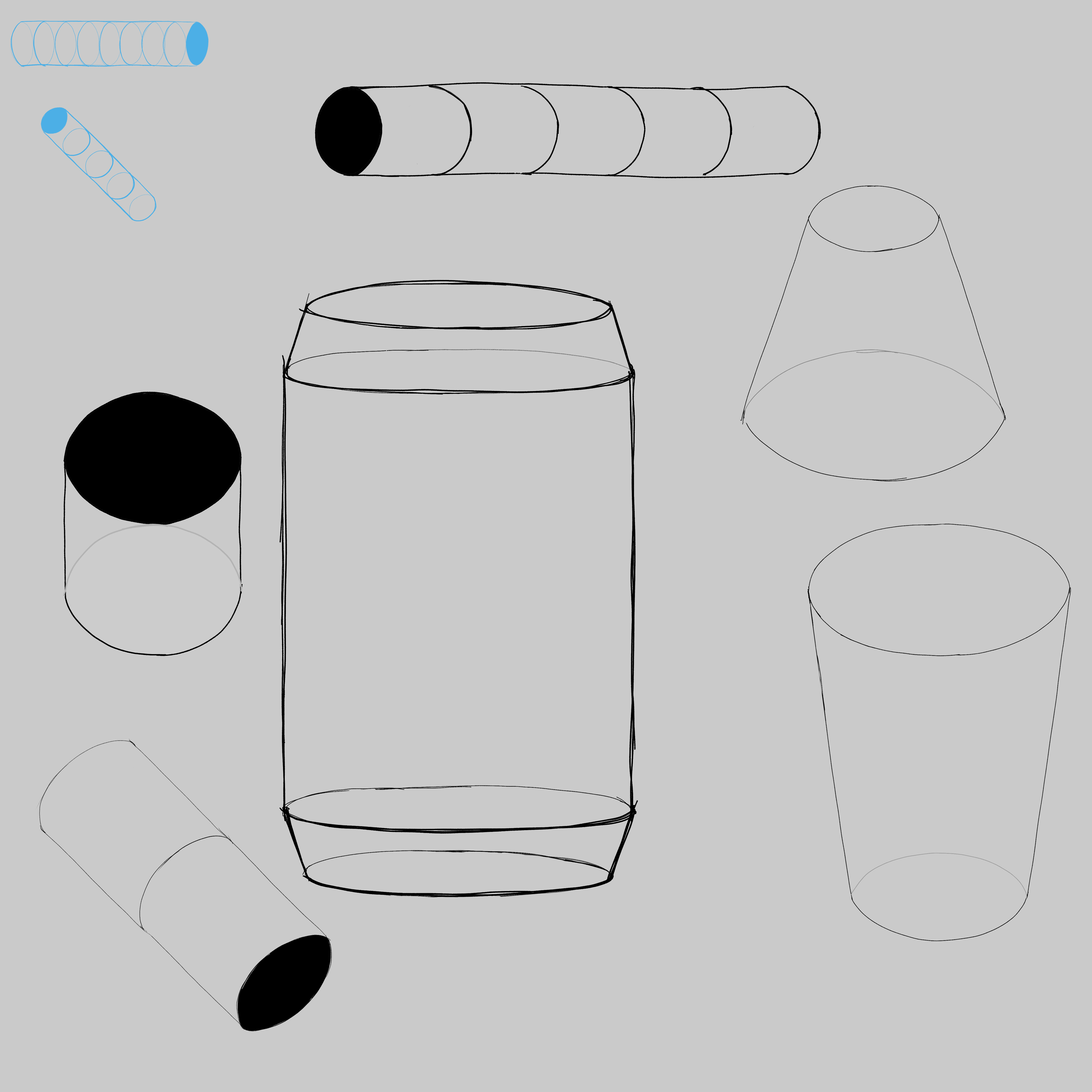
Looking really good Fizzy! Think you are getting a good idea of these objects in space. The only real issue I see is the cylinders don't always appear to be at the correct angle, or are rectangles. For example I would suggest drawing an elipse through the cylinders at least 5 elipses at each end, middle and each quarter, something like this will give you a much better understanding of the form of the cylinder. Here is an example of one I did recently.

I would do the chest and pelvis boxes just like you have done on yours, but really focus on those elipses on the cylinders, its a super important skill that will keep coming back! It will be super hard at first, thats normal. Just keep at it! Hopefully that is helpful Really nice job so far keep it up and let me know if you have any questions.


6 months later
Hi again. Did not find any willpower to study recently, that's why i did not post anything in past months. Decided to change it now so hopefully i can keep posting more often.
Here is my piece from one point perspective exercise.
I studied perspective in the past from different sources so i don't know if i should keep working on it.

Looking good, I don't see any perspective issues here so I'd say you're good to move on!

hey there, I don't think I've stumbled upon your journey before. I'm snakker, local noob here to give support as best I can as I also go through my journey
I see you feel you hit a wall with the gestures - I can understand you as I felt mine were bad at first but in truth, it's not the gesture that's good or bad really - it's more abstract and has to do with line quality and shape language - at least in order to get a result you may enjoy more or find more pleasing. There are some combinations of curves, tapered line segments, line weight combinations etc that will look more pleasing to your eyes than others, and nature would have it that poses typically show these combinations. That's why you will see artists recommend using tapered lines, C and S curves and straight lines.
Your gestures aren't bad, they convey poses as clear as gestures can, unless you add a little hint of construction such as contour lines, overlap etc that would convey more information than a strict gesture. I think what you don't like is the other aspect which I was exposing. Additionally, you might find difficulty in the proportions department, and that's ok, it's something to work on by drawing from reference and trying to really hit the spot on the proportions.
Now, one thing that can happen a lot in art practice is not practicing the right purpose. You might be doing gestures and end up shading and coloring them- could be a fun experiment sure, but maybe you lose sight of the purpose of the exercise. I recommend working on the mental attitude of having a clear purpose - not because I'm an expert at practice, but because I also have this issue a lot. Once you can focus on improving some fundamental aspect you improve much faster.
So for example, next time you do gestures, maybe give yourself some extra time at first, and work on really hitting that line quality. let it flow from the shoulder and make thoughtful decisions on the motion, the type of curve, try saying in your mind this is an S or a C or a strong line going down or whatnot and keep it simple, as few lines as possible for each gesture, like a puzzle. This will lead to working on pure line quality and pose thinking
Same thing when working on cylinders, think strictly on the 3-dimensionality and when working on proportions, just focus on the proportions and shapes (accuracy) and forget everything else - always focusing on the biggest things like the cylinders of the arms, the placement and size of the major masses etc
Focusing the practice is very effective, and allows you to manage energy and time better. Trust me, I took doing "extra" detail way overboard and in hind sight, I guess I'd do it again, but I think the focused approach is better.
Oh man, that was an essay I'm sorry about that. hopefully something useful came out of all of that
cheers!!
I did not expect such elaborated answer. Thank you very much for that!
I think you are right about them not being bad but not as pleasant for the eyes as i would like to and also i can put some blame on my inner perfectionist for that.
Gonna try to focus more on the shapes and try to not think about them as human figures, maybe that can help.
This really helped me a lot and i'll try to implement them next time.
Thank You.
Hello fizzy, welcome! it’s looking great, so far so good.


Here are some of exercises i did in last two days.
If anyone have any critique or advice is more than welcome to do so.
Gonna try to do the copy 5 of other artists pieces exercise soon, just need to calm down my inner perfectionist who tells me i should not do it untill i'm sure it comes out perfectly.
