• Gave myself 5 days to do something. This is what I managed to do. I'm trying to get better at illustrations, but I have patience to work on something for 3 days maximum :( Splash_Process.jpg5000x3140 2.21 MB Splash_Process-6.jpg3896x2429 2.83 MB concept list char copy.jpg5388x3000 1.7 MB
    20.8k
  • Did a character concept for a course.https://www.artstation.com/artwork/P6gm3y - more:) list1.jpg3541x1920 2.82 MB
    20.8k
  • Day 4: Star Wars May The 4th =] Queen Padmé Amidala in my art style! First time drawing her and I really enjoyed making this one! Used watercolours, ink pen, acrylic markers and gold paint for accents on my Canson mix media sketchbook. I hope you like it!
    82.4k
  • A creature design from a while back
    by
    6.7k
  • Here is some more recent stuff, I need to make more body studies
  • It's been a while and god, it is so cringe to go through all previous messages xDmy study.
    20.8k
  • Thank you! I finally cleaned that up. Meanwhile started 3 more ..I have a habit of taking too long to finish a piece, then I lose interest in it and just start something else. I found 8 from recently i started and abandoned, that are decent enough to not delete, but not finished. There’s also been a number of drawings I felt I “outgrew” - became better before I finished them, and it would be easier to start from scratch than fix them. Anyone else thinking that?
  • Lady Death Fanart Collectible: Part 6 Polypaint and base Hi, it’s time to share with you another part of the process to create this fanart piece. Polypaint As this is my first collectible fanart I didn’t have previous experience with polypaint so I tried my best and played a bit with it.I wanted to give a ghostly and eerie look to Lady Death, she is beautiful and deadly, but at the end of the day she is a woman that died and was reborn at hell as an avenging spirit, that’s why I gave her skin tone a bluish very cold tone.As you will see I gave myself some creative freedom to deviate from the traditional color scheme that this characater has in comics and illustrations.To add a bit of sensuality by painting some freckles on the face and the chest. The dark nature of this character was the perfect excuse to gave her a kind of goth make up, very dark shadows around the eyes, blue lips and fingernails. I know that the original character includes sexy red lips but I wanted this girl to have a sexy but at the same time creepy look, that’s why we can see some thin veins emanating from her eyes. The biggest chromatic change I did for this character is at the hair. Lady Death has a characteristic white weavy hair but in my fanart I decided to gave her a very saturated blue color.The reason behind this wasn’t only an aesthetic choice. I want that the face area strongly pulls the attention of the viewer so this area needed a stronger contrast. Another reason is that I want her to have a more modern look, as I mentioned before, I’m strongly attracted to women with goth/punk look. I gave myself half an hour or more to analyse the work of experienced sculptors that create collectibles and I discovered that the use of darker values on the skin is often applied to create a greater sense of volume and three-dimensionality. I found that areas with heavy ambient occlusion are the perfect places to paint with darker colors in order to increase the separation between different forms. Even though she has a bluish skin tone, I used a bit of warmer hues in areas that, in real life, tend to go towards red and pink, this is very obvious in the nose, cheeks, and knuckles. Thinking with a logical mind it’s completely absurd to have warmer tones on the body of a zombie like creature but I didn’t want to limit myself by using only blue tones, it looks boring and artificial. In real life these colors are created by blood vessels in areas where the skin is very thin. ** Scythe **for her weapon I applied a cool gray with some warmer variations, this color scheme is influenced by the work of H.R giger. Base I’d like to talk about the design for the base which, to be honest, I forgot to develop along with the character.My main idea with the base is to show that Lady Death inhabits a very sterile and arid land, at the end of the day she is at hell.You can see a that she walks over dirt and rocks, a sign that she’s surrounded by death and loneliness. As part of the landscape we can see some bones and skulls to reinforce the idea of lack of living creatures, yet we can see three hands that try to reach her legs.This hands represent that all creatures are subordinated to her power and seek an evil blessing with a simple touch of the princess of the damned.1- The hand with skin burns represents the souls of those who are newcomers to hell, tortured souls that suffer for the sins comitted on earth.2- The hand with greenish rotten skin and pustules is the reminder of the decay that has infected the souls of those who have been trapped and have forgotten their humanity3- Last but not least, the hand of a demon shows that even dark creatures and entities bow before her presence. The cherry on the top, at least in my vision, are the simese twins that emerge from the ground, this malevolent creatures remind us that in hell there’s only perversion and any trace of innocence is lost. Thanks for reading till this pointI’m really happy to be very close to finish this creative journey, last but not least it’s mandatory to talk about splitting the sculpture in several pieces to be printed, this will be my last entry before showing the final rendered images. See yaMay Zbrush be with you
    1.5k
  • memory 2min gartic phone, used ref 2m gartic, used ref for pose 2min gartic 2min gartic 2min gartic 2min gartic memory memory memory memory study memory memory memorymemory memory memory memory memory memory study memorystudy study stylized left memory, right study study memory memorymemory memory memory memorymemory memory, porportions r offmemory memorystudystudy memorymemorymemory memory memory memory memory memory memory memory, right leg is a bit broken The feeling of only getting 1 - 3 likes on a social media post will never not be discouraging. But nothing is discouraging enough to make me quit drawing. I think the strategy of drawing a lot of stuff and waiting a while to post is good though rather than posting it immediately and then feeling that sadness on the next set of drawing
  • Urban Dragon Girl Wip Urban Dragon Girl_wip1.jpg5000x5000 1.11 MB
  • Long time no see! New artworks produced lately
    6.7k
  • studies studies juri study imagination, how I feel before a speech imagination imagination study something I drew for my presentation also drew this for my presentation, didn't fix the one hand being bigger than the other imagination + study study studies study study, I need to fix the face a bit based on screenshot from anime but in my style study. except for the eye study studies studies study. changed some things tho imagination imagination imagination study studies, except top right samurai based on anime screenshot wolverine studies, changed some of the poses a lil, not very good at all, but first time i drew the character ever. semi study studies study imagination imagination imagination , for first time ever i tried to draw over 3d model for middle pose, I dont like the result tbh, but it makes it much easier than coming up with it from memory.imagination, except right figurestudies imagination + studies, coming up with action poses r hard, these are not dynamic enough, I will redraw better ones in future. imagination , imagination imagination study, except for eye imagination imagination imagination doodles except for the two chrollos imagination storyboard thumbnail, idk if i ever shared this. my storyboards end up being a little detailed since i usually just draw in one layer.
    by
    22.3k

Hi, my name is Alejandro (Ale(HANDRO)), I am an aspiring artist from the small state of Delaware. I Started Marc's Art School some years back. I've been slowly making progress on it over the years.

I used to post my progress on this forum (1 Topic per Term) before, however after some burnout I stopped doing so. I didn't stop drawing just making actual progress on the work for the classes. Instead I wanted to focus on areas I felt could improve (still need to improve). I realized the process I was following was too rigid, not allowing any room for creativity. Now I am instead focusing on drawing something fun while applying the lessons from the classes (it may not make sense).

After some time away, I am back on this forum in the hopes of getting some feedback and meeting some great artist. Originally was going to post a bunch of my previous works to start this off but instead I will just post a few of my favorite pieces and just include a few links where you can see the rest of my stuff. I didn't want to overload the first topic.

I Plan on updating this weekly follow my progress and hopefully get some feedback.

I look forward to meeting some aspiring and talented artist. Cheers!

https://www.deviantart.com/h4ndr0/gallery

So this past week I spent my time doing an architectural piece. A Fantasy House - Inspired by the traditional French architecture (they have the exposed trusses on the outside). It was a nice change of pace for me since I haven't done buildings for a while. Let me know what you think. :smile:

This looks great! It's got a very inviting feel to it. Try to make sure you double check your perspective though, the stuff on the left wall is a tiny bit off.

Thanks Hyoi,

this was my first attempt at doing perspective in a while, I did notice that some things were off (even in the minor details), I didn't focus on the perspective too much. I always tend to focus on it to much with these things so instead I decided to try for aesthetics. Ill be sure pay closer attention to this in the future.

So last week I did some grayscale portraits. to help refine the minor details of the face in my drawings. Take a look below and let me know what you think.

This week However I am working on composition and story telling ( in a sense). Below is a progress shot of my piece. feedback is welcome. ESPECIALLY if you have any thoughts on how to depict motion. I have some ideas but I am not sure what will work the best. for now I am focusing on actually drawing the piece completely before tackling this problem.

Hi Handro!

You're clearly very comfortable with draftsmanship and rendering! Your use of line-weight is awesome, and I am in love with the way you've drawn that hand with the buckler - it looks straight out of a 3D render, which is saying a lot.

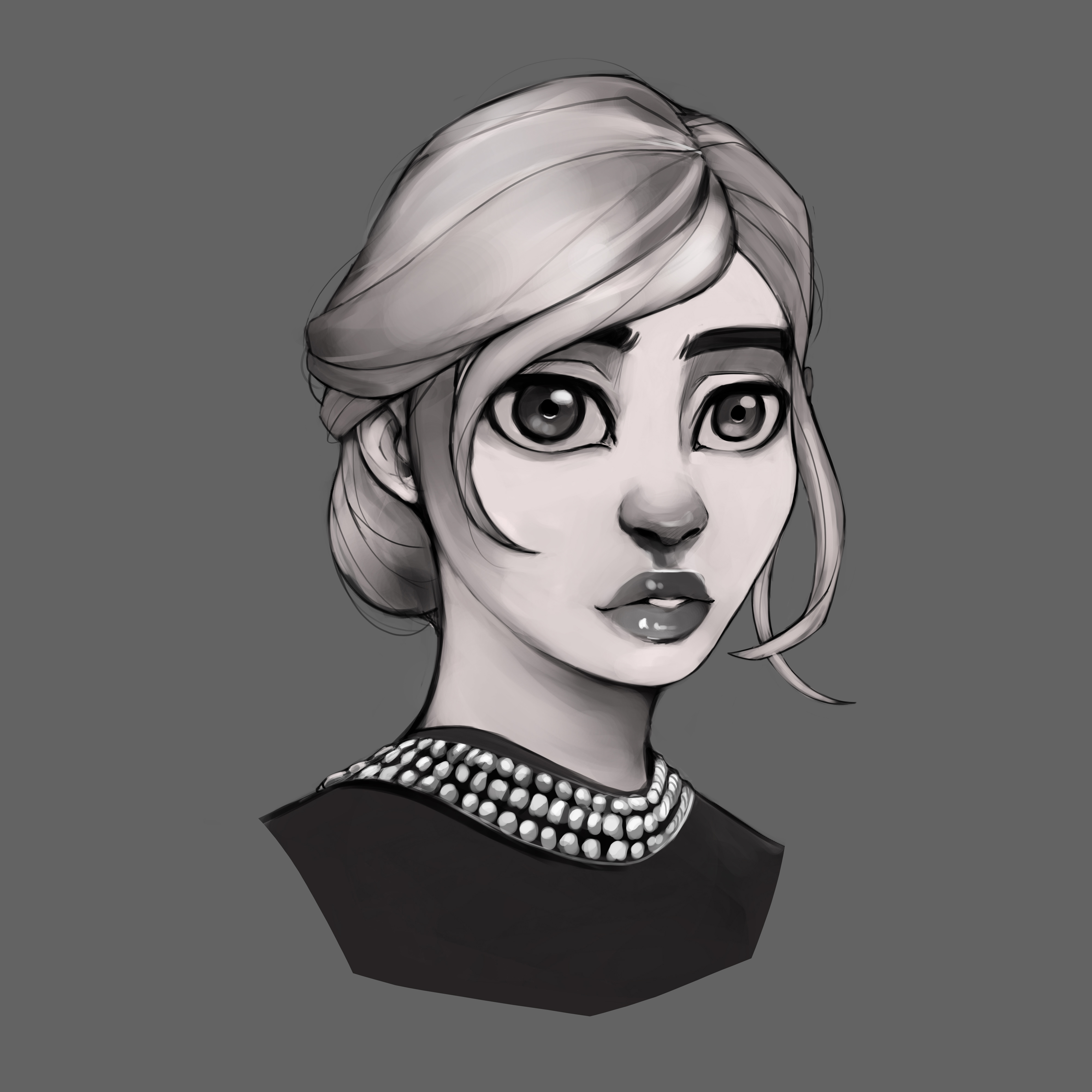
I don't think you really need to fix anything specific in your latest pieces - the proportions have a bit of an Angel Ganev thing going on, which is fine. Areas to look into improving are mostly anatomy and the planes of the face. The construction of your noses is a bit-samey and not as confident as the rest of the drawing - make sure you review that, but you could also double-check eyelids and lips! Photo references with strong lighting will also allow you to read the planes of the face better, and put that wonderful rendering skill to good use. Eventually you'll want to start planning your global values a bit better, which is the essential skill for an easy transition to color. Great head studies, keep doing more!

As for your action piece, it's looking good so far. Motion is better suggested through exaggerations, and the way you're pushing that perspective is a fantastic example of that. Dynamic poses can feature straight elements depicted as slightly curved, for instance that sword could be displayed as a partial arc instead of a straight edge. This even applies to limbs, in some cases! Having an off-balance center of gravity and strong reliance on line of action also helps a lot. I don't think there is any need to display motion blur, so keep doing the kind of rendering you've been doing so far :smile:

Thanks for the Feedback Von.

I definitely agree with everything you said. they originally started out as just grayscale studies but I started stylizing them. half way through. Regarding the eyes I'm still messing around with how I want to depict them. I think your right though. Ill definitely have to do a more 1 to 1 study in order to get the volumes of the face to pop out.

Regarding my progress piece, I should clarify the motion I want to depict, I want the arm in the back with the sword to look like its coming forward. but I rather not rely on curving too much as I think that might take away from the overall presentation. I will definitely keep this in mind however. Like I mentioned, I will probably have to mess with different styles to see what works best in the end.