


 Thank you! I finally cleaned that up. Meanwhile started 3 more ..I have a habit of taking too long to finish a piece, then I lose interest in it and just start something else. I found 8 from recently i started and abandoned, that are decent enough to not delete, but not finished. There’s also been a number of drawings I felt I “outgrew” - became better before I finished them, and it would be easier to start from scratch than fix them. Anyone else thinking that?in24.5k
 Lady Death Fanart Collectible: Part 6 Polypaint and base Hi, it’s time to share with you another part of the process to create this fanart piece. Polypaint As this is my first collectible fanart I didn’t have previous experience with polypaint so I tried my best and played a bit with it.I wanted to give a ghostly and eerie look to Lady Death, she is beautiful and deadly, but at the end of the day she is a woman that died and was reborn at hell as an avenging spirit, that’s why I gave her skin tone a bluish very cold tone.As you will see I gave myself some creative freedom to deviate from the traditional color scheme that this characater has in comics and illustrations.To add a bit of sensuality by painting some freckles on the face and the chest. The dark nature of this character was the perfect excuse to gave her a kind of goth make up, very dark shadows around the eyes, blue lips and fingernails. I know that the original character includes sexy red lips but I wanted this girl to have a sexy but at the same time creepy look, that’s why we can see some thin veins emanating from her eyes. The biggest chromatic change I did for this character is at the hair. Lady Death has a characteristic white weavy hair but in my fanart I decided to gave her a very saturated blue color.The reason behind this wasn’t only an aesthetic choice. I want that the face area strongly pulls the attention of the viewer so this area needed a stronger contrast. Another reason is that I want her to have a more modern look, as I mentioned before, I’m strongly attracted to women with goth/punk look. I gave myself half an hour or more to analyse the work of experienced sculptors that create collectibles and I discovered that the use of darker values on the skin is often applied to create a greater sense of volume and three-dimensionality. I found that areas with heavy ambient occlusion are the perfect places to paint with darker colors in order to increase the separation between different forms. Even though she has a bluish skin tone, I used a bit of warmer hues in areas that, in real life, tend to go towards red and pink, this is very obvious in the nose, cheeks, and knuckles. Thinking with a logical mind it’s completely absurd to have warmer tones on the body of a zombie like creature but I didn’t want to limit myself by using only blue tones, it looks boring and artificial. In real life these colors are created by blood vessels in areas where the skin is very thin. ** Scythe **for her weapon I applied a cool gray with some warmer variations, this color scheme is influenced by the work of H.R giger. Base I’d like to talk about the design for the base which, to be honest, I forgot to develop along with the character.My main idea with the base is to show that Lady Death inhabits a very sterile and arid land, at the end of the day she is at hell.You can see a that she walks over dirt and rocks, a sign that she’s surrounded by death and loneliness. As part of the landscape we can see some bones and skulls to reinforce the idea of lack of living creatures, yet we can see three hands that try to reach her legs.This hands represent that all creatures are subordinated to her power and seek an evil blessing with a simple touch of the princess of the damned.1- The hand with skin burns represents the souls of those who are newcomers to hell, tortured souls that suffer for the sins comitted on earth.2- The hand with greenish rotten skin and pustules is the reminder of the decay that has infected the souls of those who have been trapped and have forgotten their humanity3- Last but not least, the hand of a demon shows that even dark creatures and entities bow before her presence. The cherry on the top, at least in my vision, are the simese twins that emerge from the ground, this malevolent creatures remind us that in hell there’s only perversion and any trace of innocence is lost. Thanks for reading till this pointI’m really happy to be very close to finish this creative journey, last but not least it’s mandatory to talk about splitting the sculpture in several pieces to be printed, this will be my last entry before showing the final rendered images. See yaMay Zbrush be with youin1.5k


 memory 2min gartic phone, used ref 2m gartic, used ref for pose 2min gartic 2min gartic 2min gartic 2min gartic memory memory memory memory study memory memory memorymemory memory memory memory memory memory study memorystudy study stylized left memory, right study study memory memorymemory memory memory memorymemory memory, porportions r offmemory memorystudystudy memorymemorymemory memory memory memory memory memory memory memory, right leg is a bit broken The feeling of only getting 1 - 3 likes on a social media post will never not be discouraging. But nothing is discouraging enough to make me quit drawing. I think the strategy of drawing a lot of stuff and waiting a while to post is good though rather than posting it immediately and then feeling that sadness on the next set of drawingin


 studies studies juri study imagination, how I feel before a speech imagination imagination study something I drew for my presentation also drew this for my presentation, didn't fix the one hand being bigger than the other imagination + study study studies study study, I need to fix the face a bit based on screenshot from anime but in my style study. except for the eye study studies studies study. changed some things tho imagination imagination imagination study studies, except top right samurai based on anime screenshot wolverine studies, changed some of the poses a lil, not very good at all, but first time i drew the character ever. semi study studies study imagination imagination imagination , for first time ever i tried to draw over 3d model for middle pose, I dont like the result tbh, but it makes it much easier than coming up with it from memory.imagination, except right figurestudies imagination + studies, coming up with action poses r hard, these are not dynamic enough, I will redraw better ones in future. imagination , imagination imagination study, except for eye imagination imagination imagination doodles except for the two chrollos imagination storyboard thumbnail, idk if i ever shared this. my storyboards end up being a little detailed since i usually just draw in one layer.in22.4k


19 days later
I'm no professional (i'm still learning many of the fundamentals) so I wont be able to tell you exactly what to do but I can give my two cents. What make these hard to read for me are the colors/lighting. It looks like there's not enough contrast which makes the arms blend in with the body. This also applies to the colors, the values look the same all around the character making your eye wander and not really settle anywhere. To fix that you could maybe tone the colors down in parts around the illustration to focus the eye on the middle of the frame or the face. You can try Overwatch concept art for reference.
Besides that I think these designs are super cool and interesting. The shapes you use seem consistent through out the character which helps pull the design together.
I wish you good luck and I can't wait to see you improve.
19 days later
Your pictures are still outstanding and far exceed my skill level! I'm no professional artist, so my advice may overlook niche areas that could be improved. But my first impression is that there isn't proper value in your pictures. This is mostly in your latter two pictures (the girls in tech suits). The darkest part of their suits blends in with the dark grey background you used and almost gives the impression that her whitish armor is floating. This can be easily fixed by adding contrast between the characters and the background. In other words, make either the background or suit lighter than the other.
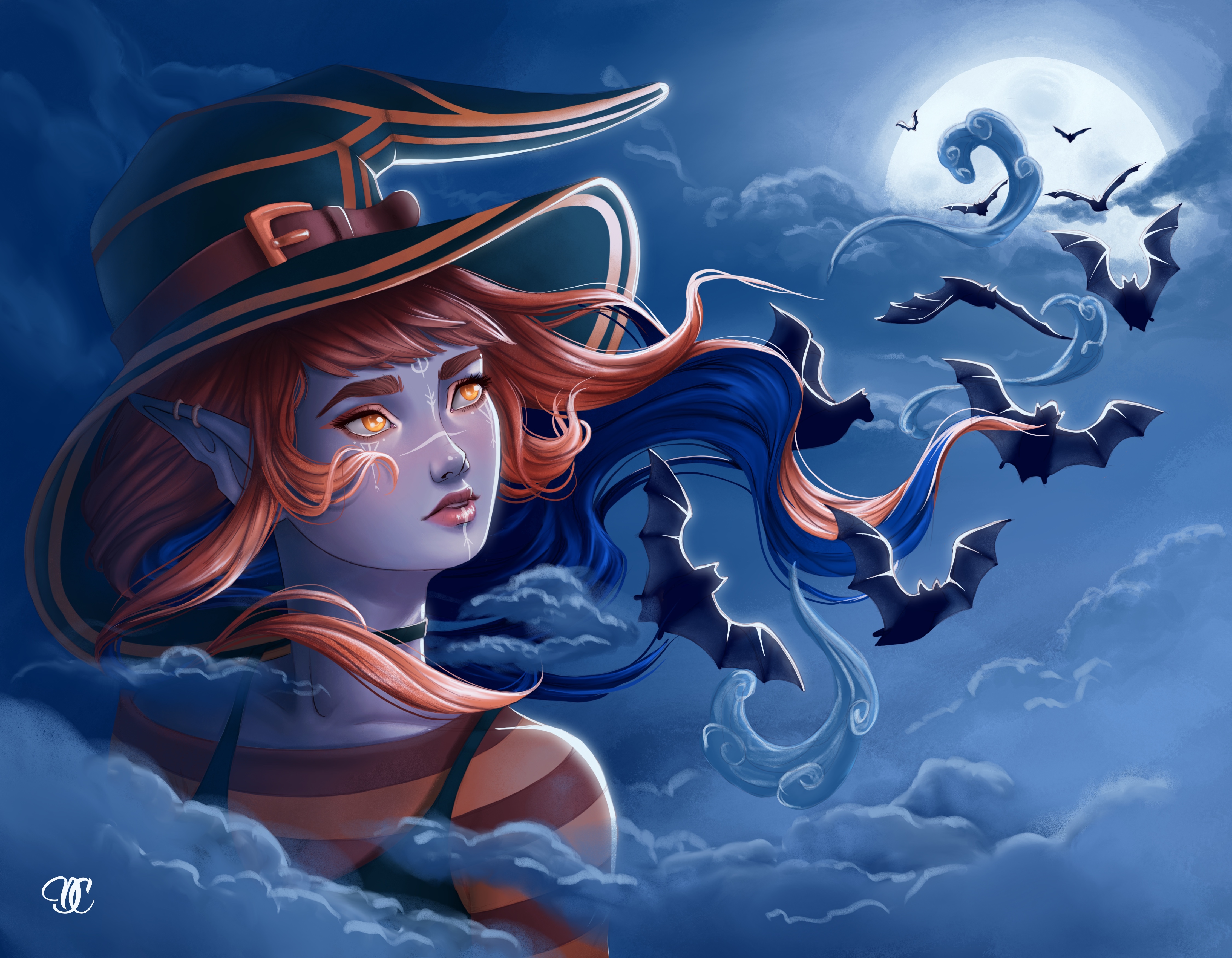
It's a similar story with the witch in your first picture (although not so much). The orange/reds add a nice contrast that helps the girl stand out. But (in my personal opinion) the blues blend in with the background too much. Adding rim lighting is a good way to fix this, and I see you have already done this to some extent.
As for mood, your first picture captures it best. As for the second, I'd personally illustrate her floating (instead of standing) for that final whimsical touch. I cannot comment too much on the latter, because she has more of a blank expression and I don't really know what her intentions are. Additionally, the foreshortening of her left hand is slightly off and makes her hand appear to connect directly to her shoulder.
Your pictures are still outstanding and appear close to professional! (to me at least). I really like the flow you created in the first picture (from the witch towards the moon)! I hope my tips help to some extent.
14 days later
I fully agree with the previous comments.
My main gripe is about the posings themselves, and particularly the neck. All of this looks pretty stiff/rigid and lacks of "life" –in other words, the human body doesn't act this way, it is way smoother. For example, in the second piece, the body of the lady looks like it was bent as a whole instead of having only its spine bent and the limbs (particularly the left arm) following it as an element made of two straight other elements.
As for the necks, it seems your characters have their head attached to the top of a rigid part and turned around, when the neck actually is a set of vertebraes which all move in conjonction, forming a smooth curve. Right now, those characters look more like some sort of action figures than living beings... Also, the right shoulder of the witch looks to be slightly wider than the left one. Be careful with the perspective of her face too, as her left eye should be closer to the line of the nose, leaving a small space between the eye itself and the side of the face.
My advice would be to find some references of the human body in various poses, preferably as photographies, and study them. If you feel like it, you could also install the free app Daz Studio and use its various provided figures as templates once posed how you want them. You could screencap the view, or make a rough render that you import in your drawing software as a basis to work from.
Keep up the good work!
Suggested Topics
| Topic | Category | Replies | Views | Activity |
|---|---|---|---|---|
| Architectural Practice Render - Photoshop | Art Critique | 1 | 1.2k | May '19 |
| Suggestions and advice | Art Critique | 1 | 971 | May '19 |
| Term 2 Noses am i blocking them in, in the right way? | Art Critique | 1 | 951 | Jan '21 |
| First attempt - Please critique | Art Critique | 8 | 1.9k | Sep '18 |
| Critique and Feedback Needed | Art Critique | 2 | 1.2k | Apr '17 |