• Gave myself 5 days to do something. This is what I managed to do. I'm trying to get better at illustrations, but I have patience to work on something for 3 days maximum :( Splash_Process.jpg5000x3140 2.21 MB Splash_Process-6.jpg3896x2429 2.83 MB concept list char copy.jpg5388x3000 1.7 MB
    20.7k
  • Did a character concept for a course.https://www.artstation.com/artwork/P6gm3y - more:) list1.jpg3541x1920 2.82 MB
    20.7k
  • Day 4: Star Wars May The 4th =] Queen Padmé Amidala in my art style! First time drawing her and I really enjoyed making this one! Used watercolours, ink pen, acrylic markers and gold paint for accents on my Canson mix media sketchbook. I hope you like it!
    82.0k
  • A creature design from a while back
    by
    6.6k
  • Here is some more recent stuff, I need to make more body studies
  • It's been a while and god, it is so cringe to go through all previous messages xDmy study.
    20.7k
  • Thank you! I finally cleaned that up. Meanwhile started 3 more ..I have a habit of taking too long to finish a piece, then I lose interest in it and just start something else. I found 8 from recently i started and abandoned, that are decent enough to not delete, but not finished. There’s also been a number of drawings I felt I “outgrew” - became better before I finished them, and it would be easier to start from scratch than fix them. Anyone else thinking that?
  • Lady Death Fanart Collectible: Part 6 Polypaint and base Hi, it’s time to share with you another part of the process to create this fanart piece. Polypaint As this is my first collectible fanart I didn’t have previous experience with polypaint so I tried my best and played a bit with it.I wanted to give a ghostly and eerie look to Lady Death, she is beautiful and deadly, but at the end of the day she is a woman that died and was reborn at hell as an avenging spirit, that’s why I gave her skin tone a bluish very cold tone.As you will see I gave myself some creative freedom to deviate from the traditional color scheme that this characater has in comics and illustrations.To add a bit of sensuality by painting some freckles on the face and the chest. The dark nature of this character was the perfect excuse to gave her a kind of goth make up, very dark shadows around the eyes, blue lips and fingernails. I know that the original character includes sexy red lips but I wanted this girl to have a sexy but at the same time creepy look, that’s why we can see some thin veins emanating from her eyes. The biggest chromatic change I did for this character is at the hair. Lady Death has a characteristic white weavy hair but in my fanart I decided to gave her a very saturated blue color.The reason behind this wasn’t only an aesthetic choice. I want that the face area strongly pulls the attention of the viewer so this area needed a stronger contrast. Another reason is that I want her to have a more modern look, as I mentioned before, I’m strongly attracted to women with goth/punk look. I gave myself half an hour or more to analyse the work of experienced sculptors that create collectibles and I discovered that the use of darker values on the skin is often applied to create a greater sense of volume and three-dimensionality. I found that areas with heavy ambient occlusion are the perfect places to paint with darker colors in order to increase the separation between different forms. Even though she has a bluish skin tone, I used a bit of warmer hues in areas that, in real life, tend to go towards red and pink, this is very obvious in the nose, cheeks, and knuckles. Thinking with a logical mind it’s completely absurd to have warmer tones on the body of a zombie like creature but I didn’t want to limit myself by using only blue tones, it looks boring and artificial. In real life these colors are created by blood vessels in areas where the skin is very thin. ** Scythe **for her weapon I applied a cool gray with some warmer variations, this color scheme is influenced by the work of H.R giger. Base I’d like to talk about the design for the base which, to be honest, I forgot to develop along with the character.My main idea with the base is to show that Lady Death inhabits a very sterile and arid land, at the end of the day she is at hell.You can see a that she walks over dirt and rocks, a sign that she’s surrounded by death and loneliness. As part of the landscape we can see some bones and skulls to reinforce the idea of lack of living creatures, yet we can see three hands that try to reach her legs.This hands represent that all creatures are subordinated to her power and seek an evil blessing with a simple touch of the princess of the damned.1- The hand with skin burns represents the souls of those who are newcomers to hell, tortured souls that suffer for the sins comitted on earth.2- The hand with greenish rotten skin and pustules is the reminder of the decay that has infected the souls of those who have been trapped and have forgotten their humanity3- Last but not least, the hand of a demon shows that even dark creatures and entities bow before her presence. The cherry on the top, at least in my vision, are the simese twins that emerge from the ground, this malevolent creatures remind us that in hell there’s only perversion and any trace of innocence is lost. Thanks for reading till this pointI’m really happy to be very close to finish this creative journey, last but not least it’s mandatory to talk about splitting the sculpture in several pieces to be printed, this will be my last entry before showing the final rendered images. See yaMay Zbrush be with you
    1.5k
  • memory 2min gartic phone, used ref 2m gartic, used ref for pose 2min gartic 2min gartic 2min gartic 2min gartic memory memory memory memory study memory memory memorymemory memory memory memory memory memory study memorystudy study stylized left memory, right study study memory memorymemory memory memory memorymemory memory, porportions r offmemory memorystudystudy memorymemorymemory memory memory memory memory memory memory memory, right leg is a bit broken The feeling of only getting 1 - 3 likes on a social media post will never not be discouraging. But nothing is discouraging enough to make me quit drawing. I think the strategy of drawing a lot of stuff and waiting a while to post is good though rather than posting it immediately and then feeling that sadness on the next set of drawing
  • Urban Dragon Girl Wip Urban Dragon Girl_wip1.jpg5000x5000 1.11 MB
  • Long time no see! New artworks produced lately
    6.6k
  • studies studies juri study imagination, how I feel before a speech imagination imagination study something I drew for my presentation also drew this for my presentation, didn't fix the one hand being bigger than the other imagination + study study studies study study, I need to fix the face a bit based on screenshot from anime but in my style study. except for the eye study studies studies study. changed some things tho imagination imagination imagination study studies, except top right samurai based on anime screenshot wolverine studies, changed some of the poses a lil, not very good at all, but first time i drew the character ever. semi study studies study imagination imagination imagination , for first time ever i tried to draw over 3d model for middle pose, I dont like the result tbh, but it makes it much easier than coming up with it from memory.imagination, except right figurestudies imagination + studies, coming up with action poses r hard, these are not dynamic enough, I will redraw better ones in future. imagination , imagination imagination study, except for eye imagination imagination imagination doodles except for the two chrollos imagination storyboard thumbnail, idk if i ever shared this. my storyboards end up being a little detailed since i usually just draw in one layer.
    by
    22.2k

Hi and thanks for checking in! My name is Junyeong, but you can call me Jun or Leeireo. I started teaching myself to draw back in about 2017 near the end of my middle school years and I've continued to develop a passion for art ever since. Over the years I've improved a lot, but now I've reached a point where it's slowed down quite a bit due to me not knowing where to go next. So, after months of consideration, I've finally decided to enroll in ART School!

This is my progress before starting ART School in 2021, Dec. 30th. (KST)

I'm fairly proud of these four artworks and if I was told to recreate them, I probably wouldn't be able to haha.
After finishing ART School, I would love to be able to create at a "League Splash Art" level. It won't be easy, but with determination and guidance, I'm sure it'll work out! Maybe I can look back at this post in a few years time and be able to smile :smile:
The next post will most likely be the perspective homework from term 1. That's it for now. Thanks again!

There are 96 replies with an estimated read time of 12 minutes.

I love the way you use color. Looking forward to see how you improve!

thank you! Looking forward to the journey as well!

I've drawn my room in one point perspective! Up next I will be drawing a street corner from reference for the assignment. Criticism is always welcome!

Very nice paintings Jun! I'm looking forward to see your progress!

Wow! I'm really starting to feel the challenge. Up until now I've always neglected learning how to draw most of the facial features in full detail and in space. I will go and refine my knowledge of all of the facial features before continuing!

criticism is always welcome!

I've reviewed the anatomy head lesson and tried to draw two heads from imagination.

Criticism is always welcome!

Wow, so many things already!

First of all great job! Your shading looks awesome! Let me try to give some feedback...

1p Perspective
Nice room, i think you understand the concept very well! One thing i think you can do better is to give more attention to the size and thickness of the objects. it looks a little strange to me, but i'm not sure exactly what it is (maybe the door and chair thickness, the floor tile or the shading on the bed. You can also work on your lines a little, giving things that are closer to us thicker lines.
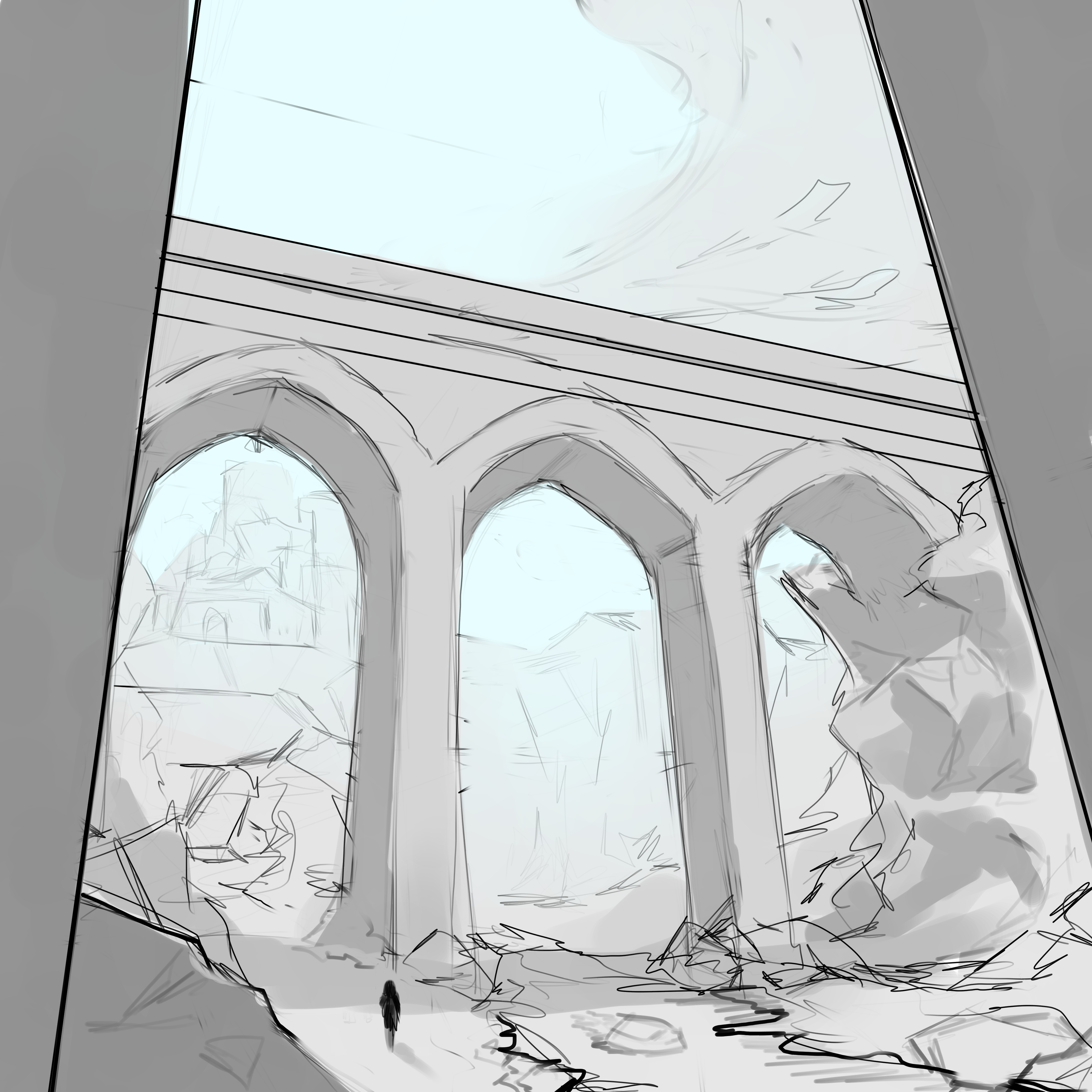
2p Perspective
Good job! I think you could have spent a little more time in this though, working a little more on the windows and doors and the thickness of things... I don't know if you did this, but i think it's a good practice to make the straight lines free handly... i think you used the line tool by the fixed thickness of the lines.

Face/Head
Nice work again! The top of the head of the left one is a little too short and the ears could be sent a little more to the back. The ears in the right one look kinda small and the shading is making the forehead look too flat in both. I recommend that you take a look at the Asaro Head to understand the planes of the face better.

You're doing great, and so fast! It took me ages to get to those assignments, hehe.
Hope this helps! keep it up!

really great stuff for your early postings! for your one point perspective room its more or a tiny addition that you could add or keep in mind for the future is Ambient Occlusion where you have darker deeper shadows in places where light has a harder time reaching like on the bottom shelves of the bookshelf or under the bed since they have a harder time bouncing light in those areas, and your faces look really good already.

  • for the ones from imagination same advice with what Darts said but I would like to add that for the face on the left it could be a problem with the chin and area below the forehead being too long as well it just depends on how you look at the problem proportion wise with the face measurements. It could be both things are the issue, but keep up the good work and great studies! :smile:

Thank you for the insightful criticisms Douglas! I'll make sure to keep these in mind!

1p Perspective
You're right! After drawing it all I felt like the size of the bed and the desk / chair looked very odd next to each other. And I think I know what you mean about the lines. It probably looks strange cause of all the random line weight changes throughout the whole sketch.

2p Perspective
Yes.. it definitely could use more work. The reference I used was very detailed so I rushed and simplified too much of it. Also you'd be right about the line tool. I did 99% of the work with it haha.. I'll try to utilize my own hand more!

Face/Head
I can definitely see those mistakes! I used to draw anime a lot so thinking of the head and its features in space is quite challenging still. I'll take a look at the Asaro Head, thanks for the recommendation!

Ambient Occlusion eh? :open_mouth: I remember seeing a video about it on YouTube from Marco Bucci, but never really used it much in my own works. I'll start giving it a go from now on!

I can see that as well! Although heads come in many shapes and sizes it's important to keep everything in "perfect" proportions when learning I think. I will go over the proportions lessons again.

Thank you for the criticisms, Joshua!