• Gave myself 5 days to do something. This is what I managed to do. I'm trying to get better at illustrations, but I have patience to work on something for 3 days maximum :( Splash_Process.jpg5000x3140 2.21 MB Splash_Process-6.jpg3896x2429 2.83 MB concept list char copy.jpg5388x3000 1.7 MB
    20.8k
  • Did a character concept for a course.https://www.artstation.com/artwork/P6gm3y - more:) list1.jpg3541x1920 2.82 MB
    20.8k
  • Day 4: Star Wars May The 4th =] Queen Padmé Amidala in my art style! First time drawing her and I really enjoyed making this one! Used watercolours, ink pen, acrylic markers and gold paint for accents on my Canson mix media sketchbook. I hope you like it!
    82.4k
  • A creature design from a while back
    by
    6.7k
  • Here is some more recent stuff, I need to make more body studies
  • It's been a while and god, it is so cringe to go through all previous messages xDmy study.
    20.8k
  • Thank you! I finally cleaned that up. Meanwhile started 3 more ..I have a habit of taking too long to finish a piece, then I lose interest in it and just start something else. I found 8 from recently i started and abandoned, that are decent enough to not delete, but not finished. There’s also been a number of drawings I felt I “outgrew” - became better before I finished them, and it would be easier to start from scratch than fix them. Anyone else thinking that?
  • Lady Death Fanart Collectible: Part 6 Polypaint and base Hi, it’s time to share with you another part of the process to create this fanart piece. Polypaint As this is my first collectible fanart I didn’t have previous experience with polypaint so I tried my best and played a bit with it.I wanted to give a ghostly and eerie look to Lady Death, she is beautiful and deadly, but at the end of the day she is a woman that died and was reborn at hell as an avenging spirit, that’s why I gave her skin tone a bluish very cold tone.As you will see I gave myself some creative freedom to deviate from the traditional color scheme that this characater has in comics and illustrations.To add a bit of sensuality by painting some freckles on the face and the chest. The dark nature of this character was the perfect excuse to gave her a kind of goth make up, very dark shadows around the eyes, blue lips and fingernails. I know that the original character includes sexy red lips but I wanted this girl to have a sexy but at the same time creepy look, that’s why we can see some thin veins emanating from her eyes. The biggest chromatic change I did for this character is at the hair. Lady Death has a characteristic white weavy hair but in my fanart I decided to gave her a very saturated blue color.The reason behind this wasn’t only an aesthetic choice. I want that the face area strongly pulls the attention of the viewer so this area needed a stronger contrast. Another reason is that I want her to have a more modern look, as I mentioned before, I’m strongly attracted to women with goth/punk look. I gave myself half an hour or more to analyse the work of experienced sculptors that create collectibles and I discovered that the use of darker values on the skin is often applied to create a greater sense of volume and three-dimensionality. I found that areas with heavy ambient occlusion are the perfect places to paint with darker colors in order to increase the separation between different forms. Even though she has a bluish skin tone, I used a bit of warmer hues in areas that, in real life, tend to go towards red and pink, this is very obvious in the nose, cheeks, and knuckles. Thinking with a logical mind it’s completely absurd to have warmer tones on the body of a zombie like creature but I didn’t want to limit myself by using only blue tones, it looks boring and artificial. In real life these colors are created by blood vessels in areas where the skin is very thin. ** Scythe **for her weapon I applied a cool gray with some warmer variations, this color scheme is influenced by the work of H.R giger. Base I’d like to talk about the design for the base which, to be honest, I forgot to develop along with the character.My main idea with the base is to show that Lady Death inhabits a very sterile and arid land, at the end of the day she is at hell.You can see a that she walks over dirt and rocks, a sign that she’s surrounded by death and loneliness. As part of the landscape we can see some bones and skulls to reinforce the idea of lack of living creatures, yet we can see three hands that try to reach her legs.This hands represent that all creatures are subordinated to her power and seek an evil blessing with a simple touch of the princess of the damned.1- The hand with skin burns represents the souls of those who are newcomers to hell, tortured souls that suffer for the sins comitted on earth.2- The hand with greenish rotten skin and pustules is the reminder of the decay that has infected the souls of those who have been trapped and have forgotten their humanity3- Last but not least, the hand of a demon shows that even dark creatures and entities bow before her presence. The cherry on the top, at least in my vision, are the simese twins that emerge from the ground, this malevolent creatures remind us that in hell there’s only perversion and any trace of innocence is lost. Thanks for reading till this pointI’m really happy to be very close to finish this creative journey, last but not least it’s mandatory to talk about splitting the sculpture in several pieces to be printed, this will be my last entry before showing the final rendered images. See yaMay Zbrush be with you
    1.5k
  • memory 2min gartic phone, used ref 2m gartic, used ref for pose 2min gartic 2min gartic 2min gartic 2min gartic memory memory memory memory study memory memory memorymemory memory memory memory memory memory study memorystudy study stylized left memory, right study study memory memorymemory memory memory memorymemory memory, porportions r offmemory memorystudystudy memorymemorymemory memory memory memory memory memory memory memory, right leg is a bit broken The feeling of only getting 1 - 3 likes on a social media post will never not be discouraging. But nothing is discouraging enough to make me quit drawing. I think the strategy of drawing a lot of stuff and waiting a while to post is good though rather than posting it immediately and then feeling that sadness on the next set of drawing
  • Urban Dragon Girl Wip Urban Dragon Girl_wip1.jpg5000x5000 1.11 MB
  • Long time no see! New artworks produced lately
    6.7k
  • studies studies juri study imagination, how I feel before a speech imagination imagination study something I drew for my presentation also drew this for my presentation, didn't fix the one hand being bigger than the other imagination + study study studies study study, I need to fix the face a bit based on screenshot from anime but in my style study. except for the eye study studies studies study. changed some things tho imagination imagination imagination study studies, except top right samurai based on anime screenshot wolverine studies, changed some of the poses a lil, not very good at all, but first time i drew the character ever. semi study studies study imagination imagination imagination , for first time ever i tried to draw over 3d model for middle pose, I dont like the result tbh, but it makes it much easier than coming up with it from memory.imagination, except right figurestudies imagination + studies, coming up with action poses r hard, these are not dynamic enough, I will redraw better ones in future. imagination , imagination imagination study, except for eye imagination imagination imagination doodles except for the two chrollos imagination storyboard thumbnail, idk if i ever shared this. my storyboards end up being a little detailed since i usually just draw in one layer.
    by
    22.4k

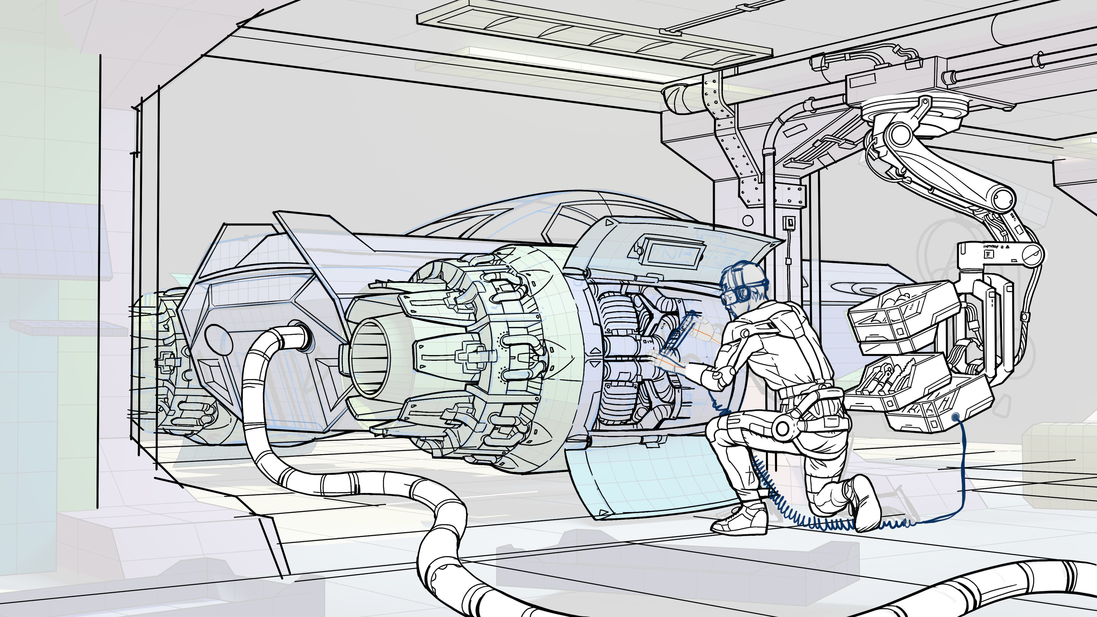
Here an update. This is being tough because it is my first time on many things. First perspective and inking (from the last 20 years at least). The first serious drawing with Clip Studio... Completing this picture is being hard like a puzzle, but it is satisfying :smile:

By the way... Can you help me? I have serious doubts... I should do with or without shadows?

Really good so far. Give's me some Ryan Otley Vibes. :smile:

not sure what you mean about shadows. from the looks of it you are opting for a comic style for it. I think what you have is good so far. if you decide to color just remember to adjust to hues and tones for the colors.

In my opinion though I think your spaceship drawing could really benefit from adjusting the line weights for the objects in the back. I know its a lot of work since its really detailed but I think reducing them will really make your drawings pop in the future.

I like this drawing, but I am strongly against the black shadows.

I know this is a classic comic-book effect, but it works best for really strong core-shadows, and even so, they're very rarely used in detailed illustrations like the comic book's cover. They're there to save time, really.

If it's not too late, leave the black shadow shapes out completely - do them justice in rendering. Shadows are delicious to render, picking up the ambient light's color, and subject to all sorts of effects like subsurface scattering, bounce light, and ambient occlusion. Don't do your picture a dirty by making the shadows black.

OMG! This is so amazing!!! Congrats!!! The level of detail in here is mind blowing! You're nailing it so far. Really well done 💙💙💙

I really enjoyed seeing your work flow for this! This looks stunning!

One thing I will say is that I liked when you added the dark shadows earlier in the process. I feel like with this amount of detail it helps to break things up a little. The area where the figure is working on the parts and the tool holder is a bit hard to make out.

Overall this is amazing work!

Wow really really awesome work!
I love how you concentrated the details of the engine to create a focal point!
Great that you dropped the black shadows and went with lighter tones!
Keep it up! :clap:

12 days later

Hi there! Thank you all for the kind comments. Here I started thinking about a new idea, this time for the 3 vanishing points perspective. Again I will use the 3D, also because I want to use a 3D model that I was working on.

I want to give it a fresh look and feel (colour ink and watercolour and so). I will draw the detail directly instead of sketching them.

That 3D model looks really good! Looking forward to the final piece :clap:

It's exciting to see someone using 3-D sculpts for their projects! Looking forward to this one!

Impressive work Llucia. Definitely cool seeing how you built up the 1 and 2 point perspective assignments. I was not really looking forward to any of the zbrush/3d sculpting elements - but after seeing how you crossed the mediums, made it look really fun.

The 3point persperctive piece, with the flying boat, reminds me of the Alliance ships in World of Warcraft, very cool. :smile:

Yay! In my previous job position, I did a lot of 3D overpaint. I got tired of this technique because I love painting from scratch, but I cannot avoid the practicality of having the perspective solved. So, I will use it but the minimum, just as a ref.

By the way, this is the model I am using for the sails ship.

It is a WIP. I am pretty stuck on it, so it is sleeping now.

I prefer the one on the left., its a bit more welcoming than the other two. the one on the right reminds me of something from the pirates of the Caribbean.

I think it would be nice if you have the same shadows from the middle one, but use the same warmth and brightness from the left one on a point on the ship to create a focal point.

Loving the process so far!

those ships are looking epic. agree with Von, the middle one is :+1:

Also agree with Lesley, adding some warmth to the middle one, making it an inviting adventure ship to travel on :smile: