• Gave myself 5 days to do something. This is what I managed to do. I'm trying to get better at illustrations, but I have patience to work on something for 3 days maximum :( Splash_Process.jpg5000x3140 2.21 MB Splash_Process-6.jpg3896x2429 2.83 MB concept list char copy.jpg5388x3000 1.7 MB
    20.8k
  • Did a character concept for a course.https://www.artstation.com/artwork/P6gm3y - more:) list1.jpg3541x1920 2.82 MB
    20.8k
  • Day 4: Star Wars May The 4th =] Queen Padmé Amidala in my art style! First time drawing her and I really enjoyed making this one! Used watercolours, ink pen, acrylic markers and gold paint for accents on my Canson mix media sketchbook. I hope you like it!
    82.4k
  • A creature design from a while back
    by
    6.7k
  • Here is some more recent stuff, I need to make more body studies
  • It's been a while and god, it is so cringe to go through all previous messages xDmy study.
    20.8k
  • Thank you! I finally cleaned that up. Meanwhile started 3 more ..I have a habit of taking too long to finish a piece, then I lose interest in it and just start something else. I found 8 from recently i started and abandoned, that are decent enough to not delete, but not finished. There’s also been a number of drawings I felt I “outgrew” - became better before I finished them, and it would be easier to start from scratch than fix them. Anyone else thinking that?
  • Lady Death Fanart Collectible: Part 6 Polypaint and base Hi, it’s time to share with you another part of the process to create this fanart piece. Polypaint As this is my first collectible fanart I didn’t have previous experience with polypaint so I tried my best and played a bit with it.I wanted to give a ghostly and eerie look to Lady Death, she is beautiful and deadly, but at the end of the day she is a woman that died and was reborn at hell as an avenging spirit, that’s why I gave her skin tone a bluish very cold tone.As you will see I gave myself some creative freedom to deviate from the traditional color scheme that this characater has in comics and illustrations.To add a bit of sensuality by painting some freckles on the face and the chest. The dark nature of this character was the perfect excuse to gave her a kind of goth make up, very dark shadows around the eyes, blue lips and fingernails. I know that the original character includes sexy red lips but I wanted this girl to have a sexy but at the same time creepy look, that’s why we can see some thin veins emanating from her eyes. The biggest chromatic change I did for this character is at the hair. Lady Death has a characteristic white weavy hair but in my fanart I decided to gave her a very saturated blue color.The reason behind this wasn’t only an aesthetic choice. I want that the face area strongly pulls the attention of the viewer so this area needed a stronger contrast. Another reason is that I want her to have a more modern look, as I mentioned before, I’m strongly attracted to women with goth/punk look. I gave myself half an hour or more to analyse the work of experienced sculptors that create collectibles and I discovered that the use of darker values on the skin is often applied to create a greater sense of volume and three-dimensionality. I found that areas with heavy ambient occlusion are the perfect places to paint with darker colors in order to increase the separation between different forms. Even though she has a bluish skin tone, I used a bit of warmer hues in areas that, in real life, tend to go towards red and pink, this is very obvious in the nose, cheeks, and knuckles. Thinking with a logical mind it’s completely absurd to have warmer tones on the body of a zombie like creature but I didn’t want to limit myself by using only blue tones, it looks boring and artificial. In real life these colors are created by blood vessels in areas where the skin is very thin. ** Scythe **for her weapon I applied a cool gray with some warmer variations, this color scheme is influenced by the work of H.R giger. Base I’d like to talk about the design for the base which, to be honest, I forgot to develop along with the character.My main idea with the base is to show that Lady Death inhabits a very sterile and arid land, at the end of the day she is at hell.You can see a that she walks over dirt and rocks, a sign that she’s surrounded by death and loneliness. As part of the landscape we can see some bones and skulls to reinforce the idea of lack of living creatures, yet we can see three hands that try to reach her legs.This hands represent that all creatures are subordinated to her power and seek an evil blessing with a simple touch of the princess of the damned.1- The hand with skin burns represents the souls of those who are newcomers to hell, tortured souls that suffer for the sins comitted on earth.2- The hand with greenish rotten skin and pustules is the reminder of the decay that has infected the souls of those who have been trapped and have forgotten their humanity3- Last but not least, the hand of a demon shows that even dark creatures and entities bow before her presence. The cherry on the top, at least in my vision, are the simese twins that emerge from the ground, this malevolent creatures remind us that in hell there’s only perversion and any trace of innocence is lost. Thanks for reading till this pointI’m really happy to be very close to finish this creative journey, last but not least it’s mandatory to talk about splitting the sculpture in several pieces to be printed, this will be my last entry before showing the final rendered images. See yaMay Zbrush be with you
    1.5k
  • memory 2min gartic phone, used ref 2m gartic, used ref for pose 2min gartic 2min gartic 2min gartic 2min gartic memory memory memory memory study memory memory memorymemory memory memory memory memory memory study memorystudy study stylized left memory, right study study memory memorymemory memory memory memorymemory memory, porportions r offmemory memorystudystudy memorymemorymemory memory memory memory memory memory memory memory, right leg is a bit broken The feeling of only getting 1 - 3 likes on a social media post will never not be discouraging. But nothing is discouraging enough to make me quit drawing. I think the strategy of drawing a lot of stuff and waiting a while to post is good though rather than posting it immediately and then feeling that sadness on the next set of drawing
  • Urban Dragon Girl Wip Urban Dragon Girl_wip1.jpg5000x5000 1.11 MB
  • Long time no see! New artworks produced lately
    6.7k
  • studies studies juri study imagination, how I feel before a speech imagination imagination study something I drew for my presentation also drew this for my presentation, didn't fix the one hand being bigger than the other imagination + study study studies study study, I need to fix the face a bit based on screenshot from anime but in my style study. except for the eye study studies studies study. changed some things tho imagination imagination imagination study studies, except top right samurai based on anime screenshot wolverine studies, changed some of the poses a lil, not very good at all, but first time i drew the character ever. semi study studies study imagination imagination imagination , for first time ever i tried to draw over 3d model for middle pose, I dont like the result tbh, but it makes it much easier than coming up with it from memory.imagination, except right figurestudies imagination + studies, coming up with action poses r hard, these are not dynamic enough, I will redraw better ones in future. imagination , imagination imagination study, except for eye imagination imagination imagination doodles except for the two chrollos imagination storyboard thumbnail, idk if i ever shared this. my storyboards end up being a little detailed since i usually just draw in one layer.
    by
    22.4k

Hello everyone! I'm Lukael, 32 from Quebec, Canada, and I just recently purchased Art School. I like to draw mostly characters, be it fanart of video games or original creations.

I've been drawing for my entire life but have been growing increasingly frustrated at my lack of progress/motivation over the last decade, so I've decided to take a leap of faith and I recently quit my job in order to put 100% of my focus into art and improving. Over the next year, I want to dedicate myself to completing this program, and then hopefully find a way to make a living from my art in the future.

Because I've never had any proper art training or schooling, I felt like it would be a good idea to start from the beginning and learn the fundamentals again, which I'm hoping this program can help with. I'm gonna be starting from Term 1 very soon and I look forward to sharing my experience with all of you, let's all become better artists together! I'm always open to feedback and critique!

If you'd like, you can check my stuff on my social media:
https://twitter.com/Lukael
https://www.facebook.com/LukaelArt/
https://www.instagram.com/lukaelart/

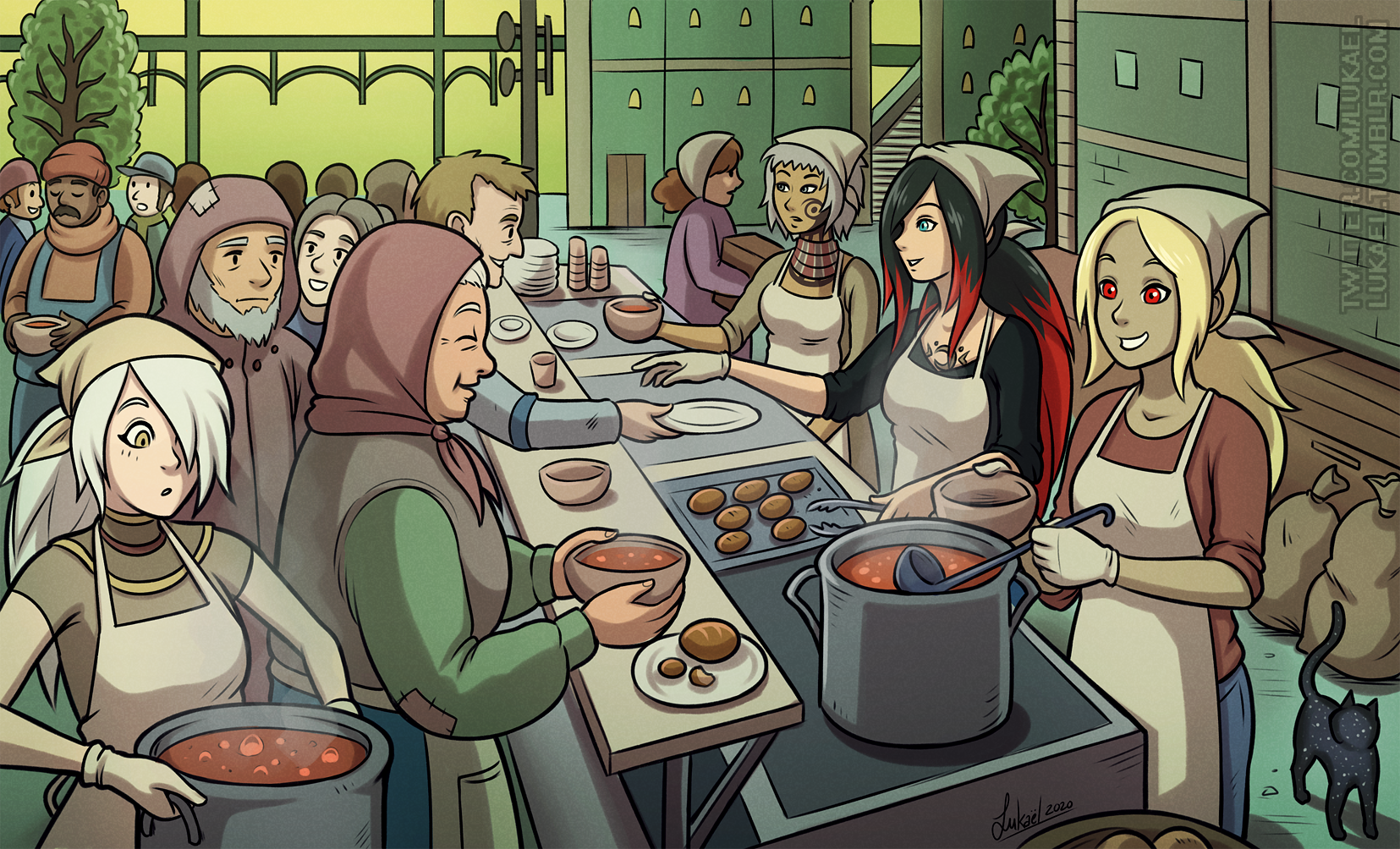
Here's a few of my recent pictures:


Also, this may be a stupid question, but how can you change your profile picture? I've looked in all the settings/profile pages and I can't seem to figure it out :sweat:

Welcome! You're work thus far is wonderful. You and I share a similar story for the most part. Given that I work in a theme park in California, I haven't been able to work since March. Being equally as frustrated with my own upward mobility, I decided to take advantage of my "down time" and focus on improving my art.

Having only been in this class for three weeks now I can honestly say there's nothing like it. From what I have seen the content is solid and even better the community is extremely supportive. We're all after the same goal.

Lastly, to change you profile pic go to the far right icon at the top and click profile. That should take you to page to where you can change it.

Looking forward to your progress.

Great work you've got there already. With a solid foundation like that you'll go far! I recommend you join the Art School discord chat as well :smile:

I've been drawing all my life, but starting at the absolute basic level with term 1 has helped me progress in ways I did not suspect. It's been about six months now and my art skills have leveled up tremendously just by doing my homework.

Looking forward to seeing your work, et un ptit bonjour venant de Montréal :smile:

You already have a well established style, which is extremely important! I think going through the fundamentals of the first terms will improve it even more. Looking forward to seeing how far you'll go.

Thanks for the nice words guys! I did join the Discord as well but I still can't figure out how to change my profile picture lol

Here's a commission I just finished, I've already been trying to implement some feedback I heard from Marc to other students in his past livestreams which I've been binging while drawing, overall pretty happy with a bit more action-y pose piece but open to feedback!

Finished another picture, this one was very busy so I kept the shading and details to a minimum so it wouldn't take longer than it already did! I tried incorporating some simple perspective and to have the lines point toward the object of focus on the right (the main character), overall I think it gets the situation across but I definitely want to work on improving perspective a lot in the future.

Hey Lukael!

First off, great work and I love your line-work, designs, and attention to detail. Even your color palette is spot on!

I am offering critique based on perspective based on your text above, but know that there are other (minor) improvements you could also do on your values and composition to increase the readability of the image.

First off, I noticed that your background is a bit "stiff" and takes away from the image a little bit. I cropped it out and immediately the image felt more organic to me (see result below).

Second of all, your camera's viewpoint is situated slightly ABOVE the crowd, looking down. The service counter is already done using this perspective. This means that there should be a vanishing point for the vertical lines in the drawing, as seen on my second iteration above. By just transforming the background to account for this third vanishing point, immediately the perspective felt more "right" to me.

Also, as a suggestion, I desaturated the background to give more attention to the bright and vivid characters in the foreground.

Bottom-line, try to keep the background consistent with the foreground perspective and you're golden!

Thanks a lot for the feedback, I can definitely see the improvement! Will keep those things in mind

9 days later

Finished another picture that I've been trying to get done for a long time, a fanart from the game "Catherine", I used a reference and initially tried using the same lighting but it didn't work at all, so I had to come up with different lighting from scratch but I tried to make it somewhat interesting? Struggled a lot with this one, I think it could be better but I tried my best, all feedback is welcome!

Still working on the program, practicing the figure drawing of Term 1 with cylinders and whatnot! in between I've been working on some personal art, here's Jean from Genshin Impact which I've been playing a bit. Feedback is welcomed!

Done watching the figure drawing video from Term 1 and did my first session, gonna try to make this into a daily routine! something I should have been doing for a long time, tho I am a bit skeptical about the benefits because it feels like I'm more practicing observation than anatomy per say? but I guess that's not entirely the point, more so just lines of action etc.... we'll see in a few weeks if I can see a difference!

Another personal art, from Gravity Rush, one of my favorite games! Used a number of references for this, from a spilled drink to a person tripping, ultimately I'm pretty happy with how it ended up. I rarely use much movement in my images so this was a fun challenge, and drawing food is surprisingly fun too!

You captured the pose so well! One question though: what did she trip on? Was it the cat? (cats like to do that to people). Would add to the storytelling if you have the culprit more defined.

Thank you! Honestly at first I had drawn a small ledge on the ground, like her foot got caught in the pavement or something like that, but trying to have it be within the frame messed a bit with the overall composition so I opted to leave it out to keep the focus on the character. She's rather clumsy anyways so I could see her just losing her balance even without any obstacle. Thank you for the feedback!