


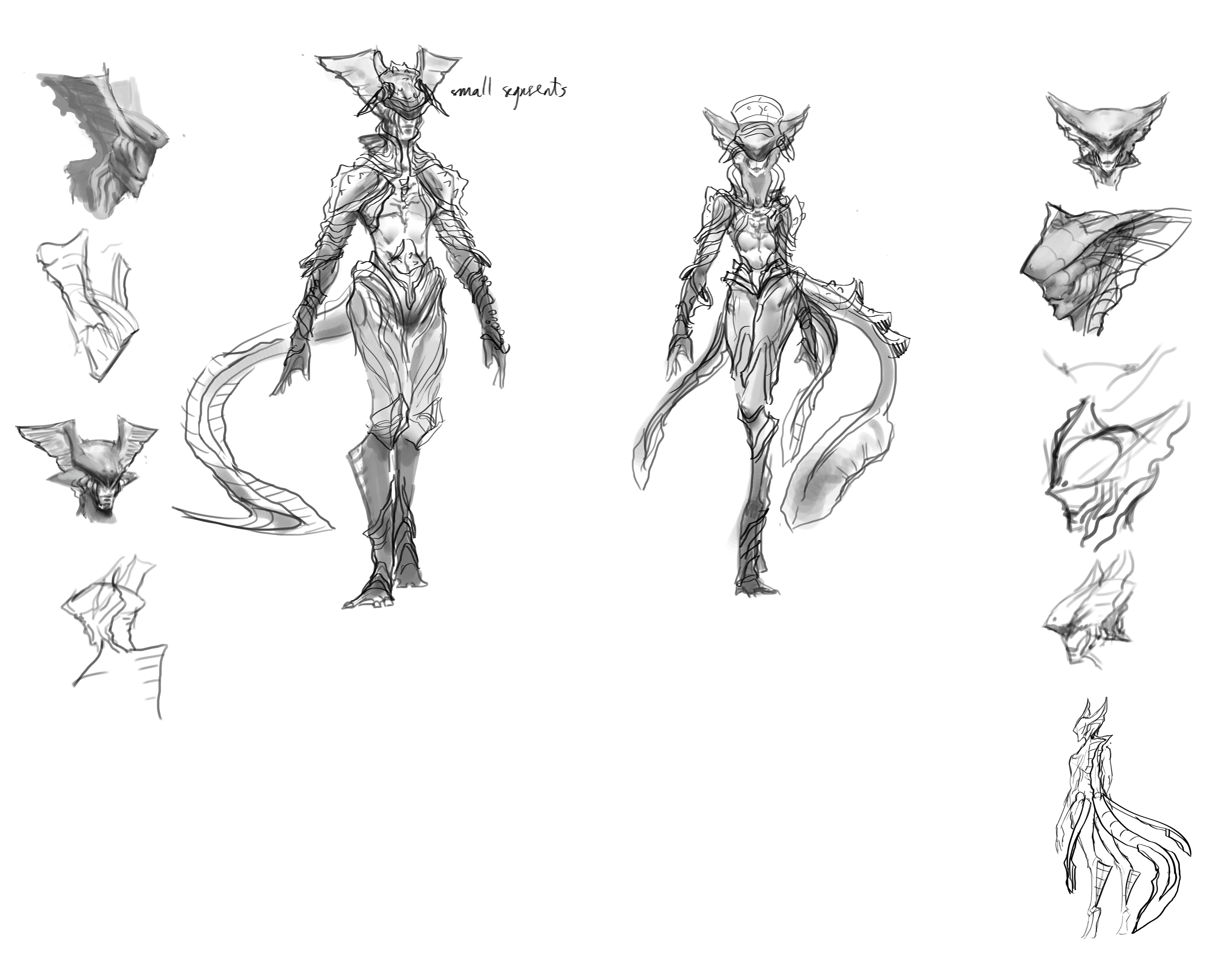
I finally make some progress for this character. After narrowing stuff down i did these sketches and favor the ones with tail rather than the 1 with wings (i think the tail will make more sense so they will be an expert at swimming whereas the wing only help them glide in the water.
If someone stumbled upon this post, your Feedback and opinion would be more than welcome.

 Thank you! I finally cleaned that up. Meanwhile started 3 more ..I have a habit of taking too long to finish a piece, then I lose interest in it and just start something else. I found 8 from recently i started and abandoned, that are decent enough to not delete, but not finished. There’s also been a number of drawings I felt I “outgrew” - became better before I finished them, and it would be easier to start from scratch than fix them. Anyone else thinking that?in24.4k
 Lady Death Fanart Collectible: Part 6 Polypaint and base Hi, it’s time to share with you another part of the process to create this fanart piece. Polypaint As this is my first collectible fanart I didn’t have previous experience with polypaint so I tried my best and played a bit with it.I wanted to give a ghostly and eerie look to Lady Death, she is beautiful and deadly, but at the end of the day she is a woman that died and was reborn at hell as an avenging spirit, that’s why I gave her skin tone a bluish very cold tone.As you will see I gave myself some creative freedom to deviate from the traditional color scheme that this characater has in comics and illustrations.To add a bit of sensuality by painting some freckles on the face and the chest. The dark nature of this character was the perfect excuse to gave her a kind of goth make up, very dark shadows around the eyes, blue lips and fingernails. I know that the original character includes sexy red lips but I wanted this girl to have a sexy but at the same time creepy look, that’s why we can see some thin veins emanating from her eyes. The biggest chromatic change I did for this character is at the hair. Lady Death has a characteristic white weavy hair but in my fanart I decided to gave her a very saturated blue color.The reason behind this wasn’t only an aesthetic choice. I want that the face area strongly pulls the attention of the viewer so this area needed a stronger contrast. Another reason is that I want her to have a more modern look, as I mentioned before, I’m strongly attracted to women with goth/punk look. I gave myself half an hour or more to analyse the work of experienced sculptors that create collectibles and I discovered that the use of darker values on the skin is often applied to create a greater sense of volume and three-dimensionality. I found that areas with heavy ambient occlusion are the perfect places to paint with darker colors in order to increase the separation between different forms. Even though she has a bluish skin tone, I used a bit of warmer hues in areas that, in real life, tend to go towards red and pink, this is very obvious in the nose, cheeks, and knuckles. Thinking with a logical mind it’s completely absurd to have warmer tones on the body of a zombie like creature but I didn’t want to limit myself by using only blue tones, it looks boring and artificial. In real life these colors are created by blood vessels in areas where the skin is very thin. ** Scythe **for her weapon I applied a cool gray with some warmer variations, this color scheme is influenced by the work of H.R giger. Base I’d like to talk about the design for the base which, to be honest, I forgot to develop along with the character.My main idea with the base is to show that Lady Death inhabits a very sterile and arid land, at the end of the day she is at hell.You can see a that she walks over dirt and rocks, a sign that she’s surrounded by death and loneliness. As part of the landscape we can see some bones and skulls to reinforce the idea of lack of living creatures, yet we can see three hands that try to reach her legs.This hands represent that all creatures are subordinated to her power and seek an evil blessing with a simple touch of the princess of the damned.1- The hand with skin burns represents the souls of those who are newcomers to hell, tortured souls that suffer for the sins comitted on earth.2- The hand with greenish rotten skin and pustules is the reminder of the decay that has infected the souls of those who have been trapped and have forgotten their humanity3- Last but not least, the hand of a demon shows that even dark creatures and entities bow before her presence. The cherry on the top, at least in my vision, are the simese twins that emerge from the ground, this malevolent creatures remind us that in hell there’s only perversion and any trace of innocence is lost. Thanks for reading till this pointI’m really happy to be very close to finish this creative journey, last but not least it’s mandatory to talk about splitting the sculpture in several pieces to be printed, this will be my last entry before showing the final rendered images. See yaMay Zbrush be with youin1.5k

 memory 2min gartic phone, used ref 2m gartic, used ref for pose 2min gartic 2min gartic 2min gartic 2min gartic memory memory memory memory study memory memory memorymemory memory memory memory memory memory study memorystudy study stylized left memory, right study study memory memorymemory memory memory memorymemory memory, porportions r offmemory memorystudystudy memorymemorymemory memory memory memory memory memory memory memory, right leg is a bit broken The feeling of only getting 1 - 3 likes on a social media post will never not be discouraging. But nothing is discouraging enough to make me quit drawing. I think the strategy of drawing a lot of stuff and waiting a while to post is good though rather than posting it immediately and then feeling that sadness on the next set of drawingin

 studies studies juri study imagination, how I feel before a speech imagination imagination study something I drew for my presentation also drew this for my presentation, didn't fix the one hand being bigger than the other imagination + study study studies study study, I need to fix the face a bit based on screenshot from anime but in my style study. except for the eye study studies studies study. changed some things tho imagination imagination imagination study studies, except top right samurai based on anime screenshot wolverine studies, changed some of the poses a lil, not very good at all, but first time i drew the character ever. semi study studies study imagination imagination imagination , for first time ever i tried to draw over 3d model for middle pose, I dont like the result tbh, but it makes it much easier than coming up with it from memory.imagination, except right figurestudies imagination + studies, coming up with action poses r hard, these are not dynamic enough, I will redraw better ones in future. imagination , imagination imagination study, except for eye imagination imagination imagination doodles except for the two chrollos imagination storyboard thumbnail, idk if i ever shared this. my storyboards end up being a little detailed since i usually just draw in one layer.in22.3k
8 days later

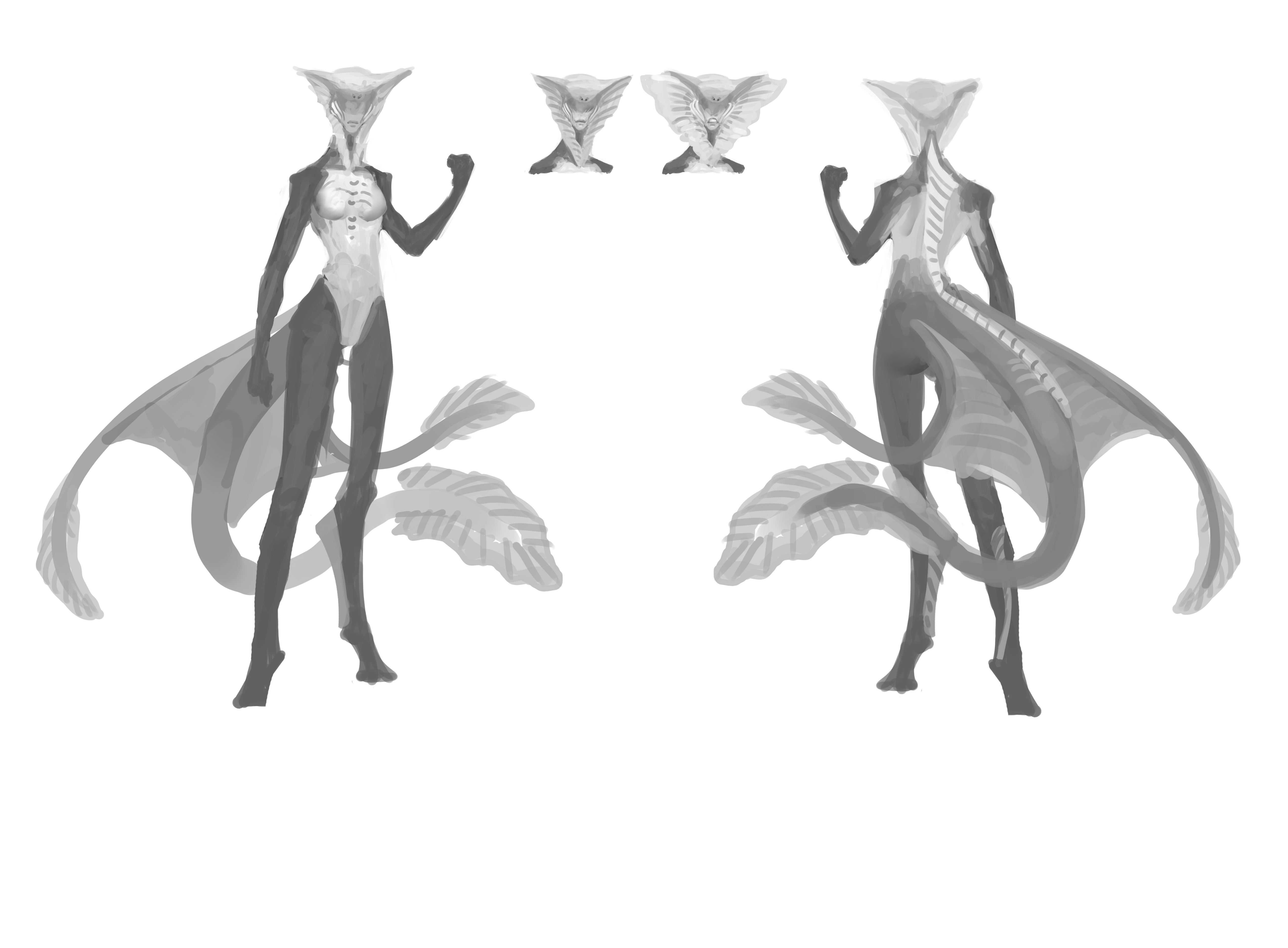
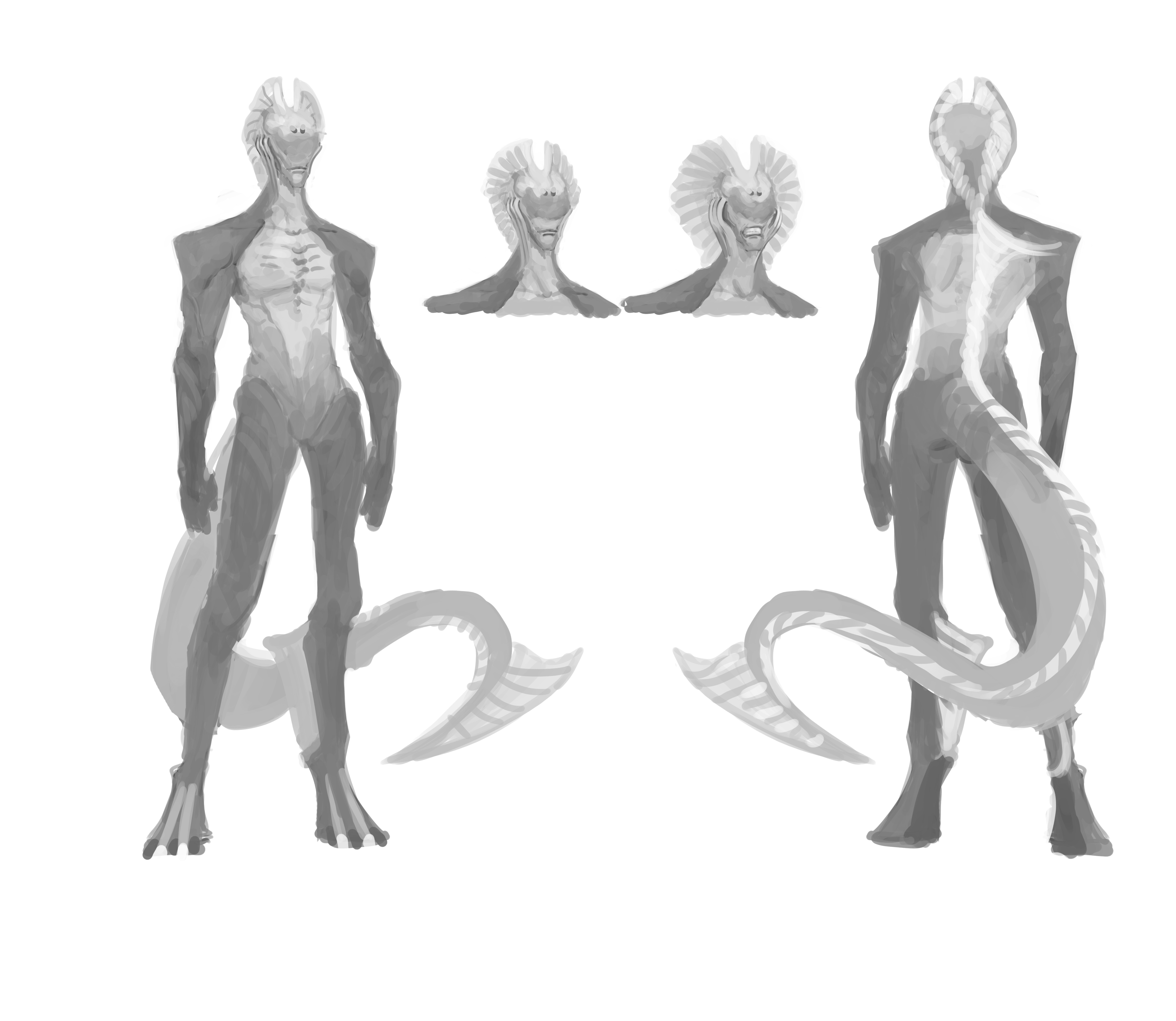
Some updates for my final project. Made alternatives for the body type and try to put some armor.
I want the way they wear the armor is different from normal human. I might try to put some little pieces of armor on the torso or some parts of the body.
As usual feedback would be great
Thanks for stopping by


Hey there!
The evolution of these seapeople is really cool to see!
I would suggest more difference betwen male and female characters-especially head design.
Concerning the tail, the first and the fourth from the initial tail sketches were my favorites.
The legs-the first post with the body ideas... The third iteration in the top row is something i haven't seen before and i think it's brilliant! They could use the feet as fins in the water but pull their fingers together to walk/run on land.
If they will fight humans, consider their fight style and design the armor that would be needed for that kind of battles (in tight formation, hunter type, ranged or melee etc.)
You might add something that would sugest they are in aggressive stance-like the collar on beta fish.
I hope this is the kind of feedback you want and is helpful.
Anyways, this thread looks great so far, keep it up!
Thanks for dropping by.
And your feedbacks are really great man. I like the beta fish idea the most. I agree they have to be more difference beside the tail.
I'm designing the armor right now and will start to clean the rough sketches a little bit. At the moment, i'm thinking about the male will be more like tank class and the female would be a DPS class (i reference mantis shrimp for the female fighting style).
I will post the armor concept design tomorrow. This is my first time designing something hybrid so i kinda struggle a little bit, but i think i'm getting there.
Thanks again for your feedback and i really appreciate it.
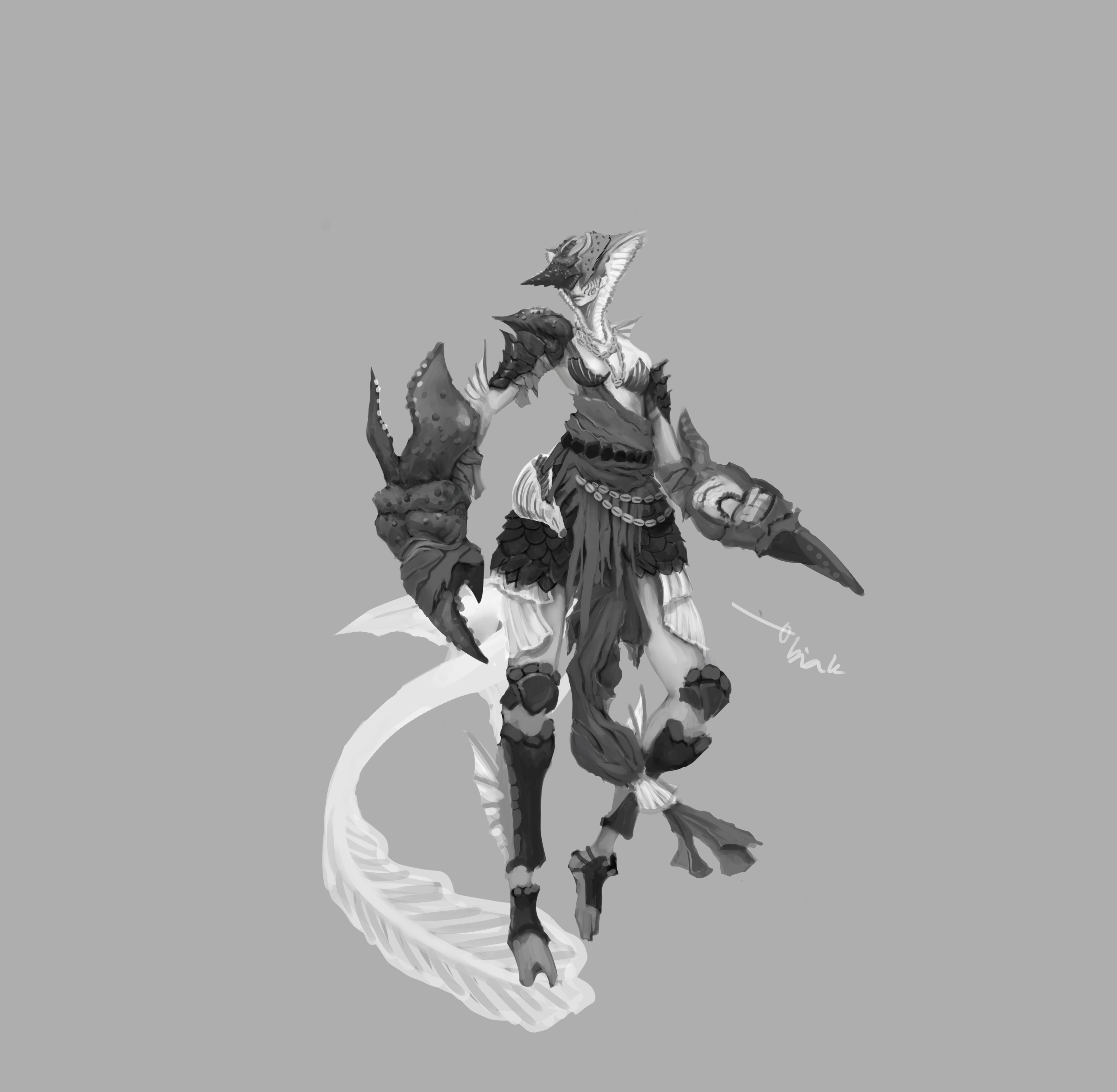
I'm trying to do some armor design for my characters while developing the species a little bit more. The armor could change a little bit in further development.
I tried to incorporate turtle shell for the male character and crab, lobster, and shells for female as DPS character.

Feel free to give your opinion if you have some ideas and thank you for stopping by.
Cheers
Nice work there with the exploration of armor!
I love all of the shields (also the red one). But that's not very helpful is it;)
Armor design-the middle black for male is my favorite. Weapon design... The last one is kind of too sketchy to be understood-the other two are cool looking tools for piercing enemy's hearts. If they fight in a tight formation like a phalanx, this is great but if you want a tank, that jumps into the frey and just damages everything round him, these weapons are too slick imo. Something for hacking/slashing/smashing would be more apropriate. True, a shield could be used in such a fashion...
Head from the first and second black characters look great, i would describe the third as a bit goofy.
I think something is a bit off with the anatomy-the males seem to be missing knees or they are being bent in the opposite direction. There is no such issue with the female character. I guess it's just the pose of the males...
As for the females, the middle one seems to be the best but i think that is simply because it's the easyest to understand when looking at it. There are so many lines that it's hard to make out what is what. Using different line thicknesses would help i think...
Thanks for the feedback. I'd been busy to prepare for my presentation and went through it quite alright.
I changed a couple of things and came up with this design for a while.


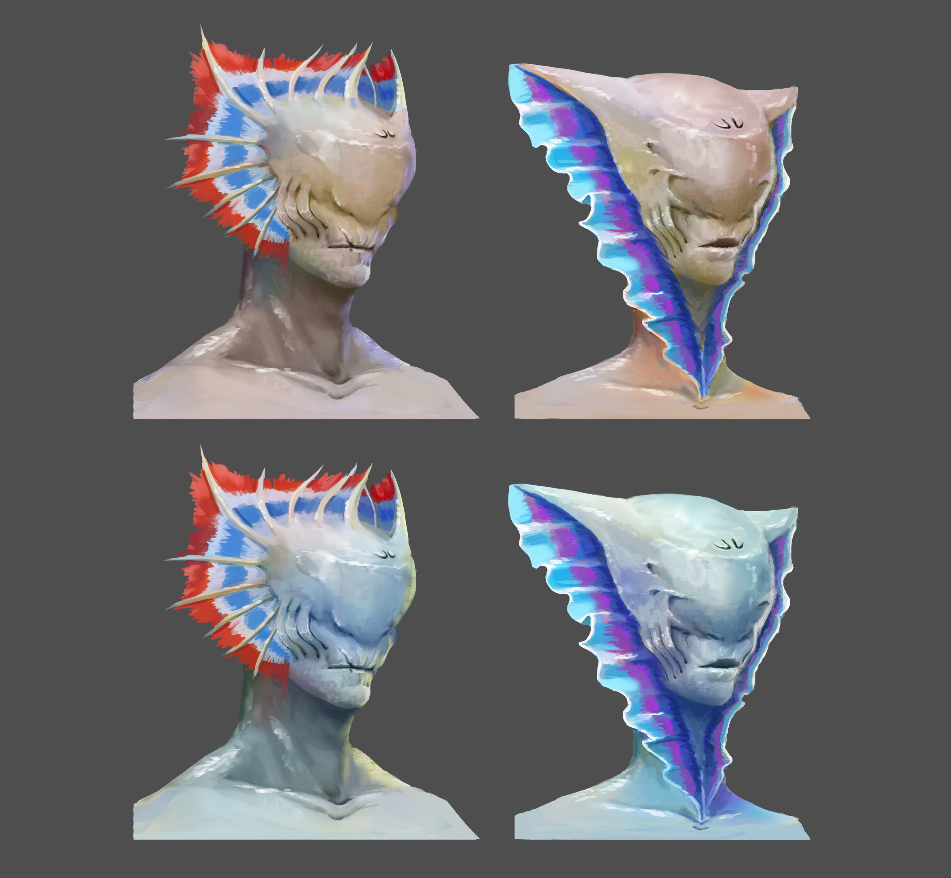
I'm still stuck with the head design. lol. But after the presentation i've got some feedback that i could add some distinguished fish/sea creature feature to my character. I think that's a good idea but i've been trying to avoid such things because i don't want my character to be recognize as human+fish/sea creature, i want them to be more like alien that can swim and go to the surface and fight.
I also clarify what their armor would look like.
Thanks again for dropping by and give your time and feedback
11 days later
I'm glad to hear it went well with the presentation.
The idea of giving your characters some more destinguishable fish/sea creature feature is not bad. I think it's easyer to change it more alien-like after you have the base than start into the wild with no boundaries...
The head designs you have for the female and male are really cool-the larger ones. I like how you managed to add that collar to them, it looks natural/believable. But since this is game design, you could experiment with the shape a bit more (maybe making it more spiky), to make it as clear as possible that it is dangerous to be round that one when the collar is spreaded.
I know you are not focusing on rendering the image but it would be easyer to read the image if it wasn't as bright, if you would use darker values too.
Anyways, it's cool to see your characters go through all sorts of metamorphosis and fashion styles:)
16 days later
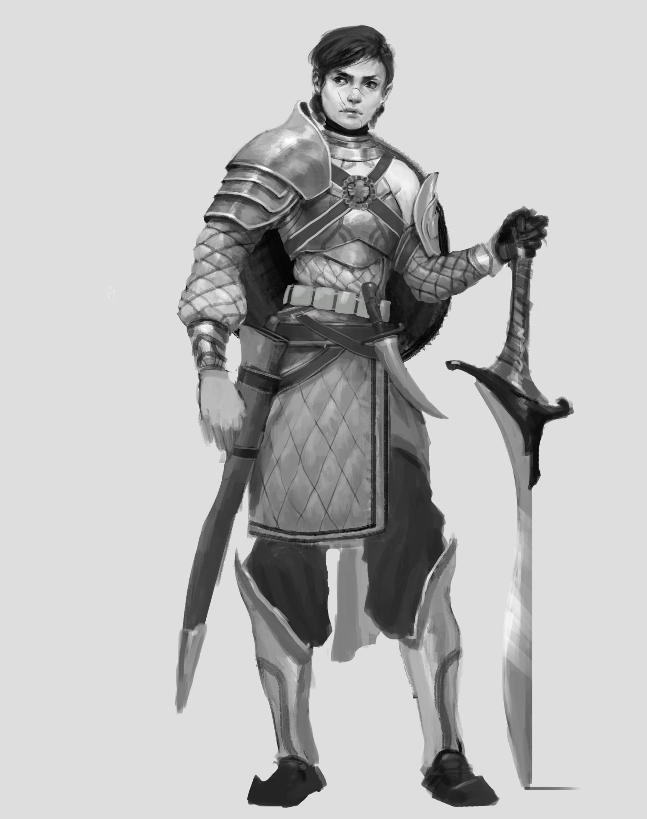
Thank you for your feedback as always. I was doing some work on my characters on my summer break and i already settled on the design for this project.
Here is the base design and some starting armor ideas as well

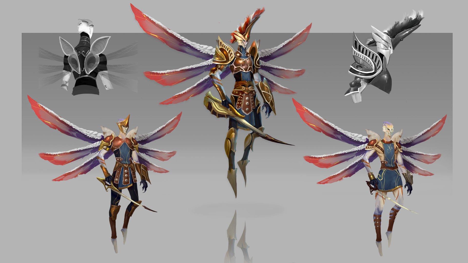
Couple of weeks later i decided to do the max level armor design (ignore the gauntlet on the male character, lol)
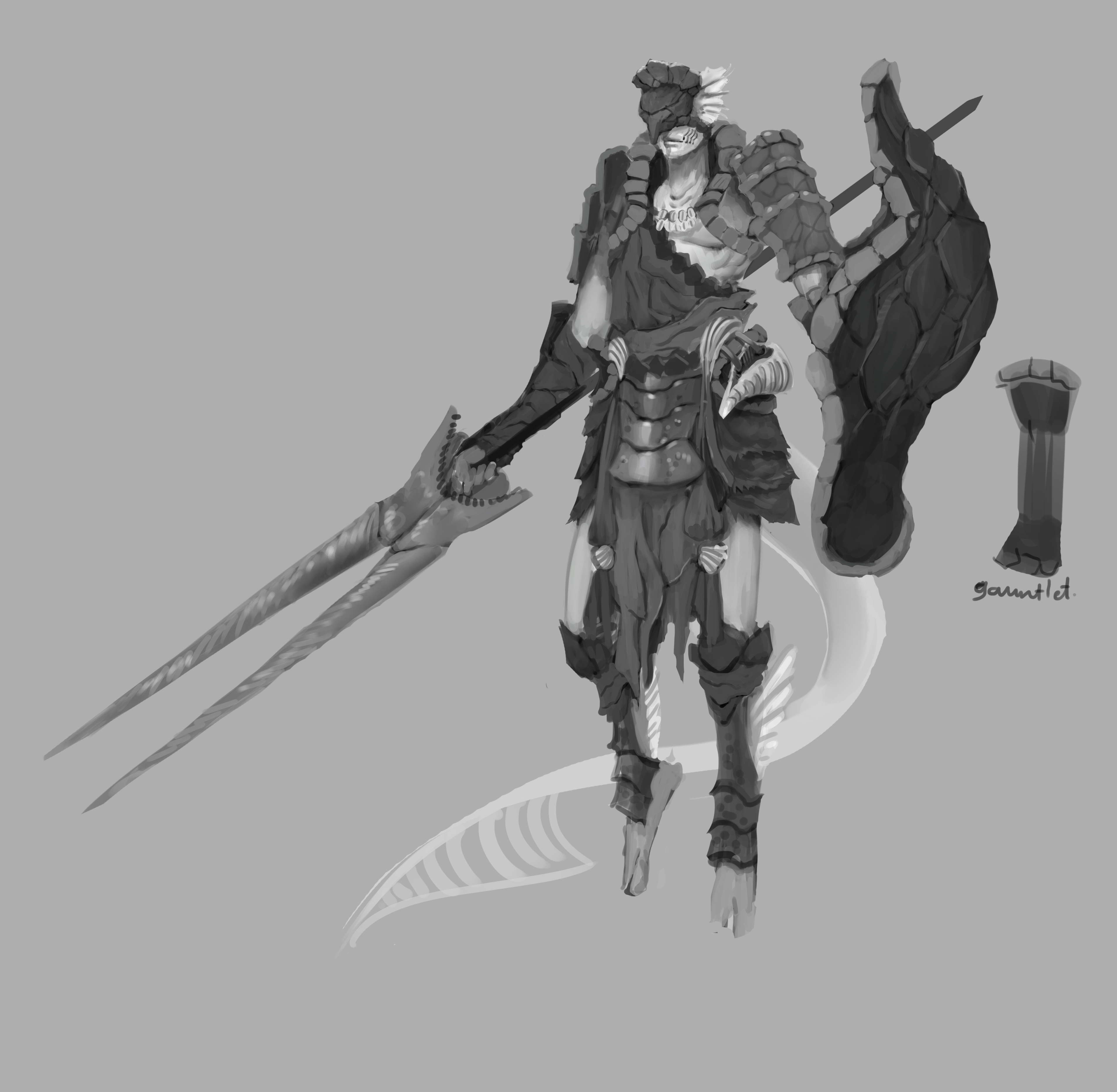
As usual some feedbacks would be welcome as i move on to color these guys.
I'll keep posting any updates about my final project and also i already done some progression for 2 other races.
Thank you for stopping by
What are you eating man!? They were good before but now, they are so much better! You can make such progress in just couple of weeks?
Show the other races too!
The head design is really cool. Female looks more threatening and the male is more threatening:)


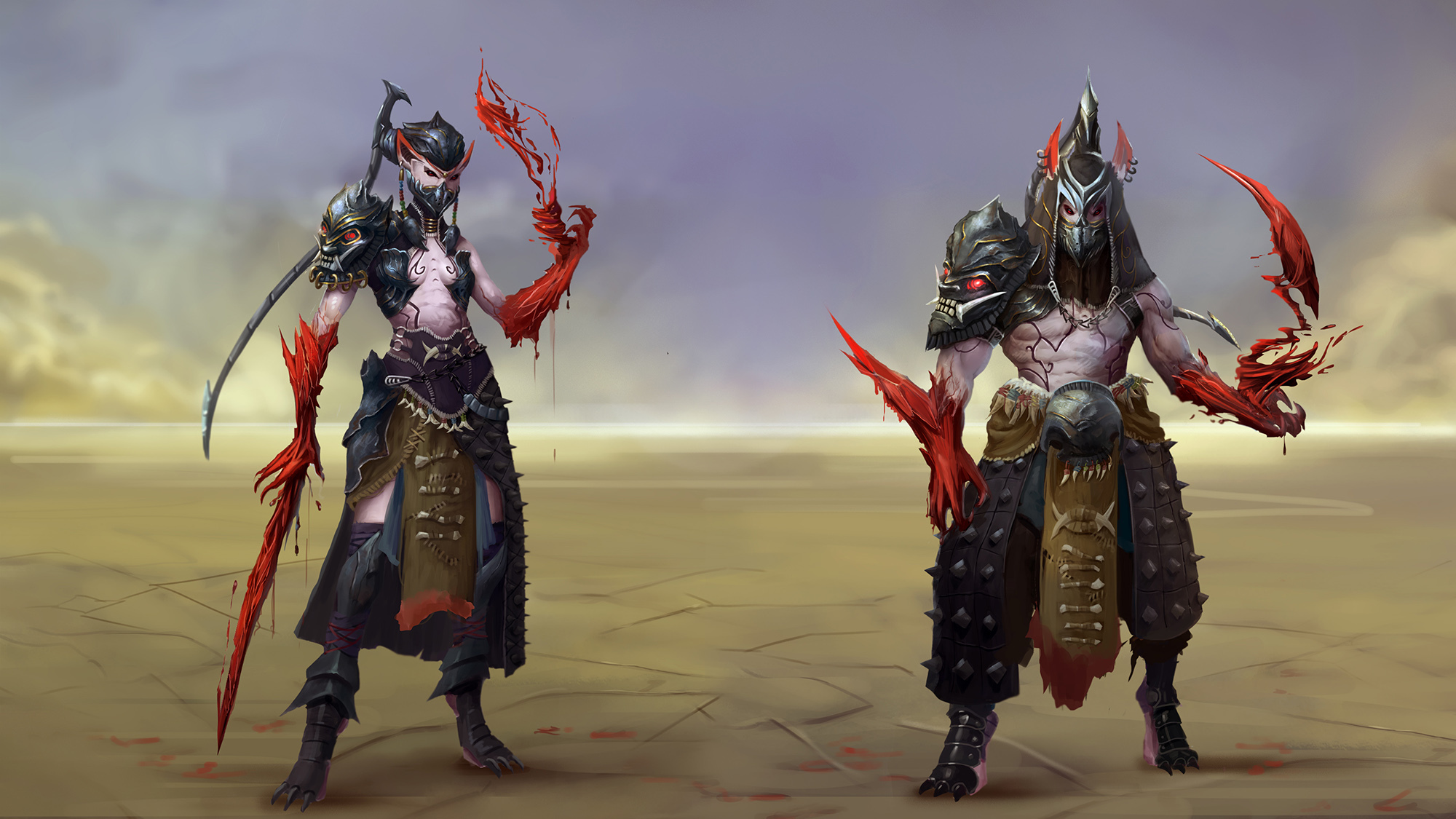


I would say that the disigns look bomb, and congrats on your graduation! You rendering is also very good. Maybe you should look at some basic anatomy stuff, some of your figures look a little bit stiff, and the lasts creatures torso (with the green wings) looks a little bit too long to me. But this is really looking bomb! So just continue I guess ^-^
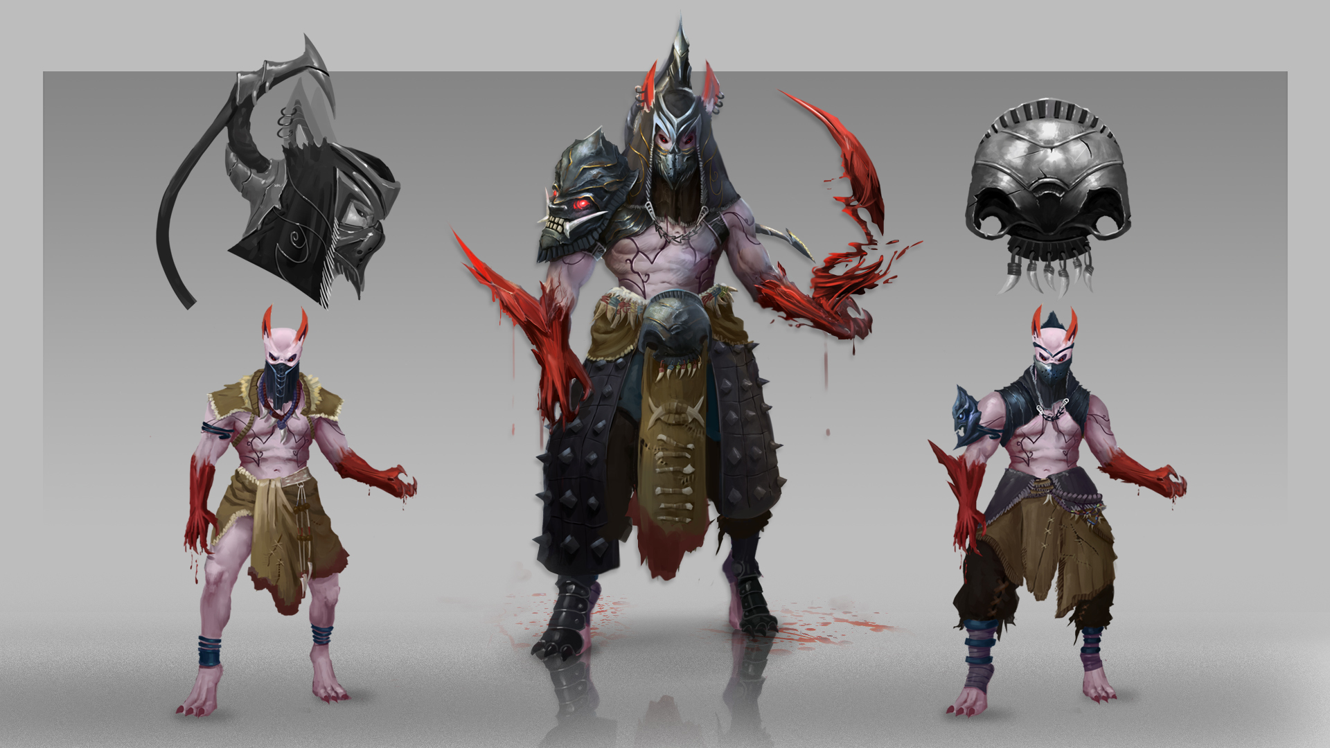
Hey, glad you like them @jilltonic . I made the torso longer on purpose but i think i'd gone too far that's why it looks out of proportion.
And thank you for your feedback, and yes! i'm working on my anatomy and gesture right now.
Here's more art that i've been doing
Suggested Topics
| Topic | Category | Replies | Views | Activity |
|---|---|---|---|---|
| Maria`s art blog | Art Blogs | 3 | 1.0k | Dec '21 |
| Selkirk has a pencil ! sketchbook! | Art Blogs | 26 | 8.0k | Aug '17 |
| Snoopyloop artblog | Art Blogs | 16 | 3.8k | Oct '17 |
| Toasty’s Journey to Blizzard | Art Blogs | 1 | 1.2k | Dec '17 |
| Dogui’s Journey! =D | Art Blogs | 1 | 514 | Sep '16 |