• Gave myself 5 days to do something. This is what I managed to do. I'm trying to get better at illustrations, but I have patience to work on something for 3 days maximum :( Splash_Process.jpg5000x3140 2.21 MB Splash_Process-6.jpg3896x2429 2.83 MB concept list char copy.jpg5388x3000 1.7 MB
    21.1k
  • Did a character concept for a course.https://www.artstation.com/artwork/P6gm3y - more:) list1.jpg3541x1920 2.82 MB
    21.1k
  • Day 4: Star Wars May The 4th =] Queen Padmé Amidala in my art style! First time drawing her and I really enjoyed making this one! Used watercolours, ink pen, acrylic markers and gold paint for accents on my Canson mix media sketchbook. I hope you like it!
    83.3k
  • A creature design from a while back
    by
    6.8k
  • Here is some more recent stuff, I need to make more body studies
  • It's been a while and god, it is so cringe to go through all previous messages xDmy study.
    21.1k
  • Thank you! I finally cleaned that up. Meanwhile started 3 more ..I have a habit of taking too long to finish a piece, then I lose interest in it and just start something else. I found 8 from recently i started and abandoned, that are decent enough to not delete, but not finished. There’s also been a number of drawings I felt I “outgrew” - became better before I finished them, and it would be easier to start from scratch than fix them. Anyone else thinking that?
  • Lady Death Fanart Collectible: Part 6 Polypaint and base Hi, it’s time to share with you another part of the process to create this fanart piece. Polypaint As this is my first collectible fanart I didn’t have previous experience with polypaint so I tried my best and played a bit with it.I wanted to give a ghostly and eerie look to Lady Death, she is beautiful and deadly, but at the end of the day she is a woman that died and was reborn at hell as an avenging spirit, that’s why I gave her skin tone a bluish very cold tone.As you will see I gave myself some creative freedom to deviate from the traditional color scheme that this characater has in comics and illustrations.To add a bit of sensuality by painting some freckles on the face and the chest. The dark nature of this character was the perfect excuse to gave her a kind of goth make up, very dark shadows around the eyes, blue lips and fingernails. I know that the original character includes sexy red lips but I wanted this girl to have a sexy but at the same time creepy look, that’s why we can see some thin veins emanating from her eyes. The biggest chromatic change I did for this character is at the hair. Lady Death has a characteristic white weavy hair but in my fanart I decided to gave her a very saturated blue color.The reason behind this wasn’t only an aesthetic choice. I want that the face area strongly pulls the attention of the viewer so this area needed a stronger contrast. Another reason is that I want her to have a more modern look, as I mentioned before, I’m strongly attracted to women with goth/punk look. I gave myself half an hour or more to analyse the work of experienced sculptors that create collectibles and I discovered that the use of darker values on the skin is often applied to create a greater sense of volume and three-dimensionality. I found that areas with heavy ambient occlusion are the perfect places to paint with darker colors in order to increase the separation between different forms. Even though she has a bluish skin tone, I used a bit of warmer hues in areas that, in real life, tend to go towards red and pink, this is very obvious in the nose, cheeks, and knuckles. Thinking with a logical mind it’s completely absurd to have warmer tones on the body of a zombie like creature but I didn’t want to limit myself by using only blue tones, it looks boring and artificial. In real life these colors are created by blood vessels in areas where the skin is very thin. ** Scythe **for her weapon I applied a cool gray with some warmer variations, this color scheme is influenced by the work of H.R giger. Base I’d like to talk about the design for the base which, to be honest, I forgot to develop along with the character.My main idea with the base is to show that Lady Death inhabits a very sterile and arid land, at the end of the day she is at hell.You can see a that she walks over dirt and rocks, a sign that she’s surrounded by death and loneliness. As part of the landscape we can see some bones and skulls to reinforce the idea of lack of living creatures, yet we can see three hands that try to reach her legs.This hands represent that all creatures are subordinated to her power and seek an evil blessing with a simple touch of the princess of the damned.1- The hand with skin burns represents the souls of those who are newcomers to hell, tortured souls that suffer for the sins comitted on earth.2- The hand with greenish rotten skin and pustules is the reminder of the decay that has infected the souls of those who have been trapped and have forgotten their humanity3- Last but not least, the hand of a demon shows that even dark creatures and entities bow before her presence. The cherry on the top, at least in my vision, are the simese twins that emerge from the ground, this malevolent creatures remind us that in hell there’s only perversion and any trace of innocence is lost. Thanks for reading till this pointI’m really happy to be very close to finish this creative journey, last but not least it’s mandatory to talk about splitting the sculpture in several pieces to be printed, this will be my last entry before showing the final rendered images. See yaMay Zbrush be with you
    1.5k
  • memory 2min gartic phone, used ref 2m gartic, used ref for pose 2min gartic 2min gartic 2min gartic 2min gartic memory memory memory memory study memory memory memorymemory memory memory memory memory memory study memorystudy study stylized left memory, right study study memory memorymemory memory memory memorymemory memory, porportions r offmemory memorystudystudy memorymemorymemory memory memory memory memory memory memory memory, right leg is a bit broken The feeling of only getting 1 - 3 likes on a social media post will never not be discouraging. But nothing is discouraging enough to make me quit drawing. I think the strategy of drawing a lot of stuff and waiting a while to post is good though rather than posting it immediately and then feeling that sadness on the next set of drawing
  • Urban Dragon Girl Wip Urban Dragon Girl_wip1.jpg5000x5000 1.11 MB
  • Long time no see! New artworks produced lately
    6.8k
  • studies studies juri study imagination, how I feel before a speech imagination imagination study something I drew for my presentation also drew this for my presentation, didn't fix the one hand being bigger than the other imagination + study study studies study study, I need to fix the face a bit based on screenshot from anime but in my style study. except for the eye study studies studies study. changed some things tho imagination imagination imagination study studies, except top right samurai based on anime screenshot wolverine studies, changed some of the poses a lil, not very good at all, but first time i drew the character ever. semi study studies study imagination imagination imagination , for first time ever i tried to draw over 3d model for middle pose, I dont like the result tbh, but it makes it much easier than coming up with it from memory.imagination, except right figurestudies imagination + studies, coming up with action poses r hard, these are not dynamic enough, I will redraw better ones in future. imagination , imagination imagination study, except for eye imagination imagination imagination doodles except for the two chrollos imagination storyboard thumbnail, idk if i ever shared this. my storyboards end up being a little detailed since i usually just draw in one layer.
    by
    22.7k

With all
the introduction done, here are some examples of the exercises I did on week
one.

Starting
first with Pen control. Below are my tries of Day 1(Tuesday), Day 3(Thursday)
and day 6 (Sunday) and from today (Today I reduced the size of the brush from
3px to 1px to give make the exercises a bit harder). Last year I modified the picture bit, so that I can practice all 8 directions
for the straight lines and both directions of rotation for the circles on one
sheet. Since I have some mileage with this kind of exercises, I think my
straights are Ok but is clear that the horizontal lines are my weakest part and
therefore wavier then the others. I still try to find a comfortable movement of
my arm to draw them but made some progress over the last months. Overall I
think there is also some room of improvement to the other lines but I´m content
with my current progress.

For the
exercise where we should divide the rectangle with straight lines, I did just 2
directions per day, because this takes a lot of time. In general, I find it
much harder to draw get straight lines here, in contrast to the first exercise.

The circles are ok, but I have to try if I can get smother lines if I draw
them quicker without losing the accuracy. This is something I am going to try
this week.

Finally my thoughts
for the pressure control exercise. I think they are also ok, but there is also
a lot of room for improvement, especially in the sense of uniformity between
the lines and the, maximum pressure, where I often don’t push enough to get the
max. possible outcome.

Her is also
my attempt for the image adjustment exercise. The first 3 exercises are ok but
could be better and with exercise 4 I’m not satisfied. I tried several hours to
get the right values but every time a came close with one part, another got
worse and for the sake of my sanity I left at the stage you can see, where I
think it is somewhat close to the original. I think I will consult additional
material how the 4 tools we learned so far work an try this exercise after
finishing term 1 again.

I think, the beach beauty with the coconut-drink is our all nightmare to adjust right. Welcome to the forum!

Welcome aboard!

I wouldn’t suggest to go overboard with color adjustments. Almost everyone has a hard time with the beach girl

I suggest doing it enough to just get used to the tool and get to know it, have a general feel of what you can do with each adjustment tool but not to worry too much. As long as you do a little each time you’ll have what you need for when you need it (which for now - currently in term 2 - has been never for me XD. ) but I know if I ever need it I can always use it and know it exists there

Cheers

Hello snakker and Norma,

thank you for your concern, but i don´t have the plan to go over board with this exerciese. The sole reason i spent so much time with it this week, was that on the first week of Marc´s Study Guide ther aren´t so many exercieses yet, so that i had a lot of spare time. If this was not the case, I probably would have stoped earlier.

This week, there are the first three assignments of “Nude Figure Drawing” at the agenda of the study guide and here are my first attempts of them.
Starting with assignment one (Line of Action over photos as warmup) I included my first attempt from Monday. I think this assignment is straight forward and I don´t have to many problems to find the primary line of action on the most poses, however the sitting poses are a little bit harder. On the last pose, I´m not sure if it is better to draw a secondary action line for the arm like I did ore if it gives more clarity to leave it out.

The next assignment was the one page of the cylinders and here I included my pages from Monday and today. In my opinion this exercise is a lot harder for me than they look on the first glance, especially if I try to draw the cylinders like Marc did it in the video for this lesson. At day one I experimented with Marc’s construction Method and the method I used until now and the hardest part with Marc´s method for me is, to draw the same ellipse two times for the top and the bottom of the cylinder without a boundary on the sides. This leads to cylinders, where the bottom is too big or has a false opening and therefore cylinders which don´t appear in the right perspective. I also sometimes struggle to align the ellipses around the dots and, so that the top and bottom ellipses are offset. Forward I choose to stick with Marc´s method and think at some cylinders I made some progress in today’s attempt compared to Monday. At least, it feels better when I draw the ellipses, than on Monday.

Monday

Today

The last exercise is the one, where we should draw a simple skeleton over photo references.
Here I posted my tries from Monday and today. I must note, that although Marc mentioned his video for this lesson, that the ovals and rectangles as replacement for the head, torso, and pelvis doesn´t work to well for poses, which are in a stronger perspective I also included a few of such poses. The reason for this is, that I have a lot of poses due to a past membership of new masters academy and there are of excellent quality, these poses aren´t sorted in as specific manner on my hard drive, so that I would need a lot of time search them for simple standing poses, which I see a bit wasted. Instead, I just pick some random images and load them into photoshop, which results in the random selection of poses. I know that this is not optimal but as long as I have “enough” simple poses, I am also willing to try this exercises on some quite hard poses. What I have registered so far, is that ovals are somewhat ok for this hard poses but simple rectangles don’t work at all. Since I have a little experience with boxes as replacement, I am going to try to abstract the head, torso, and pelvis on this poses with them and have a look, how this works out.
For the cylinders as limps, I think, that I am mostly able to see, in what direction the cylinders should be open, even on very flat angles, but have some problems to find the correct degree of openness of the ellipses, that start and endpoint of the cylinders and sometimes I try to hard to match the contour of the limps. This are definitively the points I am going to work the most on, on the remaining times, I do this exercise.

Monday

Today

As I mentioned, a lot of this poses are from my membership of New Masers Academy,
and I don´t know exactly how the copyright situation are for this. If this
should be a problem, I immediately remove the pictures and must search for some
with an open licence. Although it will cost me a lot of time, I rather would
like to stay safe.

Looking good
Drawing cylinders is definitely harder than it seems, in this case they are simplified ones. If you were to draw them more technically then starting with a box in perspective would definitely help

Cheers

Today I finished
the last attempt of the Pen control exercise I have to do following Marc´s study
guide. Compared to the last one I posted, there isn´t much change in the
quality and the accuracy of the lines, but I was expecting this. Next week this
exercise gets replaced with pen control practice from Marc´s youtube video “Top
10 Drawing Exercises” and I can´t wait to try them.

Next is the cylinder exercise, of which I attached my attempt from today. My biggest problem so far was the right placing of the two ellipses for the bottom and top of the cylinder and that often they didn´t match in size and the degree of there opening. In this regard I think I had some large improvement and the cylinders look much cleaner now, but there is still room for improvement.

I also think that I made improvements on the simple skeleton drawn over photo references of which I included todays attempt. As I said on Wednesday, I tried to draw boxes instead of rectangles for the head, torso and pelvis for the more complicated poses, but often I didn´t get the orientation and size of the boxes right. This is going to be my focus for this exercise next week.

The last to exercise for this week were “combining Images” and “Selection/Liquify/Healstamp”. My attempts can be seen bellow and for the first try, I´m quite satisfied with them. For the “combining Images” exercise I added the wooden house on the water, the Stonehouse in the background, the two otters and the geese.
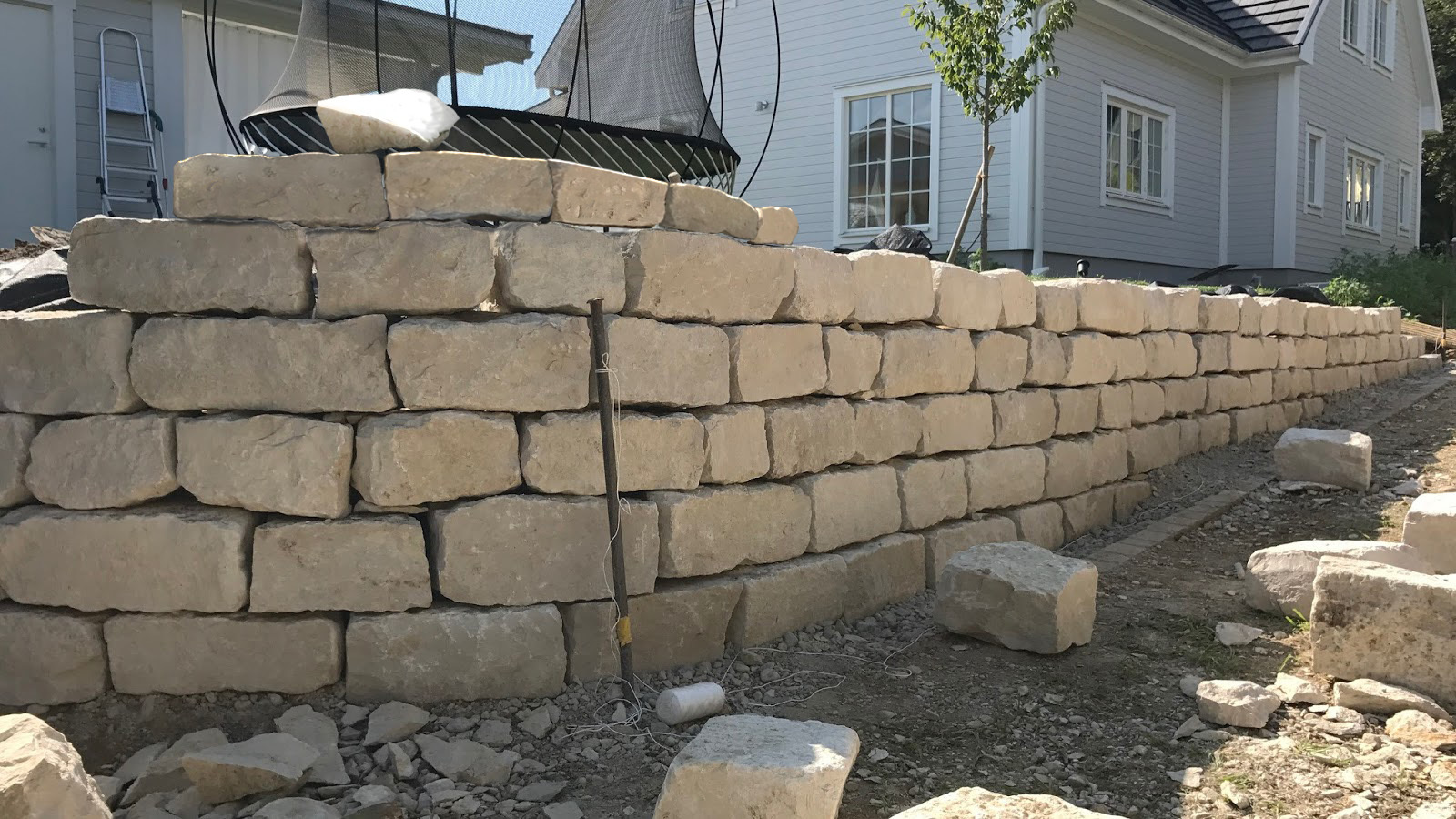
On the image with the wall, I added some stones on top of it.
(Note I didn´t had time to finish the young to old part of the exercise yet and have to see if I am able to do it next week or not.)

This week, the Pem Control Practice from Term 1 was replaced by exercises from Marc´s YouTube Video “Top 10 Drawing Exercises”. Because 9 exercises (I excluded exercise 10 – Gesture Drawing, since it has it appears as a separate point in the schedule) are a lot for one day, I decided to do 5 exercises ala 5 Minutes every day respectively and alternate between the fist 4 and the last 4. For the 5 exercise I did the rotation of the boxes every day, because it is the hardest one for me. Below are my first try for each exercise, which I did on Monday and yesterday. Here I think, the exercises I found the easiest is the one where you should draw a line, which becomes bigger, as farther it goes followed by ribbons and the dividing of the rectangles. The hardest were as I already mentioned the rotation of the boxes, because I find it particular hard to get the right proportions and orientations of the lines down, in such a manner, that the boxes appear as the same box in a different perspective. Also, the colour blending exercise and the circles are harder than it appears.

On the cylinders isn´t much development from the last time I posted a page of these, so I don´t think I need to show my newest try’s here. I will post my last page I have to do on Sunday instead.
For the simple skeleton my main goal this week is to get better at drawing boxes for the head, torso and pelvis instead of rectangles, to and I think one some poses I made progress and start to get better at the process, although I have a lot of potential for improvement. Attached todays try of this exercise.

The second new exercise this week was 30s-Gestures. This was not the first time of doing this exercise and over the last years I developed a mixture of techniques from Michael Hampton and Steve Huston whereby the influence of Michael Hampton prevails in my opinion. I also rarely did 30s poses in the past and struggle to finish the whole pose most of the time, but hope that I will get faster with some more experience. Mostly I didn´t have time to finish the arms.

You're doing great! Keep it up!

With the
end of week 3, I finished with doing the first tree assignments of “Nude Figure
Drawing”, according to Weekly Study Companion Guide. The first assignment
became very easy for me, and I can identify the primary line of action on
almost all poses I had after max. 3 seconds if not earlier.

I also
think that I made quite a progress on assignment 2 my cylinders do look better
than when I started it, but I sometimes have still problems to draw the top and
the bottom ellipse the same but I’m sure that with more experience, this will
become also better. The picture I attached is my try I had today.

As I wrote
on last Sunday and Wednesday my main focus for exercise 3 was to get better at
drawing boxes as substitution for the head, torso and pelvis. One some poses, I’m
quite confident to draw them now, but on other possess, especially if there more
in an site view I still struggle, because I have problems to find the change of
plane there. When I use ovals for the 3 body parts, I´m comfortable even on
more difficult poses and the simple skeleton doesn’t fall apart, even, when I
hide the figure beneath it. In my opinion this also applies on most of the
simple poses, when I use boxes, so that I am overall quite stratified with the progress
I made in this two weeks. This also should get better the more you know about
anatomy I think, but correct me if I´m wrong. Attached is here also my attempt from
Today.

For Gesture drawing, today was also the last time for now, to do 30s-Gestures and next week I have one minute. I look forward, to see, hoe my gestures come out if I have a
little more time. Here I also attached todays work.

At last, according
to the schedule we had to do 5 studies (lineart only) of characters from video
games, movies, shows wee like. I didn´t know exactly hoe to do this exercise and
after watching a YouTube video of Marc, about this topic, where he says at
level 1, you should copy the reference as best as you can, with your current abilities,
I did that, but was only able to do 1 study, which I attaches below. The other
studies I try do next week.

To be
honest, this exercise makes me very uncomfortable, because this can feel overwhelming
and I didn´t know, how to tackle it. At first I tried to copy the lines, as I see
them, but the result, was a big mess and I started over, using a bi of gesture
drawing and ovals for the torso and pelvis as an foundation. This worked much
better, but it is nevertheless very hard, especially with the clothing and accessories.
My attempt is in the picture below. If you have tips you want to share for this
subject, feel free to do so. It would be a great help and I would appreciate it
a lot.

Those Cylinders are looking pretty nice! You should also remember that if the cylinder is on perspective, the contour lines get closer to each other as they get further away from the camera, I hope you know what I mean