Reworked the face a little bit, adjusting the eyes

8 days later
First pass on the leather


I'm quite happy with the skin now. Followed this Tutorial with a few tweaks and this Tutorial with a few tweaks. WIP eyelashes and hair that is still way too symmetrical. Planning on adjusting that more. Right now the eyebrows are in the textures and there is no actual haircards. Might add a few to increase the 3D effect.
Looking better and better 

13 days later
Taking a short break from my current project to fit the new Artstation challenge in between I will be making Mordred made by Ana Fedina
For now the first little bit of the face. Tomorrow I hope to spend more time on adjusting the shapes and fixing the volumes.


A bit more work on the face
PS. feedback is as always appreciated


Adjusted the face a little bit. Worked on the first blockout for the upper body and did some work on the hardsurface props like the swords and daggers. Trying to find out how the shapes of the concept work. Since this will be a game-ready character I tried to go for alternative sleeves that might be easier to rig / animate. Hoping to finish off the blockout for the upper body tomorrow and and start the lower body as well, since I'd have to struggle a lot less with Marvelous Designer for tomorrow.

Wanted to do a bit more, but I got tired. At least the base is there
11 days later


Started adding some WIP cloth definition and some other detailing. Wasn't able to work on it in the meantime since I was abroad for the weekend. Hopefully I can finish the highpoly this weekend as I will be away for holiday for another two weeks in not too long D:
Still need to adjust the arms. The body proportions seem to be right, if I put the model next to the concept. The arms however seem to be a tad bit too long? Although in the concept the arms are also really long...


This looks fantastic. Awesome work. Look forward to seeing the low poly version and textures for the character.


Finished the retopo after working hours, it's a bit messy, but good enough for some posing. Did a very crude rig and weightpaint so I could pose the model. Also did a quick set-up with the materials, but a lot of tweaking is still required on this WIP. At least I know the general direction that I want to go in now Next two weeks will be quiet here because I will go on holiday!
NIce work. Hope you have an amazing 2 weeks of holiday break. Look forward to the next updates in the future.
29 days later
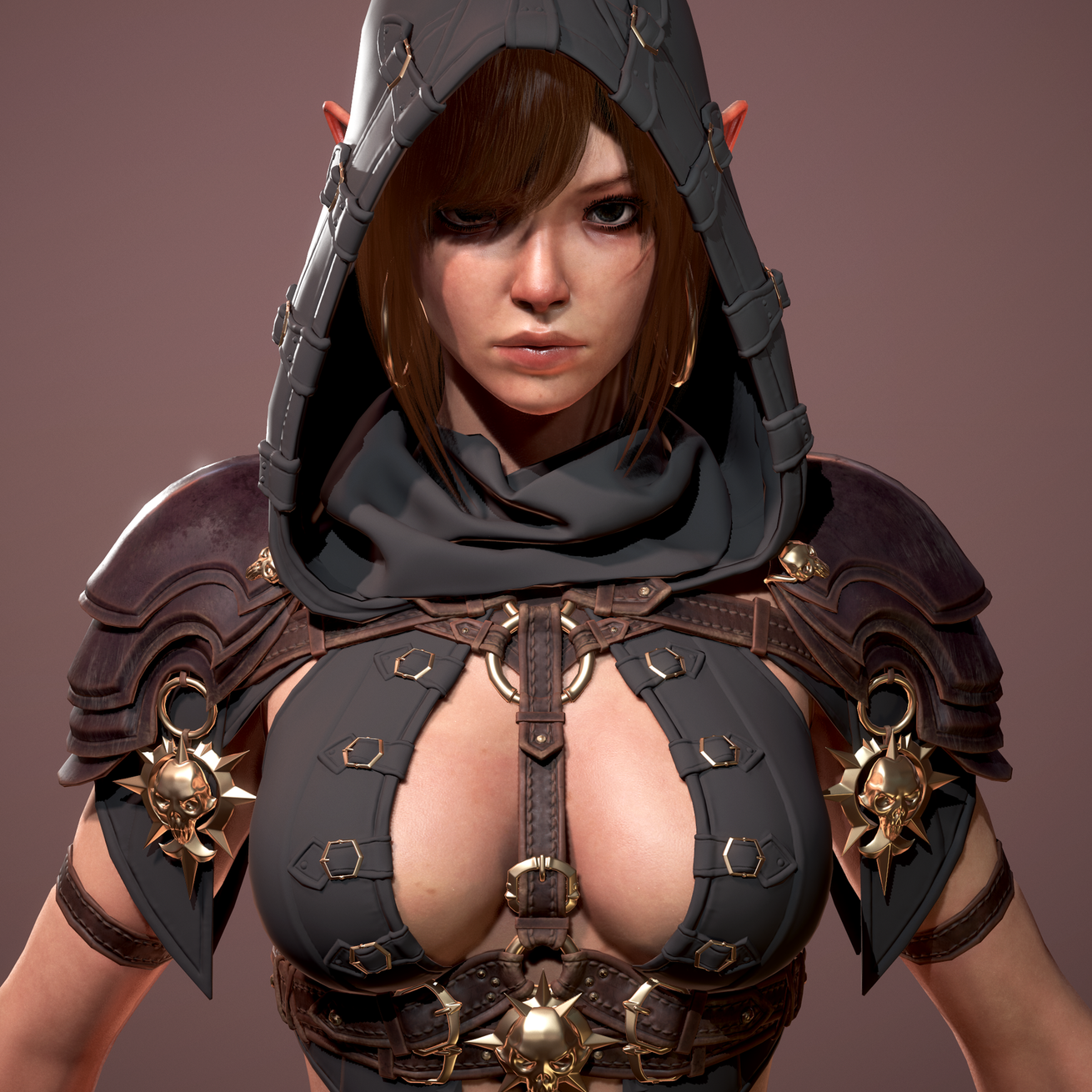
Super happy that I was able to finish this in time! I changed the modelled hair to haircards last minute and while I could have polished it all a lot more, I'm glad with the outcome. Working fulltime and going on a holiday made this a tough challenge timewise  That's it for this project. I might polish it a bit here and there so I can upload it to my portfolio


And a turntable!
Awesome work here. Nice finish on the character.
8 months later
And after half a year of silence another update! This project has been going on for about one and a half years now and I finally want to finish it. With the whole Work From Home I can find the time again to work on it a little more. I made a list of improvement points:
- Adjust the colours on the face
- Adjust the normals on the knees? (make them less prominent? move them up?)
- Texture the secondary sword
- Polish the cape alpha and texture
This was the original concept it is based on: https://www.artstation.com/artwork/GqxXz
I would love some feedback on areas I can improve, since I'm polishing it all right now.


Its looking good, but since you are asking for suggestions there are a few things you could do depending on how far you want it to go.
This might just be a render settings thing, but the blade of the sword seems to be clashing in this render. You have so many touches of metal on the skulls and hilt that the blade seems to be made of green stone in comparison.
Try hitting the thread stitching on the gloves, vest and hood with a different color the way you did with the leather straps (which are fantastic btw). It probably shouldn't shift too much, not contrast stitching, but as it stands it looks more like a stamp than a separate material.
Maybe make some more tonal shifts in the skin into the blue range for blood vessels under the skin if you are feeling up to it, its of course a taste thing but it ramps up the depth of the skin and realism aspect a lot. The leather straps are so very detailed that they seem more realistic than the skin around them. Only bother with this if you intend the model to be viewed up close of course.
And yeah maybe try bumping the knees back a little bit. I don't find them too distracting as it is, but the leggings would be crazy tight like this, more like tight stockings. They do not appear to be placed wrong, but the heels are making it very hard to judge that.
Again, its looking good.
That's great feedback, this is really useful for me! I'll put it on my list of things to work on
Suggested Topics
| Topic | Category | Replies | Views | Activity |
|---|---|---|---|---|
| Adrian Birkeland - Realistic Concept Art & Design | Art Blogs | 4 | 2.1k | Nov '18 |
| Error code sketchbook | Art Blogs | 1 | 719 | Jun '22 |
| My Studies | Art Blogs | 0 | 588 | Oct '18 |
| Jon’s Art Blog | Art Blogs | 16 | 3.0k | Dec '19 |
| Jayy’s Art Blog | Art Blogs | 3 | 888 | Nov '16 |