- Thank you! I finally cleaned that up. Meanwhile started 3 more ..I have a habit of taking too long to finish a piece, then I lose interest in it and just start something else. I found 8 from recently i started and abandoned, that are decent enough to not delete, but not finished. There’s also been a number of drawings I felt I “outgrew” - became better before I finished them, and it would be easier to start from scratch than fix them. Anyone else thinking that?in24.5k
- Lady Death Fanart Collectible: Part 6 Polypaint and base Hi, it’s time to share with you another part of the process to create this fanart piece. Polypaint As this is my first collectible fanart I didn’t have previous experience with polypaint so I tried my best and played a bit with it.I wanted to give a ghostly and eerie look to Lady Death, she is beautiful and deadly, but at the end of the day she is a woman that died and was reborn at hell as an avenging spirit, that’s why I gave her skin tone a bluish very cold tone.As you will see I gave myself some creative freedom to deviate from the traditional color scheme that this characater has in comics and illustrations.To add a bit of sensuality by painting some freckles on the face and the chest. The dark nature of this character was the perfect excuse to gave her a kind of goth make up, very dark shadows around the eyes, blue lips and fingernails. I know that the original character includes sexy red lips but I wanted this girl to have a sexy but at the same time creepy look, that’s why we can see some thin veins emanating from her eyes. The biggest chromatic change I did for this character is at the hair. Lady Death has a characteristic white weavy hair but in my fanart I decided to gave her a very saturated blue color.The reason behind this wasn’t only an aesthetic choice. I want that the face area strongly pulls the attention of the viewer so this area needed a stronger contrast. Another reason is that I want her to have a more modern look, as I mentioned before, I’m strongly attracted to women with goth/punk look. I gave myself half an hour or more to analyse the work of experienced sculptors that create collectibles and I discovered that the use of darker values on the skin is often applied to create a greater sense of volume and three-dimensionality. I found that areas with heavy ambient occlusion are the perfect places to paint with darker colors in order to increase the separation between different forms. Even though she has a bluish skin tone, I used a bit of warmer hues in areas that, in real life, tend to go towards red and pink, this is very obvious in the nose, cheeks, and knuckles. Thinking with a logical mind it’s completely absurd to have warmer tones on the body of a zombie like creature but I didn’t want to limit myself by using only blue tones, it looks boring and artificial. In real life these colors are created by blood vessels in areas where the skin is very thin. ** Scythe **for her weapon I applied a cool gray with some warmer variations, this color scheme is influenced by the work of H.R giger. Base I’d like to talk about the design for the base which, to be honest, I forgot to develop along with the character.My main idea with the base is to show that Lady Death inhabits a very sterile and arid land, at the end of the day she is at hell.You can see a that she walks over dirt and rocks, a sign that she’s surrounded by death and loneliness. As part of the landscape we can see some bones and skulls to reinforce the idea of lack of living creatures, yet we can see three hands that try to reach her legs.This hands represent that all creatures are subordinated to her power and seek an evil blessing with a simple touch of the princess of the damned.1- The hand with skin burns represents the souls of those who are newcomers to hell, tortured souls that suffer for the sins comitted on earth.2- The hand with greenish rotten skin and pustules is the reminder of the decay that has infected the souls of those who have been trapped and have forgotten their humanity3- Last but not least, the hand of a demon shows that even dark creatures and entities bow before her presence. The cherry on the top, at least in my vision, are the simese twins that emerge from the ground, this malevolent creatures remind us that in hell there’s only perversion and any trace of innocence is lost. Thanks for reading till this pointI’m really happy to be very close to finish this creative journey, last but not least it’s mandatory to talk about splitting the sculpture in several pieces to be printed, this will be my last entry before showing the final rendered images. See yaMay Zbrush be with youin1.5k
- memory 2min gartic phone, used ref 2m gartic, used ref for pose 2min gartic 2min gartic 2min gartic 2min gartic memory memory memory memory study memory memory memorymemory memory memory memory memory memory study memorystudy study stylized left memory, right study study memory memorymemory memory memory memorymemory memory, porportions r offmemory memorystudystudy memorymemorymemory memory memory memory memory memory memory memory, right leg is a bit broken The feeling of only getting 1 - 3 likes on a social media post will never not be discouraging. But nothing is discouraging enough to make me quit drawing. I think the strategy of drawing a lot of stuff and waiting a while to post is good though rather than posting it immediately and then feeling that sadness on the next set of drawingin
- studies studies juri study imagination, how I feel before a speech imagination imagination study something I drew for my presentation also drew this for my presentation, didn't fix the one hand being bigger than the other imagination + study study studies study study, I need to fix the face a bit based on screenshot from anime but in my style study. except for the eye study studies studies study. changed some things tho imagination imagination imagination study studies, except top right samurai based on anime screenshot wolverine studies, changed some of the poses a lil, not very good at all, but first time i drew the character ever. semi study studies study imagination imagination imagination , for first time ever i tried to draw over 3d model for middle pose, I dont like the result tbh, but it makes it much easier than coming up with it from memory.imagination, except right figurestudies imagination + studies, coming up with action poses r hard, these are not dynamic enough, I will redraw better ones in future. imagination , imagination imagination study, except for eye imagination imagination imagination doodles except for the two chrollos imagination storyboard thumbnail, idk if i ever shared this. my storyboards end up being a little detailed since i usually just draw in one layer.in22.4k
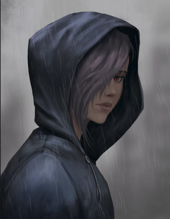
one think i’m noticing is that the figure feels very “airbrushed” for lack of a better word. especially at the edges and the outline of the character it just sort of bristles off. try making sure you have a hard edge — here’s what i mean
(it doesn’t really work as well because i zoomed in a lot but if you look at the work of any famous “semi realistic” painterly artist like ruan jia, huangjian guang, guweiz, wlop, etc you can see what i mean)
now, obviously you can have soft edges (there’s a marco bucci video talking about soft and hard edges), but you need to be very conscious of where you’re putting them and honestly you only really do that if you have a super heavy painterly style (in which case ur mimicking a canvas so it’s not really applicable here)
also, remember cast shadows will have a much more abrupt edge than the gradient one you incorporated. here’s an image from color and light by james gurney. if you haven’t read the book please do
@Julia_J thank you for thinking so! I see I am still lacking but for now it is close enough!
@ziggydas you mean stuff like this:
Nice catch with it, I have forgotten to crank up my lineart to 100% as I paint with lower opacity to have a better grasp on edges + I finish cleaning edges only at the very end as I often change things during painting so it would be a double work to do this otherwise. I think an arm shows that I am constantly things about hard and soft edges, isn't it?
I have this book on thje shelf and read every page of it, I am thinking about core shadows and reflected light all the time but I am trying to mimic the style of original artwork sotrying to not get overboard with reality
I really like the way you are rendering the ice, looks awesome! And biiig congratulations on your second commission, thats super exciting to hear!
The design is cool (is it your own or a fan art?).
You went for a really dramatic pose with his right hand, which looks cool.
I dont know what the terms of your commission were, but next time, I'd focus more on the composition to really define a fore-, mid- and background to create more sense of depth.
You did some of that with the foreshortening of the right arm, but I am sure you could push it a little further.
I really liked the first sketch you shared with us because the ice shards around the character gave the scene more depth
Regardless of what I said above, awesome work, Frygidal!
This looks epic! I think you did a great job capturing the ice texture and the overall scene looks like something is about to happen.
One thing I'd say is the lighting is a little off. I think with the clouds and coldness the scene would be a little more desaturated and the shadows would be a little darker.
Let me know what you think!
thank you for this in-depth feedback! It is the fanart of Khazard from afk arena, he looks in game something like that:
my first idea was to use ice blocks, but client definitely anted to add his dragon so I needed to get him there and ice blocks + dragon were far too much. Final version looks like that:
Totally agree that composition is an issue there, I gave some smoke and blur but didn't want to get too far with it because it was supposed to be kind of splash art so tried to stay vibrant, need to work on this on my next works.
@LesleyCarol thank you very much! It definitely looks more real this way which is also cool, but the client wanted a splash art so my main inspiration were works like that:
But still a long way ahead to achieve this level
Glad to see you got it finished!
I think you added in everything I was going to say. In your inspiration there's a bright light source in the background so the artist was able to add saturation and a lot light to the character. I see that you added some light-rays to make it a little brighter.
Hope your client liked it!
Suggested Topics
Topic | Category | Replies | Views | Activity |
---|---|---|---|---|
Jendives - My Art School Journey | Art School | 2 | 438 | Jan '23 |
Charlie Odow - Art School Journey: First Steps | Art School | 42 | 4.9k | May '22 |
Term 2– krystafae | Art School | 4 | 1.4k | Jan '20 |
Uggie - Art School Journey | Art School | 409 | 14.3k | 6d |
Vlad a.k.a. Beowulf - Art school journey | Art School | 22 | 3.8k | Dec '23 |