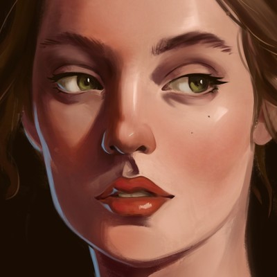
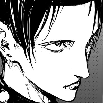
Hi! Welcome to the forums! Your work has nice colors and rendering. I just spotted a few little things that I think could be improved in the first and second one.
For the first one, it's the position of the arm holding the staff. While it's possible to have your arm like this, I don't think it feels quite natural. I think the arm should bend less towards us and more towards the front of the character, I did a quick paintover to show what I mean.


As for the canon, I think the perspective of the barrel doesn't line up with the rest. It should come more towards us, I think. Something like this perhaps

I hope this helps and keep up the good work 


