• Gave myself 5 days to do something. This is what I managed to do. I'm trying to get better at illustrations, but I have patience to work on something for 3 days maximum :( Splash_Process.jpg5000x3140 2.21 MB Splash_Process-6.jpg3896x2429 2.83 MB concept list char copy.jpg5388x3000 1.7 MB
    20.8k
  • Did a character concept for a course.https://www.artstation.com/artwork/P6gm3y - more:) list1.jpg3541x1920 2.82 MB
    20.8k
  • Day 4: Star Wars May The 4th =] Queen Padmé Amidala in my art style! First time drawing her and I really enjoyed making this one! Used watercolours, ink pen, acrylic markers and gold paint for accents on my Canson mix media sketchbook. I hope you like it!
    82.3k
  • A creature design from a while back
    by
    6.7k
  • Here is some more recent stuff, I need to make more body studies
  • It's been a while and god, it is so cringe to go through all previous messages xDmy study.
    20.8k
  • Thank you! I finally cleaned that up. Meanwhile started 3 more ..I have a habit of taking too long to finish a piece, then I lose interest in it and just start something else. I found 8 from recently i started and abandoned, that are decent enough to not delete, but not finished. There’s also been a number of drawings I felt I “outgrew” - became better before I finished them, and it would be easier to start from scratch than fix them. Anyone else thinking that?
  • Lady Death Fanart Collectible: Part 6 Polypaint and base Hi, it’s time to share with you another part of the process to create this fanart piece. Polypaint As this is my first collectible fanart I didn’t have previous experience with polypaint so I tried my best and played a bit with it.I wanted to give a ghostly and eerie look to Lady Death, she is beautiful and deadly, but at the end of the day she is a woman that died and was reborn at hell as an avenging spirit, that’s why I gave her skin tone a bluish very cold tone.As you will see I gave myself some creative freedom to deviate from the traditional color scheme that this characater has in comics and illustrations.To add a bit of sensuality by painting some freckles on the face and the chest. The dark nature of this character was the perfect excuse to gave her a kind of goth make up, very dark shadows around the eyes, blue lips and fingernails. I know that the original character includes sexy red lips but I wanted this girl to have a sexy but at the same time creepy look, that’s why we can see some thin veins emanating from her eyes. The biggest chromatic change I did for this character is at the hair. Lady Death has a characteristic white weavy hair but in my fanart I decided to gave her a very saturated blue color.The reason behind this wasn’t only an aesthetic choice. I want that the face area strongly pulls the attention of the viewer so this area needed a stronger contrast. Another reason is that I want her to have a more modern look, as I mentioned before, I’m strongly attracted to women with goth/punk look. I gave myself half an hour or more to analyse the work of experienced sculptors that create collectibles and I discovered that the use of darker values on the skin is often applied to create a greater sense of volume and three-dimensionality. I found that areas with heavy ambient occlusion are the perfect places to paint with darker colors in order to increase the separation between different forms. Even though she has a bluish skin tone, I used a bit of warmer hues in areas that, in real life, tend to go towards red and pink, this is very obvious in the nose, cheeks, and knuckles. Thinking with a logical mind it’s completely absurd to have warmer tones on the body of a zombie like creature but I didn’t want to limit myself by using only blue tones, it looks boring and artificial. In real life these colors are created by blood vessels in areas where the skin is very thin. ** Scythe **for her weapon I applied a cool gray with some warmer variations, this color scheme is influenced by the work of H.R giger. Base I’d like to talk about the design for the base which, to be honest, I forgot to develop along with the character.My main idea with the base is to show that Lady Death inhabits a very sterile and arid land, at the end of the day she is at hell.You can see a that she walks over dirt and rocks, a sign that she’s surrounded by death and loneliness. As part of the landscape we can see some bones and skulls to reinforce the idea of lack of living creatures, yet we can see three hands that try to reach her legs.This hands represent that all creatures are subordinated to her power and seek an evil blessing with a simple touch of the princess of the damned.1- The hand with skin burns represents the souls of those who are newcomers to hell, tortured souls that suffer for the sins comitted on earth.2- The hand with greenish rotten skin and pustules is the reminder of the decay that has infected the souls of those who have been trapped and have forgotten their humanity3- Last but not least, the hand of a demon shows that even dark creatures and entities bow before her presence. The cherry on the top, at least in my vision, are the simese twins that emerge from the ground, this malevolent creatures remind us that in hell there’s only perversion and any trace of innocence is lost. Thanks for reading till this pointI’m really happy to be very close to finish this creative journey, last but not least it’s mandatory to talk about splitting the sculpture in several pieces to be printed, this will be my last entry before showing the final rendered images. See yaMay Zbrush be with you
    1.5k
  • memory 2min gartic phone, used ref 2m gartic, used ref for pose 2min gartic 2min gartic 2min gartic 2min gartic memory memory memory memory study memory memory memorymemory memory memory memory memory memory study memorystudy study stylized left memory, right study study memory memorymemory memory memory memorymemory memory, porportions r offmemory memorystudystudy memorymemorymemory memory memory memory memory memory memory memory, right leg is a bit broken The feeling of only getting 1 - 3 likes on a social media post will never not be discouraging. But nothing is discouraging enough to make me quit drawing. I think the strategy of drawing a lot of stuff and waiting a while to post is good though rather than posting it immediately and then feeling that sadness on the next set of drawing
  • Urban Dragon Girl Wip Urban Dragon Girl_wip1.jpg5000x5000 1.11 MB
  • Long time no see! New artworks produced lately
    6.7k
  • studies studies juri study imagination, how I feel before a speech imagination imagination study something I drew for my presentation also drew this for my presentation, didn't fix the one hand being bigger than the other imagination + study study studies study study, I need to fix the face a bit based on screenshot from anime but in my style study. except for the eye study studies studies study. changed some things tho imagination imagination imagination study studies, except top right samurai based on anime screenshot wolverine studies, changed some of the poses a lil, not very good at all, but first time i drew the character ever. semi study studies study imagination imagination imagination , for first time ever i tried to draw over 3d model for middle pose, I dont like the result tbh, but it makes it much easier than coming up with it from memory.imagination, except right figurestudies imagination + studies, coming up with action poses r hard, these are not dynamic enough, I will redraw better ones in future. imagination , imagination imagination study, except for eye imagination imagination imagination doodles except for the two chrollos imagination storyboard thumbnail, idk if i ever shared this. my storyboards end up being a little detailed since i usually just draw in one layer.
    by
    22.3k

Hi all! My day job is in a decidedly non art related field. I once dreamed of art as a career, but never developed my skills to the level I wanted. I did take classes and such but frankly didn't work hard enough or use enough of the resources at that time. To be fair, I also didn't have anyone around to provide direction.

I hail from sunny Arizona. My chosen software has been Krita but I've been branching out into Clip Studio Paint. I'm really excited to begin. My contact info is a bit bare since I left ArtStation a while back due to the AI debacle, and recently quit DeviantArt due to the same reason. I use InkBlot though. Not on Discord, Facebook or Instagram and never will be.

On the bright side, I'm really looking forward to meeting everyone and finally making real progress with my art. My hobbies include cooking, baking, gardening, writing, and tabletop gaming. My goal in art school, for now, is to give myself the education I never got at university, and to finally be able to truly paint what's in my mind's eye.

Hi again! Thanks for the replies. :smile: I decided that I'm going to write some thoughts and observations as I go along, as well as progress pieces. This way I'll have something to refer to in the future, and who knows, maybe it'll help someone else somehow. Comments are still welcome of course.

I just finished my first day of studies. It's the weekend so I have a bit more time. (I work full time and have a home to maintain so time is precious.) I watched the Visual Communication 1 class and found it really informative. Even though it was less than an hour long I still managed to learn some new things and can see how the ideas introduced will be really helpful in the future!

I figured I'd breeze through the pen control exercise but holy crap, my lines and circles look like I'm palsied and inebriated! Therefore it must be good practice. I've been drawing for quite a few years so I know I can draw, but I rarely do unassisted straight lines, and that is the point. I'm looking forward to seeing my progress through the week. Onward and upward!

Hi! Welcome! Great job on working through the first exercises!

Here's a quick sketch as a benchmark to show what a basic character sketch from imagination is for me. This was done in less than an hour and isn't very polished but shows a starting point.

Day 3 check in: Having watched Visual Communication 1, I have also now watched Photoshop 1 except for the last two assignments. It was surprisingly interesting and informative. I hadn't expected to get a lot out of it, but I was pleasantly surprised. I've never been a Photoshop person. Most of the tips were very relevant to Clip Studio Paint however and quite a few were even relevant to Krita!

Regarding the daily pen control practice, I am pleased because I see improvement after only doing the exercise three times! This is better than expected and I'm glad I didn't skip it. Even though I have had a tablet for quite some time, and this year upgraded to a display tablet, I am still not as comfortable as I would like to be and this has helped quite a bit. My lines are still wonky but they are LESS wonky.

I feel so good right now, finally doing something to realize my dream. I actually got a university degree in interdisciplinary visual art, but I was very foolish when young and really didn't get everything out of it that I could have. Now, nearly 25 years later, I can tell that the content in these courses is very solid and I intend to put everything into the assignments that I should. I like learning what I need to know, not that plus a distribution of stuff I don't need.

Day 6 check in: I've watched all the Photoshop 1 including assignments and am almost done with the assignments. Have gotten pretty close on all the exercises except the final one which I'm still working on. Have watched about half of Nude Figure Drawing. I am not doing a full week on all the basic exercises. Marc said we could skip some of the basics if we didn't need them. I am not skipping everything but may not give some of the ultra basic stuff a full week. However, I may go back to those pesky vertical lines periodically so I can get a temperature check on my pen control.

I continue to do most of my practice on the non display tablet, since I know that my control automatically will get about twice as good when using it so it's kind of like a stress test.

Day 8! I've made it a whole week! I was having a surprisingly hard time finding good free stock for doing the nude gesture drawing but I thought of a few places that will have high quality images and aren't behind a paywall. (So far I've been subsisting off samples from paid image packs.)

Exercise and martial arts guides! You could use yoga, calisthenics, pilates, any number of different ones. Many of them will have a ton of images of people doing the different activities in very tight clothing so it's almost as good as a nude. It also might be less embarrassing if you have to share space with a family member or non artist. And the martial arts ones will be great for action poses. Anyway, once I had the idea I figured I'd share in case this helps anyone.

I'm struggling a bit with my graphics tablet because it's kind of a pain to set up the display tablet, so I usually end up using the non-display tablet as mentioned before. I keep telling myself, it's good practice. Today I had very low motivation so I used my clutch pencil instead, on actual paper. That feeling of touching graphite to paper is just so darn satisfying. Even though my primary goal is to improve fluency with digital art, I will swap in traditional stuff now and again. The really funny thing is, my traditional and digital practice all seems to help each other and I want to stay good at both.

Sample coursework, a basic proportions sketch. Probably need to measure my boxes better when I do it again.

Day 8 check in - finished watching all the Nude Figure Drawing 1 lesson and started doing gesture drawings. I also finished 2 more Photoshop assignments - I do better with a variety of topics at one time. Felt pretty good about the aging manipulation, less so about liquify. I think my chosen software (Clip Studio Paint, the older version with perpetual license not the new one that requires Windows 10) has a less effective liquify tool than Photoshop does, though I could be wrong. Anyway, here are the two newest Photoshop assignments. Yes, I couldn't resist giving the actor snake eyes, and changing the color on the alien. I only altered half the face as I was getting really tired of dealing with the ineffective liquify tool.

Confirmed: For anyone keeping track, Photoshop's liquify tool is a whole set of 12 different options while the Krita or Clip Studio Paint is basically one option. Hence the problem. I'm using the old perpetual license version of Clip Studio Paint, they may have improved this in the new, subscription based version.

i bought the perp version 1 right before the upgrade so i got to get csp 2.0 for free and yep liquify can now be used on mutiple layers at once!

Good to know! The Photoshop version still seems to have a lot more options unless 2.0 changed a whole lot. Which it could have. However I don't think it's compatible with windows 7 and I haven't swapped over to Linux again - yet.

Here is my "Photoshop" final project for Term 1 - all stock is royalty free from Pixabay. I used four images, considered a fifth but didn't end up using it. Not totally happy over the lighting but had fun with the concept. For a little extra light and shadow I used a top layer with hard light and a soft brush. Been paying attention to Marc!

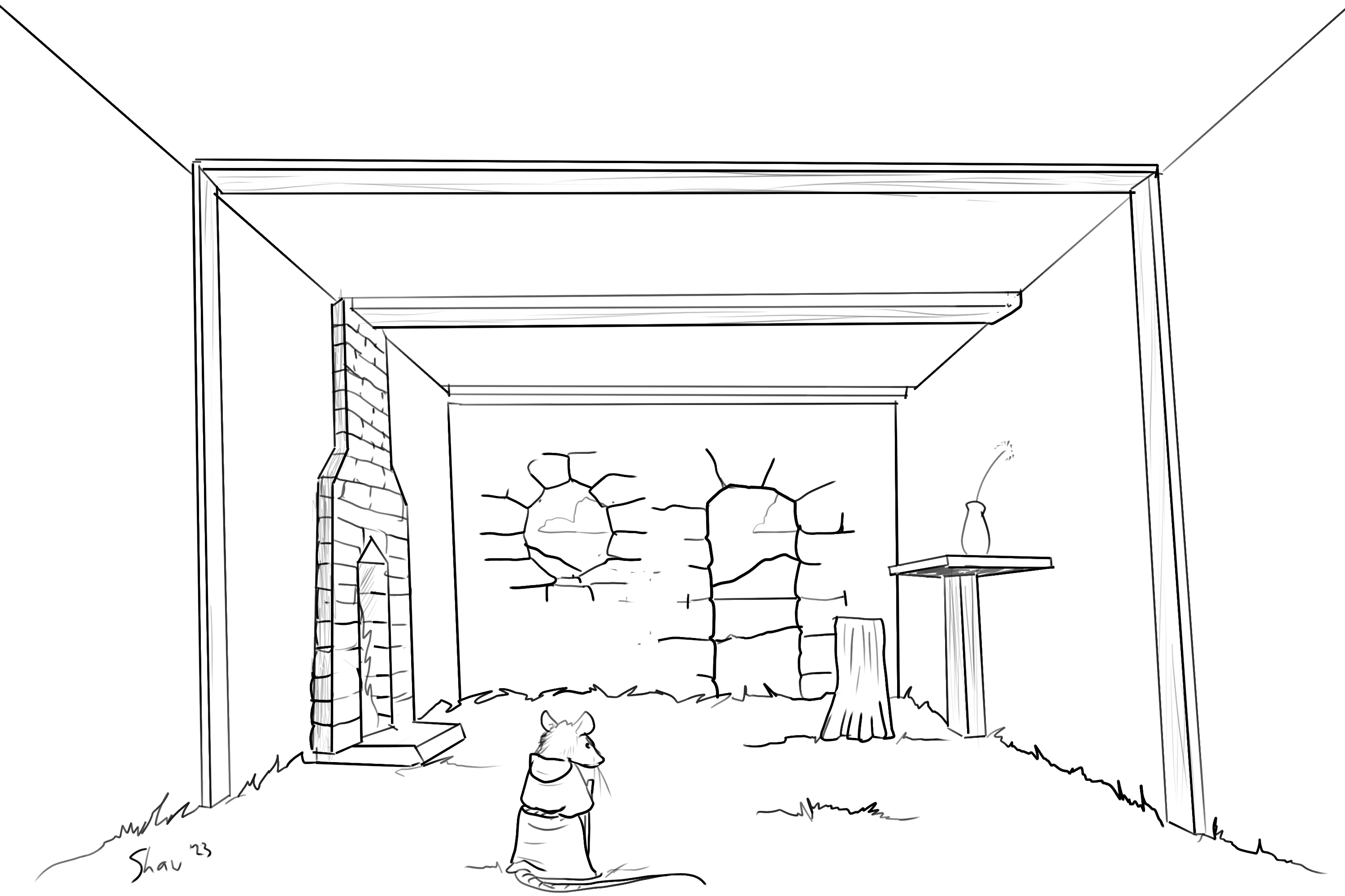
Doing my perspective class - the last one from Term 1. Have done all the explanation and am working through the assignments. I'm not all that inspired by one point perspective so my room is not nearly as cool as Marc's is.