


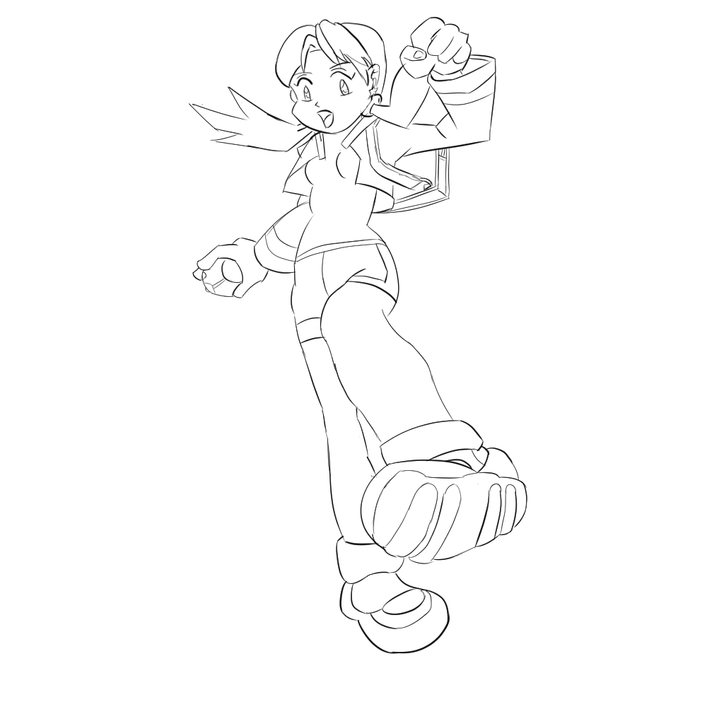
Yeah, it's from a Pokémon game.
And you are right about some lines. You see, I first used the lines from VP when doing the buildings, and when the basic structures were done, I changed the canvas and then did the windows and roofs using the lines already available as reference. So yeah, some of them don't like very good.
I have tried a second one, a wall this time. I had some problems because I felt that I was mostly using the left VP for the wall and didn't know when to use the right VP. Again, I reduced the canvas so can't see the VP, but from now on I will share the whole picture here.
Again, the same problem of not using reference lines for smaller things. Also, I did this one with another software (Procreate) and I still can't use it very well (sometimes I draw on my iPad)

 Thank you! I finally cleaned that up. Meanwhile started 3 more ..I have a habit of taking too long to finish a piece, then I lose interest in it and just start something else. I found 8 from recently i started and abandoned, that are decent enough to not delete, but not finished. There’s also been a number of drawings I felt I “outgrew” - became better before I finished them, and it would be easier to start from scratch than fix them. Anyone else thinking that?in24.5k
 Lady Death Fanart Collectible: Part 6 Polypaint and base Hi, it’s time to share with you another part of the process to create this fanart piece. Polypaint As this is my first collectible fanart I didn’t have previous experience with polypaint so I tried my best and played a bit with it.I wanted to give a ghostly and eerie look to Lady Death, she is beautiful and deadly, but at the end of the day she is a woman that died and was reborn at hell as an avenging spirit, that’s why I gave her skin tone a bluish very cold tone.As you will see I gave myself some creative freedom to deviate from the traditional color scheme that this characater has in comics and illustrations.To add a bit of sensuality by painting some freckles on the face and the chest. The dark nature of this character was the perfect excuse to gave her a kind of goth make up, very dark shadows around the eyes, blue lips and fingernails. I know that the original character includes sexy red lips but I wanted this girl to have a sexy but at the same time creepy look, that’s why we can see some thin veins emanating from her eyes. The biggest chromatic change I did for this character is at the hair. Lady Death has a characteristic white weavy hair but in my fanart I decided to gave her a very saturated blue color.The reason behind this wasn’t only an aesthetic choice. I want that the face area strongly pulls the attention of the viewer so this area needed a stronger contrast. Another reason is that I want her to have a more modern look, as I mentioned before, I’m strongly attracted to women with goth/punk look. I gave myself half an hour or more to analyse the work of experienced sculptors that create collectibles and I discovered that the use of darker values on the skin is often applied to create a greater sense of volume and three-dimensionality. I found that areas with heavy ambient occlusion are the perfect places to paint with darker colors in order to increase the separation between different forms. Even though she has a bluish skin tone, I used a bit of warmer hues in areas that, in real life, tend to go towards red and pink, this is very obvious in the nose, cheeks, and knuckles. Thinking with a logical mind it’s completely absurd to have warmer tones on the body of a zombie like creature but I didn’t want to limit myself by using only blue tones, it looks boring and artificial. In real life these colors are created by blood vessels in areas where the skin is very thin. ** Scythe **for her weapon I applied a cool gray with some warmer variations, this color scheme is influenced by the work of H.R giger. Base I’d like to talk about the design for the base which, to be honest, I forgot to develop along with the character.My main idea with the base is to show that Lady Death inhabits a very sterile and arid land, at the end of the day she is at hell.You can see a that she walks over dirt and rocks, a sign that she’s surrounded by death and loneliness. As part of the landscape we can see some bones and skulls to reinforce the idea of lack of living creatures, yet we can see three hands that try to reach her legs.This hands represent that all creatures are subordinated to her power and seek an evil blessing with a simple touch of the princess of the damned.1- The hand with skin burns represents the souls of those who are newcomers to hell, tortured souls that suffer for the sins comitted on earth.2- The hand with greenish rotten skin and pustules is the reminder of the decay that has infected the souls of those who have been trapped and have forgotten their humanity3- Last but not least, the hand of a demon shows that even dark creatures and entities bow before her presence. The cherry on the top, at least in my vision, are the simese twins that emerge from the ground, this malevolent creatures remind us that in hell there’s only perversion and any trace of innocence is lost. Thanks for reading till this pointI’m really happy to be very close to finish this creative journey, last but not least it’s mandatory to talk about splitting the sculpture in several pieces to be printed, this will be my last entry before showing the final rendered images. See yaMay Zbrush be with youin1.5k

 memory 2min gartic phone, used ref 2m gartic, used ref for pose 2min gartic 2min gartic 2min gartic 2min gartic memory memory memory memory study memory memory memorymemory memory memory memory memory memory study memorystudy study stylized left memory, right study study memory memorymemory memory memory memorymemory memory, porportions r offmemory memorystudystudy memorymemorymemory memory memory memory memory memory memory memory, right leg is a bit broken The feeling of only getting 1 - 3 likes on a social media post will never not be discouraging. But nothing is discouraging enough to make me quit drawing. I think the strategy of drawing a lot of stuff and waiting a while to post is good though rather than posting it immediately and then feeling that sadness on the next set of drawingin

 studies studies juri study imagination, how I feel before a speech imagination imagination study something I drew for my presentation also drew this for my presentation, didn't fix the one hand being bigger than the other imagination + study study studies study study, I need to fix the face a bit based on screenshot from anime but in my style study. except for the eye study studies studies study. changed some things tho imagination imagination imagination study studies, except top right samurai based on anime screenshot wolverine studies, changed some of the poses a lil, not very good at all, but first time i drew the character ever. semi study studies study imagination imagination imagination , for first time ever i tried to draw over 3d model for middle pose, I dont like the result tbh, but it makes it much easier than coming up with it from memory.imagination, except right figurestudies imagination + studies, coming up with action poses r hard, these are not dynamic enough, I will redraw better ones in future. imagination , imagination imagination study, except for eye imagination imagination imagination doodles except for the two chrollos imagination storyboard thumbnail, idk if i ever shared this. my storyboards end up being a little detailed since i usually just draw in one layer.in22.4k
Ok, a good practice with all the guidelines
Green is for buildings, purple is for tree (not good at drawing trees)

Hi Sara!
The 4 point mannequin assignment is very tricky. I agree that curving the lines would help to keep the roundness on the volumes of the body. As for the head, it might be beneficial to review proportions of the human body. I tried to show my thinking in some images below.
I'm not a professional, so I'm just giving advice as best I can. But as a general guide, female shoulders are usually 2 heads wide (2.5 heads for males). So if you are using the rectangle as a guide for the width of the shoulders (as in your image above), it might be useful to use it as a guide for the size of the head. Also, because of the angle from which we are viewing the head (like a fisheye lens), we are likely going to see more of the underside of the chin than the front of the face. It should kinda look like the head is tilted back some.
I did 3 drawovers of your image to try to illustrate my thinking.
First is to identify the shoulder width proportions and their centerline, then fit 2 heads within that space (1 head in the center and .5 of a head to each side for a total of 2 head witdths):

Second is to warp those guides with the curving perspective. Remember that the curvature gets more extreme the further away we are from the horizon line:

And third is to fit the body to the new proportions while trying to keep in mind that, from our point of view, we are looking up toward the underside of the head:

Again, I'm an amateur so this may not be totally correct, but this is how I would go about trying to solve the head proportion issue.
I hope this helps! Cheers!
Wow, thank you so much for such a detailed explanation! It was my first time with this and didn't pay that much attention to proportions (aside from dividing the model in 8 parts, but didn't calculate the shoulder width).


heyo, you're doing great, perspective can indeed be very tricky, @Kektet reply inspired me to try to explain how i tackled the 4 point assignment.
I'm gonna use the one i did as reference i hope you don't mind, but basically to do these you need to go beyond what the reference shows you, you need to have a understanding of the construction behind what you're seeing, you must think 3d, break it down to simple shapes and, depending of the point of view, these shapes will begin to overlap each other.

and it truly helps to have a reference so you can use it as a base for what you're doing, i used marc's one in my case, keep it up c:
Hi! It's been a while! Thank you both @Pattu_w and @Kektet for your tutorials. I gave it a try again. They don't look as Pattu's examples because, well, not much anamoty knowledge yet, but it kinda looks similar. This time, I paid attention to the proportions (2 and 1/3 heads for the width of the body) and tried to make the head look similar by making sure the neck is visible

Hi, a while again! This time I went through the Photoshop practice. I'm not very good with the pen tool and vectors, and Photopea wouldn't let me modify the layer without rasterizing it first. But I kinda did something that looks like a box with a title and the creature (all of them as smart objects)
1 month later
Hi everybody! I know it's been so long since the last time I posted something. Believe it or not, I've been drawing, but I wasn't doing anything specific from the course so I didn't post anything XD
So I wanted to share my progress from this last month. I tried going into Term 3, but realized it was soon, so I focused a bit on doing an art study from Pokémon manga, and when Marc published the weekly schedule, I went ahead from Week 2. Here are some examples of what I've been doing in the last weeks:


This is the art study (and an original piece using that style)


Suggested Topics
| Topic | Category | Replies | Views | Activity |
|---|---|---|---|---|
| Chase - Art School Journey (Term 1 - Week 5) | Art School | 41 | 926 | 15d |
| SamuraiSingh - Art School Journey | Art School | 612 | 20.0k | 1d |
| Summer - Art School Journey | Art School | 4 | 1.1k | Oct '21 |
| Eric - Art school Journey | Art School | 15 | 2.0k | Aug '21 |
| Beaver - ART School | Art School | 11 | 1.5k | Sep '23 |