


Welcome back Tanuki!

 Thank you! I finally cleaned that up. Meanwhile started 3 more ..I have a habit of taking too long to finish a piece, then I lose interest in it and just start something else. I found 8 from recently i started and abandoned, that are decent enough to not delete, but not finished. There’s also been a number of drawings I felt I “outgrew” - became better before I finished them, and it would be easier to start from scratch than fix them. Anyone else thinking that?in24.8k
 Lady Death Fanart Collectible: Part 6 Polypaint and base Hi, it’s time to share with you another part of the process to create this fanart piece. Polypaint As this is my first collectible fanart I didn’t have previous experience with polypaint so I tried my best and played a bit with it.I wanted to give a ghostly and eerie look to Lady Death, she is beautiful and deadly, but at the end of the day she is a woman that died and was reborn at hell as an avenging spirit, that’s why I gave her skin tone a bluish very cold tone.As you will see I gave myself some creative freedom to deviate from the traditional color scheme that this characater has in comics and illustrations.To add a bit of sensuality by painting some freckles on the face and the chest. The dark nature of this character was the perfect excuse to gave her a kind of goth make up, very dark shadows around the eyes, blue lips and fingernails. I know that the original character includes sexy red lips but I wanted this girl to have a sexy but at the same time creepy look, that’s why we can see some thin veins emanating from her eyes. The biggest chromatic change I did for this character is at the hair. Lady Death has a characteristic white weavy hair but in my fanart I decided to gave her a very saturated blue color.The reason behind this wasn’t only an aesthetic choice. I want that the face area strongly pulls the attention of the viewer so this area needed a stronger contrast. Another reason is that I want her to have a more modern look, as I mentioned before, I’m strongly attracted to women with goth/punk look. I gave myself half an hour or more to analyse the work of experienced sculptors that create collectibles and I discovered that the use of darker values on the skin is often applied to create a greater sense of volume and three-dimensionality. I found that areas with heavy ambient occlusion are the perfect places to paint with darker colors in order to increase the separation between different forms. Even though she has a bluish skin tone, I used a bit of warmer hues in areas that, in real life, tend to go towards red and pink, this is very obvious in the nose, cheeks, and knuckles. Thinking with a logical mind it’s completely absurd to have warmer tones on the body of a zombie like creature but I didn’t want to limit myself by using only blue tones, it looks boring and artificial. In real life these colors are created by blood vessels in areas where the skin is very thin. ** Scythe **for her weapon I applied a cool gray with some warmer variations, this color scheme is influenced by the work of H.R giger. Base I’d like to talk about the design for the base which, to be honest, I forgot to develop along with the character.My main idea with the base is to show that Lady Death inhabits a very sterile and arid land, at the end of the day she is at hell.You can see a that she walks over dirt and rocks, a sign that she’s surrounded by death and loneliness. As part of the landscape we can see some bones and skulls to reinforce the idea of lack of living creatures, yet we can see three hands that try to reach her legs.This hands represent that all creatures are subordinated to her power and seek an evil blessing with a simple touch of the princess of the damned.1- The hand with skin burns represents the souls of those who are newcomers to hell, tortured souls that suffer for the sins comitted on earth.2- The hand with greenish rotten skin and pustules is the reminder of the decay that has infected the souls of those who have been trapped and have forgotten their humanity3- Last but not least, the hand of a demon shows that even dark creatures and entities bow before her presence. The cherry on the top, at least in my vision, are the simese twins that emerge from the ground, this malevolent creatures remind us that in hell there’s only perversion and any trace of innocence is lost. Thanks for reading till this pointI’m really happy to be very close to finish this creative journey, last but not least it’s mandatory to talk about splitting the sculpture in several pieces to be printed, this will be my last entry before showing the final rendered images. See yaMay Zbrush be with youin1.5k

 memory 2min gartic phone, used ref 2m gartic, used ref for pose 2min gartic 2min gartic 2min gartic 2min gartic memory memory memory memory study memory memory memorymemory memory memory memory memory memory study memorystudy study stylized left memory, right study study memory memorymemory memory memory memorymemory memory, porportions r offmemory memorystudystudy memorymemorymemory memory memory memory memory memory memory memory, right leg is a bit broken The feeling of only getting 1 - 3 likes on a social media post will never not be discouraging. But nothing is discouraging enough to make me quit drawing. I think the strategy of drawing a lot of stuff and waiting a while to post is good though rather than posting it immediately and then feeling that sadness on the next set of drawingin

 studies studies juri study imagination, how I feel before a speech imagination imagination study something I drew for my presentation also drew this for my presentation, didn't fix the one hand being bigger than the other imagination + study study studies study study, I need to fix the face a bit based on screenshot from anime but in my style study. except for the eye study studies studies study. changed some things tho imagination imagination imagination study studies, except top right samurai based on anime screenshot wolverine studies, changed some of the poses a lil, not very good at all, but first time i drew the character ever. semi study studies study imagination imagination imagination , for first time ever i tried to draw over 3d model for middle pose, I dont like the result tbh, but it makes it much easier than coming up with it from memory.imagination, except right figurestudies imagination + studies, coming up with action poses r hard, these are not dynamic enough, I will redraw better ones in future. imagination , imagination imagination study, except for eye imagination imagination imagination doodles except for the two chrollos imagination storyboard thumbnail, idk if i ever shared this. my storyboards end up being a little detailed since i usually just draw in one layer.in22.7k
Term 1 - Nude Figure Drawing
Assignment 1-3: Draw 10 skeletons over a reference photo
I'll be combining assignments 1-3 into one since it's about the same thing. Some of the references I used had clothes and it was definitely a lot harder to try and do those ahaha... wanted to try it, but learned the hard way.

Assignment 4: Draw 5 skeletons with cyclinders as limbs from imagination
I tried my best to draw some poses from imagination. I have done gesture drawings in the past, but haven't been doing them for a while. I should start doing it again on free time.

Assignment 5: Practice drawing the male and female with the 8-head proportion grid until you can draw it from memory
This one wasn't too challenging to do since I already know the basic proportions. It was a good review though. Caught some things that I forgot about 
The one below is the sketch I did with the 8-head proportion grid while I was watching the video and followed along.

The sketch below is of the basic proportions drawn from memory.

Assignment 6: Gesture Drawings
I will be skipping this one since I will be doing this everyday on my freetime. I don't think it will be too neccessary to show these on here.
Assignment 7: Practice drawing the full figure from reference
This one was quite interesting to try and do on my own and I'll show you why below. But first, here is the full figure drawing I did while following alongside Marc in the video.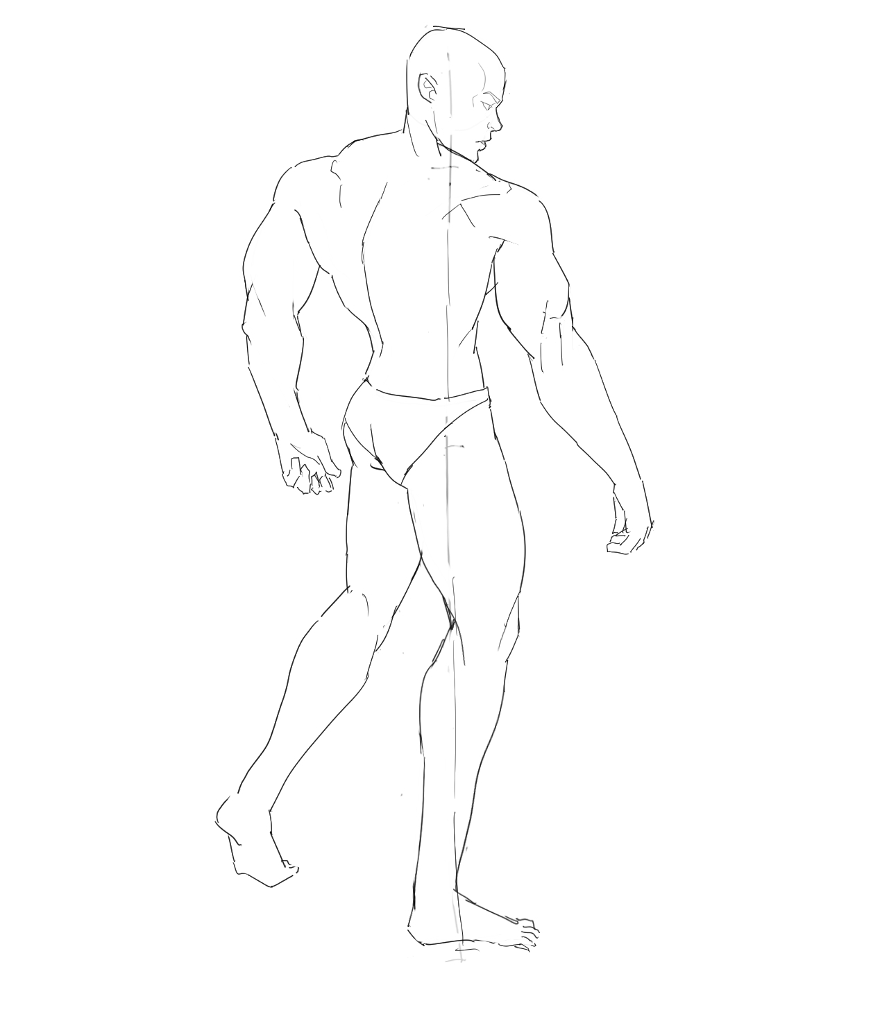
And below is the one that I did by myself after watching the lesson. I thought it was going fairly well, but when I tried overlapping my sketch with the reference, it was off by a mile! I learned that I tend to try and draw everything a bit tilted to the right which is something that I should probably look into and fix.

I still quite liked how the sketch came out, so I decided to clean it up a bit and add the face!
That wraps it up for the nude figure drawing assignments from term 1! Thanks for checking my topic and any and all feedback is appreciated!
Yo! you're going hard at it! It's all good work there. It seems you already have an eye for self analysis, since you did the overlap and quickly saw the mistakes. If you haven't remember that flipping horizontally frrequently is also a neat brain hack to allow you to easily notice miss proportions and unbalance.
I was also going to mention line confidence in some of this, but the last one shows you can make cleaner and more confident lineart, so I think it's just because most of the exercices where just sketchwork.
It also seems resolution is a bit low, though barely noticeable. For these exercices it's perfectly fine, especially if it's a consious choice, otherwise it might help to understand the different resolutions available, DPI and how it impacts the overall smoothness.
Keep it up man, you're doing great there.
Thank you for the detailed response!! Honestly line confidence is indeed something I still struggle with especially when my hands are just naturally pretty shaky. I have been trying to stop myself from chicken scratching and just going for bigger strokes recently though which has halped a bit.
And as for the resolution is setting the DPI at 300 and exporting the image as jpg causing the low resolution at all?
As for resolution, there are two parts to it, DPI (300 seems to be the norm), but also the overall width and height. Judging by the work it seems to be around 1.5 k? For these exercices I think it's fine, as it keeps resources low and you are bound to do many of them. For more elaborate work, 3k-4k is probably better. More pro work can go up to 6k and beyond. You can also increase resolution middway, which will allow you to pack in more detail.
When exporting, PNG usually has a good balance of quality/size. That's what I normally use, though I'm no expert, I'm sure there are more settings to keep in mind i'm unaware of. The only other aspect I'd probably note of is the ratio and output size. I'd say just keep it at 100% unless you are specifically going for something.
I see! thank you for clearing it up for me. I'll keep these in mind for the future. I think I have been exporting as jpg just to keep the file size low. Didn't really think about how it would affect the quality as well aha...
It's all good! for practice work like this it really doesn't make much of a difference. Just worth knowing for when you start doing more elaborate work or color.
looking back at your other page you are really talented already and from what I can see from the stuff you have posted you are already on your way of zipping those these lessons. Excited to see more
Thank you!! I honestly don't believe I have the same skillset I used to have back then, but I'll work hard to regain my abilities again!
Nice to have you here mate, saw your previous work and you've got some really nice stuff! Here's to those art gains
cheers
Term 1 - Perspective
Hiya there! I was away meeting some friends so I have a lot of catching up to do.
Assignment 1: Using existing photos try finding convergence lines, vanishing points and the horizon
Learning perspective is pretty interesting. I'm starting to understand it a bit more. I tried doing a little sketch of a birds-eye view scene on the right hand corner and I'm not too sure how to scale buildings and people when it's in 3-point perspective still. Any tips or help on that would be appreciated!

Assignment 2: Practice drawing cubes and simple sculted shapes
I tried pushing the cube outside of the vanishing points and it seems to get distorted. And it seems to get distorted even when inside of 2 vanishing points if you go far enough away from the horizon.

Assignment 3: Using 1-point perspective, draw a room in your house ( fantasy twist )
I know it's a bit rushed, but I wanted to get the assignment done as soon as possible. Really want to finish term 1 and move on to term 2. Will be doing the fourth term 1 perspective assignment tomorrow.
Good work man. Yea, perspective in general takes a bit to get used to. Like in, I still have a rough time getting used to it xD.
Those exercices does help understand how vanishing points affects objects as they move closer to them though. You're right, as you get closer, things distort a bit, like if you're getting closer to a black hole. The viewable are will usually rest in an area where the vanishing points are way off outside of the frame to keep things proper.
Because of this, depending on the tool you are using, it's better to focus on the viewable area rather than on the points themselves. Hard to explain, and something I didn't really see elaborated much.
Still, keep experimenting, creating perspectives from references and so, and you slowly start to get the hang of it, pretty much like any area of drawing.
The room is nice, though it could use some furniture xD.
@daceronine Yeah perspective is definitely one of the areas that makes less sense to me the more I look into it lol. Wish it was as simple as most people make it out to be like 1point, 2point, and 3point perspective. And yeah I should have chose to draw a living room or something rather than a random hallway xP... does look empty
@mitsuki-youko Thanks! Honestly was a mistake cause I accidentally painted over the sketch, but I like how it turned out. I might try to incorporate shading backgrounds like that in the future. Happy little accident lol
Term 1 - Perspective
Assignment 4: Draw a street corner in 2-point perspective
I tried to pick a harder reference to use and I'm still unsure what to do when there are multiple objects that seem to go to a different vanishing point. I'm pretty sure there is only supposed to be one horizon line(?), but it felt like there was more than one. Maybe I didn't watch the lesson closely enough, or it's explained in a different term.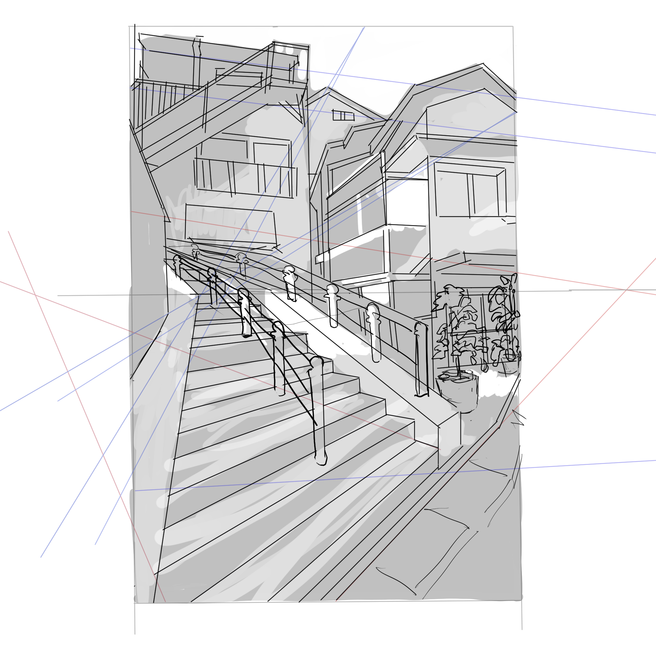
Wasn't perfect, but finally finished with term 1. I think I will try to keep a fast pace until I get to the lessons where I really don't understand much of it. I might go take some other lessons for perspective.
yoo this looks rly amazing too!
Nice everything looking nice so far
Term 2 - Anatomy 1
I probably won't be doing any of the photoshop classes in term 2 for the same reason I skipped them in term 1.
Assignment 1: Practice drawing volumes in perspective
I might try to do these daily whenever I'm feeling bored like Marc said. I think it'll help me train my eye to see 3D space better.
Assignment 2: Practice drawing the main head sphere with its correct horizontal and vertical guidelines and then full head volume
I'm still in the process of watching this part of the class, but I think I got it down enough to be able to do the assignment. Tomorrow I'll try to finish the rest of Anatomy 1 lessons.