


Good work!
I have the impression that you were trying to draw what you think is there for the right hand of the model, but this exercise is about drawing what you see, so maybe if you try to be more conscious about it it will help next time.

 Thank you! I finally cleaned that up. Meanwhile started 3 more ..I have a habit of taking too long to finish a piece, then I lose interest in it and just start something else. I found 8 from recently i started and abandoned, that are decent enough to not delete, but not finished. There’s also been a number of drawings I felt I “outgrew” - became better before I finished them, and it would be easier to start from scratch than fix them. Anyone else thinking that?in24.4k
 Lady Death Fanart Collectible: Part 6 Polypaint and base Hi, it’s time to share with you another part of the process to create this fanart piece. Polypaint As this is my first collectible fanart I didn’t have previous experience with polypaint so I tried my best and played a bit with it.I wanted to give a ghostly and eerie look to Lady Death, she is beautiful and deadly, but at the end of the day she is a woman that died and was reborn at hell as an avenging spirit, that’s why I gave her skin tone a bluish very cold tone.As you will see I gave myself some creative freedom to deviate from the traditional color scheme that this characater has in comics and illustrations.To add a bit of sensuality by painting some freckles on the face and the chest. The dark nature of this character was the perfect excuse to gave her a kind of goth make up, very dark shadows around the eyes, blue lips and fingernails. I know that the original character includes sexy red lips but I wanted this girl to have a sexy but at the same time creepy look, that’s why we can see some thin veins emanating from her eyes. The biggest chromatic change I did for this character is at the hair. Lady Death has a characteristic white weavy hair but in my fanart I decided to gave her a very saturated blue color.The reason behind this wasn’t only an aesthetic choice. I want that the face area strongly pulls the attention of the viewer so this area needed a stronger contrast. Another reason is that I want her to have a more modern look, as I mentioned before, I’m strongly attracted to women with goth/punk look. I gave myself half an hour or more to analyse the work of experienced sculptors that create collectibles and I discovered that the use of darker values on the skin is often applied to create a greater sense of volume and three-dimensionality. I found that areas with heavy ambient occlusion are the perfect places to paint with darker colors in order to increase the separation between different forms. Even though she has a bluish skin tone, I used a bit of warmer hues in areas that, in real life, tend to go towards red and pink, this is very obvious in the nose, cheeks, and knuckles. Thinking with a logical mind it’s completely absurd to have warmer tones on the body of a zombie like creature but I didn’t want to limit myself by using only blue tones, it looks boring and artificial. In real life these colors are created by blood vessels in areas where the skin is very thin. ** Scythe **for her weapon I applied a cool gray with some warmer variations, this color scheme is influenced by the work of H.R giger. Base I’d like to talk about the design for the base which, to be honest, I forgot to develop along with the character.My main idea with the base is to show that Lady Death inhabits a very sterile and arid land, at the end of the day she is at hell.You can see a that she walks over dirt and rocks, a sign that she’s surrounded by death and loneliness. As part of the landscape we can see some bones and skulls to reinforce the idea of lack of living creatures, yet we can see three hands that try to reach her legs.This hands represent that all creatures are subordinated to her power and seek an evil blessing with a simple touch of the princess of the damned.1- The hand with skin burns represents the souls of those who are newcomers to hell, tortured souls that suffer for the sins comitted on earth.2- The hand with greenish rotten skin and pustules is the reminder of the decay that has infected the souls of those who have been trapped and have forgotten their humanity3- Last but not least, the hand of a demon shows that even dark creatures and entities bow before her presence. The cherry on the top, at least in my vision, are the simese twins that emerge from the ground, this malevolent creatures remind us that in hell there’s only perversion and any trace of innocence is lost. Thanks for reading till this pointI’m really happy to be very close to finish this creative journey, last but not least it’s mandatory to talk about splitting the sculpture in several pieces to be printed, this will be my last entry before showing the final rendered images. See yaMay Zbrush be with youin1.5k

 memory 2min gartic phone, used ref 2m gartic, used ref for pose 2min gartic 2min gartic 2min gartic 2min gartic memory memory memory memory study memory memory memorymemory memory memory memory memory memory study memorystudy study stylized left memory, right study study memory memorymemory memory memory memorymemory memory, porportions r offmemory memorystudystudy memorymemorymemory memory memory memory memory memory memory memory, right leg is a bit broken The feeling of only getting 1 - 3 likes on a social media post will never not be discouraging. But nothing is discouraging enough to make me quit drawing. I think the strategy of drawing a lot of stuff and waiting a while to post is good though rather than posting it immediately and then feeling that sadness on the next set of drawingin

 studies studies juri study imagination, how I feel before a speech imagination imagination study something I drew for my presentation also drew this for my presentation, didn't fix the one hand being bigger than the other imagination + study study studies study study, I need to fix the face a bit based on screenshot from anime but in my style study. except for the eye study studies studies study. changed some things tho imagination imagination imagination study studies, except top right samurai based on anime screenshot wolverine studies, changed some of the poses a lil, not very good at all, but first time i drew the character ever. semi study studies study imagination imagination imagination , for first time ever i tried to draw over 3d model for middle pose, I dont like the result tbh, but it makes it much easier than coming up with it from memory.imagination, except right figurestudies imagination + studies, coming up with action poses r hard, these are not dynamic enough, I will redraw better ones in future. imagination , imagination imagination study, except for eye imagination imagination imagination doodles except for the two chrollos imagination storyboard thumbnail, idk if i ever shared this. my storyboards end up being a little detailed since i usually just draw in one layer.in22.3k
Thanks!
Ye, alright, i think i get what you mean. But i would say that it is definetly harder to draw something if you have no idea how it's constructed. Well, at least for me.
Love the detail your getting on those smaller objects and your line weight is really good at driving the perspective.
If I was to add anything, I think you need some objects in the foreground. It would really add to composition and make it seem like the camera isn't so far away and the room wouldn't feel as empty too.
Either way looks like a very solid foundation - your other work is great so I'm looking forward to seeing what you do with it!
Alex
Hey, Alex!
I will definetly work around foreground and the ceiling area :>
Thanks a lot for the support 
I keep adding details slowly, rounding the corners and all. It gets harder for me with every second because i am not really good with making up interiors (at least i dont think so) and I am more a minimalistic type of person, haha 

Nice! I like the changes you've did. It seems like it will turn out to be a pretty cool room


Aww come on now, that turned out quite decent!
And its important to not filling images with everything under the sun, give the eye some resting space, I would say that you actually obeyed the thirds system with this layout.
If you want to put in a little more, maybe just cut a doorway onto the wall on the far right of the image, like show that a hallway is there or something, that is the only spot that looks unused.
Maybe try pumping up the light cast in by the window on a separate layer, like the sun is just coming up and it is throwing a hard beam into the room. That might be fun.
Its a fun image that shows you nailed the perspective.
If you're intersted into doing more you can always check out interior magazines or websites. There's a lot of really cool ideas for layouts and prop design to found in those.
Another idea is to imagine how would you decorate and arrange this place if you were living there. Like, if you like to read, putting in a cabinet with books, a cozy chair and a lamp for when it's dark could be cool. Or if you'Re the kind of person who likes hanging stuff their wall, just add some of that to your drawing. Or you can also do the same by creating a character in your head and go through the same process, but from the perspective of that character instead of yours.
But as @PeterH mentionned, you also don't necessarely always need to fill the whole place either. I think it already works well as it is overall.
As for the shading, I think you just need to push the darks a little bit more to create a better contrast. Something a little bit like this maybe? 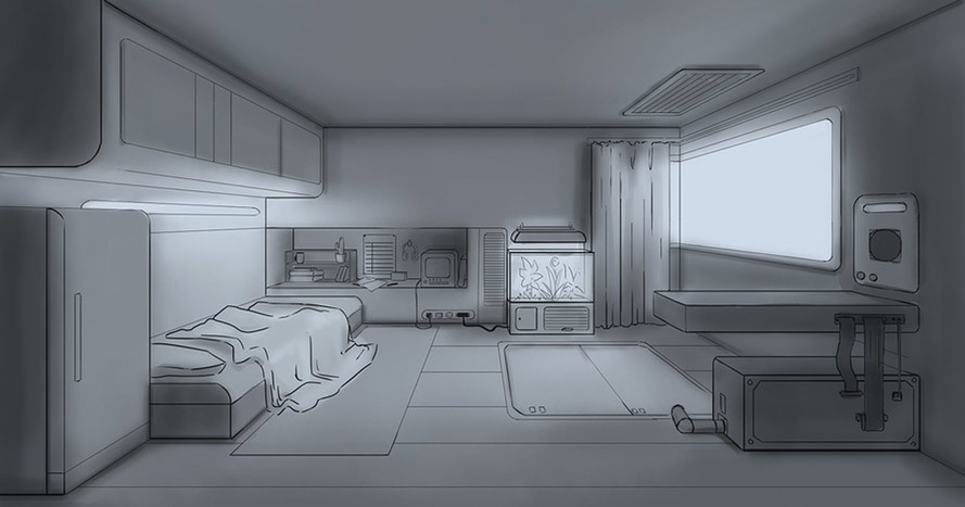
A lot of what I did was darkening the areas where objects meet (like where walls corner and where the furniture touch the ground). I think it's called occlusion, but don't quote me on that. I also darkened the closer planes facing us as the light from the window wouldn't affect them as much.
But otherwise, I'd say good job! That's a pretty good perspective job

I didn't have much time to properly work on it tbh but yours advices (@cedricgo and @PeterH) are very helpful indeed!
I tried to push darks as much as i htought it would work out..
I do see now where i could add more details and I have a bit of an idea now.. but unfortunetly I will have to leave this as is for now.

I'm glad that I was of some help
As for the changes you've done, I think you did a very nice job. It looks pretty good to me. Good job!
Wow, it is nice to see the evolution of the piece, and that it came out so well! I really like the idea and the results!
I think the only little details to work, would be the folds of the blanket, and that thing on the right wall (I'm sorry, I don't know what it is), that seems a little bit out of perspective. But they really are very minor details.

Oh, very nice! I see you've followed Marc's suggestions. I think it all works really well. My only very minor nitpick is that I feel that the little cabinet on the right, the one on top of the desk thing, calls a little bit much attention to itself. Maybe darkening it just a bit would help make it blend a little bit better with every thing else.
But other than that, it looks really cool
Ye, i will definetly darken it up.
thanks

Suggested Topics
| Topic | Category | Replies | Views | Activity |
|---|---|---|---|---|
| 16galint - Art Journey | Art School | 4 | 919 | Dec '21 |
| Cynder’s Art Blog🤍 | Art School | 44 | 1.3k | 28d |
| Shan - Art School Journey | Art School | 41 | 6.1k | Jan '23 |
| Voidknight96 (Ricardo) - Art school Journey | Art School | 26 | 4.6k | Sep '24 |
| Gemsy - Art School Journey | Art School | 1 | 586 | Jul '22 |