


 Thank you! I finally cleaned that up. Meanwhile started 3 more ..I have a habit of taking too long to finish a piece, then I lose interest in it and just start something else. I found 8 from recently i started and abandoned, that are decent enough to not delete, but not finished. There’s also been a number of drawings I felt I “outgrew” - became better before I finished them, and it would be easier to start from scratch than fix them. Anyone else thinking that?in24.4k
 Lady Death Fanart Collectible: Part 6 Polypaint and base Hi, it’s time to share with you another part of the process to create this fanart piece. Polypaint As this is my first collectible fanart I didn’t have previous experience with polypaint so I tried my best and played a bit with it.I wanted to give a ghostly and eerie look to Lady Death, she is beautiful and deadly, but at the end of the day she is a woman that died and was reborn at hell as an avenging spirit, that’s why I gave her skin tone a bluish very cold tone.As you will see I gave myself some creative freedom to deviate from the traditional color scheme that this characater has in comics and illustrations.To add a bit of sensuality by painting some freckles on the face and the chest. The dark nature of this character was the perfect excuse to gave her a kind of goth make up, very dark shadows around the eyes, blue lips and fingernails. I know that the original character includes sexy red lips but I wanted this girl to have a sexy but at the same time creepy look, that’s why we can see some thin veins emanating from her eyes. The biggest chromatic change I did for this character is at the hair. Lady Death has a characteristic white weavy hair but in my fanart I decided to gave her a very saturated blue color.The reason behind this wasn’t only an aesthetic choice. I want that the face area strongly pulls the attention of the viewer so this area needed a stronger contrast. Another reason is that I want her to have a more modern look, as I mentioned before, I’m strongly attracted to women with goth/punk look. I gave myself half an hour or more to analyse the work of experienced sculptors that create collectibles and I discovered that the use of darker values on the skin is often applied to create a greater sense of volume and three-dimensionality. I found that areas with heavy ambient occlusion are the perfect places to paint with darker colors in order to increase the separation between different forms. Even though she has a bluish skin tone, I used a bit of warmer hues in areas that, in real life, tend to go towards red and pink, this is very obvious in the nose, cheeks, and knuckles. Thinking with a logical mind it’s completely absurd to have warmer tones on the body of a zombie like creature but I didn’t want to limit myself by using only blue tones, it looks boring and artificial. In real life these colors are created by blood vessels in areas where the skin is very thin. ** Scythe **for her weapon I applied a cool gray with some warmer variations, this color scheme is influenced by the work of H.R giger. Base I’d like to talk about the design for the base which, to be honest, I forgot to develop along with the character.My main idea with the base is to show that Lady Death inhabits a very sterile and arid land, at the end of the day she is at hell.You can see a that she walks over dirt and rocks, a sign that she’s surrounded by death and loneliness. As part of the landscape we can see some bones and skulls to reinforce the idea of lack of living creatures, yet we can see three hands that try to reach her legs.This hands represent that all creatures are subordinated to her power and seek an evil blessing with a simple touch of the princess of the damned.1- The hand with skin burns represents the souls of those who are newcomers to hell, tortured souls that suffer for the sins comitted on earth.2- The hand with greenish rotten skin and pustules is the reminder of the decay that has infected the souls of those who have been trapped and have forgotten their humanity3- Last but not least, the hand of a demon shows that even dark creatures and entities bow before her presence. The cherry on the top, at least in my vision, are the simese twins that emerge from the ground, this malevolent creatures remind us that in hell there’s only perversion and any trace of innocence is lost. Thanks for reading till this pointI’m really happy to be very close to finish this creative journey, last but not least it’s mandatory to talk about splitting the sculpture in several pieces to be printed, this will be my last entry before showing the final rendered images. See yaMay Zbrush be with youin1.5k


 memory 2min gartic phone, used ref 2m gartic, used ref for pose 2min gartic 2min gartic 2min gartic 2min gartic memory memory memory memory study memory memory memorymemory memory memory memory memory memory study memorystudy study stylized left memory, right study study memory memorymemory memory memory memorymemory memory, porportions r offmemory memorystudystudy memorymemorymemory memory memory memory memory memory memory memory, right leg is a bit broken The feeling of only getting 1 - 3 likes on a social media post will never not be discouraging. But nothing is discouraging enough to make me quit drawing. I think the strategy of drawing a lot of stuff and waiting a while to post is good though rather than posting it immediately and then feeling that sadness on the next set of drawingin


 studies studies juri study imagination, how I feel before a speech imagination imagination study something I drew for my presentation also drew this for my presentation, didn't fix the one hand being bigger than the other imagination + study study studies study study, I need to fix the face a bit based on screenshot from anime but in my style study. except for the eye study studies studies study. changed some things tho imagination imagination imagination study studies, except top right samurai based on anime screenshot wolverine studies, changed some of the poses a lil, not very good at all, but first time i drew the character ever. semi study studies study imagination imagination imagination , for first time ever i tried to draw over 3d model for middle pose, I dont like the result tbh, but it makes it much easier than coming up with it from memory.imagination, except right figurestudies imagination + studies, coming up with action poses r hard, these are not dynamic enough, I will redraw better ones in future. imagination , imagination imagination study, except for eye imagination imagination imagination doodles except for the two chrollos imagination storyboard thumbnail, idk if i ever shared this. my storyboards end up being a little detailed since i usually just draw in one layer.in22.3k


Hey @Frog~ For your latest one good work following the instruction pretty closely and taking it further with some definition too! Everything seems right to me but the only thing that stood out for me is the lower legs seem a bit short? Perhaps the knees should be shifted slightly above the horizontal line? And the calves seem a bit on the fat side to me haha.
But overall great quality work, keep it up! Your 1 min gestures are great, I wish I can put in that much detail as you in 1 minute haha  .
.
heya @fuulin thanks yeah looking back at it the legs do seem stumpy lmao.  Also on my gestures don't feel too put down i kinda cheated and took a couple more seconds to draw extra stuff.

Hi Frog, I love to see your work. its amazing and I can see you put so much effort and dedication into it. I have just started doing these homework myself. I think you nailed the Photoshop assignment as well the figure drawing one.
As for the Castle piece, I really like how you put all of them together. and I'd like to give couple of my thoughts.
First Scale: The proportion of the Human figures compared to the castle seemed to be bit off. I think you are trying to avoid to make them too small that they can be seen by the viewer so they can be used to convey the storytelling. But I think they should be a bit smaller, unless they are meant to be specifically bigger than Normal figures.
The Boat: I like how you crop the lights under the boat to add reflection effect on the water, I think you did a good job on this one. It would be nice to make the sail (cloth part) a bit convex to emphasize the wind blowing. This can be used to tell which direction the boat goes.
The Air Particle: I am seeing the Castle sort of "popped" from the rest of the object. The further the object from the camera the less saturated the color will be, its because there is layers of air particle this can be used to convey depth. Try to apply a bit into the boat as well so they feel like they belong in the environment.
The Shadows: So The sun is blocked by the Castle so there should be some shadows on the water. Also the Castle should look more like a silhouette shape since its against the light source (sun).
The Composition: As for the composition I think you can use rule of thirds and golden ratio to keep the composition interesting. Right now I see so much going on in the mid section of the picture. Meanwhile there is so much negative space on the right side of the picture. I think it would look better if you move the castle layer slightly to the right side of the image following the rule of thirds. Also shrink the Caslte size because right now the proportion between the Caslte and the Boat is almost 1 vs 1, it makes the viewer hard to determine which is the main focus and which is secondary one. As for the reference I think they are pretty good references. Overall I think you are pretty good in terms of the technique.
i like how you Blend the the old man's beard into the portrait and your Figure drawings are gorgeous. Keep it up !! I can see a lot potential in you.
Cheers,
Draxist
8 days later
heya @gameomic Thank you so much, im glad you like my work!! 
 As for the castle yeah it really gave me so much trouble haha, I kinda wanted everything to fit and be visible? but yah as your sayin it really makes it look weird but ill keep what you said for future reference.

Those values. Hell yeah!!!
@Frog that value drawing is looking kick-ass man! I struggle pretty hard when it comes to using values, but you nailed it here =) nice job, keep it up!
19 days later
Nice value study! As for the critique, the latissimus is peaking out a little too much and you could go darker at some spots (e.g. the occlusion shadow between arm and torso). Also, the head is turned more to the left than yours is and his left leg appears kinda stiff on your painting.
All in all a great value study though, keep it up 
Thank you !! i see what you mean, yeah i kinda lost it while painting

Impressive, I'm doing the gesture exercise myself. Have you ever been in a drawing class before?
Thank you !! Do you mean like a paid art class?? i mean i took art class in highschool but for the most part im self taught.
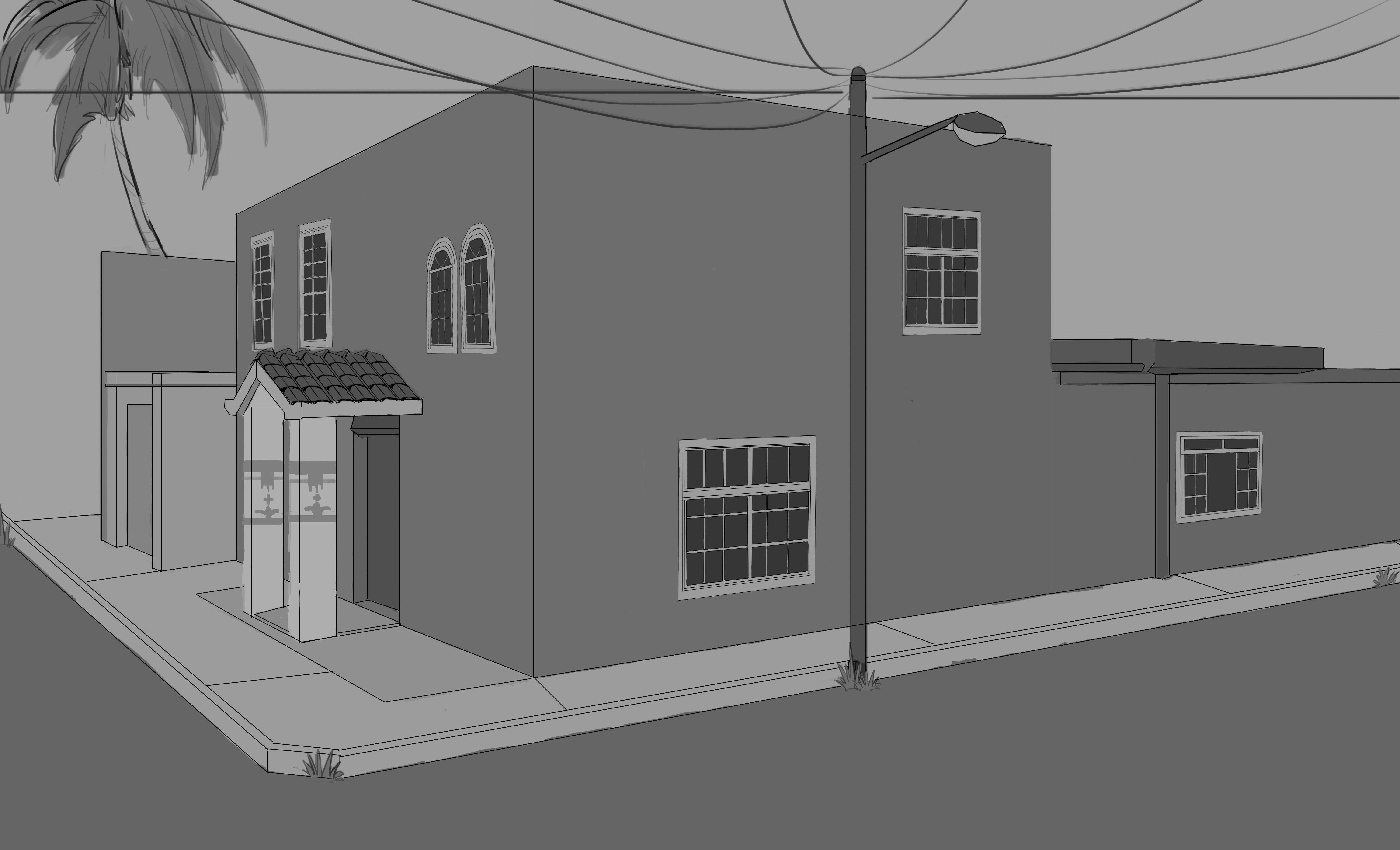
amazing detail  really liking the pattern on the bed and wardrobe, alittle bothered by the top left curtains contour. Feels abit messy and thick
9 days later
I like the room as well, rather pleasant.
I recommend getting the patterns that you used into perspective as well, the floor tile texture, try to line up the vertical component with the wall and the carpet, I think that you can just grab the texture and drag the corner points with... I want to say the warp option, but I don't think that is what its called... where you can move the corners of a selection freely.
Thank you!!
yeah I know what you're talking about, uhh I don't remember what its called. I did use it for the cupboard and stuff but yeah looking back at it the floor it's killing, It kinda Looks slanted to the right a bit.
Really liking the effort made so far Frog master. The attempt at 3rd level details in the room especially is very nice to see, The next step will be to add life to the scene but honestly very decent at the moment.
Be a little careful of the lens you are using you are getting weird distortions but that can be corrected :D.
Thanka :DD it really means alot, but i woudnt go that far, im just a simple frog lmao.
also what lens?? im honestly confused, like i see what you mean its kinda slanted but im not really using anything? 😅😅🤔🤔
Suggested Topics
| Topic | Category | Replies | Views | Activity |
|---|---|---|---|---|
| Daniel.R.R - Art School Journey | Art School | 46 | 5.4k | May '23 |
| Marr’s Art School Journey | Art School | 6 | 198 | Jan 23 |
| Full Art School Journey - Alexandra | Art School | 37 | 6.5k | May '20 |
| Bun - Art School Journey | Art School | 6 | 932 | Mar '22 |
| Term 2 - Mike Fam | Art School | 1 | 1.2k | May '18 |