• Gave myself 5 days to do something. This is what I managed to do. I'm trying to get better at illustrations, but I have patience to work on something for 3 days maximum :( Splash_Process.jpg5000x3140 2.21 MB Splash_Process-6.jpg3896x2429 2.83 MB concept list char copy.jpg5388x3000 1.7 MB
    20.8k
  • Did a character concept for a course.https://www.artstation.com/artwork/P6gm3y - more:) list1.jpg3541x1920 2.82 MB
    20.8k
  • Day 4: Star Wars May The 4th =] Queen Padmé Amidala in my art style! First time drawing her and I really enjoyed making this one! Used watercolours, ink pen, acrylic markers and gold paint for accents on my Canson mix media sketchbook. I hope you like it!
    82.4k
  • A creature design from a while back
    by
    6.7k
  • Here is some more recent stuff, I need to make more body studies
  • It's been a while and god, it is so cringe to go through all previous messages xDmy study.
    20.8k
  • Thank you! I finally cleaned that up. Meanwhile started 3 more ..I have a habit of taking too long to finish a piece, then I lose interest in it and just start something else. I found 8 from recently i started and abandoned, that are decent enough to not delete, but not finished. There’s also been a number of drawings I felt I “outgrew” - became better before I finished them, and it would be easier to start from scratch than fix them. Anyone else thinking that?
  • Lady Death Fanart Collectible: Part 6 Polypaint and base Hi, it’s time to share with you another part of the process to create this fanart piece. Polypaint As this is my first collectible fanart I didn’t have previous experience with polypaint so I tried my best and played a bit with it.I wanted to give a ghostly and eerie look to Lady Death, she is beautiful and deadly, but at the end of the day she is a woman that died and was reborn at hell as an avenging spirit, that’s why I gave her skin tone a bluish very cold tone.As you will see I gave myself some creative freedom to deviate from the traditional color scheme that this characater has in comics and illustrations.To add a bit of sensuality by painting some freckles on the face and the chest. The dark nature of this character was the perfect excuse to gave her a kind of goth make up, very dark shadows around the eyes, blue lips and fingernails. I know that the original character includes sexy red lips but I wanted this girl to have a sexy but at the same time creepy look, that’s why we can see some thin veins emanating from her eyes. The biggest chromatic change I did for this character is at the hair. Lady Death has a characteristic white weavy hair but in my fanart I decided to gave her a very saturated blue color.The reason behind this wasn’t only an aesthetic choice. I want that the face area strongly pulls the attention of the viewer so this area needed a stronger contrast. Another reason is that I want her to have a more modern look, as I mentioned before, I’m strongly attracted to women with goth/punk look. I gave myself half an hour or more to analyse the work of experienced sculptors that create collectibles and I discovered that the use of darker values on the skin is often applied to create a greater sense of volume and three-dimensionality. I found that areas with heavy ambient occlusion are the perfect places to paint with darker colors in order to increase the separation between different forms. Even though she has a bluish skin tone, I used a bit of warmer hues in areas that, in real life, tend to go towards red and pink, this is very obvious in the nose, cheeks, and knuckles. Thinking with a logical mind it’s completely absurd to have warmer tones on the body of a zombie like creature but I didn’t want to limit myself by using only blue tones, it looks boring and artificial. In real life these colors are created by blood vessels in areas where the skin is very thin. ** Scythe **for her weapon I applied a cool gray with some warmer variations, this color scheme is influenced by the work of H.R giger. Base I’d like to talk about the design for the base which, to be honest, I forgot to develop along with the character.My main idea with the base is to show that Lady Death inhabits a very sterile and arid land, at the end of the day she is at hell.You can see a that she walks over dirt and rocks, a sign that she’s surrounded by death and loneliness. As part of the landscape we can see some bones and skulls to reinforce the idea of lack of living creatures, yet we can see three hands that try to reach her legs.This hands represent that all creatures are subordinated to her power and seek an evil blessing with a simple touch of the princess of the damned.1- The hand with skin burns represents the souls of those who are newcomers to hell, tortured souls that suffer for the sins comitted on earth.2- The hand with greenish rotten skin and pustules is the reminder of the decay that has infected the souls of those who have been trapped and have forgotten their humanity3- Last but not least, the hand of a demon shows that even dark creatures and entities bow before her presence. The cherry on the top, at least in my vision, are the simese twins that emerge from the ground, this malevolent creatures remind us that in hell there’s only perversion and any trace of innocence is lost. Thanks for reading till this pointI’m really happy to be very close to finish this creative journey, last but not least it’s mandatory to talk about splitting the sculpture in several pieces to be printed, this will be my last entry before showing the final rendered images. See yaMay Zbrush be with you
    1.5k
  • memory 2min gartic phone, used ref 2m gartic, used ref for pose 2min gartic 2min gartic 2min gartic 2min gartic memory memory memory memory study memory memory memorymemory memory memory memory memory memory study memorystudy study stylized left memory, right study study memory memorymemory memory memory memorymemory memory, porportions r offmemory memorystudystudy memorymemorymemory memory memory memory memory memory memory memory, right leg is a bit broken The feeling of only getting 1 - 3 likes on a social media post will never not be discouraging. But nothing is discouraging enough to make me quit drawing. I think the strategy of drawing a lot of stuff and waiting a while to post is good though rather than posting it immediately and then feeling that sadness on the next set of drawing
  • Urban Dragon Girl Wip Urban Dragon Girl_wip1.jpg5000x5000 1.11 MB
  • Long time no see! New artworks produced lately
    6.7k
  • studies studies juri study imagination, how I feel before a speech imagination imagination study something I drew for my presentation also drew this for my presentation, didn't fix the one hand being bigger than the other imagination + study study studies study study, I need to fix the face a bit based on screenshot from anime but in my style study. except for the eye study studies studies study. changed some things tho imagination imagination imagination study studies, except top right samurai based on anime screenshot wolverine studies, changed some of the poses a lil, not very good at all, but first time i drew the character ever. semi study studies study imagination imagination imagination , for first time ever i tried to draw over 3d model for middle pose, I dont like the result tbh, but it makes it much easier than coming up with it from memory.imagination, except right figurestudies imagination + studies, coming up with action poses r hard, these are not dynamic enough, I will redraw better ones in future. imagination , imagination imagination study, except for eye imagination imagination imagination doodles except for the two chrollos imagination storyboard thumbnail, idk if i ever shared this. my storyboards end up being a little detailed since i usually just draw in one layer.
    by
    22.3k

PHOTOSHOP II


1.1 LOGO, LOGO ALTERNATE, & INSPIRATION

So for this assignment I wanted to do something with a western that incorporated a mexican aspect to it. As such the word i initially choose was DESPERADO but through my research at western style fonts i stumbled upon a few images that really inspired me. Above all this was the assignment i was most unhappy with in the end because i just have a hard time with fonts and graphic design in general.

1.2 CHARACTERS (VECTORS!!!)

I had a bit of a hard time with this assignment because i felt that it could have been done alot faster it was just done with the brush tool instead of the pen tool. i also had a hard time because i had trouble simplifying my character(s). As a result i choose to do more than one. After this assignment though i think i have a pretty good grasp of the pen tool.

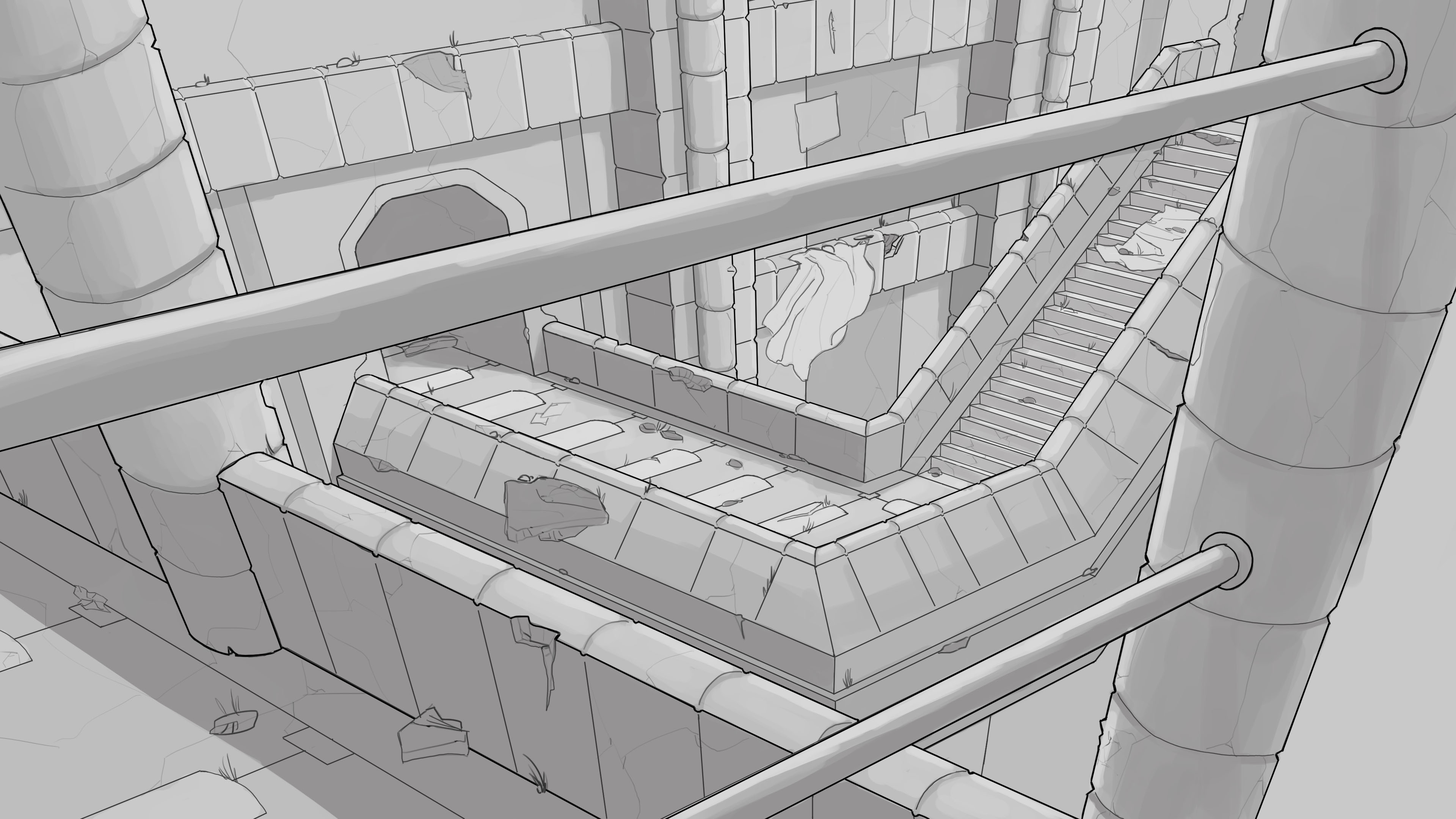
1.3 BOX COVER (SMART OBJECTS)

This assignment was pretty straight forward, i would like to note that my design process was a bit backwards. I initially started out creating everything in one drawing and after it was completed i created the smart objects and painted over the seams to make it look like it was was continuous object.

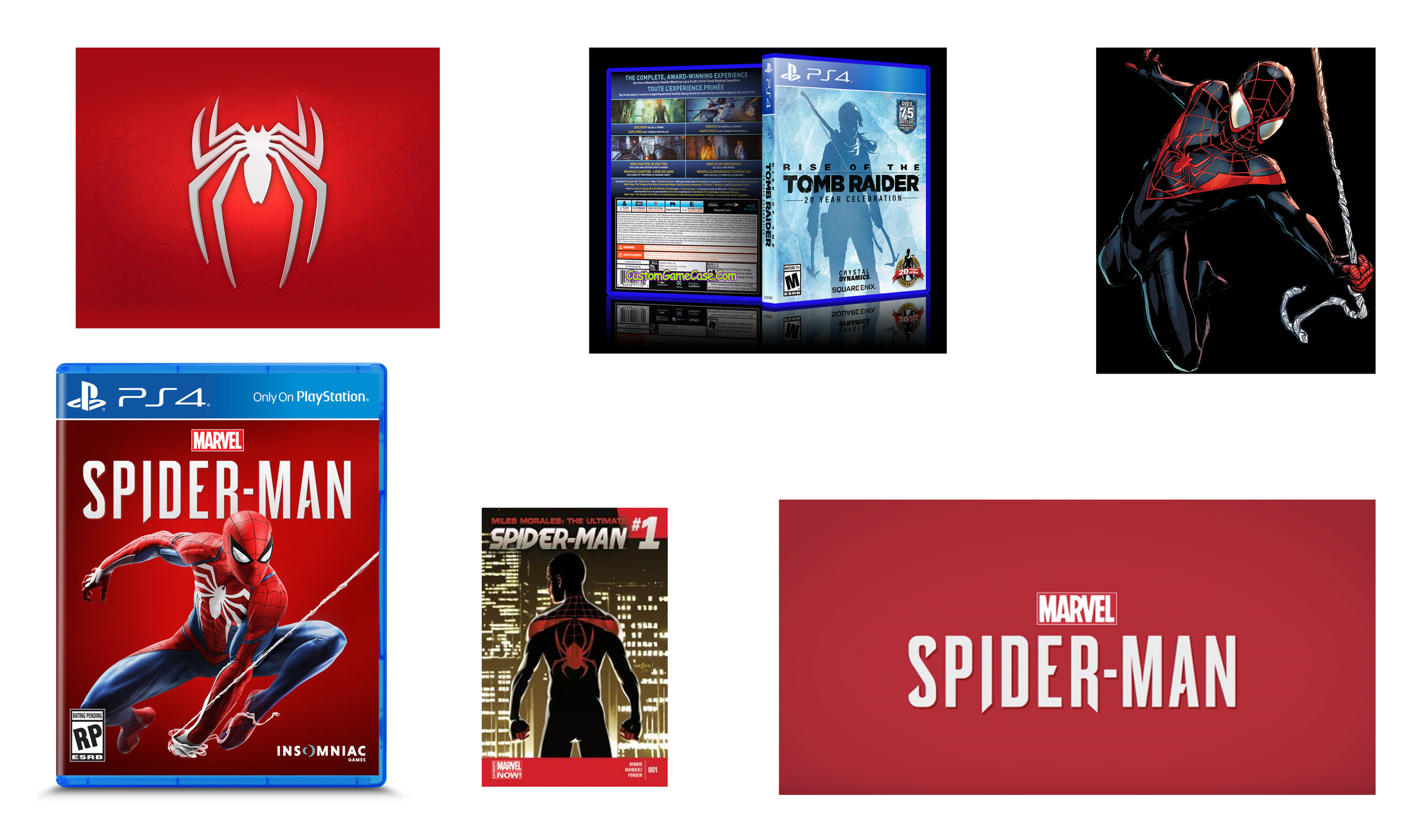
UH... hyped for SPIDER-MAN (PS4) - PLEASE DONT SUE ME - haha
the reason i decided to do spider man was because i started working on this around the time game informer first announced the release date for it. Also i had just finished reading Brian Michael Bendis' Ultimate Spiderman: Peter Parker and wanted to pay homage to that character.

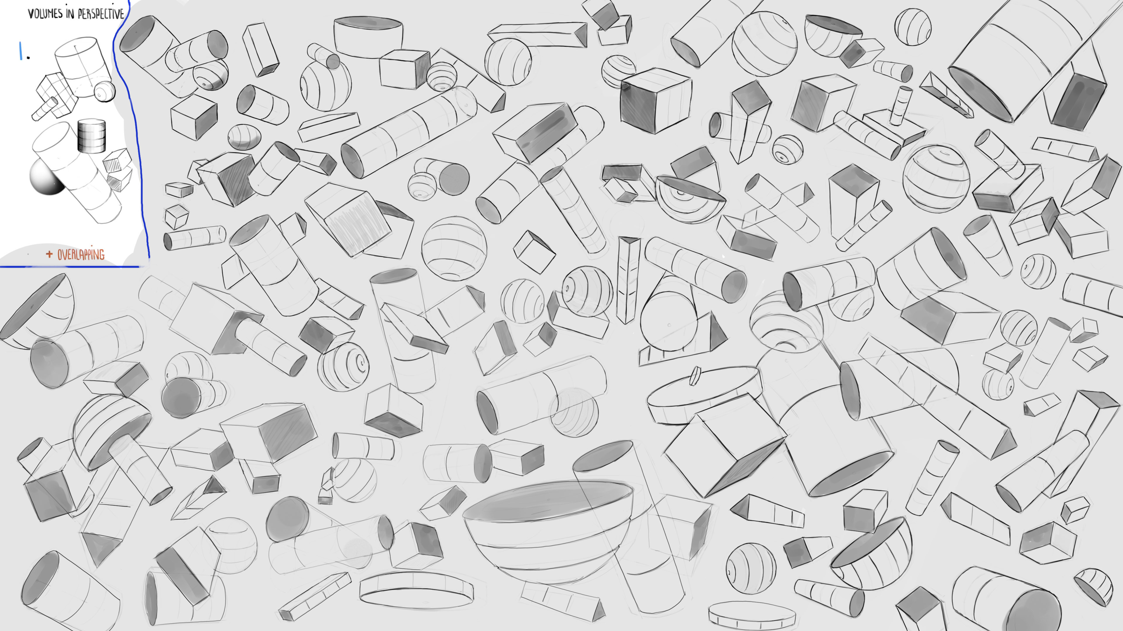
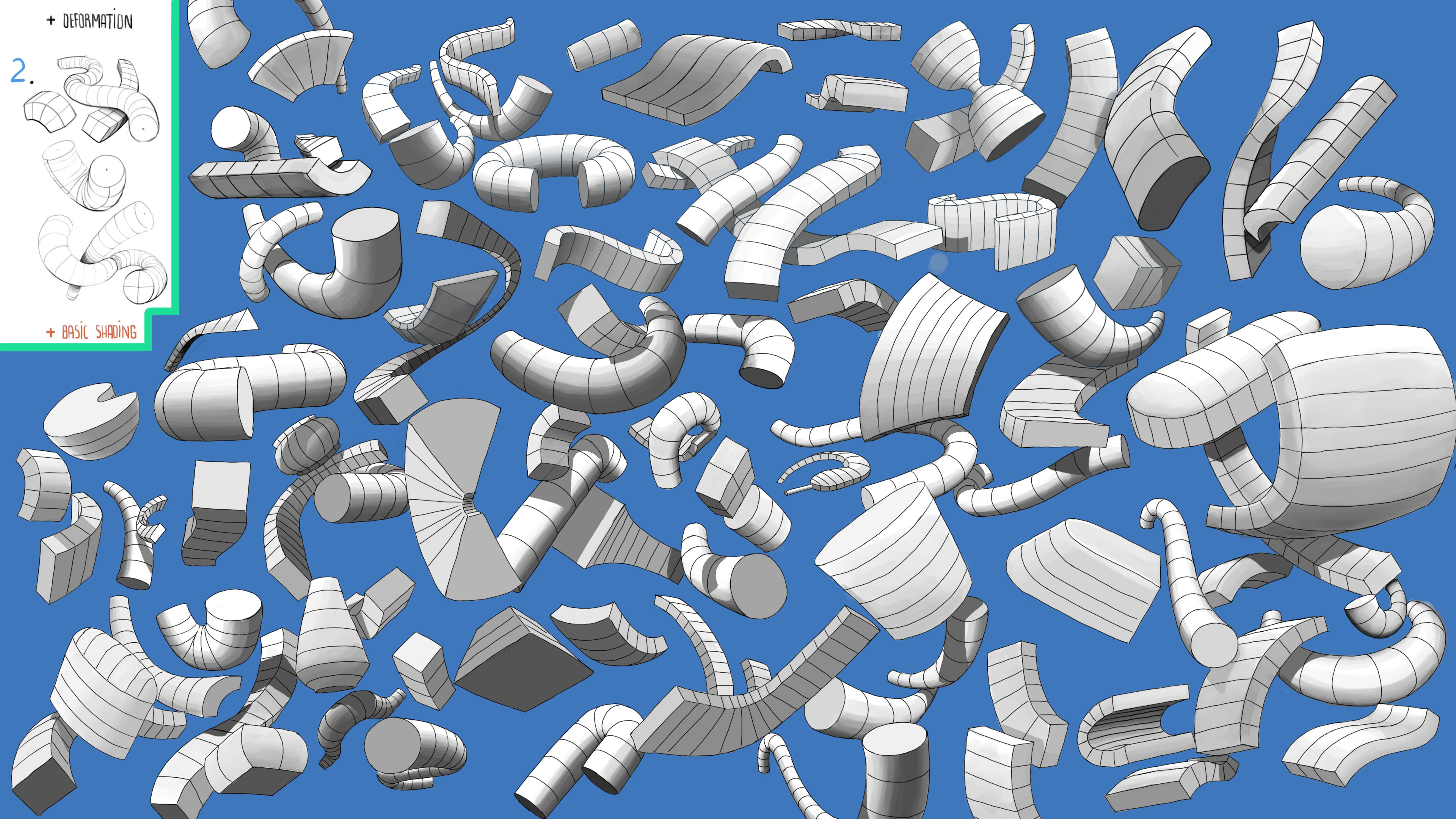
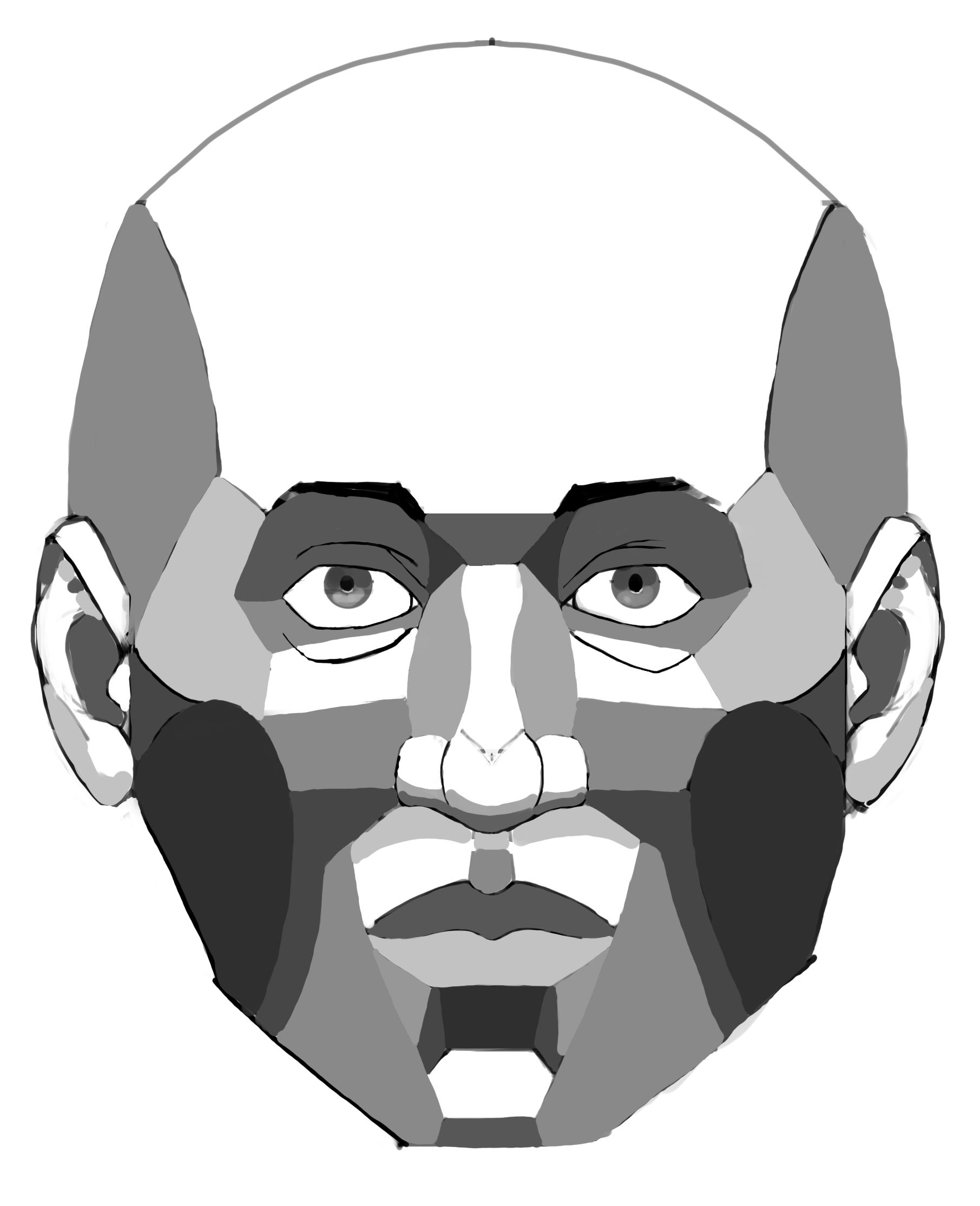
1.4 LINEWEIGHT, LIGHT, SHADING, BRUSHES.

I put a RED X next to examples mark drew so that you don't get confused.

Once again, this assignment was pretty straight forward. I am not perfect with my line weights as of yet but i think i am improving (compared to the assignments from term 1). For Light and Shading i wanted to try my hand at more complex shapes and i think i did a decent job at showing the shapes with only values to depict the objects. For the color blending i think i could use improvement but overall i think i did a decent job. Also i wanted to challenge myself so i tried to do something more complex (HEXAGON) but i don't think it helped convey the message. Finally Brushes, I've created brushes before so for this task i wanted to challenge myself by adding depth to the brushes and a bit more detail so hopefully the 2 brushes i created helped with that.

THAT'S ALL FOLKS!
For now i am done. Hopefully you guys at least enjoyed looking at it. I will post more as soon as i have completed another class. However that doesn't mean i wont be checking here so if you have a question feel free to ask.

I really liked the box cover you made. The only thing I kind of felt off was the M label, it doesn't really follow the box line. (at least not for the upper line, or my eyes are just playing with me).
Anyway, I'm also super hyped for the Spider-Man PS4 to come out!

Thanks @jezzart, do you mean that it doesn't follow the perspective of the box? if so it might visual illusion or just a mistake on my part (the placement of the box relative to the overall case). The only reason i mention this is because the front of the box was done as a flat image first, and after everything was done i just distorted the front to match the perspective i wanted.

Yes, I mean the perspective. (I totally forgot the name when I wrote it.) Its just a small mistake that often happens when you are looking at the piece for to long. I always find all my errors after I'm done with my stuff. hehe
But at the same time, it could just be my eyes that find the label to be off.

1 month later

Hey All!
Been a while since i last posted, I wanted to make sure I completed another class before I posted again. I feel confident with the work that i completed for this class but of course any feedback is welcome.
PERSPECTIVE 2


2.1 - 3 POINT PERSPECTIVE (ENVIRONMENT -2 ATTEMPTS)

For this assignment i had trouble starting it, mainly because i didn't feel confident with the perspectives, they either felt too far away of too close to the view. I actually completed 2 views for this assignment, the first follows a very similar format to Marc's example. The second assignment changes is it up a bit, for this one i just wanted to make sure i had a good understanding of 3 point perspective.

2.2 - 4 POINT PERSPECTIVE (HUMAN ANATOMY)

For this assignment i had a bit of trouble with the actual anatomy, mainly because my original 8 figure head was unrefined, so i refined it a bit before moving onto the 4 point perspective. I also had a bit of trouble with this because at first i was trying to fit the figure within a building template (circle) as opposed to a human template (ellipse). Refer to Marc's video tutorial for further details. I believe i managed to correct the mistake however let me know if it still looks incorrect. Also I did this assignment twice (Male and Female Figures) to make sure i understood how the proportions would work.

2.3 - 5 POINT PERSPECTIVE (RANDOM OBJECTS)

Not much to say about this one, a bit harder than 4 Point perspective but manageable. The biggest issue for me on this assignment was figuring out how to draw cylinders in correct perspective and what exactly to draw (I wanted to try to draw something more detailed than basic shapes.)

That's it for now Folks!

NEXT UP IS ANATOMY 1 (Any advice for this Class is greatly appreciated).

3 months later

I'M ALIVE!!

I Don't Really Know if anybody takes the time to read my comments or not but i think in the long run it will help me, at the very least, know where i was mentally while working through the classes.

Anyways, To me this feels like its a month overdue since I had to completely stop working on the term for a whole month (Deadlines at work).

Finally Lets jump right into Anatomy 1

All Feedback is welcome!

ANATOMY 1


3.1 - VOLUMES IN PERSPECTIVE

To Start off, I would like to be honest and say that I still didn't feel as comfortable with the drawing tablet as i wanted to; This was caused mainly because i was not able to properly draw circles (They would end up really rough and jagged because of the friction caused by the side of my hand and tablet surface.) so i decided to buy an artist glove to help with this issue but when i first started i wasnt used to it so i decided i need to get a good grasp on the artist glove before moving any further with my work, Thankfully Mark mentioned that we needed to get good a drawing basic geometry in order to become good at anatomy. So i decided to spend more time than necessary on the warm up exercises.

In the end my geometry improved but its not anywhere near perfect so i think i still need to work it, allot better than before though so I'm happy.

3.2 - DEFORMATION & BASIC SHADING

With this exercise the hardest part for me was letting loose and using curves. ( I had the most trouble figuring out what to draw that wasnt straight)

3.3 - CONNECTIONS AND INTERACTIVE SHADING

For this exercise i had trouble figuring out what to draw ( i was tired of just drawing geometry so i wanted to draw actual objects for a change, i look around my desk, online, and just used my imagination to come up with stuff to draw.

3.4 - ANATOMY NOTES

So at this point i had spent at least a month on just geometry (not counting random sketches i did when i got bored or annoyed) so i decided to revisit the video for the term and brush up on the anatomy for the face. My first attempt at Anatomy after that was a very bad, in my opinion, (FACE_LIGHTING MAP) so i decided to take notes so that i always had the essentials of face anatomy on had to reference if i got stuck on a specific body part.

I Figured it might be helpful to other people going through anatomy so decided to upload my notes as well.

3.5 - FACE_LIGHTING MAP

Not much to say about this one, My first attempt at Anatomy following the along with the video tutorial. Kept it here because it think its useful in identifying how the sun hits the different surfaces of the face but i can also use it as a benchmark to see how i improve going further.

3.6 - FACES

So I started working on different faces but about a week into this assignment i stopped working on it (Deadline at work forced me to not work on my art for about a month). When i came back i wasnt satisfied with my initial face anatomy; the main reason was because i was clearly defining the different surfaces of the face in terms of lighting ( i.e. FACE_LIGHTING MAP) so i decided to go back and touch up some of the faces i initially drew and make the surface transitions softer to resemble a proper face. (if you look around the faces some have a single date while others have 2 dates to signify the initial drawing date and the revisit date.)

3.7 - HEAD TILT & HAIRSTYLES

Finally this assignment wasn't necessary but i kinda wanted a bit more practice with drawing the skull and it also provided me with a chance to challenge myself. Initially this assignment would have been for HEAD TILT (signifying the movement of the head and in different perspectives), HAIRSTYLES (I am horrible at drawing hair so i wanted to step outside my comfort zone now that i understood the anatomy of the face and try my had at hair; what you see below is the result of me studying different types of hairstyles), and finally EMOTIONS (this was another challenge to myself; now that i understand the face anatomy i wanted to try drawing a face depicting different emotions such as anger and sadness, however at this point in order to do this it would have added an extra month on top in order to really study and depict the different muscles that move to show emotions so i decided to scrap this last part for this assignment. [NOTES: i will eventually revisit this assignment but i am feeling burned out with anatomy for now so i want to move onto other classes]).

If it makes you feel any better about posting, I read it. And it all looks like decent progress and work to me.

The only thing that merits comment is something that I have trouble with. In your faces image, the rear eye of the largest darker head needs to be pressed back into the skull.

I rather enjoy a bunch of the faces, good bit of variation and character going on there.

Hey @PeterH now that you mention it that eye does seem too far to the right. I must have been starring at the image too long because it never registered. Thanks

I applaud your effort on these especially your basic shapes. I'm in the same boat and my only tip for those is to try and not make them look so repetitive and increase the contrast between light and dark but other than that keep up the good work.

Thanks @luke_james_kid, i agree with you, had a bit of a hard time trying to do that very thing, i Lost all sense of creativity the more i stared at those assignments. Regarding the the values, I agree with you, looking back now i can see that i was adamant about using those darker values. ill Keep that in mind going forward.