


You certainly very eager and active! I am very sure you will make rapid progress 

 Thank you! I finally cleaned that up. Meanwhile started 3 more ..I have a habit of taking too long to finish a piece, then I lose interest in it and just start something else. I found 8 from recently i started and abandoned, that are decent enough to not delete, but not finished. There’s also been a number of drawings I felt I “outgrew” - became better before I finished them, and it would be easier to start from scratch than fix them. Anyone else thinking that?in24.6k
 Lady Death Fanart Collectible: Part 6 Polypaint and base Hi, it’s time to share with you another part of the process to create this fanart piece. Polypaint As this is my first collectible fanart I didn’t have previous experience with polypaint so I tried my best and played a bit with it.I wanted to give a ghostly and eerie look to Lady Death, she is beautiful and deadly, but at the end of the day she is a woman that died and was reborn at hell as an avenging spirit, that’s why I gave her skin tone a bluish very cold tone.As you will see I gave myself some creative freedom to deviate from the traditional color scheme that this characater has in comics and illustrations.To add a bit of sensuality by painting some freckles on the face and the chest. The dark nature of this character was the perfect excuse to gave her a kind of goth make up, very dark shadows around the eyes, blue lips and fingernails. I know that the original character includes sexy red lips but I wanted this girl to have a sexy but at the same time creepy look, that’s why we can see some thin veins emanating from her eyes. The biggest chromatic change I did for this character is at the hair. Lady Death has a characteristic white weavy hair but in my fanart I decided to gave her a very saturated blue color.The reason behind this wasn’t only an aesthetic choice. I want that the face area strongly pulls the attention of the viewer so this area needed a stronger contrast. Another reason is that I want her to have a more modern look, as I mentioned before, I’m strongly attracted to women with goth/punk look. I gave myself half an hour or more to analyse the work of experienced sculptors that create collectibles and I discovered that the use of darker values on the skin is often applied to create a greater sense of volume and three-dimensionality. I found that areas with heavy ambient occlusion are the perfect places to paint with darker colors in order to increase the separation between different forms. Even though she has a bluish skin tone, I used a bit of warmer hues in areas that, in real life, tend to go towards red and pink, this is very obvious in the nose, cheeks, and knuckles. Thinking with a logical mind it’s completely absurd to have warmer tones on the body of a zombie like creature but I didn’t want to limit myself by using only blue tones, it looks boring and artificial. In real life these colors are created by blood vessels in areas where the skin is very thin. ** Scythe **for her weapon I applied a cool gray with some warmer variations, this color scheme is influenced by the work of H.R giger. Base I’d like to talk about the design for the base which, to be honest, I forgot to develop along with the character.My main idea with the base is to show that Lady Death inhabits a very sterile and arid land, at the end of the day she is at hell.You can see a that she walks over dirt and rocks, a sign that she’s surrounded by death and loneliness. As part of the landscape we can see some bones and skulls to reinforce the idea of lack of living creatures, yet we can see three hands that try to reach her legs.This hands represent that all creatures are subordinated to her power and seek an evil blessing with a simple touch of the princess of the damned.1- The hand with skin burns represents the souls of those who are newcomers to hell, tortured souls that suffer for the sins comitted on earth.2- The hand with greenish rotten skin and pustules is the reminder of the decay that has infected the souls of those who have been trapped and have forgotten their humanity3- Last but not least, the hand of a demon shows that even dark creatures and entities bow before her presence. The cherry on the top, at least in my vision, are the simese twins that emerge from the ground, this malevolent creatures remind us that in hell there’s only perversion and any trace of innocence is lost. Thanks for reading till this pointI’m really happy to be very close to finish this creative journey, last but not least it’s mandatory to talk about splitting the sculpture in several pieces to be printed, this will be my last entry before showing the final rendered images. See yaMay Zbrush be with youin1.5k

 memory 2min gartic phone, used ref 2m gartic, used ref for pose 2min gartic 2min gartic 2min gartic 2min gartic memory memory memory memory study memory memory memorymemory memory memory memory memory memory study memorystudy study stylized left memory, right study study memory memorymemory memory memory memorymemory memory, porportions r offmemory memorystudystudy memorymemorymemory memory memory memory memory memory memory memory, right leg is a bit broken The feeling of only getting 1 - 3 likes on a social media post will never not be discouraging. But nothing is discouraging enough to make me quit drawing. I think the strategy of drawing a lot of stuff and waiting a while to post is good though rather than posting it immediately and then feeling that sadness on the next set of drawingin

 studies studies juri study imagination, how I feel before a speech imagination imagination study something I drew for my presentation also drew this for my presentation, didn't fix the one hand being bigger than the other imagination + study study studies study study, I need to fix the face a bit based on screenshot from anime but in my style study. except for the eye study studies studies study. changed some things tho imagination imagination imagination study studies, except top right samurai based on anime screenshot wolverine studies, changed some of the poses a lil, not very good at all, but first time i drew the character ever. semi study studies study imagination imagination imagination , for first time ever i tried to draw over 3d model for middle pose, I dont like the result tbh, but it makes it much easier than coming up with it from memory.imagination, except right figurestudies imagination + studies, coming up with action poses r hard, these are not dynamic enough, I will redraw better ones in future. imagination , imagination imagination study, except for eye imagination imagination imagination doodles except for the two chrollos imagination storyboard thumbnail, idk if i ever shared this. my storyboards end up being a little detailed since i usually just draw in one layer.in22.6k
Regarding the logos, 1 and 3 have some fun identifiable elements, however the backgrounds kill the readability.
Try swapping the first one to a solid black background. Other dark tones will probably work too.
The third appears to have a bloom effect on the letters, remove that or move it down a layer and swap it to a contrasting tone, something warm tone makes sense to me, but I don't know if it would work with the rest of the image. The bloom only acts to blur the lettering, if it was from the starscape background, just remove the background.
Well done on the blending, the triangle has an appearance almost of chalk, kinda neat.
Thanks for the feedback! Yeah the bloom is from the font itself, but I could probably find a different font to go with it. I was thinking the same about the background as far as making it solid. I'll work on it when I go to tweak it. Thanks again for your help 
Hmm, concerning the logos I would take half of the swirls off the B/M and maybe work some more into the other letters. The B/M become hard to read, at least for me with so much on them and adding a little more to the rest without going too far could make the whole thing pop some.
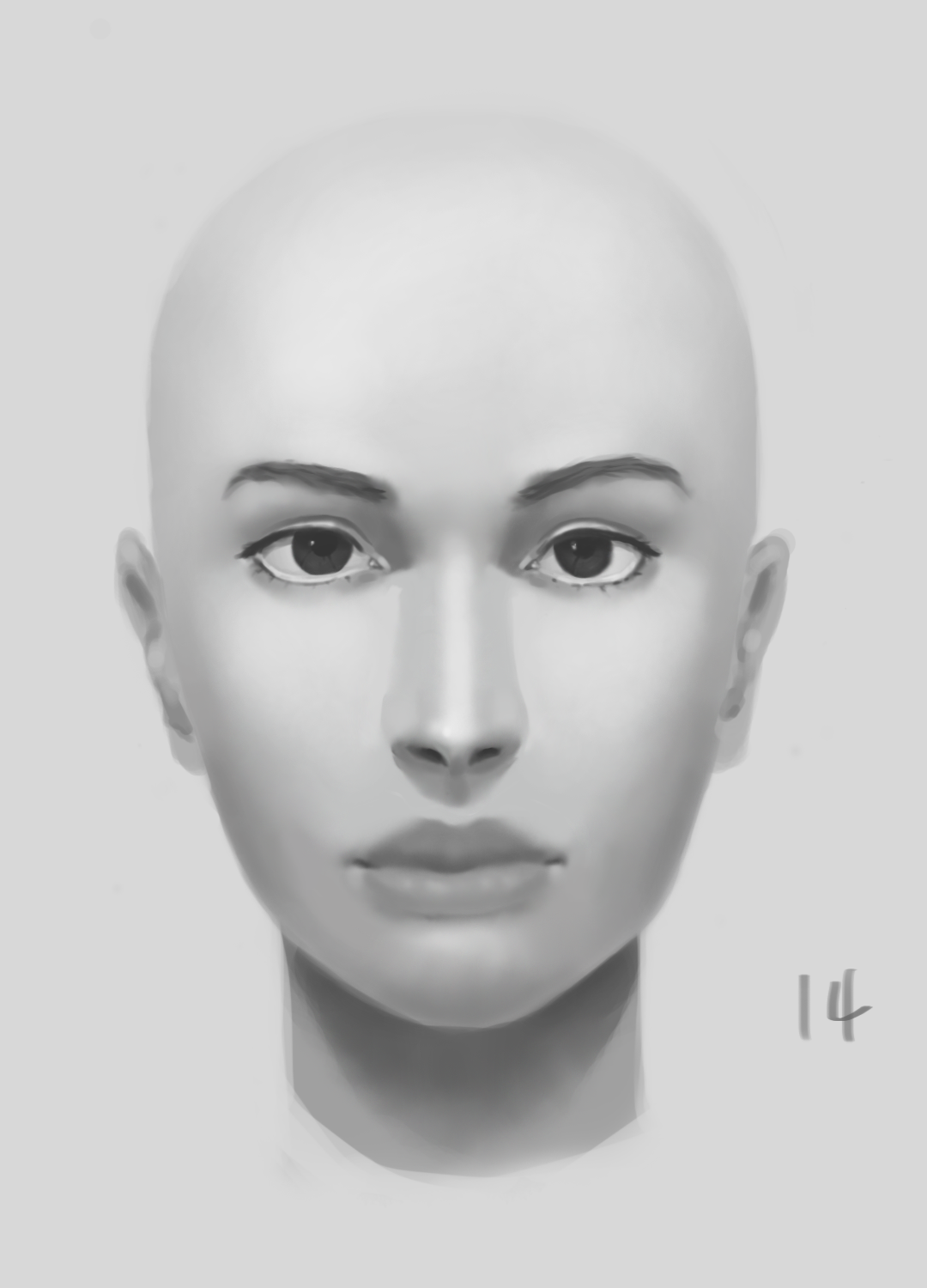
Here's what I've done so far for the anatomy portion! These are just for getting my feet wet with Marc's techniques. I want to get a schedule down to start regularly practicing all the anatomy things we've learned so far. With that said, I didn't do the full head yet from this course. I included one from a challenge I did earlier this month. It was really intensive, so I want to take a little break from the full head and do one once I do more anatomy studies and finish everything from term one and two. I wanted to put it here to see if I improved after learning from this tern. Comments and constructive criticism always welcomed.
Thank you for your feedback! I really want to post revisions on what everyone's said.


I was looking at the file with the facial features and I completely forgot about the head shapes underneath. I cropped a couple by accident but at least one is preserved 

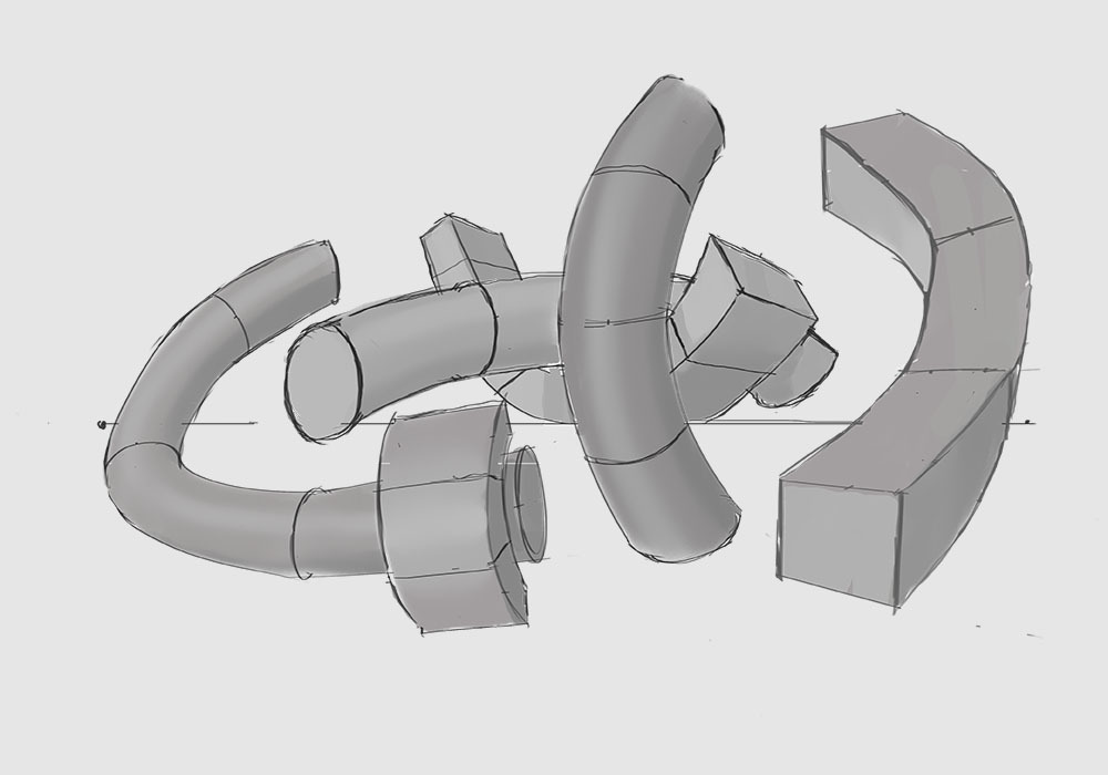
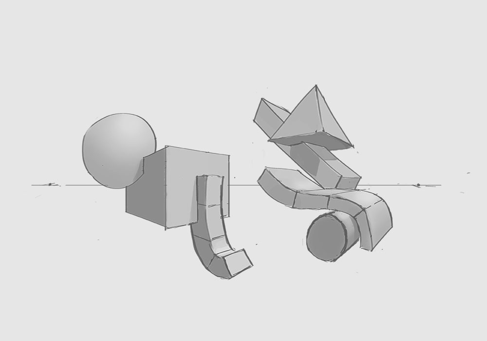
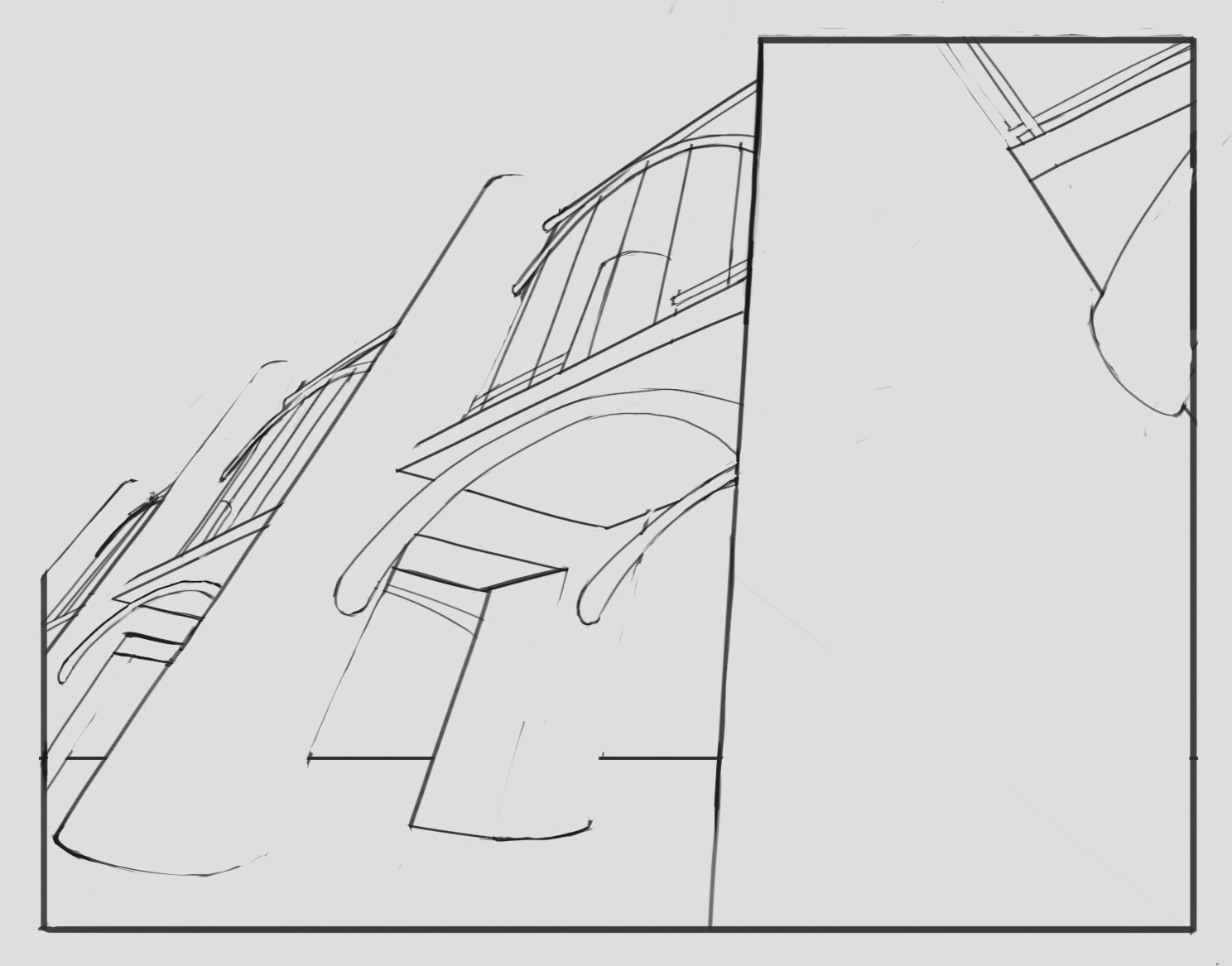
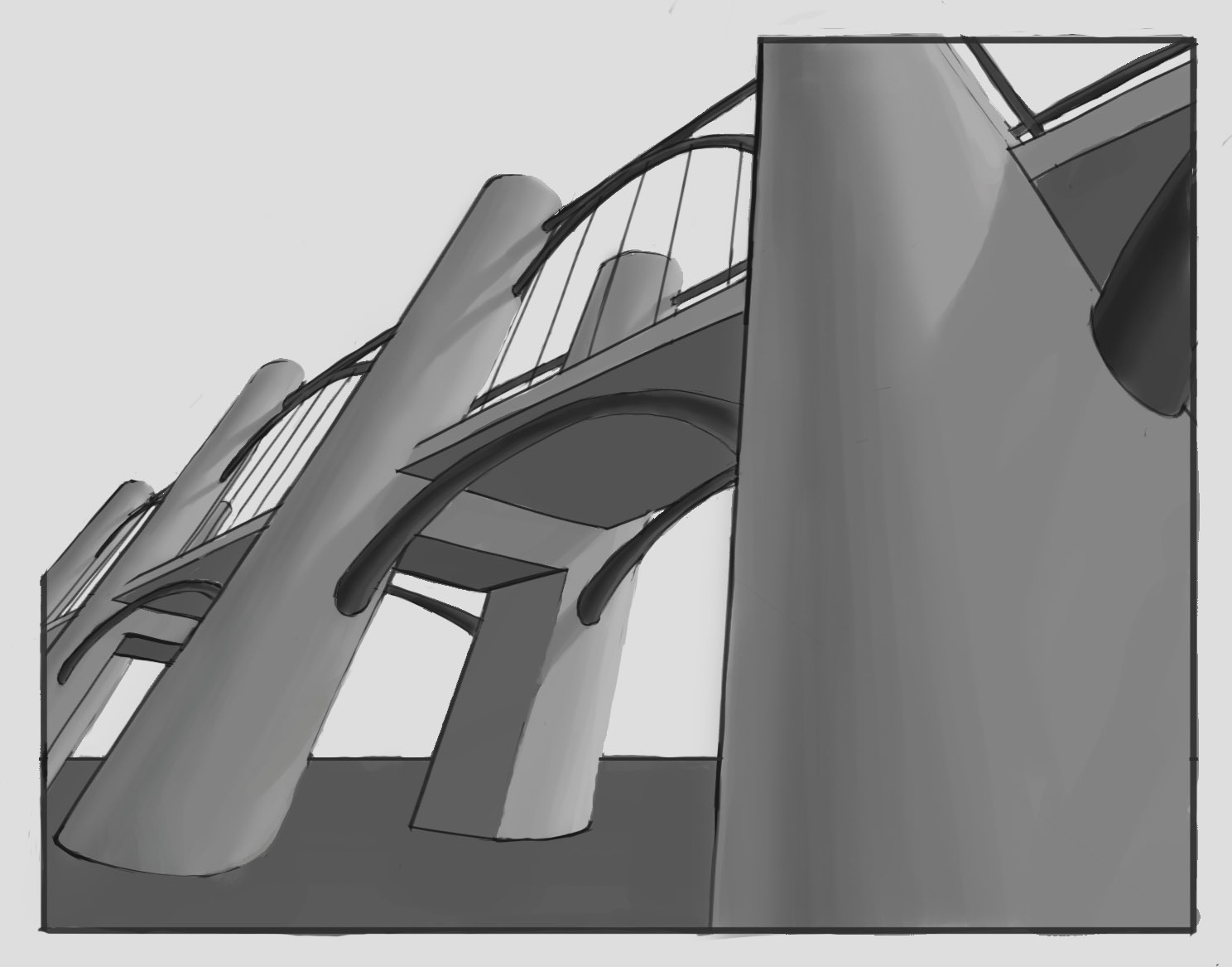
Finally finished with term 2 perspective assignments! I was worried about 4-point perspective, but 3 point gave me more of a headache. I thought I was finished when I did the figure, then I read part 2(?) where we have to draw forms in 3 and 4 point perspective and draw everyday objects 
Anything after 2 point perspective used to scare me but these assignments made me realize it's not that scary : D It's not easy, but it's doable.


Wow the perspective one looks amazing! And great job on the face too! Looks great. I'm feeling inspired now, thanks! 
Thanks so much! I really appreciate that.
And that's a wrap for term 2! For the most part, I still have to do an updated portrait for the anatomy...
I did my best to incorporate the feedback I got for the logo. It was too illegible and I realized it showed nothing about what it was meant to represent. Hopefully it's a more well rounded logo.
I need to tie up loose ends for term 1, but now I can slow down and fine tune my weaknesses. Any and all constructive criticism welcome.

Hey, great graphic design, it's very good, I like it.
Also, I love the way you shaded the objects, they seem real so I think you did awesome on that assignment. The Anatomy and perspective work is great, too!
You put quite some effort in those assignments, keep it up 


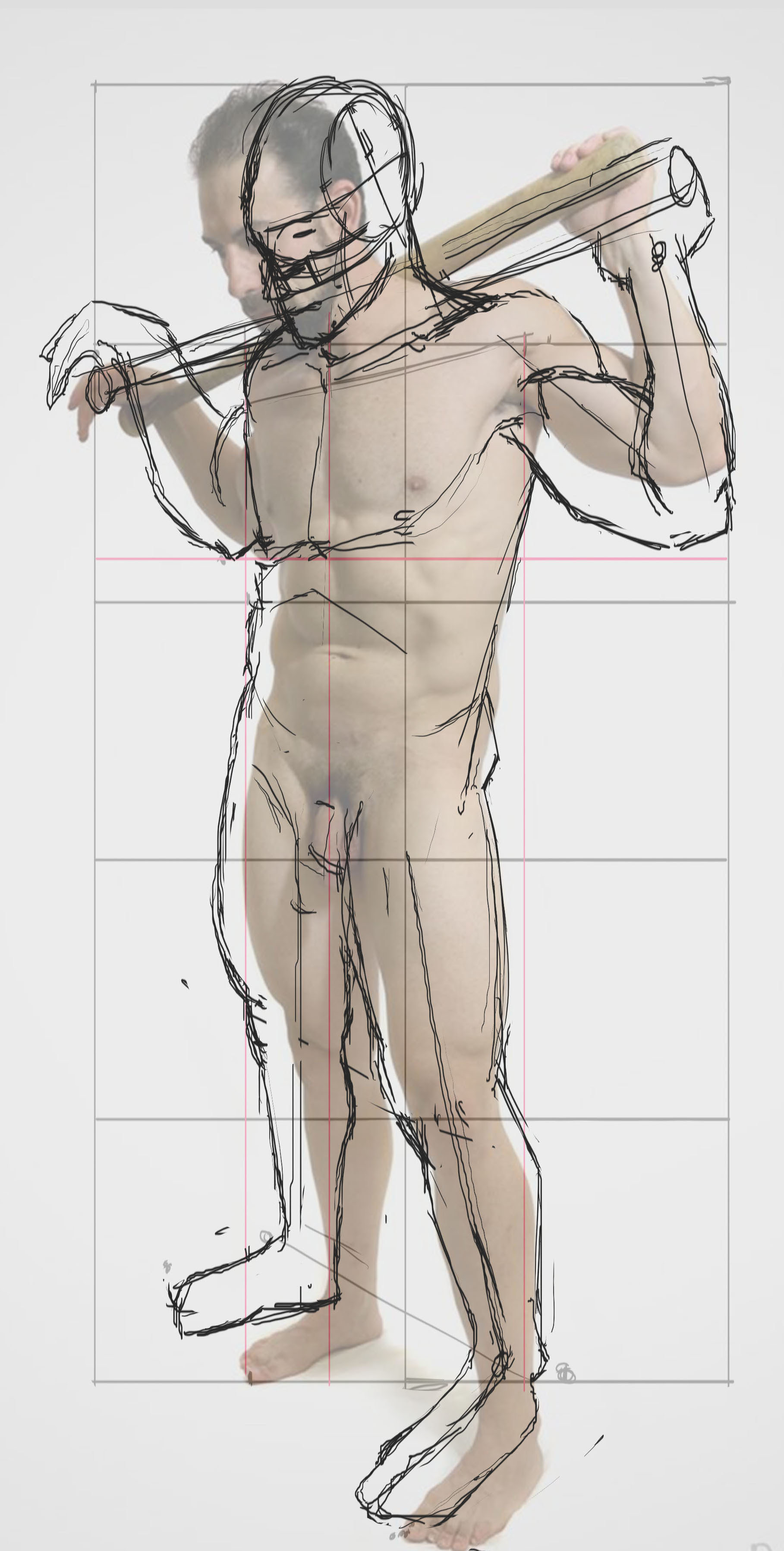


First of all, the painting of the eyes is great. For your gestures, I would recommend you too have the proportions of the human being 8 heads in the back of your mind ( I keep having this problem, too )while your doing those. Also, try to look at on what leg is more weight and shift the pelvis towards the leg with less weight, I see you doing it, but it may help to emphasize it a little more, as a lot of gesture comes from the angle of the pelvis (and shoulders). Nice work overall 