


More practice from this week. Can't wait to get the assignments for term 3, but for now here's more heads and gestures. I tried to correct what I did wrong with a red pen. I might do a 50 head challenge like the ones on draw a box to get better.
@patmast Thanks for your draw overs! They really helped.

 Thank you! I finally cleaned that up. Meanwhile started 3 more ..I have a habit of taking too long to finish a piece, then I lose interest in it and just start something else. I found 8 from recently i started and abandoned, that are decent enough to not delete, but not finished. There’s also been a number of drawings I felt I “outgrew” - became better before I finished them, and it would be easier to start from scratch than fix them. Anyone else thinking that?in24.4k
 Lady Death Fanart Collectible: Part 6 Polypaint and base Hi, it’s time to share with you another part of the process to create this fanart piece. Polypaint As this is my first collectible fanart I didn’t have previous experience with polypaint so I tried my best and played a bit with it.I wanted to give a ghostly and eerie look to Lady Death, she is beautiful and deadly, but at the end of the day she is a woman that died and was reborn at hell as an avenging spirit, that’s why I gave her skin tone a bluish very cold tone.As you will see I gave myself some creative freedom to deviate from the traditional color scheme that this characater has in comics and illustrations.To add a bit of sensuality by painting some freckles on the face and the chest. The dark nature of this character was the perfect excuse to gave her a kind of goth make up, very dark shadows around the eyes, blue lips and fingernails. I know that the original character includes sexy red lips but I wanted this girl to have a sexy but at the same time creepy look, that’s why we can see some thin veins emanating from her eyes. The biggest chromatic change I did for this character is at the hair. Lady Death has a characteristic white weavy hair but in my fanart I decided to gave her a very saturated blue color.The reason behind this wasn’t only an aesthetic choice. I want that the face area strongly pulls the attention of the viewer so this area needed a stronger contrast. Another reason is that I want her to have a more modern look, as I mentioned before, I’m strongly attracted to women with goth/punk look. I gave myself half an hour or more to analyse the work of experienced sculptors that create collectibles and I discovered that the use of darker values on the skin is often applied to create a greater sense of volume and three-dimensionality. I found that areas with heavy ambient occlusion are the perfect places to paint with darker colors in order to increase the separation between different forms. Even though she has a bluish skin tone, I used a bit of warmer hues in areas that, in real life, tend to go towards red and pink, this is very obvious in the nose, cheeks, and knuckles. Thinking with a logical mind it’s completely absurd to have warmer tones on the body of a zombie like creature but I didn’t want to limit myself by using only blue tones, it looks boring and artificial. In real life these colors are created by blood vessels in areas where the skin is very thin. ** Scythe **for her weapon I applied a cool gray with some warmer variations, this color scheme is influenced by the work of H.R giger. Base I’d like to talk about the design for the base which, to be honest, I forgot to develop along with the character.My main idea with the base is to show that Lady Death inhabits a very sterile and arid land, at the end of the day she is at hell.You can see a that she walks over dirt and rocks, a sign that she’s surrounded by death and loneliness. As part of the landscape we can see some bones and skulls to reinforce the idea of lack of living creatures, yet we can see three hands that try to reach her legs.This hands represent that all creatures are subordinated to her power and seek an evil blessing with a simple touch of the princess of the damned.1- The hand with skin burns represents the souls of those who are newcomers to hell, tortured souls that suffer for the sins comitted on earth.2- The hand with greenish rotten skin and pustules is the reminder of the decay that has infected the souls of those who have been trapped and have forgotten their humanity3- Last but not least, the hand of a demon shows that even dark creatures and entities bow before her presence. The cherry on the top, at least in my vision, are the simese twins that emerge from the ground, this malevolent creatures remind us that in hell there’s only perversion and any trace of innocence is lost. Thanks for reading till this pointI’m really happy to be very close to finish this creative journey, last but not least it’s mandatory to talk about splitting the sculpture in several pieces to be printed, this will be my last entry before showing the final rendered images. See yaMay Zbrush be with youin1.5k

 memory 2min gartic phone, used ref 2m gartic, used ref for pose 2min gartic 2min gartic 2min gartic 2min gartic memory memory memory memory study memory memory memorymemory memory memory memory memory memory study memorystudy study stylized left memory, right study study memory memorymemory memory memory memorymemory memory, porportions r offmemory memorystudystudy memorymemorymemory memory memory memory memory memory memory memory, right leg is a bit broken The feeling of only getting 1 - 3 likes on a social media post will never not be discouraging. But nothing is discouraging enough to make me quit drawing. I think the strategy of drawing a lot of stuff and waiting a while to post is good though rather than posting it immediately and then feeling that sadness on the next set of drawingin

 studies studies juri study imagination, how I feel before a speech imagination imagination study something I drew for my presentation also drew this for my presentation, didn't fix the one hand being bigger than the other imagination + study study studies study study, I need to fix the face a bit based on screenshot from anime but in my style study. except for the eye study studies studies study. changed some things tho imagination imagination imagination study studies, except top right samurai based on anime screenshot wolverine studies, changed some of the poses a lil, not very good at all, but first time i drew the character ever. semi study studies study imagination imagination imagination , for first time ever i tried to draw over 3d model for middle pose, I dont like the result tbh, but it makes it much easier than coming up with it from memory.imagination, except right figurestudies imagination + studies, coming up with action poses r hard, these are not dynamic enough, I will redraw better ones in future. imagination , imagination imagination study, except for eye imagination imagination imagination doodles except for the two chrollos imagination storyboard thumbnail, idk if i ever shared this. my storyboards end up being a little detailed since i usually just draw in one layer.in22.3k
Going strong! Strong and Steady! I'm just now got term 2 today myself so I'll be over there soon too lol
Good luck! A lot of good stuff as usual. 
If you're on Discord you're going to get a double dose of this.
I'm doing a drawing exercise where I draw the basic head form everyday until I get to 250. I was wondering if anyone wanted to do it with me? We could post in a topic on the forum or upload to an online folder just to keep each other accountable. I'm asking others to join because I think daily practice and getting the basics down is important and being accountable to other people can really help you stay motivated. Let me know if you're interested! If you're still on term 1, just watch the video in term 2 if you have it and start when you can! 
@BemezmorizeD Nice nice. You're heads look a lot better. Just remember, the Boba Fett line goes to the chin ( there is one with this mistake) and the farter something is back in the distance, the shorter it is (the first one has the mistake). Keep up the work  .
.
I sadly can't participate i the challenge, because I'm already doing two schoolism courses and Cubebrush's Artschool simultaneously, sorry! 
@patmast Thanks! It really amazes me how fast you can improve with consistent repetition.
--
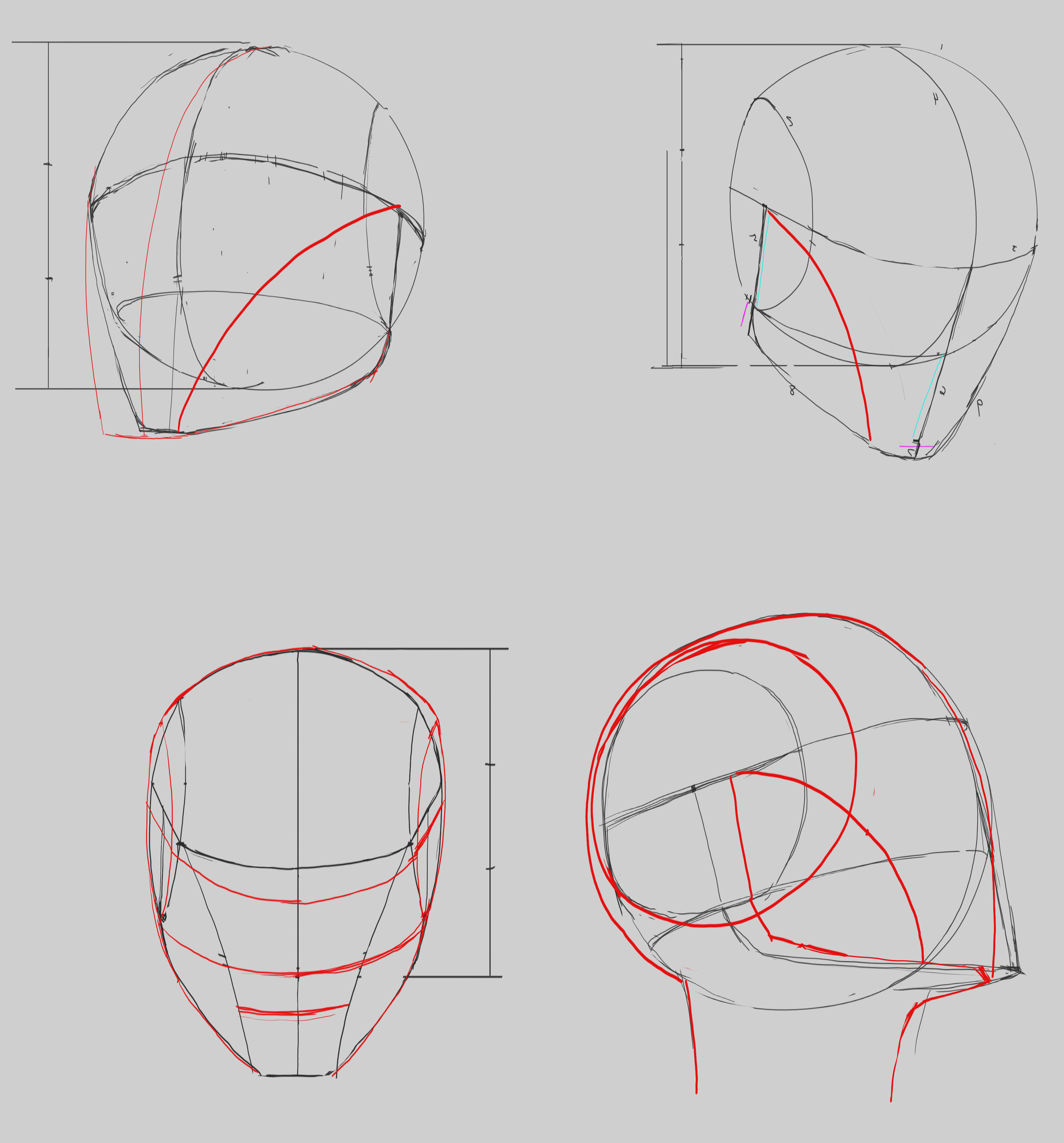
Here's my progress on the head challenge. I'm doing my best not to erase or ctrl+z and I think my lines are getting better because of it. Please join me if you can! I made a forum post for it. I'm also working on the wrap around forms, I feel like I need a lot of practice with those.


Thats a cery clean set of heads. The one thing i can see is that the the chinfor the upper angles look a bit pointy. Also for further clarity, you can lightly shade the bottom of the chin so you can easilly tell what is what for the upper ones. Im training mostly on upper for that reason. Upper is the hardest IMO. Any angle otherwise is super easy.
Yeah I agree with you on the upper angle being one of the hardest, I'll be doing more of those the next couple of days. I still have 200 chances to do more extreme angles! I think with the simpler angles it's easy to miss basic mistakes. I didn't realize until yesterday I wasn't paying attention to where exactly I was putting the center line. On some of them I let the side farthest away have more width than the closer side. 7 days in and I just now realized it
@BemezmorizeD You're heads are improving pretty fast, nice to see  and you're line quality on a lot of them looks
@patmast Thanks! I towards the beginning I decided to try and not use undo or erase so I can force myself to make things cleaner. I like this draw everyday with heavy repetition format, it really helps me problem solve. Still have a ways to go but I'm done with doing these daily 
--
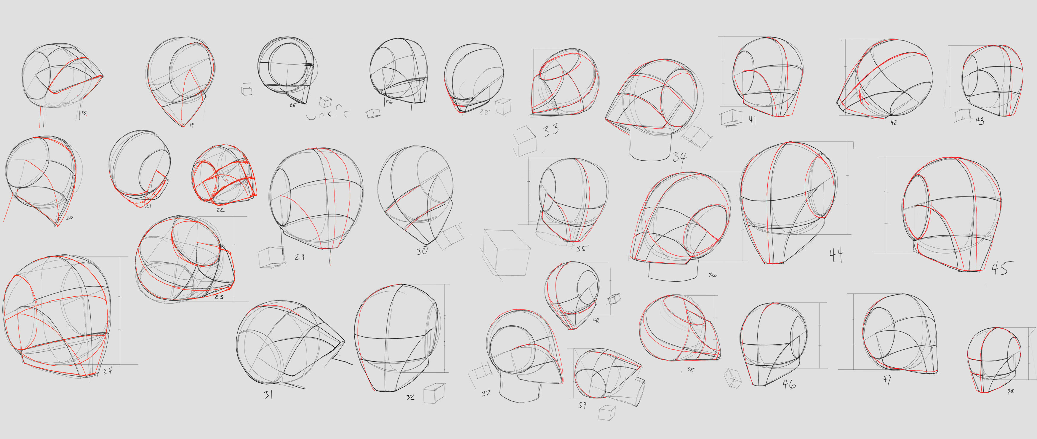
Here's the last few days of the head challenge. Give it a try if you can, it helps! Decided to stop at 100 : P


Very clean. I'm working on a stack too, but I'm gonna save it as one post too. I've been stuck between this and inking classes. That's why most of my stuff has been traditional mainly. The only thing I would suggest is to try to do some that have you looking upwards to where you see the bottom of the chin. That's the hardest thing to do head wise and I'm mainly focusing on that for that reason. That's been my bane.
This thread makes me so happy - you're killing it!!
This course is really what I needed, it fits my life style and learning style. I've improved more than I have in a long time and I can't wait to see how much I grow when I finish Thank you for all the work you've put into the course!

You have really put a lot of work on getting the proportions right - the amount of work you have put in is amazing!
my only criticisms would be the nose needs to be more rounded and show clearer definition between its different parts. I would look at different parts of the nose and construct from there. The position of the head your drawing makes it particularly difficult. I did a quick paint over to show what I mean -
.

Hopefully this helps. The nose is the hardest part of the head for me. Because of how rounded its parts are and all its different planes i get really mixed up with it. Like I said though the proportions are spot on and your values are great.
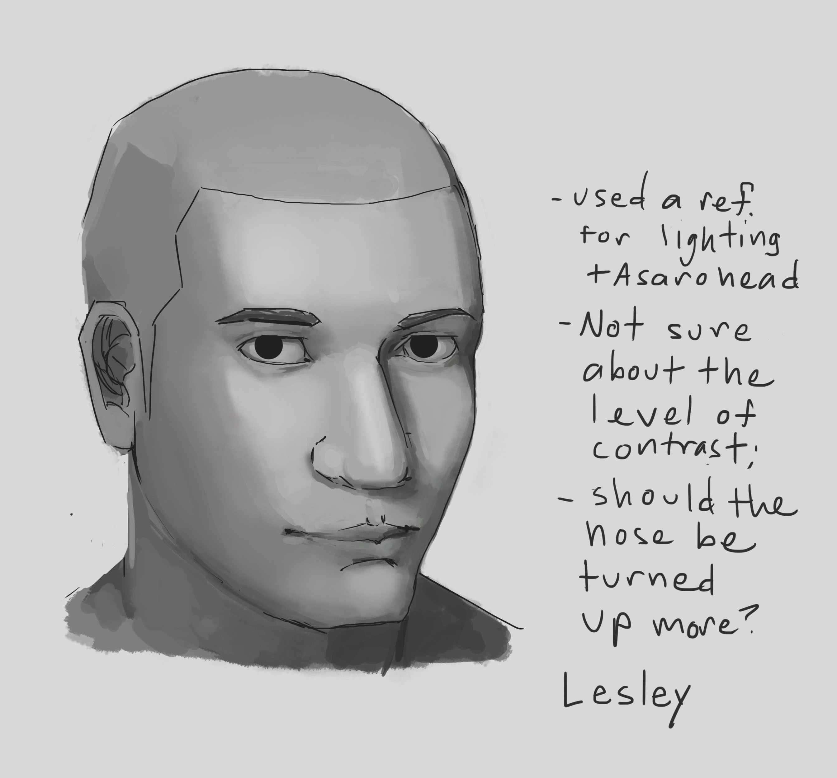
This is another head practice after getting some feedback from Marc! I want to go though one more round of critique, but there's so much improvement from last time. He actually looks like a man! Also took the lineart and shading more seriously, my history state is set to 1 so I don't rely on undo.
Used a ref for lighting
Thanks @alex_fucile for the feedback! I'm not that active so I just saw it. You gave some good pointers and I appreciate the paint over!
Suggested Topics
| Topic | Category | Replies | Views | Activity |
|---|---|---|---|---|
| Mikela Jean - Art School Journey | Art School | 4 | 609 | Nov '23 |
| Term 1 - Stryver | Art School | 17 | 3.8k | Jul '18 |
| Apham - Art School Journey - Starting from Scratch | Art School | 40 | 7.3k | May '22 |
| TERM 1 - Kuma | Art School | 16 | 2.8k | Mar '18 |
| Alex C.R Art School journey | Art School | 291 | 31.0k | Jan 16 |