


I love the quality of the hole puncher and the glass on the 1 point. But doing the 4 point. That jump says a lot of good things to me.

 Thank you! I finally cleaned that up. Meanwhile started 3 more ..I have a habit of taking too long to finish a piece, then I lose interest in it and just start something else. I found 8 from recently i started and abandoned, that are decent enough to not delete, but not finished. There’s also been a number of drawings I felt I “outgrew” - became better before I finished them, and it would be easier to start from scratch than fix them. Anyone else thinking that?in24.5k
 Lady Death Fanart Collectible: Part 6 Polypaint and base Hi, it’s time to share with you another part of the process to create this fanart piece. Polypaint As this is my first collectible fanart I didn’t have previous experience with polypaint so I tried my best and played a bit with it.I wanted to give a ghostly and eerie look to Lady Death, she is beautiful and deadly, but at the end of the day she is a woman that died and was reborn at hell as an avenging spirit, that’s why I gave her skin tone a bluish very cold tone.As you will see I gave myself some creative freedom to deviate from the traditional color scheme that this characater has in comics and illustrations.To add a bit of sensuality by painting some freckles on the face and the chest. The dark nature of this character was the perfect excuse to gave her a kind of goth make up, very dark shadows around the eyes, blue lips and fingernails. I know that the original character includes sexy red lips but I wanted this girl to have a sexy but at the same time creepy look, that’s why we can see some thin veins emanating from her eyes. The biggest chromatic change I did for this character is at the hair. Lady Death has a characteristic white weavy hair but in my fanart I decided to gave her a very saturated blue color.The reason behind this wasn’t only an aesthetic choice. I want that the face area strongly pulls the attention of the viewer so this area needed a stronger contrast. Another reason is that I want her to have a more modern look, as I mentioned before, I’m strongly attracted to women with goth/punk look. I gave myself half an hour or more to analyse the work of experienced sculptors that create collectibles and I discovered that the use of darker values on the skin is often applied to create a greater sense of volume and three-dimensionality. I found that areas with heavy ambient occlusion are the perfect places to paint with darker colors in order to increase the separation between different forms. Even though she has a bluish skin tone, I used a bit of warmer hues in areas that, in real life, tend to go towards red and pink, this is very obvious in the nose, cheeks, and knuckles. Thinking with a logical mind it’s completely absurd to have warmer tones on the body of a zombie like creature but I didn’t want to limit myself by using only blue tones, it looks boring and artificial. In real life these colors are created by blood vessels in areas where the skin is very thin. ** Scythe **for her weapon I applied a cool gray with some warmer variations, this color scheme is influenced by the work of H.R giger. Base I’d like to talk about the design for the base which, to be honest, I forgot to develop along with the character.My main idea with the base is to show that Lady Death inhabits a very sterile and arid land, at the end of the day she is at hell.You can see a that she walks over dirt and rocks, a sign that she’s surrounded by death and loneliness. As part of the landscape we can see some bones and skulls to reinforce the idea of lack of living creatures, yet we can see three hands that try to reach her legs.This hands represent that all creatures are subordinated to her power and seek an evil blessing with a simple touch of the princess of the damned.1- The hand with skin burns represents the souls of those who are newcomers to hell, tortured souls that suffer for the sins comitted on earth.2- The hand with greenish rotten skin and pustules is the reminder of the decay that has infected the souls of those who have been trapped and have forgotten their humanity3- Last but not least, the hand of a demon shows that even dark creatures and entities bow before her presence. The cherry on the top, at least in my vision, are the simese twins that emerge from the ground, this malevolent creatures remind us that in hell there’s only perversion and any trace of innocence is lost. Thanks for reading till this pointI’m really happy to be very close to finish this creative journey, last but not least it’s mandatory to talk about splitting the sculpture in several pieces to be printed, this will be my last entry before showing the final rendered images. See yaMay Zbrush be with youin1.5k

 memory 2min gartic phone, used ref 2m gartic, used ref for pose 2min gartic 2min gartic 2min gartic 2min gartic memory memory memory memory study memory memory memorymemory memory memory memory memory memory study memorystudy study stylized left memory, right study study memory memorymemory memory memory memorymemory memory, porportions r offmemory memorystudystudy memorymemorymemory memory memory memory memory memory memory memory, right leg is a bit broken The feeling of only getting 1 - 3 likes on a social media post will never not be discouraging. But nothing is discouraging enough to make me quit drawing. I think the strategy of drawing a lot of stuff and waiting a while to post is good though rather than posting it immediately and then feeling that sadness on the next set of drawingin

 studies studies juri study imagination, how I feel before a speech imagination imagination study something I drew for my presentation also drew this for my presentation, didn't fix the one hand being bigger than the other imagination + study study studies study study, I need to fix the face a bit based on screenshot from anime but in my style study. except for the eye study studies studies study. changed some things tho imagination imagination imagination study studies, except top right samurai based on anime screenshot wolverine studies, changed some of the poses a lil, not very good at all, but first time i drew the character ever. semi study studies study imagination imagination imagination , for first time ever i tried to draw over 3d model for middle pose, I dont like the result tbh, but it makes it much easier than coming up with it from memory.imagination, except right figurestudies imagination + studies, coming up with action poses r hard, these are not dynamic enough, I will redraw better ones in future. imagination , imagination imagination study, except for eye imagination imagination imagination doodles except for the two chrollos imagination storyboard thumbnail, idk if i ever shared this. my storyboards end up being a little detailed since i usually just draw in one layer.in22.4k
@ristarsonata Thank you 
Damn, I just love stuff done in 5-Point-Perspective, it looks so cool and real.
Anyway, here's the figure assignment 


Spot on with the 4 point. Andrew Loomis's Figure Drawing For All It's Worth talks a lot about perspective too. He kind of throws it at you, but he gives a lot of info. I'm trying to work through that book.
@ristarsonata Thank you on that and yes! That's a great book and also yes, he throws it at you, but if you spend quite some time on each page and draw along it helps a lot. The only thing I missed in it was some extended anatomy teaching. There are a few drawings of the bodyparts with all it's muscles, but that's pretty much it and I study such things the best when I can see it from a lot of angles, which with 3D models on the internet and especially Proko is given in this time 
Doing the next assignment I really wondered how you can achieve such results as on the jpeg given by Marc by only using the pen tool out of photoshop (and layer styles). I would really like to know that and if it's actually made in vectors in Photoshop, because I just don't know lol ... I know you can draw in vectors in Clip Studio Paint, I'll try to do it there some time later. As for this assignment I tried to do the shadows with copyying the vector layers, changing the color of it and erasing the non-shadow parts with masks... the symbol for the vector is still there, I'm not too sure about if still works as one though lol ... while scaling it up I wasn't too sure if it gets pixelated or not so I don't know if I cheated or not lol. Beside of the character I added the water quick with just painting it on quick.


So much uploaded! Happy to see it 
The 3-point objects are on point. Love the shading and the edges look really accurate.
4-point is looking good too, but it feels a little rigid. A couple of items, like the present and hat, could be curved more. And the log looks a little squished. Everything feels really structured and solid though, and I love the line work.
The muscles on the figure are beautiful and your vertical look nice. His chest looks too narrow compared to his arms, I think it needs to be widened more.
For the logo, I like the one at the bottom without the background.
I love your monster! The color palette is great and I love the motion in it. I would've kept the water simple with an opaque blue all the way through, presentation-wise it's taking away from the character.
I like your game name, i think it's cute Be careful with the perspective of the title and the box itself. If you wanted it diagonal I would get rid of the box it connects to on the spine. I would try to incorporate more of the red or green from the character into the title or effects to make it pop more.
Overall, love that you got all this done! Are you ready for term 3?!
@BemezmorizeD Thanks for the critique! I agree on most of it, I don't understand the thing with the title and the spine though lol.
Yesss, I'm already excited for ZBrush,. I've never done anything with ZBrush so far, but 3D is amazing  . I hope your as excited as I am


If thats term 2 homwwork I REALLY cant wait until my paycheck posts now! I like the disciplined hand on yournsmudfe work.
@ristarsonata Thank you for the kind words! ^^
Awesome! Love that you tried all the options for the color blending exercise. Everything looks really smooth. One thing I would say for the greyscale is to be careful with the contrast and really consider the light environment. Unless the material is very reflective you won't have those light and and extremely dark values on the same object. Also, with the background that light, those dark values wouldn't exist unless one of the objects had a crack or whole where the light couldn't reach.
On a side note I'm kind of excited for term 3. I got through the anatomy and clothes videos but I'm kind of apprehensive about the 3d modelling. I only have a surface pro 2 so I hope I'm able to actually run Zbrush once I get it  .
.
I think if you can play any current games like Overwatch for instance, Im quite sure you'll be fine. Depending on your set up, keep your opened programs to a minimum if need be. Im working with an old faithful personally. But make sure you use their 45 day trial.
@BemezmorizeD Thanks! I noticed it on my first shapes, then I thought I would keep it up for some of them to have black as their local colour. Anyway, even if some of them do have black as their local color, it's still too dark, I see now . I hope ZBrush will run fine for you. Even if not, it's actual just a quick introduction which isn't followed by any other class so it's not really that necessary I guess
@ristarsonata I don't really know what you mean lol. I mean I know Overwatch, but I'm not playing it.
Thanks @BemezmorizeD! Great critique.
Something about my tablett seems not to be right.... it just stops putting the line for a few inches while I'm drawing it, really nasty. I slowly begin to not like Wacom more and more 

Really clean work. I'm working on that anatomy phase tonight. But for your tablet issue, I have an intuos art and I'm tired of juggling the responsiveness issues. Wacom is too expensive for any problems.
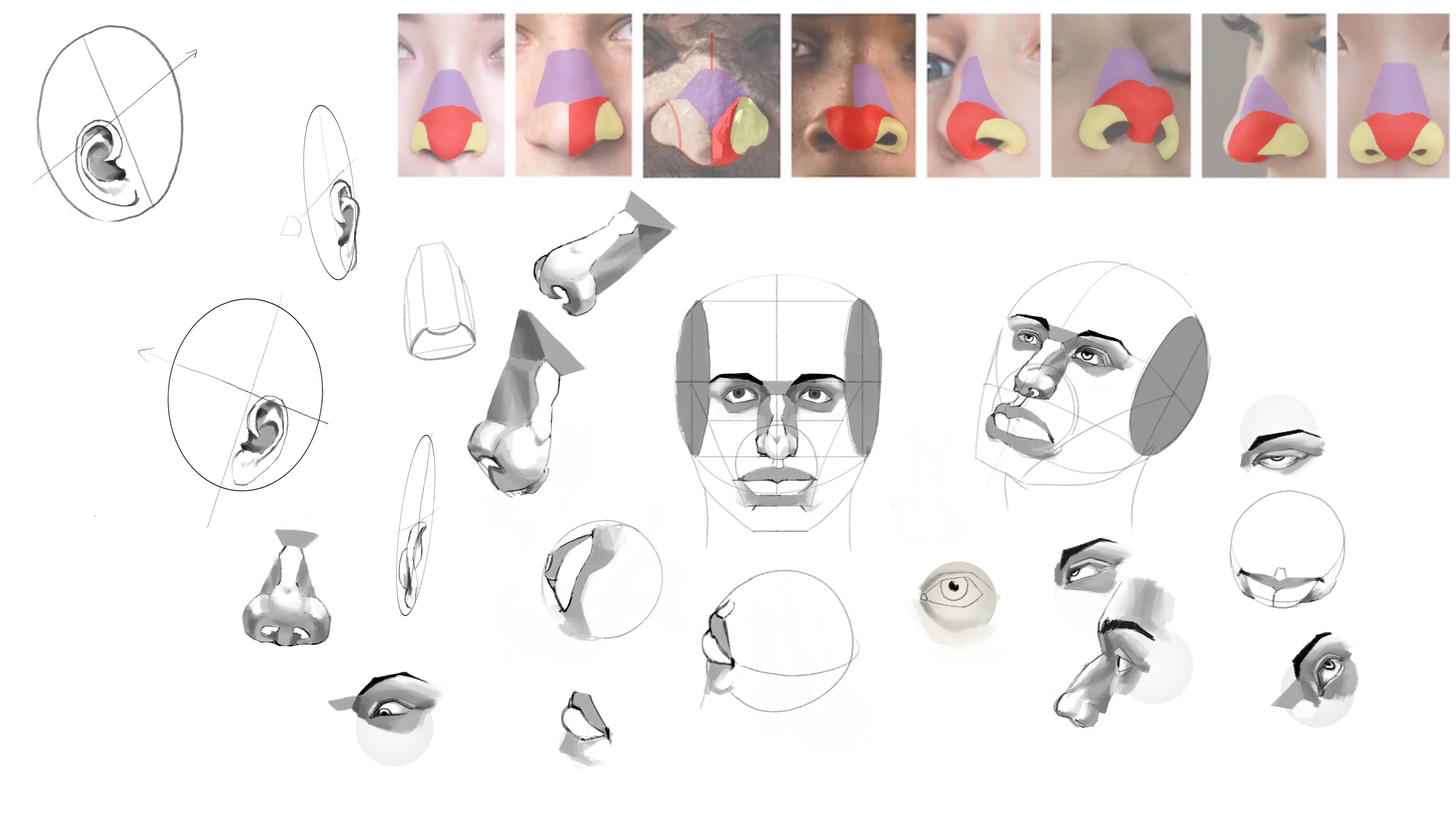
I love how you did your head diagram studies. It inspired me to try more extreme angles and different view points. It looks like you're really thinking about them in 3 dimensions. To bad you can't do the challenge 
The faces with the features look a little wide, and the facial features on the 3/4 view are curving in a little too much on the left side.
Overall nice job with the shading!
Keep it up 
@BemezmorizeD Thank you and you're right ^^'.
Here comes the last homework assignment on Term 2 . Took sooo very long lol
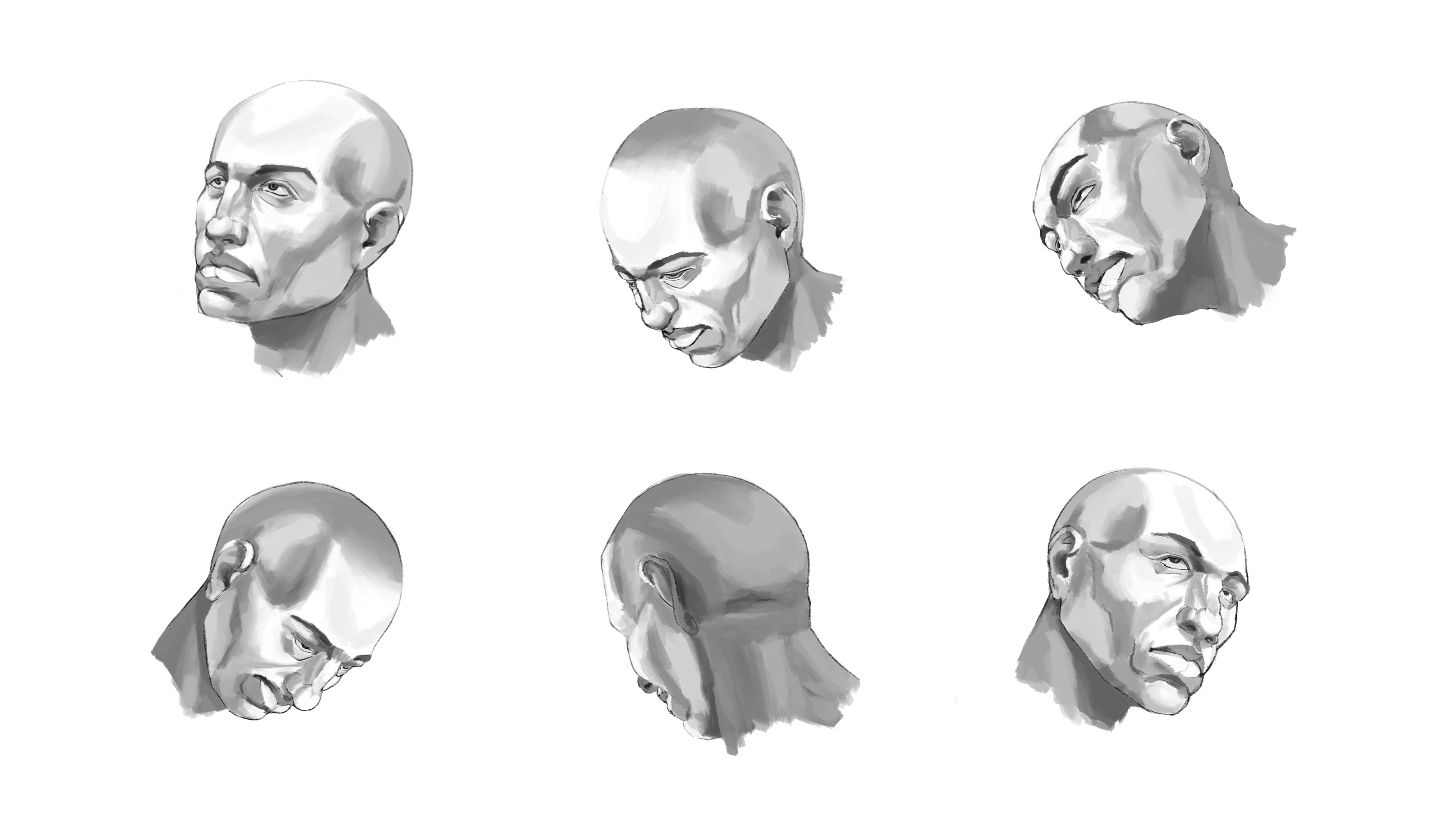
These heads look so well defined! You did a nice job rotating each facial feature and shading them.
For the bottom left I would say move the mouth over more to the right, show more of the top of the top lip and show less of the bottom for the bottom lip. Also be careful with the shading on the top dip of the skull, it looks too deep.
I really liked seeing the close ups on Instagram, keep it up!
Suggested Topics
| Topic | Category | Replies | Views | Activity |
|---|---|---|---|---|
| TERM 5 - Alejandro | Art School | 5 | 2.4k | Aug '19 |
| Nollan G - Art School Journey | Art School | 2 | 669 | Apr '21 |
| Term 1 - Sly | Art School | 17 | 4.3k | Jul '18 |
| Qbicc - Art School Journey | Art School | 5 | 854 | Apr '21 |
| Taylor - Art School Journey | Art School | 4 | 758 | Aug '22 |