• Gave myself 5 days to do something. This is what I managed to do. I'm trying to get better at illustrations, but I have patience to work on something for 3 days maximum :( Splash_Process.jpg5000x3140 2.21 MB Splash_Process-6.jpg3896x2429 2.83 MB concept list char copy.jpg5388x3000 1.7 MB
    20.8k
  • Did a character concept for a course.https://www.artstation.com/artwork/P6gm3y - more:) list1.jpg3541x1920 2.82 MB
    20.8k
  • Day 4: Star Wars May The 4th =] Queen Padmé Amidala in my art style! First time drawing her and I really enjoyed making this one! Used watercolours, ink pen, acrylic markers and gold paint for accents on my Canson mix media sketchbook. I hope you like it!
    82.4k
  • A creature design from a while back
    by
    6.7k
  • Here is some more recent stuff, I need to make more body studies
  • It's been a while and god, it is so cringe to go through all previous messages xDmy study.
    20.8k
  • Thank you! I finally cleaned that up. Meanwhile started 3 more ..I have a habit of taking too long to finish a piece, then I lose interest in it and just start something else. I found 8 from recently i started and abandoned, that are decent enough to not delete, but not finished. There’s also been a number of drawings I felt I “outgrew” - became better before I finished them, and it would be easier to start from scratch than fix them. Anyone else thinking that?
  • Lady Death Fanart Collectible: Part 6 Polypaint and base Hi, it’s time to share with you another part of the process to create this fanart piece. Polypaint As this is my first collectible fanart I didn’t have previous experience with polypaint so I tried my best and played a bit with it.I wanted to give a ghostly and eerie look to Lady Death, she is beautiful and deadly, but at the end of the day she is a woman that died and was reborn at hell as an avenging spirit, that’s why I gave her skin tone a bluish very cold tone.As you will see I gave myself some creative freedom to deviate from the traditional color scheme that this characater has in comics and illustrations.To add a bit of sensuality by painting some freckles on the face and the chest. The dark nature of this character was the perfect excuse to gave her a kind of goth make up, very dark shadows around the eyes, blue lips and fingernails. I know that the original character includes sexy red lips but I wanted this girl to have a sexy but at the same time creepy look, that’s why we can see some thin veins emanating from her eyes. The biggest chromatic change I did for this character is at the hair. Lady Death has a characteristic white weavy hair but in my fanart I decided to gave her a very saturated blue color.The reason behind this wasn’t only an aesthetic choice. I want that the face area strongly pulls the attention of the viewer so this area needed a stronger contrast. Another reason is that I want her to have a more modern look, as I mentioned before, I’m strongly attracted to women with goth/punk look. I gave myself half an hour or more to analyse the work of experienced sculptors that create collectibles and I discovered that the use of darker values on the skin is often applied to create a greater sense of volume and three-dimensionality. I found that areas with heavy ambient occlusion are the perfect places to paint with darker colors in order to increase the separation between different forms. Even though she has a bluish skin tone, I used a bit of warmer hues in areas that, in real life, tend to go towards red and pink, this is very obvious in the nose, cheeks, and knuckles. Thinking with a logical mind it’s completely absurd to have warmer tones on the body of a zombie like creature but I didn’t want to limit myself by using only blue tones, it looks boring and artificial. In real life these colors are created by blood vessels in areas where the skin is very thin. ** Scythe **for her weapon I applied a cool gray with some warmer variations, this color scheme is influenced by the work of H.R giger. Base I’d like to talk about the design for the base which, to be honest, I forgot to develop along with the character.My main idea with the base is to show that Lady Death inhabits a very sterile and arid land, at the end of the day she is at hell.You can see a that she walks over dirt and rocks, a sign that she’s surrounded by death and loneliness. As part of the landscape we can see some bones and skulls to reinforce the idea of lack of living creatures, yet we can see three hands that try to reach her legs.This hands represent that all creatures are subordinated to her power and seek an evil blessing with a simple touch of the princess of the damned.1- The hand with skin burns represents the souls of those who are newcomers to hell, tortured souls that suffer for the sins comitted on earth.2- The hand with greenish rotten skin and pustules is the reminder of the decay that has infected the souls of those who have been trapped and have forgotten their humanity3- Last but not least, the hand of a demon shows that even dark creatures and entities bow before her presence. The cherry on the top, at least in my vision, are the simese twins that emerge from the ground, this malevolent creatures remind us that in hell there’s only perversion and any trace of innocence is lost. Thanks for reading till this pointI’m really happy to be very close to finish this creative journey, last but not least it’s mandatory to talk about splitting the sculpture in several pieces to be printed, this will be my last entry before showing the final rendered images. See yaMay Zbrush be with you
    1.5k
  • memory 2min gartic phone, used ref 2m gartic, used ref for pose 2min gartic 2min gartic 2min gartic 2min gartic memory memory memory memory study memory memory memorymemory memory memory memory memory memory study memorystudy study stylized left memory, right study study memory memorymemory memory memory memorymemory memory, porportions r offmemory memorystudystudy memorymemorymemory memory memory memory memory memory memory memory, right leg is a bit broken The feeling of only getting 1 - 3 likes on a social media post will never not be discouraging. But nothing is discouraging enough to make me quit drawing. I think the strategy of drawing a lot of stuff and waiting a while to post is good though rather than posting it immediately and then feeling that sadness on the next set of drawing
  • Urban Dragon Girl Wip Urban Dragon Girl_wip1.jpg5000x5000 1.11 MB
  • Long time no see! New artworks produced lately
    6.7k
  • studies studies juri study imagination, how I feel before a speech imagination imagination study something I drew for my presentation also drew this for my presentation, didn't fix the one hand being bigger than the other imagination + study study studies study study, I need to fix the face a bit based on screenshot from anime but in my style study. except for the eye study studies studies study. changed some things tho imagination imagination imagination study studies, except top right samurai based on anime screenshot wolverine studies, changed some of the poses a lil, not very good at all, but first time i drew the character ever. semi study studies study imagination imagination imagination , for first time ever i tried to draw over 3d model for middle pose, I dont like the result tbh, but it makes it much easier than coming up with it from memory.imagination, except right figurestudies imagination + studies, coming up with action poses r hard, these are not dynamic enough, I will redraw better ones in future. imagination , imagination imagination study, except for eye imagination imagination imagination doodles except for the two chrollos imagination storyboard thumbnail, idk if i ever shared this. my storyboards end up being a little detailed since i usually just draw in one layer.
    by
    22.4k

Hello fellow artists! I am starting to get into the Art School assignments and would love some critiques from the community. I started with the 1-point perspective assignment.

Wow, great work! It looks like you've done this before 😄
Honestly it's an awesome sketch and looks correct. So it's nitpicky and only because you asked for critique: the only thing that might separate it from a professional drawing would be the lines (incl. brushwork for the light rays).

One way to tackle that is a matter of cleanup. The other is comfort and confident, interesting strokes. People say the latter "comes with practice", but practice can be made more efficient by studying masters. Your work seems advanced so you probably already know, but lmk if you'd like examples!

Appreciate the critique. I agree, my linework needs more practice. I have been doing Marc's dexterity exercises every day, but I still struggle with curved lines. If you have links to additional dexterity practice examples, I'd appreciate that!
As for light rays, I did this exercise before I discovered the joys of the custom blend brushes :sweat_smile: I cannot believe how much I was missing out on.

What are you using? Photoshop? If so, definitely take advantage of the smoothing slider. I knock it up to anywhere from 12-25% depending how long and precise the line needs to be.

Unfortunately with digital it's not all about dexterity; with any software/tablet there's the annoying "wiggle". Procreate in particular has not yet addressed this; their style of smoothing doesn't work for long strokes which need to be drawn slowly for precision.

I highly recommend the free app Krita, actually. It was absolutely wonderful to draw and paint in, and pretty intuitive to get started. It has one of the best smoothing functions out there. On tablets, Infinite Painter has good smoothing.

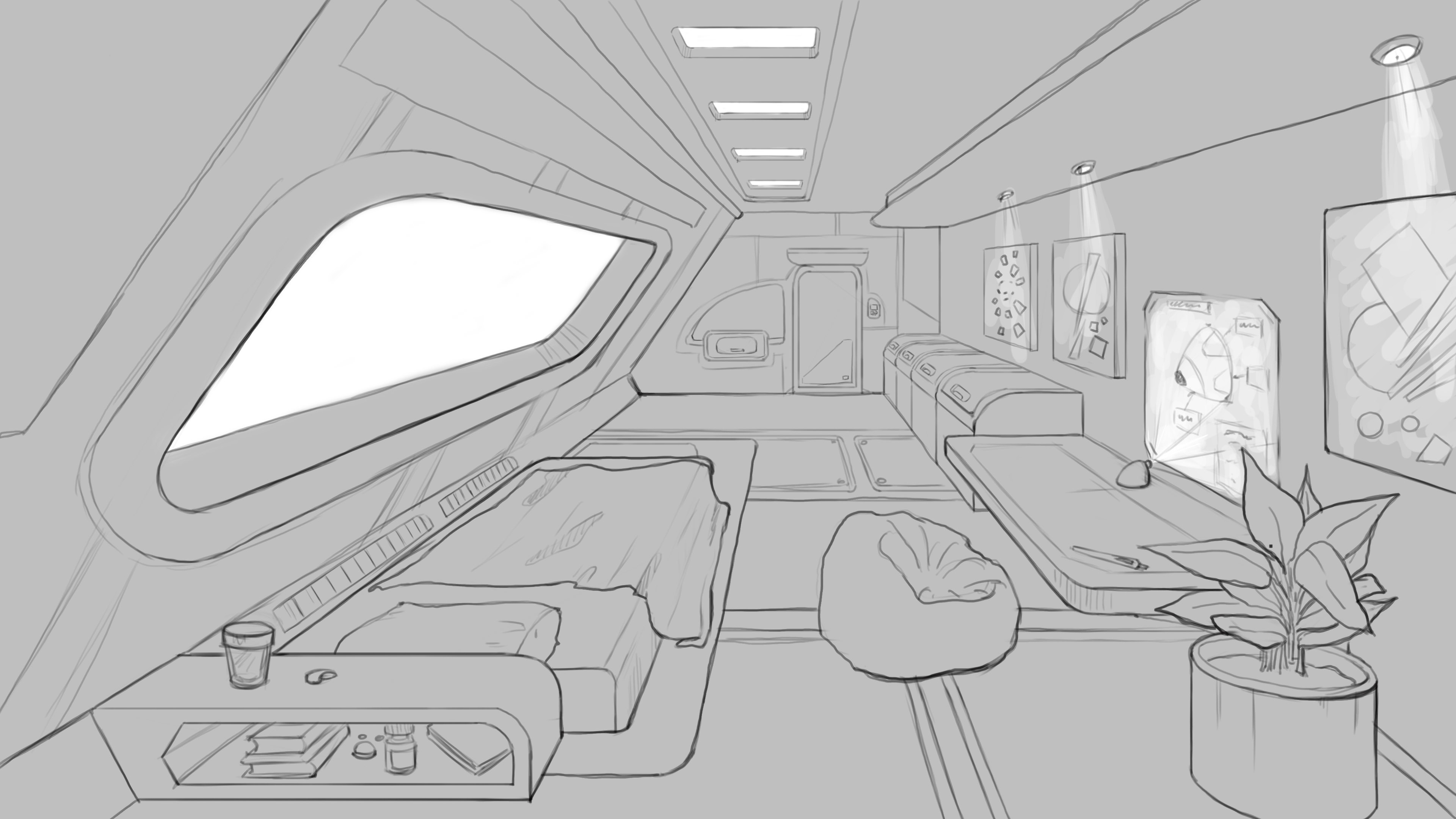
Finally, it's not that perfect lines have to be the goal — there are beautiful drawing styles with messy/wild lines! Even for straight and modern architecture like this. I can try to find some examples if you'd like.

P.S. Do tell me if I'm just going on about things you already know and not addressing the specifics you do have questions about!

I am using Photoshop, you're correct. I will definitely see what the smoothing option can do.
Haven't heard about Krita, thanks for the tip!

I can safely say that that I haven't figured out my one style yet. That's what I'm here for!
And don't ever worry about saying something I might already know. If I do, I'll share my insight and we'll just learn from each other.

Did a head study as well as shading practice this time. I know the proportions have not turned out exactly perfect (haven't drawn by pencil-measuring technique in such a long time!), but I hope with practice it'll come back to me.
As always, critique, suggestions and recommendation are welcome.
Reference:

Drawing:

Reference:

Drawing:

Nice portraits! It's great that you're going all-out and finishing these.

Maybe this post/video will help:
https://www.proko.com/top-5-shading-mistakes/

Also, I know Marc has said to start with a soft brush but I disagree a little bit — not completely, just about the type of softness. PS's standard soft brush is like an air brush, which can be difficult to get nice results with. A lot of beginner drawings have an overly-airbrushed look where forms get lost and look blurry. (Even in pencil, like this. Compare to this where they started with hard edges and blended, & another.)

A fuzzy brush can exacerbate that. Another way to soften a brush is to use one with hard edges (even a square brush) and use extremely low Flow. Like 1-3%. Try it!

Some more nice examples of blocked form to softening:
https://www.artstation.com/artwork/QzrLe3

EDIT: here we go! I think the section title is too harsh, but just happened to find a similar explanation from Proko (page-search for Self-Delusion): https://www.proko.com/top-7-digital-painting-mistakes/ — the two side-by-side portraits are a good example.

Ohh! I like this block out technique! Determined to try now. And yes, I agree, seems like all beginners' shading looks like airbrush everywhere. I'm really trying hard to get away from that.

12 days later

So I went ahead and colored the character design I showed on Saturday while trying to implement the critique Marc gave me. Let me know what you think. Any critiques/recommendations are welcome.

Wow, really really cool ;D. I like the first and the fourth ones of the second image.

Thank you! I like the #4 hairstyle too, but do you think it feels more like a priestess than an archivist?

A bit of a mix I think xd

Hi WeirdOwl,
I love your character design all off them look awesome!
But when I have to choose,I prefer the third (her hairstyle remind me of an historical person in the 14 century..I really don't know why :joy: )
She look very unique with her hair.
And I like the fourth,too.
Her hat looks so cool :heart_eyes:
She expresses wisdom and a kind of power with her hat.

Maybe if you change the height of the hat a little?
I know what you mean she look like a bit of a priestess, but I think it is either the height or the form.
I wish you luck!

Thank you @wum.laumann for sharing your preference! I agree, #3 is the most unique here. Maybe not the best choice for this concept, but I'll store this hairstyle for some other time :smile:
I do like #4 a lot too. Guess I'll cheat and see what Marc says during his critique. :sweat_smile: