• Gave myself 5 days to do something. This is what I managed to do. I'm trying to get better at illustrations, but I have patience to work on something for 3 days maximum :( Splash_Process.jpg5000x3140 2.21 MB Splash_Process-6.jpg3896x2429 2.83 MB concept list char copy.jpg5388x3000 1.7 MB
    20.8k
  • Did a character concept for a course.https://www.artstation.com/artwork/P6gm3y - more:) list1.jpg3541x1920 2.82 MB
    20.8k
  • Day 4: Star Wars May The 4th =] Queen Padmé Amidala in my art style! First time drawing her and I really enjoyed making this one! Used watercolours, ink pen, acrylic markers and gold paint for accents on my Canson mix media sketchbook. I hope you like it!
    82.4k
  • A creature design from a while back
    by
    6.7k
  • Here is some more recent stuff, I need to make more body studies
  • It's been a while and god, it is so cringe to go through all previous messages xDmy study.
    20.8k
  • Thank you! I finally cleaned that up. Meanwhile started 3 more ..I have a habit of taking too long to finish a piece, then I lose interest in it and just start something else. I found 8 from recently i started and abandoned, that are decent enough to not delete, but not finished. There’s also been a number of drawings I felt I “outgrew” - became better before I finished them, and it would be easier to start from scratch than fix them. Anyone else thinking that?
  • Lady Death Fanart Collectible: Part 6 Polypaint and base Hi, it’s time to share with you another part of the process to create this fanart piece. Polypaint As this is my first collectible fanart I didn’t have previous experience with polypaint so I tried my best and played a bit with it.I wanted to give a ghostly and eerie look to Lady Death, she is beautiful and deadly, but at the end of the day she is a woman that died and was reborn at hell as an avenging spirit, that’s why I gave her skin tone a bluish very cold tone.As you will see I gave myself some creative freedom to deviate from the traditional color scheme that this characater has in comics and illustrations.To add a bit of sensuality by painting some freckles on the face and the chest. The dark nature of this character was the perfect excuse to gave her a kind of goth make up, very dark shadows around the eyes, blue lips and fingernails. I know that the original character includes sexy red lips but I wanted this girl to have a sexy but at the same time creepy look, that’s why we can see some thin veins emanating from her eyes. The biggest chromatic change I did for this character is at the hair. Lady Death has a characteristic white weavy hair but in my fanart I decided to gave her a very saturated blue color.The reason behind this wasn’t only an aesthetic choice. I want that the face area strongly pulls the attention of the viewer so this area needed a stronger contrast. Another reason is that I want her to have a more modern look, as I mentioned before, I’m strongly attracted to women with goth/punk look. I gave myself half an hour or more to analyse the work of experienced sculptors that create collectibles and I discovered that the use of darker values on the skin is often applied to create a greater sense of volume and three-dimensionality. I found that areas with heavy ambient occlusion are the perfect places to paint with darker colors in order to increase the separation between different forms. Even though she has a bluish skin tone, I used a bit of warmer hues in areas that, in real life, tend to go towards red and pink, this is very obvious in the nose, cheeks, and knuckles. Thinking with a logical mind it’s completely absurd to have warmer tones on the body of a zombie like creature but I didn’t want to limit myself by using only blue tones, it looks boring and artificial. In real life these colors are created by blood vessels in areas where the skin is very thin. ** Scythe **for her weapon I applied a cool gray with some warmer variations, this color scheme is influenced by the work of H.R giger. Base I’d like to talk about the design for the base which, to be honest, I forgot to develop along with the character.My main idea with the base is to show that Lady Death inhabits a very sterile and arid land, at the end of the day she is at hell.You can see a that she walks over dirt and rocks, a sign that she’s surrounded by death and loneliness. As part of the landscape we can see some bones and skulls to reinforce the idea of lack of living creatures, yet we can see three hands that try to reach her legs.This hands represent that all creatures are subordinated to her power and seek an evil blessing with a simple touch of the princess of the damned.1- The hand with skin burns represents the souls of those who are newcomers to hell, tortured souls that suffer for the sins comitted on earth.2- The hand with greenish rotten skin and pustules is the reminder of the decay that has infected the souls of those who have been trapped and have forgotten their humanity3- Last but not least, the hand of a demon shows that even dark creatures and entities bow before her presence. The cherry on the top, at least in my vision, are the simese twins that emerge from the ground, this malevolent creatures remind us that in hell there’s only perversion and any trace of innocence is lost. Thanks for reading till this pointI’m really happy to be very close to finish this creative journey, last but not least it’s mandatory to talk about splitting the sculpture in several pieces to be printed, this will be my last entry before showing the final rendered images. See yaMay Zbrush be with you
    1.5k
  • memory 2min gartic phone, used ref 2m gartic, used ref for pose 2min gartic 2min gartic 2min gartic 2min gartic memory memory memory memory study memory memory memorymemory memory memory memory memory memory study memorystudy study stylized left memory, right study study memory memorymemory memory memory memorymemory memory, porportions r offmemory memorystudystudy memorymemorymemory memory memory memory memory memory memory memory, right leg is a bit broken The feeling of only getting 1 - 3 likes on a social media post will never not be discouraging. But nothing is discouraging enough to make me quit drawing. I think the strategy of drawing a lot of stuff and waiting a while to post is good though rather than posting it immediately and then feeling that sadness on the next set of drawing
  • Urban Dragon Girl Wip Urban Dragon Girl_wip1.jpg5000x5000 1.11 MB
  • Long time no see! New artworks produced lately
    6.7k
  • studies studies juri study imagination, how I feel before a speech imagination imagination study something I drew for my presentation also drew this for my presentation, didn't fix the one hand being bigger than the other imagination + study study studies study study, I need to fix the face a bit based on screenshot from anime but in my style study. except for the eye study studies studies study. changed some things tho imagination imagination imagination study studies, except top right samurai based on anime screenshot wolverine studies, changed some of the poses a lil, not very good at all, but first time i drew the character ever. semi study studies study imagination imagination imagination , for first time ever i tried to draw over 3d model for middle pose, I dont like the result tbh, but it makes it much easier than coming up with it from memory.imagination, except right figurestudies imagination + studies, coming up with action poses r hard, these are not dynamic enough, I will redraw better ones in future. imagination , imagination imagination study, except for eye imagination imagination imagination doodles except for the two chrollos imagination storyboard thumbnail, idk if i ever shared this. my storyboards end up being a little detailed since i usually just draw in one layer.
    by
    22.4k

Hello hello! I am Corey "Xemphait" Grosz and I am starting this topic to house future postings of my assignments.

Before I get to assignment stuff though I wanted to share artwork I have done to show my starting point. There is a good mix of drawings from reference and drawings from imagination.

This is Em, an original character I use for various tabletop games. She is a huge source of inspiration for me and the primary subject for a lot of my art.

I have spent a lot more time with pencil and paper than digital, and I still gravitate that way due to comfort...

I have done some digital stuff, most of it was done on my phone (Samsung Note series):

Last I wanted to include the best illustration I have done (I can't believe it has already been a year since I painted it :frowning: )

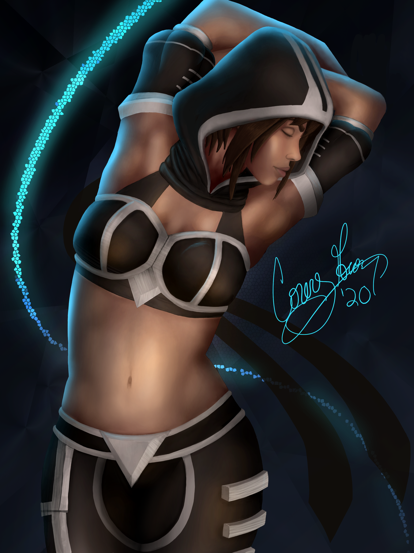
This last piece took forever... but I think it turned out great compared to all my past works. My goal is to be able to produce more stuff like this (hopefully better!) but be able to do it in less time.

Welcome to the forums! These look great both your pencil and paper and digital. I was surprised you do some of those on a phone because I wouldn't have been able to do that personally based on the screen size and how tiny your movements have to be. can't wait to see what you learn and make in the future.

Term 1 - Photoshop For Digital Production 1 - Assignment 1 - Digital Pen Control

I tried this exercise 3 times on my Microsoft Surface with Photoshop using different sensitivity and smoothing settings, once on my Samsung Note 9 with Sketchbook, and once with pencil and paper.

Each of the 3 on the Surface were the worst :frowning:, what is shown above is the best of the 3 done on the Surface... I had the brush smoothing at 25% (the first test was default at 10% and the second test I did 0% since Marc says we shouldn't use it).

I am pretty disappointed at how jittery the lines are on the Surface. At first I thought maybe it was because of the smooth glass, but the Note 9 is smooth too and I didn't have nearly as jittery lines.

Also, the Note 9 did a much better job knowing when I set the pen on the screen and lifted it off. The Surface had a lot of late-starts and early-stops on the lines, which I CTRL+Z'd and redid each time.

Last, for the circles, on the Surface the start and the end of the circle rarely lined up (probably related to the above).

When starting a new piece I tend to gravitate to pencil/paper first, then my phone, leaving the Surface last. Maybe I already subconsciously figured this all out...

Term 1 - Photoshop For Digital Production - Assignment 2 - Image Adjustments

Overall I think this went well. The last part was rough though.

Fun fact, I have a bit of colorblindness (I already knew this).

Checking the RGB/HSV values for #1 the middle green is pretty far off. I brought it to my wife and she can see the difference between the two, but I can't :frowning:

I put a little something together to help me understand where I struggle to tell the difference in hue:

I blotted colors 5 degrees in hue difference apart from each other in a long line, and noted where I couldn't tell the different between two blots. Green is really bad for me so I tried escalating the difference in hue to see if I could tell the difference... turns out there is an area that even at 40 degrees apart I can barely tell the difference.

I just try to stay away from colors that are close to green (they are ugly in my eyes anyways :wink:)

Are you using the surface pen or are you using a graphics tablet by either Huion, XP-Pen, or Wacom? If you are using the surface pen I would try to get a graphics tablet