• Gave myself 5 days to do something. This is what I managed to do. I'm trying to get better at illustrations, but I have patience to work on something for 3 days maximum :( Splash_Process.jpg5000x3140 2.21 MB Splash_Process-6.jpg3896x2429 2.83 MB concept list char copy.jpg5388x3000 1.7 MB
    20.6k
  • Did a character concept for a course.https://www.artstation.com/artwork/P6gm3y - more:) list1.jpg3541x1920 2.82 MB
    20.6k
  • Day 4: Star Wars May The 4th =] Queen Padmé Amidala in my art style! First time drawing her and I really enjoyed making this one! Used watercolours, ink pen, acrylic markers and gold paint for accents on my Canson mix media sketchbook. I hope you like it!
    81.8k
  • A creature design from a while back
    by
    6.6k
  • Here is some more recent stuff, I need to make more body studies
  • It's been a while and god, it is so cringe to go through all previous messages xDmy study.
    20.6k
  • Thank you! I finally cleaned that up. Meanwhile started 3 more ..I have a habit of taking too long to finish a piece, then I lose interest in it and just start something else. I found 8 from recently i started and abandoned, that are decent enough to not delete, but not finished. There’s also been a number of drawings I felt I “outgrew” - became better before I finished them, and it would be easier to start from scratch than fix them. Anyone else thinking that?
  • Lady Death Fanart Collectible: Part 6 Polypaint and base Hi, it’s time to share with you another part of the process to create this fanart piece. Polypaint As this is my first collectible fanart I didn’t have previous experience with polypaint so I tried my best and played a bit with it.I wanted to give a ghostly and eerie look to Lady Death, she is beautiful and deadly, but at the end of the day she is a woman that died and was reborn at hell as an avenging spirit, that’s why I gave her skin tone a bluish very cold tone.As you will see I gave myself some creative freedom to deviate from the traditional color scheme that this characater has in comics and illustrations.To add a bit of sensuality by painting some freckles on the face and the chest. The dark nature of this character was the perfect excuse to gave her a kind of goth make up, very dark shadows around the eyes, blue lips and fingernails. I know that the original character includes sexy red lips but I wanted this girl to have a sexy but at the same time creepy look, that’s why we can see some thin veins emanating from her eyes. The biggest chromatic change I did for this character is at the hair. Lady Death has a characteristic white weavy hair but in my fanart I decided to gave her a very saturated blue color.The reason behind this wasn’t only an aesthetic choice. I want that the face area strongly pulls the attention of the viewer so this area needed a stronger contrast. Another reason is that I want her to have a more modern look, as I mentioned before, I’m strongly attracted to women with goth/punk look. I gave myself half an hour or more to analyse the work of experienced sculptors that create collectibles and I discovered that the use of darker values on the skin is often applied to create a greater sense of volume and three-dimensionality. I found that areas with heavy ambient occlusion are the perfect places to paint with darker colors in order to increase the separation between different forms. Even though she has a bluish skin tone, I used a bit of warmer hues in areas that, in real life, tend to go towards red and pink, this is very obvious in the nose, cheeks, and knuckles. Thinking with a logical mind it’s completely absurd to have warmer tones on the body of a zombie like creature but I didn’t want to limit myself by using only blue tones, it looks boring and artificial. In real life these colors are created by blood vessels in areas where the skin is very thin. ** Scythe **for her weapon I applied a cool gray with some warmer variations, this color scheme is influenced by the work of H.R giger. Base I’d like to talk about the design for the base which, to be honest, I forgot to develop along with the character.My main idea with the base is to show that Lady Death inhabits a very sterile and arid land, at the end of the day she is at hell.You can see a that she walks over dirt and rocks, a sign that she’s surrounded by death and loneliness. As part of the landscape we can see some bones and skulls to reinforce the idea of lack of living creatures, yet we can see three hands that try to reach her legs.This hands represent that all creatures are subordinated to her power and seek an evil blessing with a simple touch of the princess of the damned.1- The hand with skin burns represents the souls of those who are newcomers to hell, tortured souls that suffer for the sins comitted on earth.2- The hand with greenish rotten skin and pustules is the reminder of the decay that has infected the souls of those who have been trapped and have forgotten their humanity3- Last but not least, the hand of a demon shows that even dark creatures and entities bow before her presence. The cherry on the top, at least in my vision, are the simese twins that emerge from the ground, this malevolent creatures remind us that in hell there’s only perversion and any trace of innocence is lost. Thanks for reading till this pointI’m really happy to be very close to finish this creative journey, last but not least it’s mandatory to talk about splitting the sculpture in several pieces to be printed, this will be my last entry before showing the final rendered images. See yaMay Zbrush be with you
    1.4k
  • memory 2min gartic phone, used ref 2m gartic, used ref for pose 2min gartic 2min gartic 2min gartic 2min gartic memory memory memory memory study memory memory memorymemory memory memory memory memory memory study memorystudy study stylized left memory, right study study memory memorymemory memory memory memorymemory memory, porportions r offmemory memorystudystudy memorymemorymemory memory memory memory memory memory memory memory, right leg is a bit broken The feeling of only getting 1 - 3 likes on a social media post will never not be discouraging. But nothing is discouraging enough to make me quit drawing. I think the strategy of drawing a lot of stuff and waiting a while to post is good though rather than posting it immediately and then feeling that sadness on the next set of drawing
  • Urban Dragon Girl Wip Urban Dragon Girl_wip1.jpg5000x5000 1.11 MB
  • Long time no see! New artworks produced lately
    6.6k
  • studies studies juri study imagination, how I feel before a speech imagination imagination study something I drew for my presentation also drew this for my presentation, didn't fix the one hand being bigger than the other imagination + study study studies study study, I need to fix the face a bit based on screenshot from anime but in my style study. except for the eye study studies studies study. changed some things tho imagination imagination imagination study studies, except top right samurai based on anime screenshot wolverine studies, changed some of the poses a lil, not very good at all, but first time i drew the character ever. semi study studies study imagination imagination imagination , for first time ever i tried to draw over 3d model for middle pose, I dont like the result tbh, but it makes it much easier than coming up with it from memory.imagination, except right figurestudies imagination + studies, coming up with action poses r hard, these are not dynamic enough, I will redraw better ones in future. imagination , imagination imagination study, except for eye imagination imagination imagination doodles except for the two chrollos imagination storyboard thumbnail, idk if i ever shared this. my storyboards end up being a little detailed since i usually just draw in one layer.
    by
    22.2k

Hello, ive started learning how to draw about 3 and a half years ago, since about 3 month im also doing marcs digital school of art. My main art goal is being able to draw / design characters from imagination.
For 2025 ive wrote down some main goals for my art in which I think I really need to improve.
- believable faces
- shading / hatching (I like mangas, so hatching would be useful)
-hands and feet (to often I avoid drawing hands..)
-expression (faces and poses)
-backgrounds (never really drew backgrounds, only some rooms here and there)
-coloring (Ive started to color my drawings like 3, 4 month ago, before that I actually never colored a drawing, black and white only)
-clothing (and clothing folds of course)

at the moment my characters look a bit to childish in my opinion, in the future I would like to get a more "serious" look. I love the art of the manga berserk for example, a great mix between manga style und realism.
I would love some critique on what you think I need to improve to most, what kind of study I would benefit the most. any errors in my characters that I didnt spot yet! thank you!
and english is not my main language, I hope there werent any mistakes, if yes sorry :wink:
here a couple of drawings from imagination, anatomy and clothed.

Okay not bad. Nice post with intentions. I’ll work on an extensive critique. Please feel free to post more images as it will help me with the critique further.

In the meantime please check out my other extensive critique posts I’ve done here. I’ve listed the links in my blog as well.

Hopefully I won’t use language that you will have a hard time with. See you soon.

Just letting you know I'm still working on it. Here's a preview. I'll get back to it when I get time after work this week.


INTRO

First off, great post. Welcome to the critique section.

I will try to mainly focus on the things that you need to improve the most, and
what kind of study would benefit you the most at the end.

--Seinen Manga Style (berserk) and Faces-- a quick disclaimer and statement.
DISCLAIMER - REMEMBER that these are tips and suggestions that might help you. NOT how it is supposed to LOOK, or HOW you do it. It should help you see your work in a new light. I hope....My critique is subjective and based on my experience and knowledge gained from over the years.

I am not a manga reader myself – but I learned upon starting this research that Berserk is a Seinen Manga. Geared towards older male audiences – dealing with more mature and emotional situations. Characters have a range of realistic depth. Meaning no cartoonish like expression. So their faces are more detailed and less simple. That allows them to make the range of human emotion we can relate to as readers. Their characters are complicated, and we as older readers desire complex content.

It is hard to be accurate with faces all of the time. Artists skills change with characters over time. And if you get them wrong for fans of established characters - things will start to look weird immediately. And so - with Seinen style manga (berserk) we have to stick with a face that can have a range subtle expression. There is no room to create an emoji style reaction like Shonen or Shojo style manga.

Then, when there are characters that are stressed, or in a rage and wild or evil - compared to the subtle aspect of their expression throughout the story – those moments of intensity seem even MORE intense because of the relative nature of the overall style of the story and manga itself. (Think big eyeballs, scars and lots of teeth)

Manga style facial structure has a lot more design to it than realism – When you look at characters you can tell who is the heavy slow one, the quick witted but ignorant one, the sly devious one, the hero...on and on. So with that in mind lets move on.

"what you think I need to improve to most,"

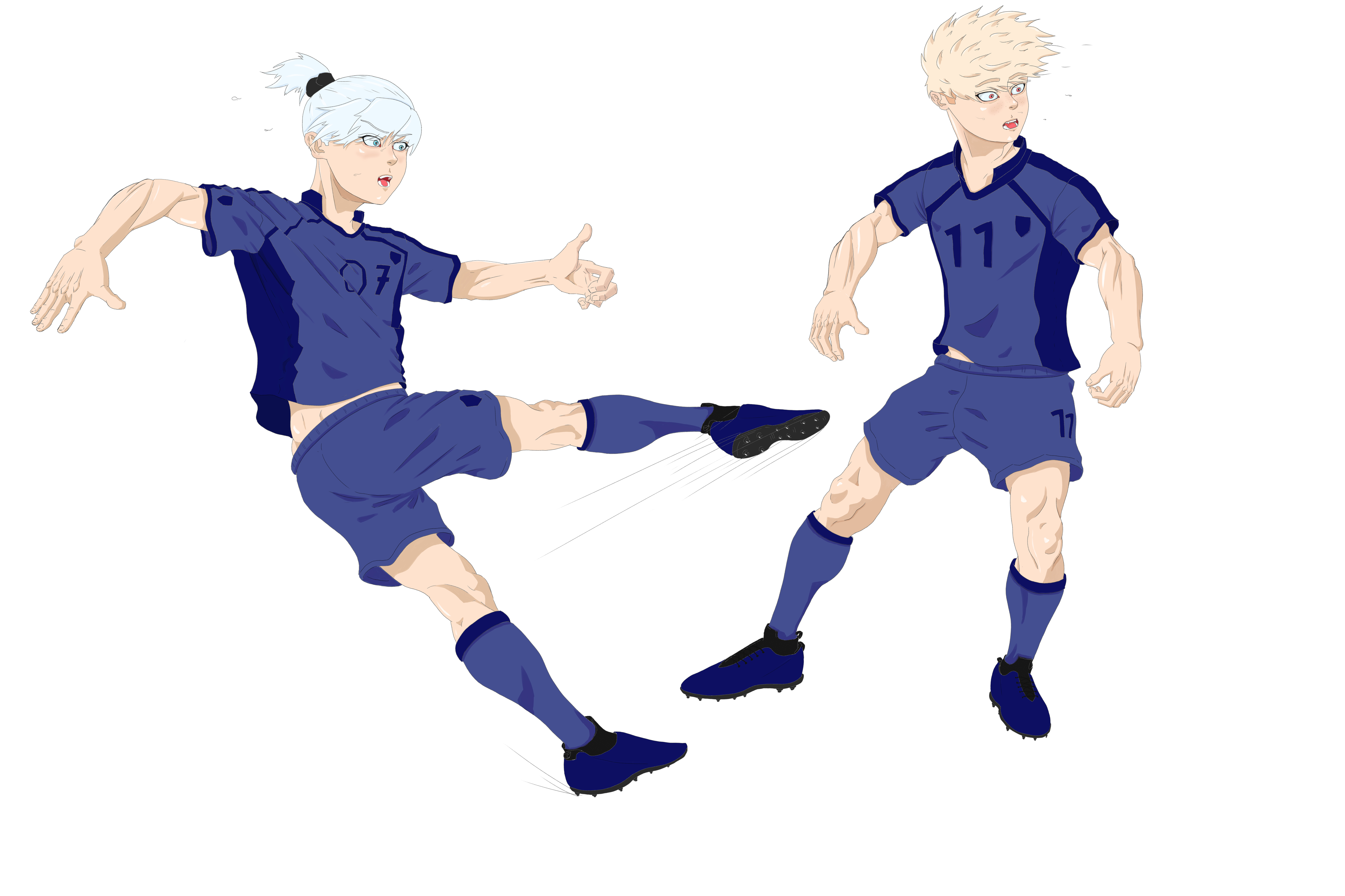
So for this first piece – We have a very stiff and static pose with limbs that are also very stiff. Gesture drawing, – in the way that I mean it – by creating a more unified and dynamic shape with motion as the intent, will reflect more natural stances. I recommend for everyone starting out – to at least try the pose themselves. What is the pose in this first piece actually saying?

What was your intent of expression? Probably just a muscular pose, but it is so awkward that we are distracted from the physique showing off – to the strange rotation of the limbs themselves.

Start out by practicing your simplified mannequin – like in the sample below – in positions that have the action you want to describe – then...see if you can push the action further. Stretch that action line, push the boundaries a bit. Although Berserk is more realistic
– it doesn't mean that figure drawing is stiff. Everything is a shape. If I could just type that a thousand times to get it into peoples heads I would. But it would make for a boring critique.
.
.
. (Save Image or open in new tab for full view.)


.
.
.

GESTURE STATEMENT

I will say what only Steve Huston put best by his drawing book. I have used this book to teach this theory to people for a couple of years now.

I have lots of other posts on it with other people asking what it is, or how to do it. Because I
think it is elusive and confusing for self taught artists with access to the infinite internet. Here are some tips from me on your subject and style needs that I can recognize.
.
.


.
.
I think that you would benefit from these Proko rhythm drawings exorcises, and then practicing the study of all of the reference pictures he provides. After one or two sessions figures come very quickly, and you will find yourself using stylistic choices of your own.

DRAWING FIGURES FROM ANY ANGLE - PROKO
-
DRAWING LIMBS FROM ANY ANGLE - PROKO
-
DRAWING HARD POSES FROM ANY ANGLE - PROKO

Free PDF and reference pictures. Its worth having to build your library - so just make an account - there is so much free content.
https://www.proko.com/course-lesson/ebook-rhythms/downloads

DRAWING STATEMENT

I want to say this before you read into the tips on this page really quick, you are already a good drawer. You can make clean lines and know anatomy really well. Your skill with construction and anatomy is good, and you just need some of step 1 here and step 6 for some artistic development. I started making this before I saw your second post with sketches and I wanted to make sure that you know -- you already do most of this really well, you just need the gesture stage and some line art consistency. Or illustrative punch.
.
.
.


.
.
.

Final Statement

You are already doing some great things. You know some anatomy, and some construction, and even some drapery.

Your drapery can be more designed with shapes and with tension points - areas that cause bunching and stretching. I'm sure you can find a video explaining that better than I could. But what I want you to know is that you can also design CLOTHING FOLDS with interesting shapes that work well with the figure, and only add detail where you want the viewer to look. Not every where the same amount of detail. Have a focal point/s. Think about how proko designs the shape of these people abstractly, you can do the same with drapery and clothing. Use the same pattern of construction for your imaginative figures.

Your anatomy is good - but it is not connected the way the human body is connected with figure drawings - with the energy of rhythm flowing from the head to the foot, or extremities. The human body is connected like a puzzle. It all fits together so perfectly from any angle so consistently. And it takes some time to study. So study from life OR MASTERS, and then try without.

Your teeth and mouths are WAY too small. They look like they eat at the restaurant "Little Bits" from Rick and Morty Cartoon. And your skull, like your feet and hands - needs some perspective work and construction help regarding the features being placed properly on the skull. I tried to illustrate a way to solve that in the pictures above. It looks like you are missing the center line of the outside contour shapes of the features, and just using the center line of the skull construction - like it was drawn on a balloon.

Some bones and joints would be broken and unnaturally turned. Your ankle bone in-consistency sticks out, and your feet and hands need some desperate practice in their construction, and some serious work on their perspective. Your anatomy is good but not everything is flexed all the time everywhere to the extreme. Adding so much detail everywhere makes it less important.

I think to remedy this you should practice these ideas using reference first - THEN do them from imagination okay? That is the best that any art school will make you do.

This ethan becker video helped me a lot to draw hands for the first time when I was stuck for a long time.

What I didn't Cover.

NOTAN, notan, notan. Group the shadows, use a singular main light source. I have not touched on this at all but I go over it in depth in other critiques. Notan is the clear separation of light and dark shapes - and yours' are scattered a lot and make the image busy. Masters group the shadows - even if they are cross hatched - see how they group them. Look up NOTAN from proko - and Ron Lemen. It makes thinking about organizing your rendering stages a breeze. Your style makes your light source and its direction look inconsistent - or like there are multiple angles of lights. Be consistent in this.

Thanks for this opportunity.

I haven't had anyone ask for a critique in a while and it has been nice to brush off some stuff over the past few days. I hope you come back and keep knocking it out of the park. You are doing some good stuff, and I can tell that you will soon be great. Just keep putting that road behind you.

Later Tater.

Thanks a lot for this very useful in depth analysis! Also had a good laugh here and there seeing some of my mistakes.
I really need to think more before I start drawing, often times I just start drawing and be like "yeah kinda works this way", without really having a big picture in my head about expression and more.
Good thing, a couple of days ago I just bought Michael Hamptons new book about gesture.
Im always getting into details to soon. I need a better simple, gestural structure before getting into the details. Next big thing im going to practice is gestural shapes and line of action (gesture overall). Also more practice in drawing hands/feet, which I already started today.
Theres so much more, the next days and weeks I will try to get as much as possible out of youre critic. I will be back after some practice!