• Gave myself 5 days to do something. This is what I managed to do. I'm trying to get better at illustrations, but I have patience to work on something for 3 days maximum :( Splash_Process.jpg5000x3140 2.21 MB Splash_Process-6.jpg3896x2429 2.83 MB concept list char copy.jpg5388x3000 1.7 MB
    21.0k
  • Did a character concept for a course.https://www.artstation.com/artwork/P6gm3y - more:) list1.jpg3541x1920 2.82 MB
    21.0k
  • Day 4: Star Wars May The 4th =] Queen Padmé Amidala in my art style! First time drawing her and I really enjoyed making this one! Used watercolours, ink pen, acrylic markers and gold paint for accents on my Canson mix media sketchbook. I hope you like it!
    83.1k
  • A creature design from a while back
    by
    6.8k
  • Here is some more recent stuff, I need to make more body studies
  • It's been a while and god, it is so cringe to go through all previous messages xDmy study.
    21.0k
  • Thank you! I finally cleaned that up. Meanwhile started 3 more ..I have a habit of taking too long to finish a piece, then I lose interest in it and just start something else. I found 8 from recently i started and abandoned, that are decent enough to not delete, but not finished. There’s also been a number of drawings I felt I “outgrew” - became better before I finished them, and it would be easier to start from scratch than fix them. Anyone else thinking that?
  • Lady Death Fanart Collectible: Part 6 Polypaint and base Hi, it’s time to share with you another part of the process to create this fanart piece. Polypaint As this is my first collectible fanart I didn’t have previous experience with polypaint so I tried my best and played a bit with it.I wanted to give a ghostly and eerie look to Lady Death, she is beautiful and deadly, but at the end of the day she is a woman that died and was reborn at hell as an avenging spirit, that’s why I gave her skin tone a bluish very cold tone.As you will see I gave myself some creative freedom to deviate from the traditional color scheme that this characater has in comics and illustrations.To add a bit of sensuality by painting some freckles on the face and the chest. The dark nature of this character was the perfect excuse to gave her a kind of goth make up, very dark shadows around the eyes, blue lips and fingernails. I know that the original character includes sexy red lips but I wanted this girl to have a sexy but at the same time creepy look, that’s why we can see some thin veins emanating from her eyes. The biggest chromatic change I did for this character is at the hair. Lady Death has a characteristic white weavy hair but in my fanart I decided to gave her a very saturated blue color.The reason behind this wasn’t only an aesthetic choice. I want that the face area strongly pulls the attention of the viewer so this area needed a stronger contrast. Another reason is that I want her to have a more modern look, as I mentioned before, I’m strongly attracted to women with goth/punk look. I gave myself half an hour or more to analyse the work of experienced sculptors that create collectibles and I discovered that the use of darker values on the skin is often applied to create a greater sense of volume and three-dimensionality. I found that areas with heavy ambient occlusion are the perfect places to paint with darker colors in order to increase the separation between different forms. Even though she has a bluish skin tone, I used a bit of warmer hues in areas that, in real life, tend to go towards red and pink, this is very obvious in the nose, cheeks, and knuckles. Thinking with a logical mind it’s completely absurd to have warmer tones on the body of a zombie like creature but I didn’t want to limit myself by using only blue tones, it looks boring and artificial. In real life these colors are created by blood vessels in areas where the skin is very thin. ** Scythe **for her weapon I applied a cool gray with some warmer variations, this color scheme is influenced by the work of H.R giger. Base I’d like to talk about the design for the base which, to be honest, I forgot to develop along with the character.My main idea with the base is to show that Lady Death inhabits a very sterile and arid land, at the end of the day she is at hell.You can see a that she walks over dirt and rocks, a sign that she’s surrounded by death and loneliness. As part of the landscape we can see some bones and skulls to reinforce the idea of lack of living creatures, yet we can see three hands that try to reach her legs.This hands represent that all creatures are subordinated to her power and seek an evil blessing with a simple touch of the princess of the damned.1- The hand with skin burns represents the souls of those who are newcomers to hell, tortured souls that suffer for the sins comitted on earth.2- The hand with greenish rotten skin and pustules is the reminder of the decay that has infected the souls of those who have been trapped and have forgotten their humanity3- Last but not least, the hand of a demon shows that even dark creatures and entities bow before her presence. The cherry on the top, at least in my vision, are the simese twins that emerge from the ground, this malevolent creatures remind us that in hell there’s only perversion and any trace of innocence is lost. Thanks for reading till this pointI’m really happy to be very close to finish this creative journey, last but not least it’s mandatory to talk about splitting the sculpture in several pieces to be printed, this will be my last entry before showing the final rendered images. See yaMay Zbrush be with you
    1.5k
  • memory 2min gartic phone, used ref 2m gartic, used ref for pose 2min gartic 2min gartic 2min gartic 2min gartic memory memory memory memory study memory memory memorymemory memory memory memory memory memory study memorystudy study stylized left memory, right study study memory memorymemory memory memory memorymemory memory, porportions r offmemory memorystudystudy memorymemorymemory memory memory memory memory memory memory memory, right leg is a bit broken The feeling of only getting 1 - 3 likes on a social media post will never not be discouraging. But nothing is discouraging enough to make me quit drawing. I think the strategy of drawing a lot of stuff and waiting a while to post is good though rather than posting it immediately and then feeling that sadness on the next set of drawing
  • Urban Dragon Girl Wip Urban Dragon Girl_wip1.jpg5000x5000 1.11 MB
  • Long time no see! New artworks produced lately
    6.8k
  • studies studies juri study imagination, how I feel before a speech imagination imagination study something I drew for my presentation also drew this for my presentation, didn't fix the one hand being bigger than the other imagination + study study studies study study, I need to fix the face a bit based on screenshot from anime but in my style study. except for the eye study studies studies study. changed some things tho imagination imagination imagination study studies, except top right samurai based on anime screenshot wolverine studies, changed some of the poses a lil, not very good at all, but first time i drew the character ever. semi study studies study imagination imagination imagination , for first time ever i tried to draw over 3d model for middle pose, I dont like the result tbh, but it makes it much easier than coming up with it from memory.imagination, except right figurestudies imagination + studies, coming up with action poses r hard, these are not dynamic enough, I will redraw better ones in future. imagination , imagination imagination study, except for eye imagination imagination imagination doodles except for the two chrollos imagination storyboard thumbnail, idk if i ever shared this. my storyboards end up being a little detailed since i usually just draw in one layer.
    by
    22.6k

22 days later

Tried to draw what I liked from this pose, but then got frustrated it didn't look like the reference. Guess I'm swinging the other way, now.

Beginning character design, I guess. Just saw a woman dressed similar and thought it looked cool. Did stop and start this, because I got into a really depressive art funk. :disappointed:

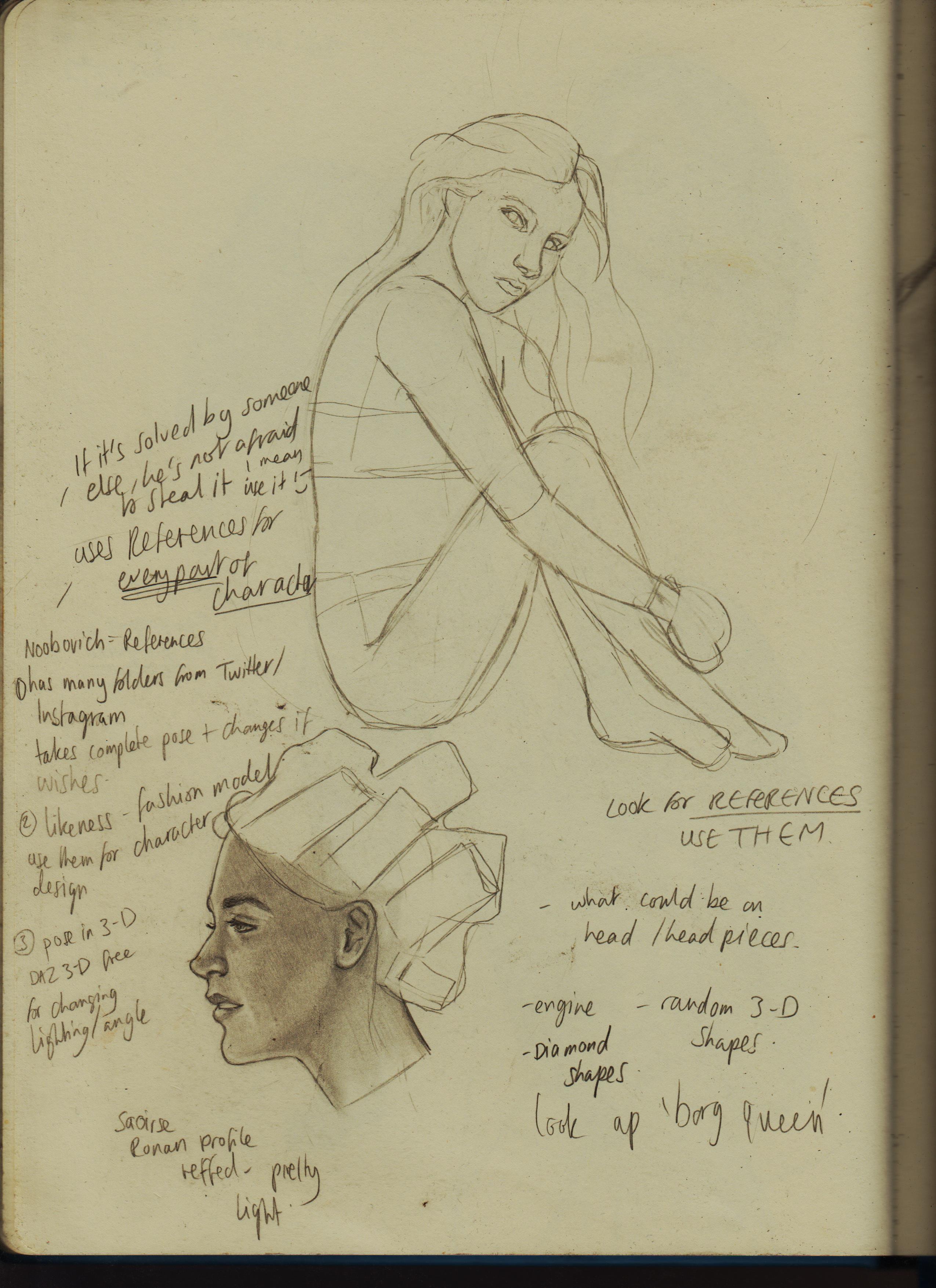
Using pose refs, again.

My first full illustration using pose refs and other references, where I was planning out a thumb and drew a full version. 660+ Female Concept Art Poses from Grafit Studio. Saw the pose and the image of a 'tree girl' started forming in my mind. I went and found the perfect tree to ref. I want to have no worry nor guilt related to using any sort of ref in the future.
I'm kind of locking down the way I like to render with pencil: lighter values, then dark, pump up values with a Black pencil, because even a 9B is just a very dark grey and use highlights when appropriate.

+1 No matter how dark they are, they’re very reflective. Charcoal, btw, is very dark but way too easy to smudge (

18 days later

This following R63 Gambit is where I took a real slump and I found it really hard to finish. I paused for a long time, because I just really wasn't feeling it. I was just riding the moment and trying to learn how to draw people sitting down. I found one pose and I kept on drawing it and started to have fun, again. I then used this as a character.


I know the arm doesn't look right, but not sure how to fix it, that might be where the impetus for the slump was.

I hate to use Charcoal in the way I'd hate to use pastel. The feeling on my hands makes me cringe, other than it being messy. (I have seen people apply with gloves, tho) I guess I don't notice the 'reflectiveness' of pencils, that much. I have discovered the 'Pitt Matte' range from Faber-Castell that I could neither buy or put on a 'wishlist' if it really starts to bother me.

An idea of an Iron Fist image appeared in my head, that I quickly noted down. I then instead of putting this off, started drawing thumbnail sketches. I'd never really done this before, but it's so helpful! It also helped me relax and it didn't have to be the final image or the internal pressure to finalise the drawings. A sketch, can just be a sketch.
I then started using PureRef, and actually getting straight front answers from Perplexity really helped not frustrate my workflow.

Here is the refined version I ended up going with. I pushed it more with the eyebrow, but in the final idea thumb (or close enough) he looks more contemplative and I did like that. It doesn't feel finished to me, because I want the lightsource to be much stronger, which should mean more of his body obscured in shadow, so the highlights really pop. But, I'm not to sure where to map that out, so any help helps!

14 days later

Really wanted to draw a pretty guy as the 'Girl with the pearl earring'. I'm actually pretty happy with how it turned out. I'm definitely a sucka for really clean edges and chiaroscuro. Really aimed for that here. Deffo wanna draw more beautiful men as the subjects (objects?) of my work. Focusing very much on the 'female gaze'. Still having problems making really smooth transitions and making the darks super dark.

I drew a thing for the Authority fandom, I bought new acrylic markers and really wanted to try them out, but I was worried I'd ruin the work, therefore I make sure to scan the pencil work first. I then tried them out, it took awhile to get started out and comfortable, but 'Trust the process', adding pencils and pen liner really helped. Really love how it turned out, especially the 2nd and 4th panel.

Really wanted to try and complete a portrait using them, but got really frustrated. I draw some lips from another and decided to break in my Strathmore mixed media sketchbook and really tried to get the correct proportions. I took my time and used the confidence of thicker paper to make multiple layers where I needed to, and adjusted with coloured pencil. I didn't get the accuracy of great likeness, but I do like the style I was able to produce. Getting a consistent and lifelike skin tone is the hardest. Here's the OG Picture: https://uk.pinterest.com/pin/598767712990772871/