


Term 2: Human body perspective

 Thank you! I finally cleaned that up. Meanwhile started 3 more ..I have a habit of taking too long to finish a piece, then I lose interest in it and just start something else. I found 8 from recently i started and abandoned, that are decent enough to not delete, but not finished. There’s also been a number of drawings I felt I “outgrew” - became better before I finished them, and it would be easier to start from scratch than fix them. Anyone else thinking that?in24.6k
 Lady Death Fanart Collectible: Part 6 Polypaint and base Hi, it’s time to share with you another part of the process to create this fanart piece. Polypaint As this is my first collectible fanart I didn’t have previous experience with polypaint so I tried my best and played a bit with it.I wanted to give a ghostly and eerie look to Lady Death, she is beautiful and deadly, but at the end of the day she is a woman that died and was reborn at hell as an avenging spirit, that’s why I gave her skin tone a bluish very cold tone.As you will see I gave myself some creative freedom to deviate from the traditional color scheme that this characater has in comics and illustrations.To add a bit of sensuality by painting some freckles on the face and the chest. The dark nature of this character was the perfect excuse to gave her a kind of goth make up, very dark shadows around the eyes, blue lips and fingernails. I know that the original character includes sexy red lips but I wanted this girl to have a sexy but at the same time creepy look, that’s why we can see some thin veins emanating from her eyes. The biggest chromatic change I did for this character is at the hair. Lady Death has a characteristic white weavy hair but in my fanart I decided to gave her a very saturated blue color.The reason behind this wasn’t only an aesthetic choice. I want that the face area strongly pulls the attention of the viewer so this area needed a stronger contrast. Another reason is that I want her to have a more modern look, as I mentioned before, I’m strongly attracted to women with goth/punk look. I gave myself half an hour or more to analyse the work of experienced sculptors that create collectibles and I discovered that the use of darker values on the skin is often applied to create a greater sense of volume and three-dimensionality. I found that areas with heavy ambient occlusion are the perfect places to paint with darker colors in order to increase the separation between different forms. Even though she has a bluish skin tone, I used a bit of warmer hues in areas that, in real life, tend to go towards red and pink, this is very obvious in the nose, cheeks, and knuckles. Thinking with a logical mind it’s completely absurd to have warmer tones on the body of a zombie like creature but I didn’t want to limit myself by using only blue tones, it looks boring and artificial. In real life these colors are created by blood vessels in areas where the skin is very thin. ** Scythe **for her weapon I applied a cool gray with some warmer variations, this color scheme is influenced by the work of H.R giger. Base I’d like to talk about the design for the base which, to be honest, I forgot to develop along with the character.My main idea with the base is to show that Lady Death inhabits a very sterile and arid land, at the end of the day she is at hell.You can see a that she walks over dirt and rocks, a sign that she’s surrounded by death and loneliness. As part of the landscape we can see some bones and skulls to reinforce the idea of lack of living creatures, yet we can see three hands that try to reach her legs.This hands represent that all creatures are subordinated to her power and seek an evil blessing with a simple touch of the princess of the damned.1- The hand with skin burns represents the souls of those who are newcomers to hell, tortured souls that suffer for the sins comitted on earth.2- The hand with greenish rotten skin and pustules is the reminder of the decay that has infected the souls of those who have been trapped and have forgotten their humanity3- Last but not least, the hand of a demon shows that even dark creatures and entities bow before her presence. The cherry on the top, at least in my vision, are the simese twins that emerge from the ground, this malevolent creatures remind us that in hell there’s only perversion and any trace of innocence is lost. Thanks for reading till this pointI’m really happy to be very close to finish this creative journey, last but not least it’s mandatory to talk about splitting the sculpture in several pieces to be printed, this will be my last entry before showing the final rendered images. See yaMay Zbrush be with youin1.5k

 memory 2min gartic phone, used ref 2m gartic, used ref for pose 2min gartic 2min gartic 2min gartic 2min gartic memory memory memory memory study memory memory memorymemory memory memory memory memory memory study memorystudy study stylized left memory, right study study memory memorymemory memory memory memorymemory memory, porportions r offmemory memorystudystudy memorymemorymemory memory memory memory memory memory memory memory, right leg is a bit broken The feeling of only getting 1 - 3 likes on a social media post will never not be discouraging. But nothing is discouraging enough to make me quit drawing. I think the strategy of drawing a lot of stuff and waiting a while to post is good though rather than posting it immediately and then feeling that sadness on the next set of drawingin

 studies studies juri study imagination, how I feel before a speech imagination imagination study something I drew for my presentation also drew this for my presentation, didn't fix the one hand being bigger than the other imagination + study study studies study study, I need to fix the face a bit based on screenshot from anime but in my style study. except for the eye study studies studies study. changed some things tho imagination imagination imagination study studies, except top right samurai based on anime screenshot wolverine studies, changed some of the poses a lil, not very good at all, but first time i drew the character ever. semi study studies study imagination imagination imagination , for first time ever i tried to draw over 3d model for middle pose, I dont like the result tbh, but it makes it much easier than coming up with it from memory.imagination, except right figurestudies imagination + studies, coming up with action poses r hard, these are not dynamic enough, I will redraw better ones in future. imagination , imagination imagination study, except for eye imagination imagination imagination doodles except for the two chrollos imagination storyboard thumbnail, idk if i ever shared this. my storyboards end up being a little detailed since i usually just draw in one layer.in22.5k


 One thing though.. it looks like he is somehow sitting IN the toilet
😄 Thanks... ya i did think he was sitting to deep but cant fix it. flattened the image and save it like that🙈
Clothed Figure 2
🤔can anyone give me advice. I struggle with the face of my models. I find that when i zoom in that there faces to fix it, it pixel to much. I think that is the term used🙃
Hey! Glad you've found the right place in the forum <3
Faces are hard, there's no questioning it. Our brains have millions of years of evolutionary experience reading them for expressions, anomalies, or even telling two people apart at a glance. It's normal that we are absolute experts at finding something wrong in a drawn or painted face.
To be honest, I find you've done a good job on the ones you've posted here. To improve, keep doing more faces! You'll improve faster if you stick very close to reference pictures, no need to do them from imagination at all. Build a construction matching the photo ref like you were taught in the class, then for the rendering take your time and compare to your reference often.
It's a good idea to use references with very strong light and shadow (like your last model pic) to get a better understanding of the planes of the face, and general rendering of faces.
Good luck, and don't forget to keep it light and fun 
Thank you Von!☺☺
Sorry if this doesn't come out as good advice, but just keep drawing more faces, little by little you will refine them, they will take you less time, you will need less brush strokes, less lines and you will spot mistakes far easier. It appears to me like you're doing a good job as of right now, so just keep at it.
Only thing to keep in mind maybe is your observational skill when doing portrait studies, really look at the reference and what you're doing, don't let your mind assume that it already knows where a line or stroke should go, really look at the ref. and as stated above it will obviously become easier the more you continue to do. gl.
9 days later
Hi
Hope everyone is doing well.
Had so much issues with ZBrush. It keeps crashing on me and took sooooo long just to make the barrel. Does anyone have problems with Zbrush and does anyone have advice on what to do so that i dont have so mush problems with this program?

Hey Wingz nice work, I see your making progress.
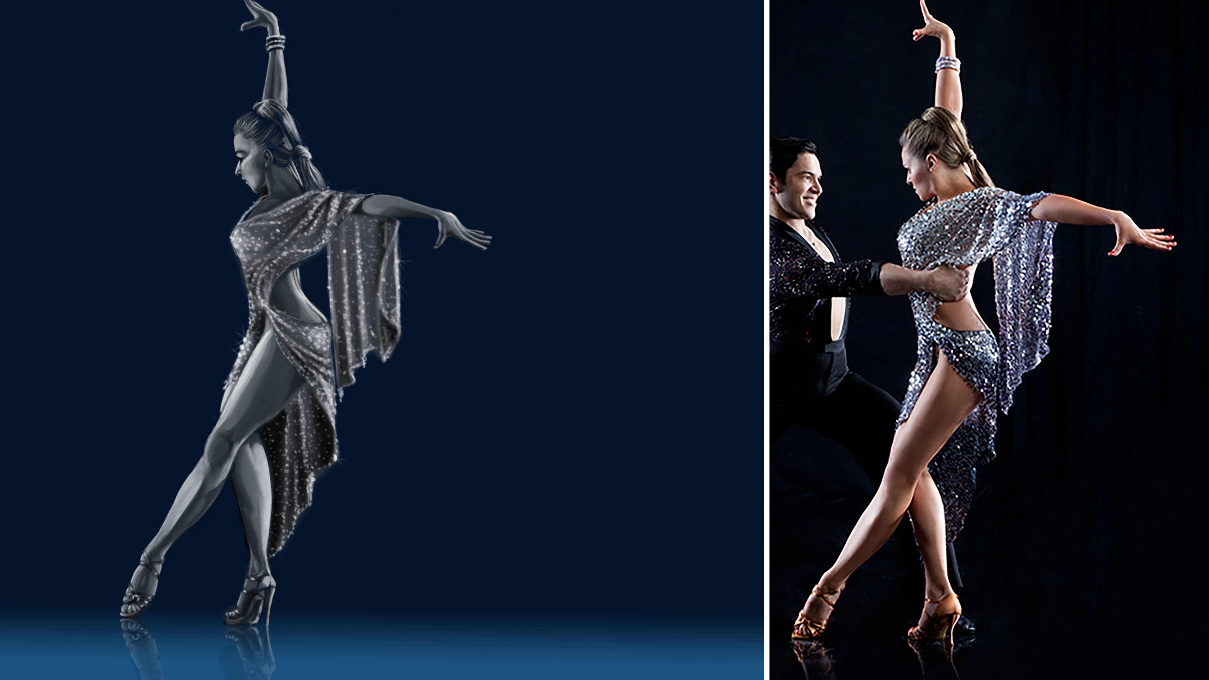
Aside from the stylized Head (being wider than longer in comparison to the model), which i assume is on purpose. I would say that your proportions need work. Her Shoulders seem a bit too wide. and the waist seems to a bit higher than it should (the length of the skirt seems smaller on your drawing) which gives me the idea that your missing 1/2 - 1 head (8 head figure). although the overall length seems fine it could be that your starting point for the skirt is a bit lower.
Thanks Handro.
I see what you see. And thanks for the in put.😄
Back to the drawing board🥴

Anatomy 2 - Term 3.

13 days later
I did a little sketch for work, just before we need to go back to work we are doing workshops to improve or skills and we were given a assignment to draw a figure and add random treatment we do at the salon...so this is mine😁
This is a lot of treatments
Suggested Topics
| Topic | Category | Replies | Views | Activity |
|---|---|---|---|---|
| Brad B - Art School Journey! | Art School | 3 | 1.1k | Dec '20 |
| Nymia - Art School Journey | Art School | 8 | 1.2k | Jun '21 |
| The Dancing Tabaxi - Art journey | Art School | 5 | 1.6k | Nov '21 |
| Jahziel - Art School Journey | Art School | 83 | 8.9k | Jan '24 |
| Jannis - Art journey | Art School | 16 | 652 | Mar 4 |