


 Thank you! I finally cleaned that up. Meanwhile started 3 more ..I have a habit of taking too long to finish a piece, then I lose interest in it and just start something else. I found 8 from recently i started and abandoned, that are decent enough to not delete, but not finished. There’s also been a number of drawings I felt I “outgrew” - became better before I finished them, and it would be easier to start from scratch than fix them. Anyone else thinking that?in24.5k
 Lady Death Fanart Collectible: Part 6 Polypaint and base Hi, it’s time to share with you another part of the process to create this fanart piece. Polypaint As this is my first collectible fanart I didn’t have previous experience with polypaint so I tried my best and played a bit with it.I wanted to give a ghostly and eerie look to Lady Death, she is beautiful and deadly, but at the end of the day she is a woman that died and was reborn at hell as an avenging spirit, that’s why I gave her skin tone a bluish very cold tone.As you will see I gave myself some creative freedom to deviate from the traditional color scheme that this characater has in comics and illustrations.To add a bit of sensuality by painting some freckles on the face and the chest. The dark nature of this character was the perfect excuse to gave her a kind of goth make up, very dark shadows around the eyes, blue lips and fingernails. I know that the original character includes sexy red lips but I wanted this girl to have a sexy but at the same time creepy look, that’s why we can see some thin veins emanating from her eyes. The biggest chromatic change I did for this character is at the hair. Lady Death has a characteristic white weavy hair but in my fanart I decided to gave her a very saturated blue color.The reason behind this wasn’t only an aesthetic choice. I want that the face area strongly pulls the attention of the viewer so this area needed a stronger contrast. Another reason is that I want her to have a more modern look, as I mentioned before, I’m strongly attracted to women with goth/punk look. I gave myself half an hour or more to analyse the work of experienced sculptors that create collectibles and I discovered that the use of darker values on the skin is often applied to create a greater sense of volume and three-dimensionality. I found that areas with heavy ambient occlusion are the perfect places to paint with darker colors in order to increase the separation between different forms. Even though she has a bluish skin tone, I used a bit of warmer hues in areas that, in real life, tend to go towards red and pink, this is very obvious in the nose, cheeks, and knuckles. Thinking with a logical mind it’s completely absurd to have warmer tones on the body of a zombie like creature but I didn’t want to limit myself by using only blue tones, it looks boring and artificial. In real life these colors are created by blood vessels in areas where the skin is very thin. ** Scythe **for her weapon I applied a cool gray with some warmer variations, this color scheme is influenced by the work of H.R giger. Base I’d like to talk about the design for the base which, to be honest, I forgot to develop along with the character.My main idea with the base is to show that Lady Death inhabits a very sterile and arid land, at the end of the day she is at hell.You can see a that she walks over dirt and rocks, a sign that she’s surrounded by death and loneliness. As part of the landscape we can see some bones and skulls to reinforce the idea of lack of living creatures, yet we can see three hands that try to reach her legs.This hands represent that all creatures are subordinated to her power and seek an evil blessing with a simple touch of the princess of the damned.1- The hand with skin burns represents the souls of those who are newcomers to hell, tortured souls that suffer for the sins comitted on earth.2- The hand with greenish rotten skin and pustules is the reminder of the decay that has infected the souls of those who have been trapped and have forgotten their humanity3- Last but not least, the hand of a demon shows that even dark creatures and entities bow before her presence. The cherry on the top, at least in my vision, are the simese twins that emerge from the ground, this malevolent creatures remind us that in hell there’s only perversion and any trace of innocence is lost. Thanks for reading till this pointI’m really happy to be very close to finish this creative journey, last but not least it’s mandatory to talk about splitting the sculpture in several pieces to be printed, this will be my last entry before showing the final rendered images. See yaMay Zbrush be with youin1.5k


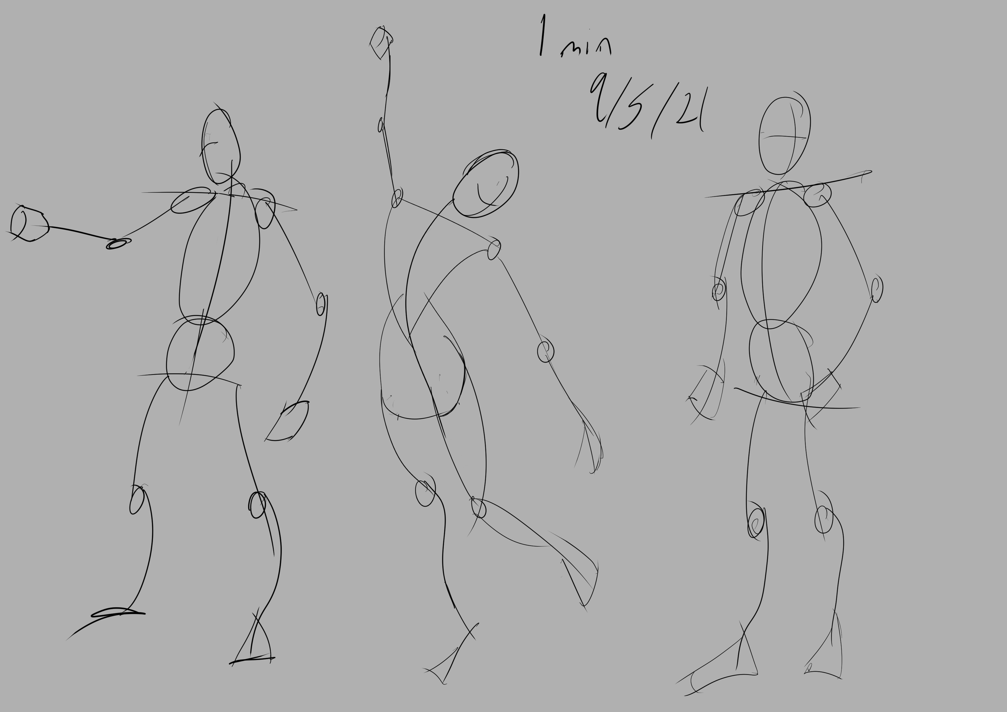
 memory 2min gartic phone, used ref 2m gartic, used ref for pose 2min gartic 2min gartic 2min gartic 2min gartic memory memory memory memory study memory memory memorymemory memory memory memory memory memory study memorystudy study stylized left memory, right study study memory memorymemory memory memory memorymemory memory, porportions r offmemory memorystudystudy memorymemorymemory memory memory memory memory memory memory memory, right leg is a bit broken The feeling of only getting 1 - 3 likes on a social media post will never not be discouraging. But nothing is discouraging enough to make me quit drawing. I think the strategy of drawing a lot of stuff and waiting a while to post is good though rather than posting it immediately and then feeling that sadness on the next set of drawingin


 studies studies juri study imagination, how I feel before a speech imagination imagination study something I drew for my presentation also drew this for my presentation, didn't fix the one hand being bigger than the other imagination + study study studies study study, I need to fix the face a bit based on screenshot from anime but in my style study. except for the eye study studies studies study. changed some things tho imagination imagination imagination study studies, except top right samurai based on anime screenshot wolverine studies, changed some of the poses a lil, not very good at all, but first time i drew the character ever. semi study studies study imagination imagination imagination , for first time ever i tried to draw over 3d model for middle pose, I dont like the result tbh, but it makes it much easier than coming up with it from memory.imagination, except right figurestudies imagination + studies, coming up with action poses r hard, these are not dynamic enough, I will redraw better ones in future. imagination , imagination imagination study, except for eye imagination imagination imagination doodles except for the two chrollos imagination storyboard thumbnail, idk if i ever shared this. my storyboards end up being a little detailed since i usually just draw in one layer.in22.4k


I feel like the ribcage box would start lower than the shoulders and you wouldn't see the bottom of the ribcage box as much as you have in your drawing, but overall looks great!
As @jpbennett02 already said, you'd see less of the rib cage's bottom plane. also you might want to make the pelvis overlap the top plane of her right leg a little more to show that it is under the pelvis.
Apart from that, I think you did a decent job
Thanks for the feedback @jpbennett02 @mau.wamp, the lower ribcage was the main thing throwing me off, but i didnt even think about/ notice the other things pointed out

Did a gesture drawing then tried applying basic forms to it, i think it came out pretty good aside from the limbs being a little on the thin side. i also tried using the two lines connecting the shoulders to show the slight tilt back and also outline where the clavicle would sit instead of just extending the ribcage box to include the shoulders like my previous figure breakdown. Any feedback on things i missed or got wrong is welcome

That form construction looks great! Good stuff!

I'll keep that in mind, thanks @Lukiesartventure
Same exercise as last time but this time i wanted to see how fast i could construct a readable figure, specifically in a non-standing position since i havent had a lot of practice with these poses recently. The gesture part took a minute, and the construction part took 30 minutes, about 10-15 of which was spent on trying to get the head angle correct.

looks great! I like how you did the feet and the construction looks solid. I will say that it's good that you are testing how fast you are at constructing a readable pose, but try to go for accuracy over how fast you can do something. If you focus too much on how fast you can do something too much that can lead to you rushing and not making things as accurate as they can be. The more you do construction or anything for that matter the faster you tend to get because you have done it accurately so many times, so just a heads up to not focus too much on speed at first. Great work!
10 days later
After a week of procrastinating, i've decided to change up what I'm focusing on before i fully burnout, so I'm jumping back to the anatomy 1 lesson where i last left off before I started posting here on the forum. With that said here's a practice i did to start to get back into a normal flow
I did this from memory to see how much i actually retained, and to sort of reestablish a baseline of where i am with this topic.
I think the head shape is fine, though do point it out if it isn't, the facial feature placement/proportions on the other hand all feel off in some way but i cant put my finger on a specific thing so all feedback is welcome
23 days later
Hey! I'd say they look to flat, because the face is turned the eye further away will be smaller. same as the lips. Keep up the drawings!
Suggested Topics
| Topic | Category | Replies | Views | Activity |
|---|---|---|---|---|
| Cesar GH - Art school Journey | Art School | 1 | 477 | May '22 |
| CattoFoxu - Art School Journey | Art School | 7 | 1.1k | Aug '21 |
| D.C. (AlwaysDecent) - Art school journey | Art School | 63 | 5.7k | Feb '24 |
| Term 1 - Noel1126 | Art School | 2 | 1.4k | May '18 |
| Xemphait - Art School Journey | Art School | 22 | 3.5k | Feb '24 |