• Gave myself 5 days to do something. This is what I managed to do. I'm trying to get better at illustrations, but I have patience to work on something for 3 days maximum :( Splash_Process.jpg5000x3140 2.21 MB Splash_Process-6.jpg3896x2429 2.83 MB concept list char copy.jpg5388x3000 1.7 MB
    20.8k
  • Did a character concept for a course.https://www.artstation.com/artwork/P6gm3y - more:) list1.jpg3541x1920 2.82 MB
    20.8k
  • Day 4: Star Wars May The 4th =] Queen Padmé Amidala in my art style! First time drawing her and I really enjoyed making this one! Used watercolours, ink pen, acrylic markers and gold paint for accents on my Canson mix media sketchbook. I hope you like it!
    82.4k
  • A creature design from a while back
    by
    6.7k
  • Here is some more recent stuff, I need to make more body studies
  • It's been a while and god, it is so cringe to go through all previous messages xDmy study.
    20.8k
  • Thank you! I finally cleaned that up. Meanwhile started 3 more ..I have a habit of taking too long to finish a piece, then I lose interest in it and just start something else. I found 8 from recently i started and abandoned, that are decent enough to not delete, but not finished. There’s also been a number of drawings I felt I “outgrew” - became better before I finished them, and it would be easier to start from scratch than fix them. Anyone else thinking that?
  • Lady Death Fanart Collectible: Part 6 Polypaint and base Hi, it’s time to share with you another part of the process to create this fanart piece. Polypaint As this is my first collectible fanart I didn’t have previous experience with polypaint so I tried my best and played a bit with it.I wanted to give a ghostly and eerie look to Lady Death, she is beautiful and deadly, but at the end of the day she is a woman that died and was reborn at hell as an avenging spirit, that’s why I gave her skin tone a bluish very cold tone.As you will see I gave myself some creative freedom to deviate from the traditional color scheme that this characater has in comics and illustrations.To add a bit of sensuality by painting some freckles on the face and the chest. The dark nature of this character was the perfect excuse to gave her a kind of goth make up, very dark shadows around the eyes, blue lips and fingernails. I know that the original character includes sexy red lips but I wanted this girl to have a sexy but at the same time creepy look, that’s why we can see some thin veins emanating from her eyes. The biggest chromatic change I did for this character is at the hair. Lady Death has a characteristic white weavy hair but in my fanart I decided to gave her a very saturated blue color.The reason behind this wasn’t only an aesthetic choice. I want that the face area strongly pulls the attention of the viewer so this area needed a stronger contrast. Another reason is that I want her to have a more modern look, as I mentioned before, I’m strongly attracted to women with goth/punk look. I gave myself half an hour or more to analyse the work of experienced sculptors that create collectibles and I discovered that the use of darker values on the skin is often applied to create a greater sense of volume and three-dimensionality. I found that areas with heavy ambient occlusion are the perfect places to paint with darker colors in order to increase the separation between different forms. Even though she has a bluish skin tone, I used a bit of warmer hues in areas that, in real life, tend to go towards red and pink, this is very obvious in the nose, cheeks, and knuckles. Thinking with a logical mind it’s completely absurd to have warmer tones on the body of a zombie like creature but I didn’t want to limit myself by using only blue tones, it looks boring and artificial. In real life these colors are created by blood vessels in areas where the skin is very thin. ** Scythe **for her weapon I applied a cool gray with some warmer variations, this color scheme is influenced by the work of H.R giger. Base I’d like to talk about the design for the base which, to be honest, I forgot to develop along with the character.My main idea with the base is to show that Lady Death inhabits a very sterile and arid land, at the end of the day she is at hell.You can see a that she walks over dirt and rocks, a sign that she’s surrounded by death and loneliness. As part of the landscape we can see some bones and skulls to reinforce the idea of lack of living creatures, yet we can see three hands that try to reach her legs.This hands represent that all creatures are subordinated to her power and seek an evil blessing with a simple touch of the princess of the damned.1- The hand with skin burns represents the souls of those who are newcomers to hell, tortured souls that suffer for the sins comitted on earth.2- The hand with greenish rotten skin and pustules is the reminder of the decay that has infected the souls of those who have been trapped and have forgotten their humanity3- Last but not least, the hand of a demon shows that even dark creatures and entities bow before her presence. The cherry on the top, at least in my vision, are the simese twins that emerge from the ground, this malevolent creatures remind us that in hell there’s only perversion and any trace of innocence is lost. Thanks for reading till this pointI’m really happy to be very close to finish this creative journey, last but not least it’s mandatory to talk about splitting the sculpture in several pieces to be printed, this will be my last entry before showing the final rendered images. See yaMay Zbrush be with you
    1.5k
  • memory 2min gartic phone, used ref 2m gartic, used ref for pose 2min gartic 2min gartic 2min gartic 2min gartic memory memory memory memory study memory memory memorymemory memory memory memory memory memory study memorystudy study stylized left memory, right study study memory memorymemory memory memory memorymemory memory, porportions r offmemory memorystudystudy memorymemorymemory memory memory memory memory memory memory memory, right leg is a bit broken The feeling of only getting 1 - 3 likes on a social media post will never not be discouraging. But nothing is discouraging enough to make me quit drawing. I think the strategy of drawing a lot of stuff and waiting a while to post is good though rather than posting it immediately and then feeling that sadness on the next set of drawing
  • Urban Dragon Girl Wip Urban Dragon Girl_wip1.jpg5000x5000 1.11 MB
  • Long time no see! New artworks produced lately
    6.7k
  • studies studies juri study imagination, how I feel before a speech imagination imagination study something I drew for my presentation also drew this for my presentation, didn't fix the one hand being bigger than the other imagination + study study studies study study, I need to fix the face a bit based on screenshot from anime but in my style study. except for the eye study studies studies study. changed some things tho imagination imagination imagination study studies, except top right samurai based on anime screenshot wolverine studies, changed some of the poses a lil, not very good at all, but first time i drew the character ever. semi study studies study imagination imagination imagination , for first time ever i tried to draw over 3d model for middle pose, I dont like the result tbh, but it makes it much easier than coming up with it from memory.imagination, except right figurestudies imagination + studies, coming up with action poses r hard, these are not dynamic enough, I will redraw better ones in future. imagination , imagination imagination study, except for eye imagination imagination imagination doodles except for the two chrollos imagination storyboard thumbnail, idk if i ever shared this. my storyboards end up being a little detailed since i usually just draw in one layer.
    by
    22.4k

Hi guys!

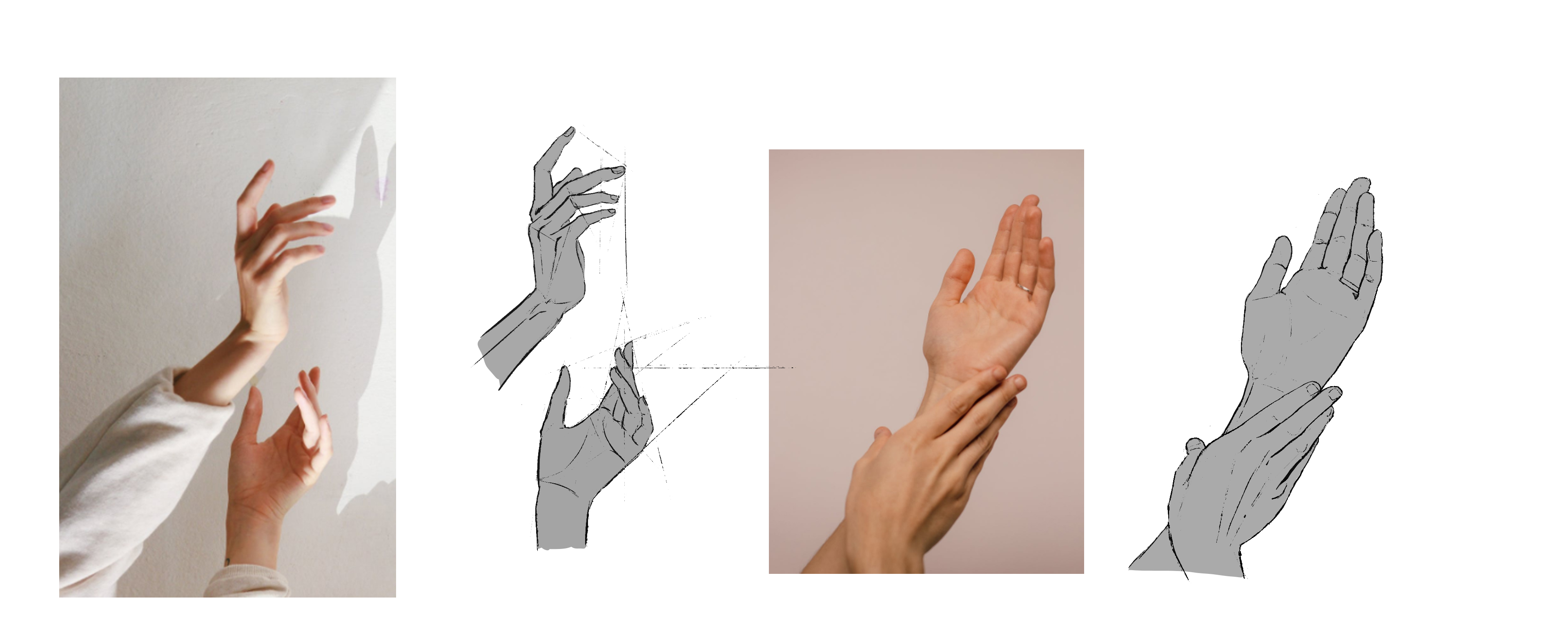
Peter there! I started drawing almost 3 years ago at the beginning in pencil and 2 years ago went fully digital. I have got Artschool course 8 months ago and posted every week since then, but didn't know we have so many nice poeple there so I am starting my thread right now :smiley: I am posting my hand study I started yesterday during the stream and then I will post some of my older works. I love giving and receiving constructive criticism so feel free to correct my mistakes if you have some spare time and I will do the same! Cheers <3

Hey there Spiderman! :smiley: Your hand studies look really really good, dude! I'm gonna start the "hand class" in a moment. Have been a bit reluctant to tackle that topic. XD Now there's no going back!
Keep up the great work!

Hi Peter! Welcome to the forum! On Facebook I'm Viktoriya. That's a nice hand study you made your entrance with. Feel free to critique me as well, and if I see anything that could be improved in your work, I will let you know. :stuck_out_tongue_winking_eye:

Hey Peter welcome!!! :heart_eyes: This is a great study session!! A question, have you done this during the stream? I was wondering if I could do it too while listening but then I get lost in the chat hahah

I started before the stream and finished 1st one when the stream was beginning and drawn 2nd one during the stream, I was listening and peeking from time to time what do you talk about :smiley: but it is definitely harder to fully focus on the stream than with just a music

I like #8 . It looks the most unique without looking wonky.

I like 1 and 8, but I feel like the mech design should be somewhat similar to the pilot's costume design (or at least have some shared shapes). That's why 1 fits a bit better, even though 8 is more unique.

Thanks guys! My favorites were 2 and 8 but everyone likes 8 best so I think I will go with this one :smiley: and for the shared shapes, I will try to incorporate them into design when dividing to smaller shapes

I updated it from yesterday with your tips and some more polish, I think i will refine a bit more rimlight and I'm done with this (oh god). What do you think? :smiley:

I love how you nailed the fabrics, and that the big guy is a married man :smile: I imagine him coming home all bloodied up after work and being like "Honey! I'm home!" :laughing:

Haha I love that you got it, on the bottom of the baseball bat is also a sign "The Be(a)st Dad" with A crossed out as a mistake because it is a gift from his children :smiley: they are a lovely family!

Oh no! That's such a nice touch, and I cannot see it at all at this size! Maybe have it as a colorful sticker? I'd hate to have such a nice storytelling detail to go to waste.

Well done, that's some amazing painting work. =)

I love the subtle touches that make it clear you thought about the characters deeply... and how the little story elements (e.g. his ring, their eyes, the earring of the thinner devilish character, and even the wisps of black magic) all double as compositional elements linking them together and as common motifs.

I would suggest you spend a little more time on their hair, as it's the only element that doesn't seem to be rendered to the same high level. There's a little unintended-looking line on the big guy's right shoulder as well, where the other man's head is, which you may wish to smudge out.

I definitely like this piece, it looks very professional!

This is an awesome work Peter, love all the dedication that you're putting in it :heart_eyes: For me this could called done, so good hahah

If I have to look for the nitpicking maybe the big guy has little ears respect the face? I don't know hahah
And maybe the hand in the pocket of the trousers should create more folds, it doesn't seems too much that there is a volume down there.
Another things (but it's so tiny that it wouldn't change so much) is the direction of the studs seems not to follow the roundness of the shape under, but I don't know probably you had a reference for that and it's just my impression hahah
Last thing (this is also so tiny) that when I wear rings they're usually near the knuckle than the joint, but as I said before I'm being really annoying with this comments hahah for me it's just perfect as it is right now without changing anything.

Hope to have helped you!! And again sorry for this annoying comment hahah
Waiting to see what Marc will say about this piece :heart_eyes: I think that you really nailed it

First thing - thank you all guys for this awesome feedback, I am very, very grateful for it and what makes me extra happy is the thing that you notice all my storytelling I put in because it is the most important thing in my art, I always wanted to tell stories with my pieces so it is the best feeling now <3

@WeirdOwl I was thinking about something standing out more or putting it along the bat, but then I tought it is cool to leave 1 little thing to discover for a viewer who would really go into details when lookin at this, I can be wrong tho!

@liviu.constantinescu they were supposed to be painted more comic way that's why hair looks like that but I always turn into semirealistic when painting xd I am not so good with rendering hair tho :frowning: I will try to make them better but Idk if I can do much better. And thanks for looking so deep to find that line :smiley: I will definitely work on the rim light some more so the line will be gone!

@chiara.arcidiaco
I love contrasts everywhere, that's why slim guy has long ears and big guy small :smiley: I think it is part of my style so I am not going to change it!!!
Pocket is good point, I will try to add some volume there but I don't want to put too much attention there, will see what I can do!
For the studs I am not sure what you mean, ones on the bat?
For the ring it is a part of my storytelling :smiley: the ring is in this place because I wanted to show that he got bigger from his wedding so the ring only can get to this point, he loves his wife so he wears it but he is too busy to make it bigger xD but now I think I need to make some skin fold there!

Thanks so much again everyone <3

Very nice work! Love the colors and the fabric folds look just awesome and these details on his belt buckle. Ah. So pretty and clean.
As I suggested during the stream, I'd add some baldn't in front of the big guy's horns.
Keep it up! :smiley:

I think I applied most of your advice better or worse :smiley: this was so much work, I won't draw multiple people on one piece for a long time I think xD