


Hi Renee,
welcome to ArtSchool! Great that you posted so much already and I noticed that we have the exact same dream house! XD Love it. My house is in Iceland on water though. 

 Thank you! I finally cleaned that up. Meanwhile started 3 more ..I have a habit of taking too long to finish a piece, then I lose interest in it and just start something else. I found 8 from recently i started and abandoned, that are decent enough to not delete, but not finished. There’s also been a number of drawings I felt I “outgrew” - became better before I finished them, and it would be easier to start from scratch than fix them. Anyone else thinking that?in24.5k
 Lady Death Fanart Collectible: Part 6 Polypaint and base Hi, it’s time to share with you another part of the process to create this fanart piece. Polypaint As this is my first collectible fanart I didn’t have previous experience with polypaint so I tried my best and played a bit with it.I wanted to give a ghostly and eerie look to Lady Death, she is beautiful and deadly, but at the end of the day she is a woman that died and was reborn at hell as an avenging spirit, that’s why I gave her skin tone a bluish very cold tone.As you will see I gave myself some creative freedom to deviate from the traditional color scheme that this characater has in comics and illustrations.To add a bit of sensuality by painting some freckles on the face and the chest. The dark nature of this character was the perfect excuse to gave her a kind of goth make up, very dark shadows around the eyes, blue lips and fingernails. I know that the original character includes sexy red lips but I wanted this girl to have a sexy but at the same time creepy look, that’s why we can see some thin veins emanating from her eyes. The biggest chromatic change I did for this character is at the hair. Lady Death has a characteristic white weavy hair but in my fanart I decided to gave her a very saturated blue color.The reason behind this wasn’t only an aesthetic choice. I want that the face area strongly pulls the attention of the viewer so this area needed a stronger contrast. Another reason is that I want her to have a more modern look, as I mentioned before, I’m strongly attracted to women with goth/punk look. I gave myself half an hour or more to analyse the work of experienced sculptors that create collectibles and I discovered that the use of darker values on the skin is often applied to create a greater sense of volume and three-dimensionality. I found that areas with heavy ambient occlusion are the perfect places to paint with darker colors in order to increase the separation between different forms. Even though she has a bluish skin tone, I used a bit of warmer hues in areas that, in real life, tend to go towards red and pink, this is very obvious in the nose, cheeks, and knuckles. Thinking with a logical mind it’s completely absurd to have warmer tones on the body of a zombie like creature but I didn’t want to limit myself by using only blue tones, it looks boring and artificial. In real life these colors are created by blood vessels in areas where the skin is very thin. ** Scythe **for her weapon I applied a cool gray with some warmer variations, this color scheme is influenced by the work of H.R giger. Base I’d like to talk about the design for the base which, to be honest, I forgot to develop along with the character.My main idea with the base is to show that Lady Death inhabits a very sterile and arid land, at the end of the day she is at hell.You can see a that she walks over dirt and rocks, a sign that she’s surrounded by death and loneliness. As part of the landscape we can see some bones and skulls to reinforce the idea of lack of living creatures, yet we can see three hands that try to reach her legs.This hands represent that all creatures are subordinated to her power and seek an evil blessing with a simple touch of the princess of the damned.1- The hand with skin burns represents the souls of those who are newcomers to hell, tortured souls that suffer for the sins comitted on earth.2- The hand with greenish rotten skin and pustules is the reminder of the decay that has infected the souls of those who have been trapped and have forgotten their humanity3- Last but not least, the hand of a demon shows that even dark creatures and entities bow before her presence. The cherry on the top, at least in my vision, are the simese twins that emerge from the ground, this malevolent creatures remind us that in hell there’s only perversion and any trace of innocence is lost. Thanks for reading till this pointI’m really happy to be very close to finish this creative journey, last but not least it’s mandatory to talk about splitting the sculpture in several pieces to be printed, this will be my last entry before showing the final rendered images. See yaMay Zbrush be with youin1.5k

 memory 2min gartic phone, used ref 2m gartic, used ref for pose 2min gartic 2min gartic 2min gartic 2min gartic memory memory memory memory study memory memory memorymemory memory memory memory memory memory study memorystudy study stylized left memory, right study study memory memorymemory memory memory memorymemory memory, porportions r offmemory memorystudystudy memorymemorymemory memory memory memory memory memory memory memory, right leg is a bit broken The feeling of only getting 1 - 3 likes on a social media post will never not be discouraging. But nothing is discouraging enough to make me quit drawing. I think the strategy of drawing a lot of stuff and waiting a while to post is good though rather than posting it immediately and then feeling that sadness on the next set of drawingin

 studies studies juri study imagination, how I feel before a speech imagination imagination study something I drew for my presentation also drew this for my presentation, didn't fix the one hand being bigger than the other imagination + study study studies study study, I need to fix the face a bit based on screenshot from anime but in my style study. except for the eye study studies studies study. changed some things tho imagination imagination imagination study studies, except top right samurai based on anime screenshot wolverine studies, changed some of the poses a lil, not very good at all, but first time i drew the character ever. semi study studies study imagination imagination imagination , for first time ever i tried to draw over 3d model for middle pose, I dont like the result tbh, but it makes it much easier than coming up with it from memory.imagination, except right figurestudies imagination + studies, coming up with action poses r hard, these are not dynamic enough, I will redraw better ones in future. imagination , imagination imagination study, except for eye imagination imagination imagination doodles except for the two chrollos imagination storyboard thumbnail, idk if i ever shared this. my storyboards end up being a little detailed since i usually just draw in one layer.in22.4k
11 days later
I have been really busy recently, but I finally have some time for a little bit! I was able to finish the one point perspective assignment. This was really difficult for me since I have never tried to put a room into perspective. My room, which I was using as reference is also very crammed since 3 of live there. I tried to add a fantasy twist, which is why I made the windows and roof more arc like. I was thinking that it maybe could be the room of a few mages who are attending school? Any feedback is much appreciated 

I love your 2 point perspective assignment here. Looks like wizards and witches live in this room and there's quite a lot to discover.
I think the doorway isn't quite in perspective though. The arch reaches too far down on the left side and the straight line doesn't seem to be parallel to the horizon line.
Also the carpet seems to be tilted too much towards the viewer in my opinion.
Other than that it looks really cool!
I hope the feedback is okay.
I don't have a lot to add since IndrawnArt and WeirdOwl covered the first things I noticed, the only other thing that kind of stood out to me is that if the floor boards are actually the same size (as each other) the ones in the middle should look wider, aside from that, it might have been intentional, but a lot of the furniture seems to be kind of twisted, like the closer chair's back and the front of the seat is out of perspective. You did a great job giving the room a fantasy-vibe, keep up the great work!
Thank you all for the feedback! I really appreciate it  I'll make sure to keep it in mind for future things! I will keep working on it!
I also have kept going on the figure drawing and these are my draw overs with the cylinders. Do the cylinders look to be in perspective? I find it hard to tell the perspective of limbs.

I have done the proportions and the first figure drawing. In the past I would only draw very simplified bodies, and stylized faces, so I am lacking in a bit of anatomical knowledge. The figure drawing was still a lot of fun, and I kept it to 1 hour so that I wouldn't over focus on smaller details. I will also do more in the future. Any feedback would be great! 
Not bad for lacking knowledge. The first thing that stand outs to me are the size of her legs and feet. I think her thighs are too short and that forced the calves to compensate.
Secondly is the proportions to her face need some love but that will come with time and a later lesson.
Overall, it's good work. Feel free to cut into me when I get to that lesson. Haha.
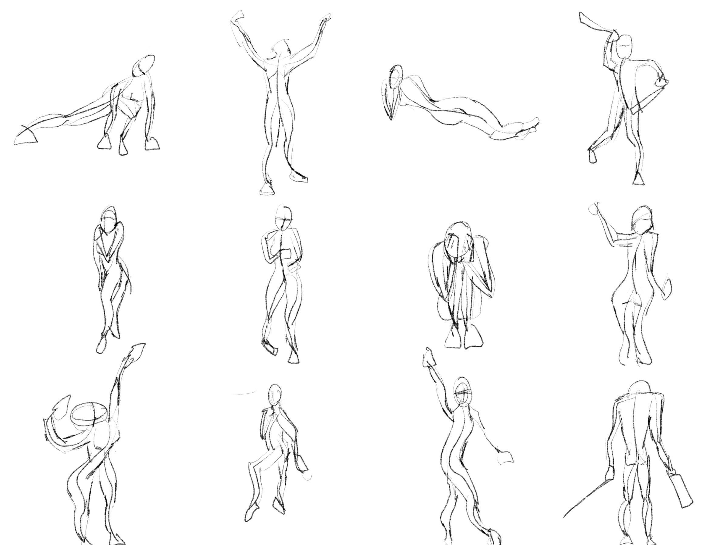
I did the gesture drawings for the first time today! It's challenging doing it in so little time. I think I have a lot of room to improve. I will keep doing these everyday as recommended. The first picture is 30 sec second is 60 sec. Is there any feedback since these seem very new to me?
I also did another figure drawing yesterday. I realized that doing things stylized is too ingrained especially in faces, so I need to focus on attempting to make it more realistic. I think when I get to the anatomy terms figure drawings will get easier.
Thanks for the feedback! I didn't notice those things. I will try to keep in mind the proportions more next time!
Try to use lines with only 1 curve for your figure drawing, that makes figures much more alive. You can always add more lines, because obviously you can't always make a figure with only 1 action line, but try to make every one of them with only 1 curve. I send you an example for what I mean. I hope it helps! 
Ok that helps a lot, I was trying to do the figure with two or three lines, so I will try with only one!
peter you should publish more of your gesture drawing, they're so good hahah
Apart from that those studies are great, with anatomy they will be even better 
And keep attention with the arm of the figure drawing, it's very important to make the body parts on the ground really solid or you character will seem to flow, but I understand that it's a super difficult pose so nevermind 
oh you are too kind Chiara  I have just got down from 90s to 60s so a lot of my figures are pretty bad, but sometimes I got lucky and make something what I think looks cool that's one of my favourites:

I almost always make one long line with 1 curve and build around it, also I try to make nice lines and retry when failed. It is really hard for me even after over 1000 figures drawn but with these tips you can get better really fast
I went back and id another perspective drawing, this time in two point perspective. The horizon line and vanishing points of the reference picture seemed difficult for me I think it was because one vanishing point is really close to the building and the other is really far off the page. Eventually I think I worked it out. I much prefer drawing people though haha 
Very nice line treatment and foliage treatment but the slanted roof seems off, lines should go to the new VP for the slanted roof, and they seem all over the place (the box for the building is narrower with more depth so the slanted roof over it should be getting narrower as well and it isn't)
Suggested Topics
| Topic | Category | Replies | Views | Activity |
|---|---|---|---|---|
| Sadik Aktas - Art School Journey | Art School | 3 | 217 | 18d |
| Natalie Viola - Art School Journey | Art School | 20 | 2.3k | Jan '24 |
| Term 1 Art School | Art School | 5 | 1.5k | Oct '17 |
| HANDRO - Art Journey | Art School | 195 | 22.7k | Sep '22 |
| Lilia- Art School Journey | Art School | 66 | 7.4k | Nov '20 |