


Hi! You did grat job with that asingmet, Looks nice. Cant wait to see more.

 Thank you! I finally cleaned that up. Meanwhile started 3 more ..I have a habit of taking too long to finish a piece, then I lose interest in it and just start something else. I found 8 from recently i started and abandoned, that are decent enough to not delete, but not finished. There’s also been a number of drawings I felt I “outgrew” - became better before I finished them, and it would be easier to start from scratch than fix them. Anyone else thinking that?in24.6k
 Lady Death Fanart Collectible: Part 6 Polypaint and base Hi, it’s time to share with you another part of the process to create this fanart piece. Polypaint As this is my first collectible fanart I didn’t have previous experience with polypaint so I tried my best and played a bit with it.I wanted to give a ghostly and eerie look to Lady Death, she is beautiful and deadly, but at the end of the day she is a woman that died and was reborn at hell as an avenging spirit, that’s why I gave her skin tone a bluish very cold tone.As you will see I gave myself some creative freedom to deviate from the traditional color scheme that this characater has in comics and illustrations.To add a bit of sensuality by painting some freckles on the face and the chest. The dark nature of this character was the perfect excuse to gave her a kind of goth make up, very dark shadows around the eyes, blue lips and fingernails. I know that the original character includes sexy red lips but I wanted this girl to have a sexy but at the same time creepy look, that’s why we can see some thin veins emanating from her eyes. The biggest chromatic change I did for this character is at the hair. Lady Death has a characteristic white weavy hair but in my fanart I decided to gave her a very saturated blue color.The reason behind this wasn’t only an aesthetic choice. I want that the face area strongly pulls the attention of the viewer so this area needed a stronger contrast. Another reason is that I want her to have a more modern look, as I mentioned before, I’m strongly attracted to women with goth/punk look. I gave myself half an hour or more to analyse the work of experienced sculptors that create collectibles and I discovered that the use of darker values on the skin is often applied to create a greater sense of volume and three-dimensionality. I found that areas with heavy ambient occlusion are the perfect places to paint with darker colors in order to increase the separation between different forms. Even though she has a bluish skin tone, I used a bit of warmer hues in areas that, in real life, tend to go towards red and pink, this is very obvious in the nose, cheeks, and knuckles. Thinking with a logical mind it’s completely absurd to have warmer tones on the body of a zombie like creature but I didn’t want to limit myself by using only blue tones, it looks boring and artificial. In real life these colors are created by blood vessels in areas where the skin is very thin. ** Scythe **for her weapon I applied a cool gray with some warmer variations, this color scheme is influenced by the work of H.R giger. Base I’d like to talk about the design for the base which, to be honest, I forgot to develop along with the character.My main idea with the base is to show that Lady Death inhabits a very sterile and arid land, at the end of the day she is at hell.You can see a that she walks over dirt and rocks, a sign that she’s surrounded by death and loneliness. As part of the landscape we can see some bones and skulls to reinforce the idea of lack of living creatures, yet we can see three hands that try to reach her legs.This hands represent that all creatures are subordinated to her power and seek an evil blessing with a simple touch of the princess of the damned.1- The hand with skin burns represents the souls of those who are newcomers to hell, tortured souls that suffer for the sins comitted on earth.2- The hand with greenish rotten skin and pustules is the reminder of the decay that has infected the souls of those who have been trapped and have forgotten their humanity3- Last but not least, the hand of a demon shows that even dark creatures and entities bow before her presence. The cherry on the top, at least in my vision, are the simese twins that emerge from the ground, this malevolent creatures remind us that in hell there’s only perversion and any trace of innocence is lost. Thanks for reading till this pointI’m really happy to be very close to finish this creative journey, last but not least it’s mandatory to talk about splitting the sculpture in several pieces to be printed, this will be my last entry before showing the final rendered images. See yaMay Zbrush be with youin1.5k

 memory 2min gartic phone, used ref 2m gartic, used ref for pose 2min gartic 2min gartic 2min gartic 2min gartic memory memory memory memory study memory memory memorymemory memory memory memory memory memory study memorystudy study stylized left memory, right study study memory memorymemory memory memory memorymemory memory, porportions r offmemory memorystudystudy memorymemorymemory memory memory memory memory memory memory memory, right leg is a bit broken The feeling of only getting 1 - 3 likes on a social media post will never not be discouraging. But nothing is discouraging enough to make me quit drawing. I think the strategy of drawing a lot of stuff and waiting a while to post is good though rather than posting it immediately and then feeling that sadness on the next set of drawingin

 studies studies juri study imagination, how I feel before a speech imagination imagination study something I drew for my presentation also drew this for my presentation, didn't fix the one hand being bigger than the other imagination + study study studies study study, I need to fix the face a bit based on screenshot from anime but in my style study. except for the eye study studies studies study. changed some things tho imagination imagination imagination study studies, except top right samurai based on anime screenshot wolverine studies, changed some of the poses a lil, not very good at all, but first time i drew the character ever. semi study studies study imagination imagination imagination , for first time ever i tried to draw over 3d model for middle pose, I dont like the result tbh, but it makes it much easier than coming up with it from memory.imagination, except right figurestudies imagination + studies, coming up with action poses r hard, these are not dynamic enough, I will redraw better ones in future. imagination , imagination imagination study, except for eye imagination imagination imagination doodles except for the two chrollos imagination storyboard thumbnail, idk if i ever shared this. my storyboards end up being a little detailed since i usually just draw in one layer.in22.5k
1 month later


I've already broken my initial plan of posting atleast once a week 
I've had to find a comfortable job to get me some money while im doing art i'm afraid.
I've read in Josh Waitzkin's book, the art of learning that consistency trumps burst of studying. So this is what i have intended to do these past weeks.
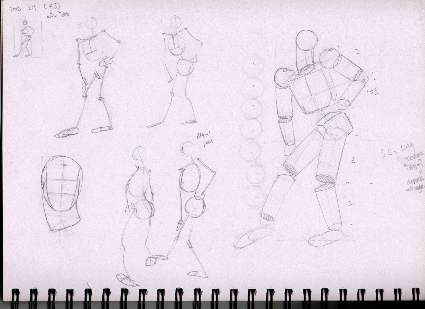
I have broken up my schedule such that i strive to study/do art for 3 hours every alternate day. Whilst doing these 40 min of studies every day. These studies are 1 Pose of the day whereby I try to breakdown and understand a particular pose, followed by 20-30 Gestures.
I hope that through consistency, it helps me better in the long run .-.
Above is the first few days i completed.
I will be adding the rest below this post.


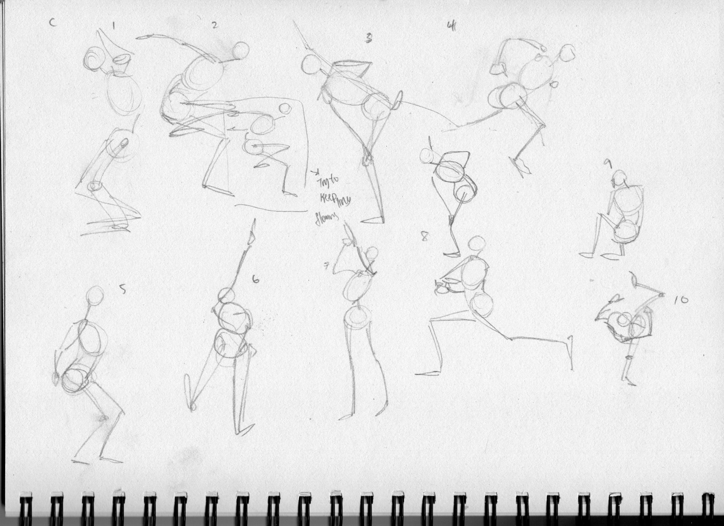


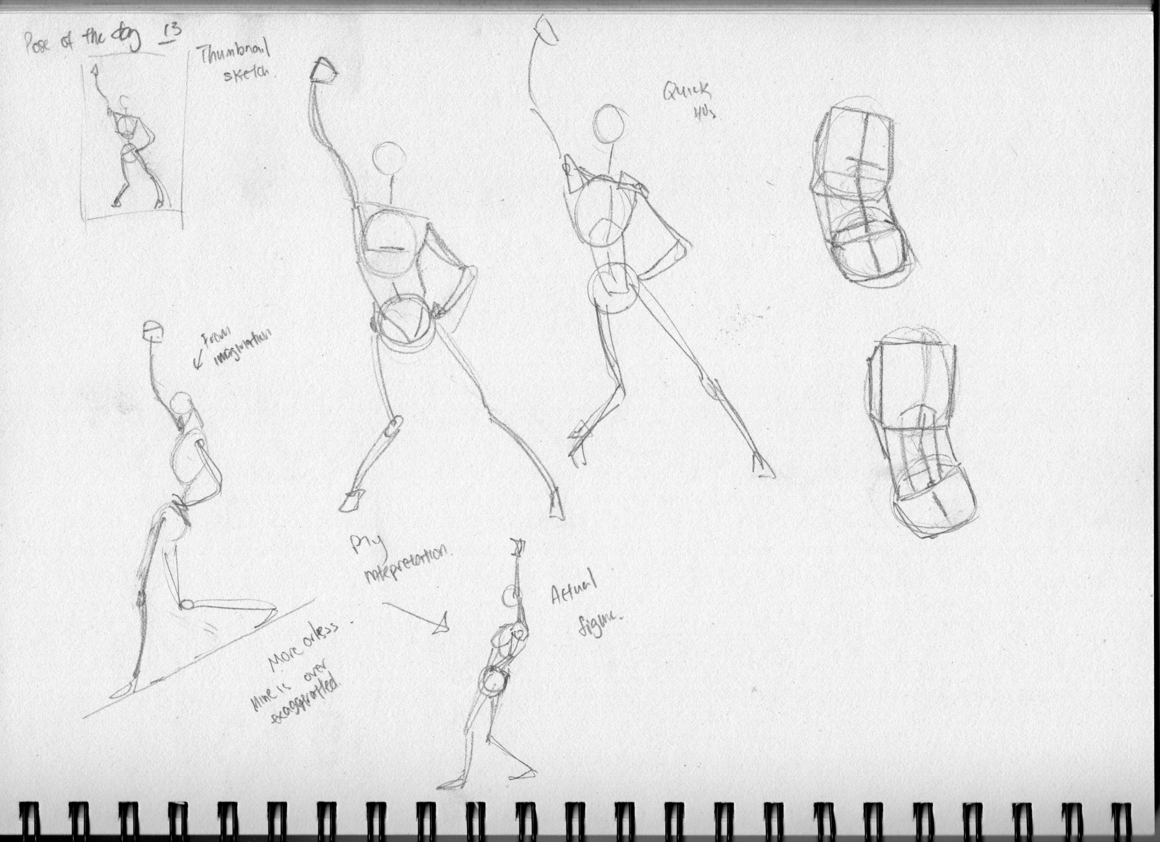


POTD 14 is missing as it was really messy and I ended up doodling over it because.


I'm using these forums as a way, not only to get criticism, but also as a way to view my art as a thirdperson. IDK why, but I can't seem to see my errors until they get posted.
Notes:
POTD 16 is 3 days after POTF 15 as i sprained my shoulder @ the gym.
I can now better see my progress and mistakes.
I guess I should separate my work more, as in give each gesture more space on the page, and stop worrying about eating too many pages for now as its starting to get messy from my perspective.
For the last 6 Gestures on set G
I took a step back and tried to put down meaningful marks instead of rushing for time and i feel that made it better.
I need to make cleaner marks and stop making hairy, hesitant strokes^^
Maybe for Gestures like G1, i should draw through for the limb in the background and make it lighter instead of just erasing away the lines completely.
I feel like my POTD 8 is alot better than the ones after. I feel like i lost track of the study from thereon.
Are there other ways i should improve my drawings, like the what is the next step i should take. in terms of learning gesture.
Other Feedback is greatly appreciated too!
These are looking lovely. I love the way you take notes on them. I think in terms of the next step for them would depend how much time you are spending on each of these. I would suggest trying to add more volume to the limbs. You are making great progress keep it up!
Thanks for the nice words, Lockenheim!
I will try adding volumes as you have recommended.
After submitting these today. I went searching online on the forums to see where other people generally post their work for critiques and came across a post where they shared a really nice video by Anthony jones. I think its pretty neat.
Putting it here as a small repository for myself.
Joining this Feed to my Sketches
As Lockenheim said, volume would be the next. I love how you characters feel so alive. It looks like animation work !
Thank you!
Will do sir.
21 days later


Submitting my art here as a way point of my work so far.
I've been trying to use my POTDs to work on my volumetric drawings.
Critique will be most welcome. I intend to continue doing this volume drawings till the end of August for now, may i also know what the next step would be from there on? (Sorry if its a dumb qsn :C )
May i also check if there is another forum/thread to post works for critique or is posting on this thread sufficient?
Notes on the work so far.
It did teach me to observe the proportions closely to make sure things look accurate, which taught me quite of the proportions from all directions and how to measure using the pencil measuring technique by proko here.
I do have a question though, i've noticed that many people measure proportions, that i have found online, by using the full length of the skull from top of the head bottom of the jaw which can vary quite a lot biologically (as people are).
Whereas for me personally i have used the ball, Cranial mass, instead as its more uniform and its also easier to draw a circle :<
I'm just curious to the pros and cons of both as most sources don't describe the reasons for either.
Thank you!
Really great work! A few notes in terms of using the head vs cranial mask. I think if you use just the cranial mass the figure is going to be out of proportion since the 8 head method includes the cranial mask and face mask. In terms of critique people will critique here if you ask for it but I have found the more you are able to critique others the more critique you will get in return. You can also try the discord as well and I would say same thing applies. You have done a really fantastic job with these so far the constructions are looking great. As for the next step maybe try the drawing figure by measuring exercise. You can build the figure on the manniquine and then add the mass on top of it. Hopefully that helps. You are doing great keep up the good work!