


Here`s my work from yesterday. Decided to take a break today, I need to learn proper hand and wrist exercises. All those hours of guitar hero are starting to catch up to me 
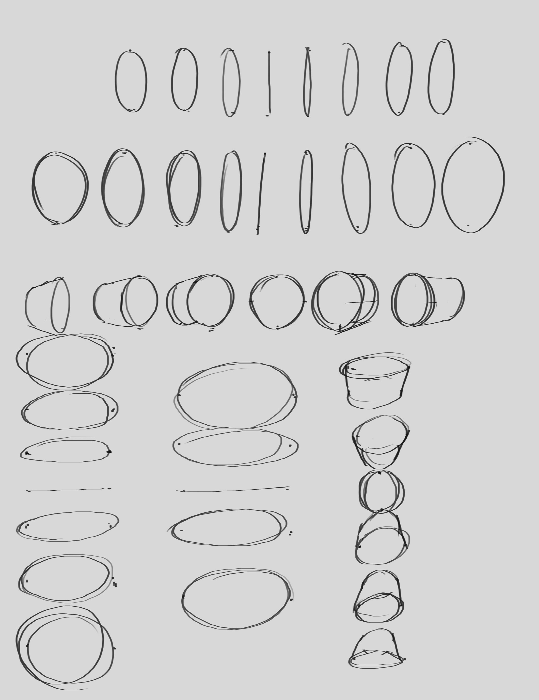
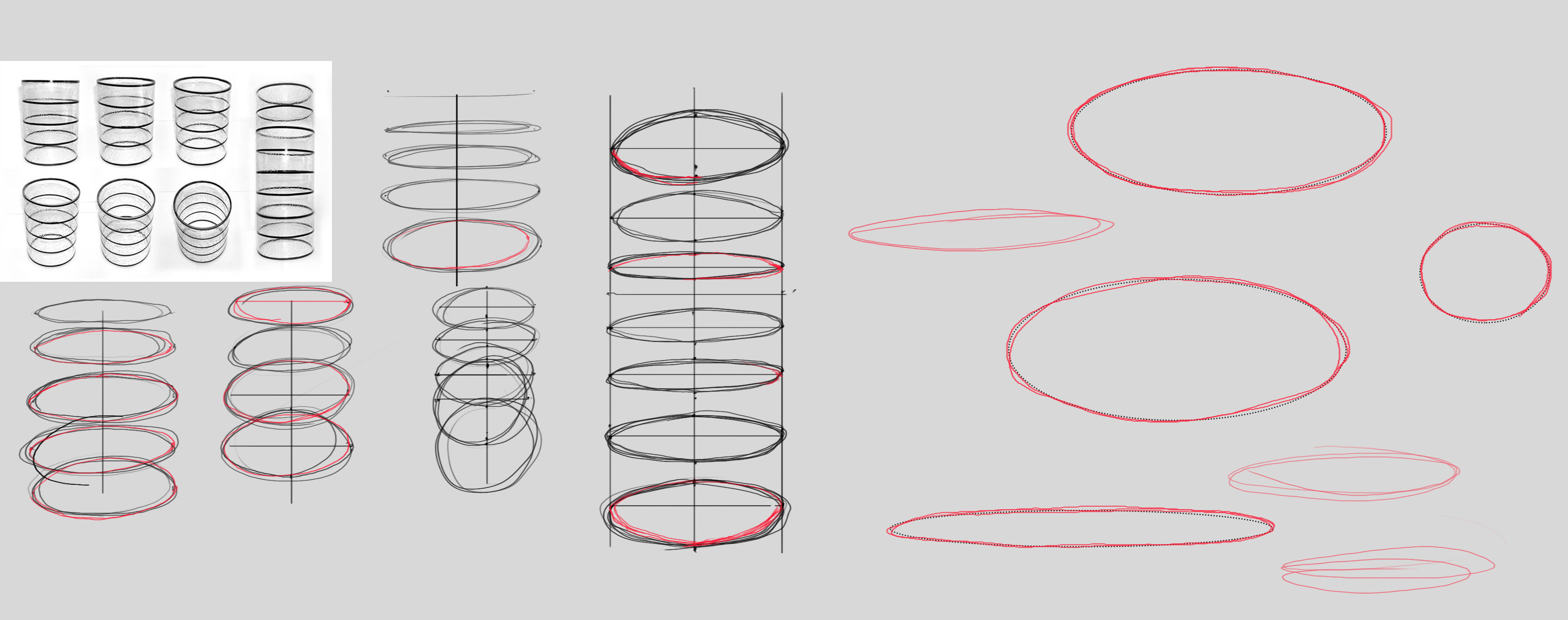
For cylinders I decided to to focus more on ellipses and not relying on ctrl+z, so essentially they're going to look like sh*t for the time being.

 Thank you! I finally cleaned that up. Meanwhile started 3 more ..I have a habit of taking too long to finish a piece, then I lose interest in it and just start something else. I found 8 from recently i started and abandoned, that are decent enough to not delete, but not finished. There’s also been a number of drawings I felt I “outgrew” - became better before I finished them, and it would be easier to start from scratch than fix them. Anyone else thinking that?in24.5k
 Lady Death Fanart Collectible: Part 6 Polypaint and base Hi, it’s time to share with you another part of the process to create this fanart piece. Polypaint As this is my first collectible fanart I didn’t have previous experience with polypaint so I tried my best and played a bit with it.I wanted to give a ghostly and eerie look to Lady Death, she is beautiful and deadly, but at the end of the day she is a woman that died and was reborn at hell as an avenging spirit, that’s why I gave her skin tone a bluish very cold tone.As you will see I gave myself some creative freedom to deviate from the traditional color scheme that this characater has in comics and illustrations.To add a bit of sensuality by painting some freckles on the face and the chest. The dark nature of this character was the perfect excuse to gave her a kind of goth make up, very dark shadows around the eyes, blue lips and fingernails. I know that the original character includes sexy red lips but I wanted this girl to have a sexy but at the same time creepy look, that’s why we can see some thin veins emanating from her eyes. The biggest chromatic change I did for this character is at the hair. Lady Death has a characteristic white weavy hair but in my fanart I decided to gave her a very saturated blue color.The reason behind this wasn’t only an aesthetic choice. I want that the face area strongly pulls the attention of the viewer so this area needed a stronger contrast. Another reason is that I want her to have a more modern look, as I mentioned before, I’m strongly attracted to women with goth/punk look. I gave myself half an hour or more to analyse the work of experienced sculptors that create collectibles and I discovered that the use of darker values on the skin is often applied to create a greater sense of volume and three-dimensionality. I found that areas with heavy ambient occlusion are the perfect places to paint with darker colors in order to increase the separation between different forms. Even though she has a bluish skin tone, I used a bit of warmer hues in areas that, in real life, tend to go towards red and pink, this is very obvious in the nose, cheeks, and knuckles. Thinking with a logical mind it’s completely absurd to have warmer tones on the body of a zombie like creature but I didn’t want to limit myself by using only blue tones, it looks boring and artificial. In real life these colors are created by blood vessels in areas where the skin is very thin. ** Scythe **for her weapon I applied a cool gray with some warmer variations, this color scheme is influenced by the work of H.R giger. Base I’d like to talk about the design for the base which, to be honest, I forgot to develop along with the character.My main idea with the base is to show that Lady Death inhabits a very sterile and arid land, at the end of the day she is at hell.You can see a that she walks over dirt and rocks, a sign that she’s surrounded by death and loneliness. As part of the landscape we can see some bones and skulls to reinforce the idea of lack of living creatures, yet we can see three hands that try to reach her legs.This hands represent that all creatures are subordinated to her power and seek an evil blessing with a simple touch of the princess of the damned.1- The hand with skin burns represents the souls of those who are newcomers to hell, tortured souls that suffer for the sins comitted on earth.2- The hand with greenish rotten skin and pustules is the reminder of the decay that has infected the souls of those who have been trapped and have forgotten their humanity3- Last but not least, the hand of a demon shows that even dark creatures and entities bow before her presence. The cherry on the top, at least in my vision, are the simese twins that emerge from the ground, this malevolent creatures remind us that in hell there’s only perversion and any trace of innocence is lost. Thanks for reading till this pointI’m really happy to be very close to finish this creative journey, last but not least it’s mandatory to talk about splitting the sculpture in several pieces to be printed, this will be my last entry before showing the final rendered images. See yaMay Zbrush be with youin1.5k

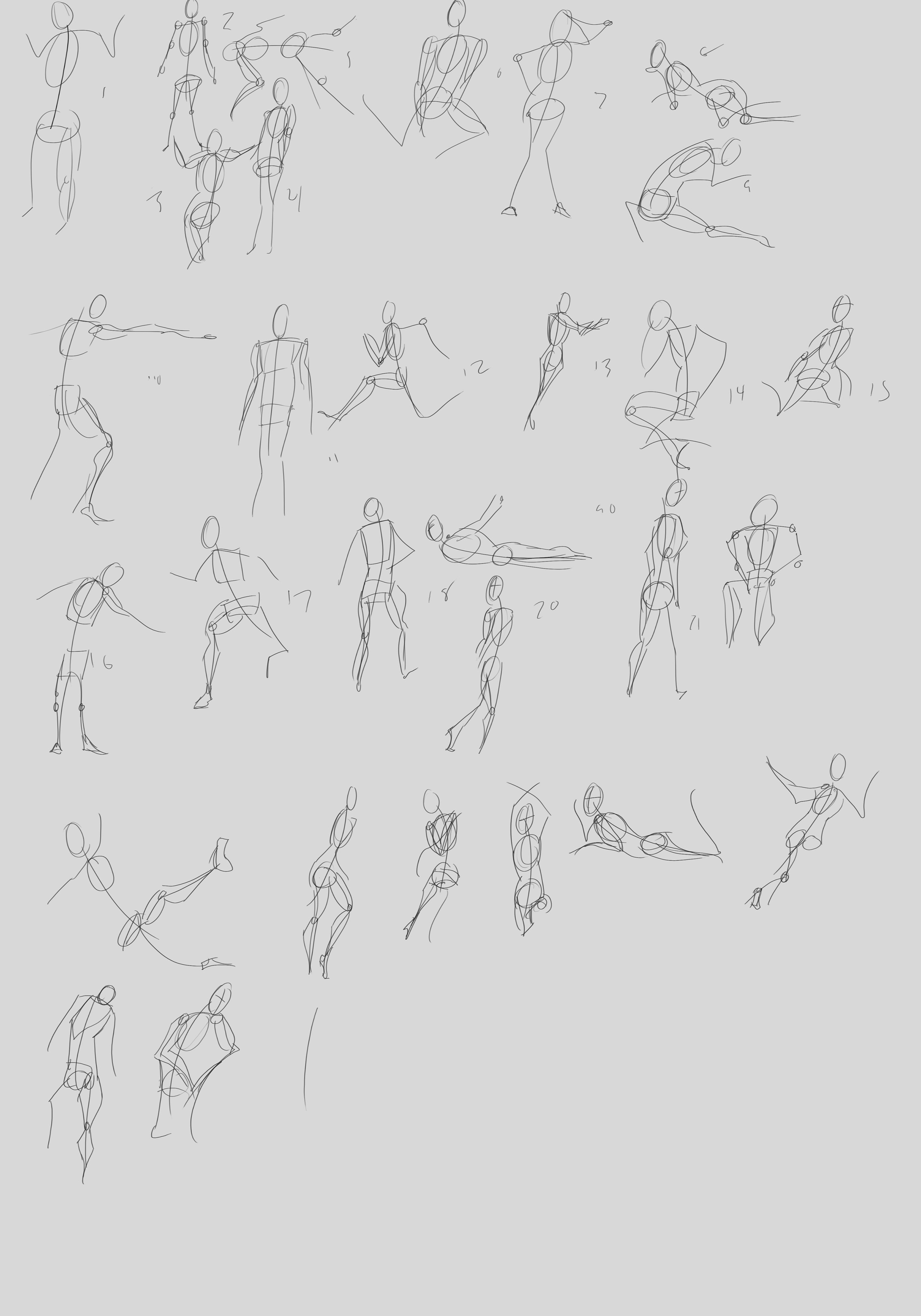
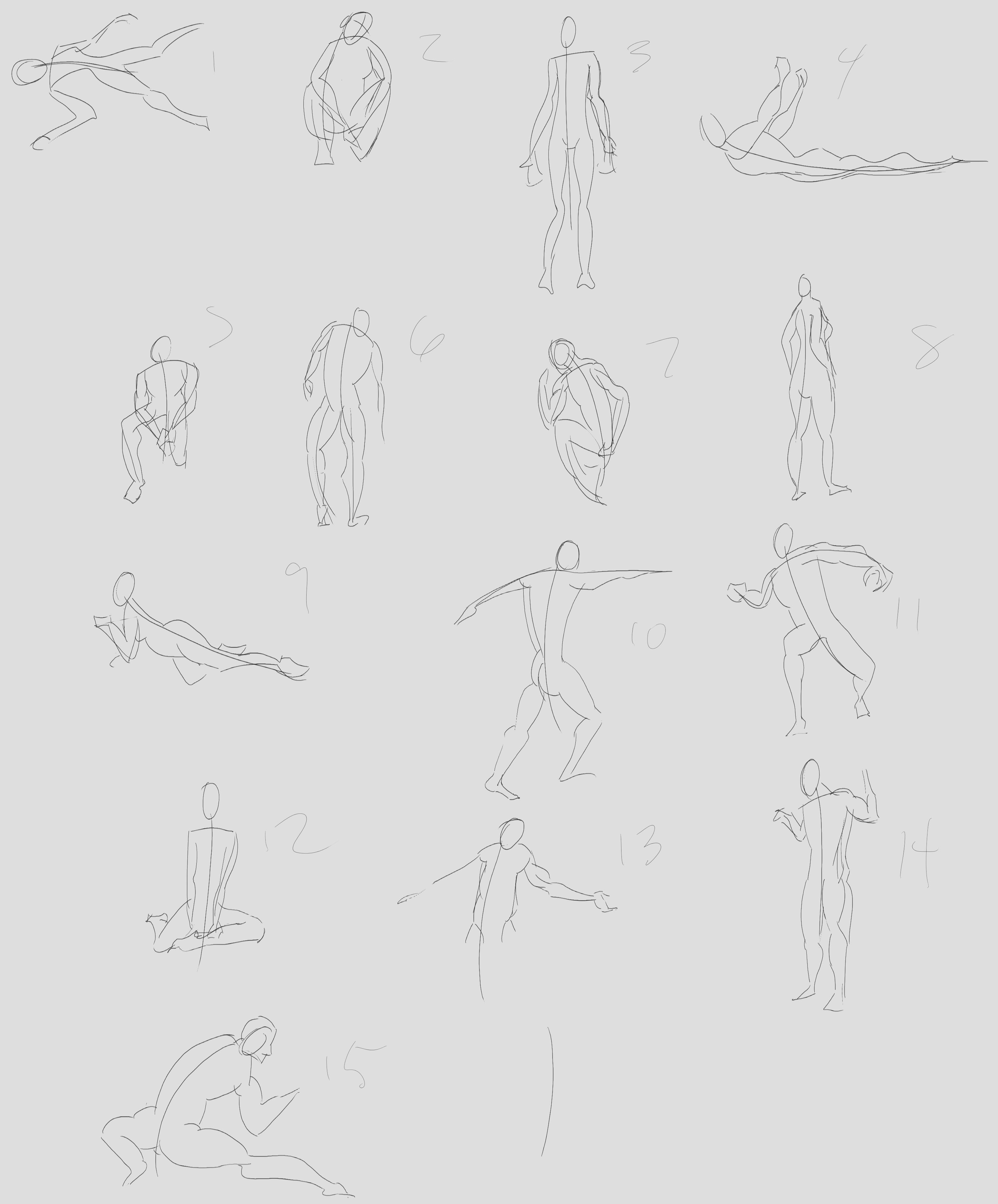
 memory 2min gartic phone, used ref 2m gartic, used ref for pose 2min gartic 2min gartic 2min gartic 2min gartic memory memory memory memory study memory memory memorymemory memory memory memory memory memory study memorystudy study stylized left memory, right study study memory memorymemory memory memory memorymemory memory, porportions r offmemory memorystudystudy memorymemorymemory memory memory memory memory memory memory memory, right leg is a bit broken The feeling of only getting 1 - 3 likes on a social media post will never not be discouraging. But nothing is discouraging enough to make me quit drawing. I think the strategy of drawing a lot of stuff and waiting a while to post is good though rather than posting it immediately and then feeling that sadness on the next set of drawingin

 studies studies juri study imagination, how I feel before a speech imagination imagination study something I drew for my presentation also drew this for my presentation, didn't fix the one hand being bigger than the other imagination + study study studies study study, I need to fix the face a bit based on screenshot from anime but in my style study. except for the eye study studies studies study. changed some things tho imagination imagination imagination study studies, except top right samurai based on anime screenshot wolverine studies, changed some of the poses a lil, not very good at all, but first time i drew the character ever. semi study studies study imagination imagination imagination , for first time ever i tried to draw over 3d model for middle pose, I dont like the result tbh, but it makes it much easier than coming up with it from memory.imagination, except right figurestudies imagination + studies, coming up with action poses r hard, these are not dynamic enough, I will redraw better ones in future. imagination , imagination imagination study, except for eye imagination imagination imagination doodles except for the two chrollos imagination storyboard thumbnail, idk if i ever shared this. my storyboards end up being a little detailed since i usually just draw in one layer.in22.5k


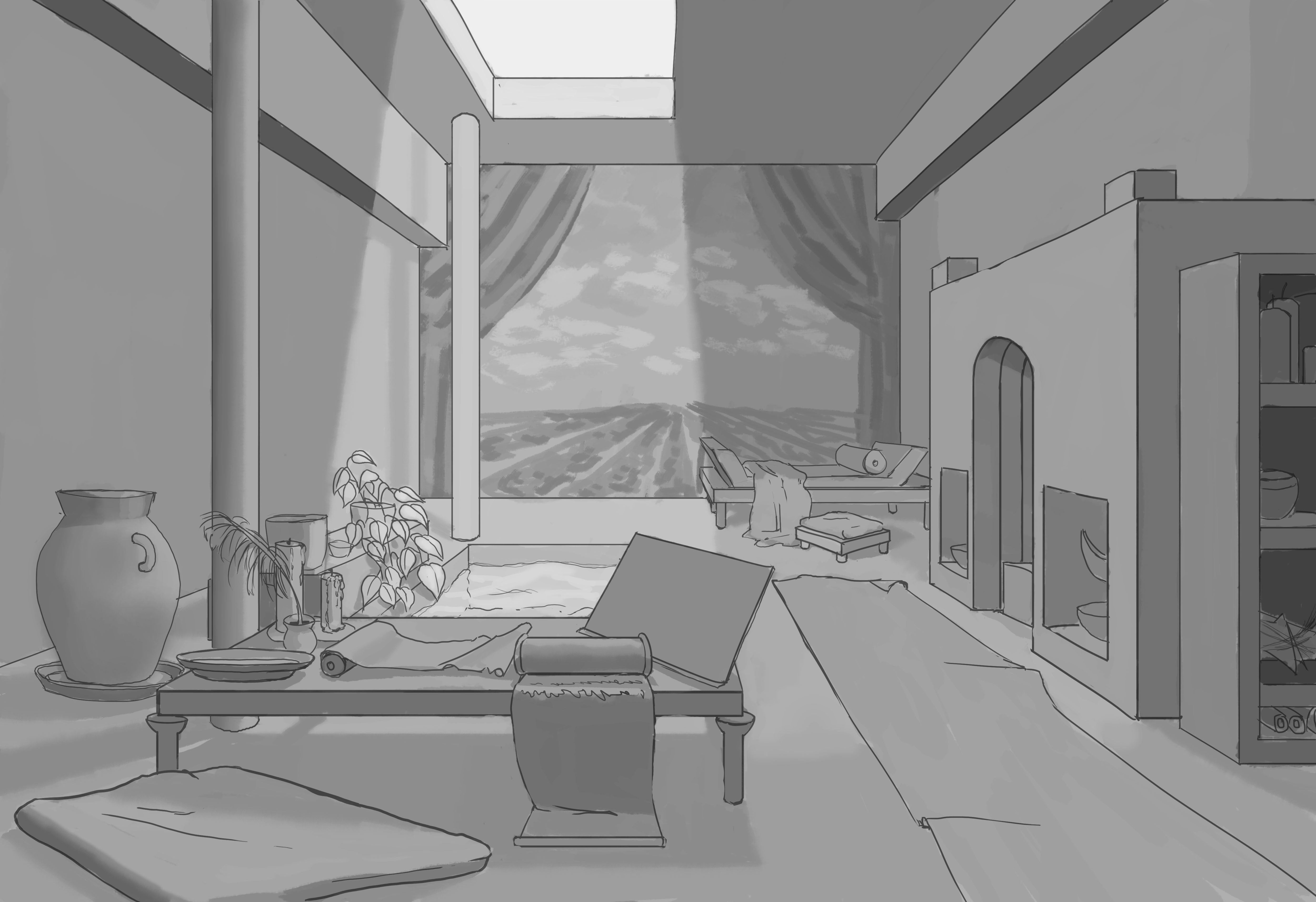
@BemezmorizeD Nice Scene, you said you'd like to make it lived in. For that I would draw the objects in different angles. Like that it doesn't look so "perfect" clean. Barely anything in real life is parallel to each other ( even walls). Try to play with line weight too and don't fear to interrupt lines. I mean in the water for example it would fit perfectly. Water refracts ( not sure if it's the right word) light and the bottom of the pool wouldn't have such a clean edge. Here I'd make it thinner and maybe also just draw it halfways. I don't know if it's by purpose, but the vase, it has the lines of the box going through it.
You can also draw knick-knacks and clutter lying around, some small objects that give personality to the character that lives there.
Great work. I like your room drawing too. I'm busy trying to get everything else done too. I would suggest though that maybe add one picture in the back wall to the left to where one or both of the left poles are blocking the view of it. That would have people guessing what the image is that is being obscured and have it stand out more. And maybe one on the right wall in a similar fashion. Because looking at the fireplace, on the edge, it looks like there's more than the camera is capturing. Something I remember from years ago this teacher told me lol.
8 days later
Hey good work, you certainly seem to be putting in the effort. I am kind of interested in your formal art school education, what did you think and how it compares to what Marc has put out thus far?
As for feedback I suggest practicing fluid line work, try to get the same result with less lines, less scratchy. Gesture drawing really is the king of all exercises when it comes to this imo.
Something that also helped me especially with longer poses is Russian academic drawings. These style of drawings often begin with blocking out the figure with only straight lines, finding the angles with as few lines as possible.
If in the long term you want to have a sketchy style which I definitely also like I believe it still pays off to have the understanding and control that comes from clean lines first. Hope this helps.
I'm initiating a momentary truce with this perspective assignment. I'm at the point where I need to add smaller details, but honestly I don't want to  I'll come back to it later, but right now I need to rebuild my momentum and get back into a drawing routine. I recently finished a challenge and I let myself get off track. So here's my 1-point room, recent gestures and the final results of my entry.

Thanks for the comment!
I had my first art class in school when I was 12, then took another when I was 16, and did a studio course the year after that. In these classes I learned about still-lifes, elements of design and how to use pencil, paint, etc. In college I majored in studio art at a public California university with an "emphasis" in oil painting. I put quotes because the art program at my school wasn't that great. They emphasized experimentation and abstract art, so I never really got to sharpen my skills. They were into Contemporary and Performance art and didn't have anything for digital art. Most of the teachers were convinced that there was no need to know anatomy or lighting. I did have a drawing teacher who taught anatomy and perspective, but they were more like sampler classes because they were offered once a year and weren't that demanding. I didn't start using references until my last year of university, and that was because a student said something during a critique instead of a professor : /
So as far as formal training, I learned how to explore my imagination but my skills were subpar and never really fine tuned.
I never took a class for digital art, but I had friends who did in high school and they introduced me to it. I got my first tablet when I was 15/16 and just did my own thing until recently. I love the content from this course and I'm definitely learning more than I've had since I took those first couple of art classes when I was a younger. At the same time I only think I'm able to get so much out of it because of my previous experience. There's things that I'm only able to tackle or understand because of what I learned from school or others online like Istebrak or Irshad Karim and his drawabox website. And those years in university taught me how not to study art  In a nutshell though I think this is a fantastic course and one of the best investments I've made. I'm glad I got it during a promotion though, but still
I really like the sound of that Russian academic approach. I tried to use straight lines and angles here and there, but if there's a whole technique out there I'm interested in learning! I don't like the scratchy look, I can only get rid of it if I draw over the initial drawing. I don't think there's anything wrong with using that sketchy look when brainstorming, but I want to learn how to be more economical with my lines.
Thanks again!
@patmast I'm super late but thanks for the feedback! This is all still during the sketch phase so I haven't thought about line weight or erasing lines through objects, definitely wouldn't leave that there for a finished work lol. Thanks for your suggestions!
@ristarsonata Thanks for the picture idea! I planned on doing a mural in the back to mimic ancient Roman houses, but I think I'll add another image to the right.
@biotic Thanks for the feedback!
ah cool, thanks for sharing your experience  It sounds like you gained maturity and a better mindset for learning throughout your education. Same thing happened to me, but i studied industrial design and managed to get by not really drawing (they never pushed it or taught us..)
Just practicing straight lines, curves and ellipses (in one sweep) like on Marcs first assignment will get you pretty far. This kind of stuff is the same in Scott Robertsons How to draw, Peter Han's Dynamic sketching and many other dynamic sketch course like draw a box that you mentioned. Economy of line is also economy of thought.
I also agree that preliminary 'rough' drawings are great for brainstorming and working out designs.
keep up the hard work
Dude the amount pf work you are producing is outstanding! Have to catch up with ya'll
I like your interiors, but just a quick tip (if you don't know it already). Try playing more with the line weight. I mean, use thicker lines in the foreground and the further it gets to the background, use thinner lines and less detail. That would make it look a lot more dynamic. Keep up the great work!
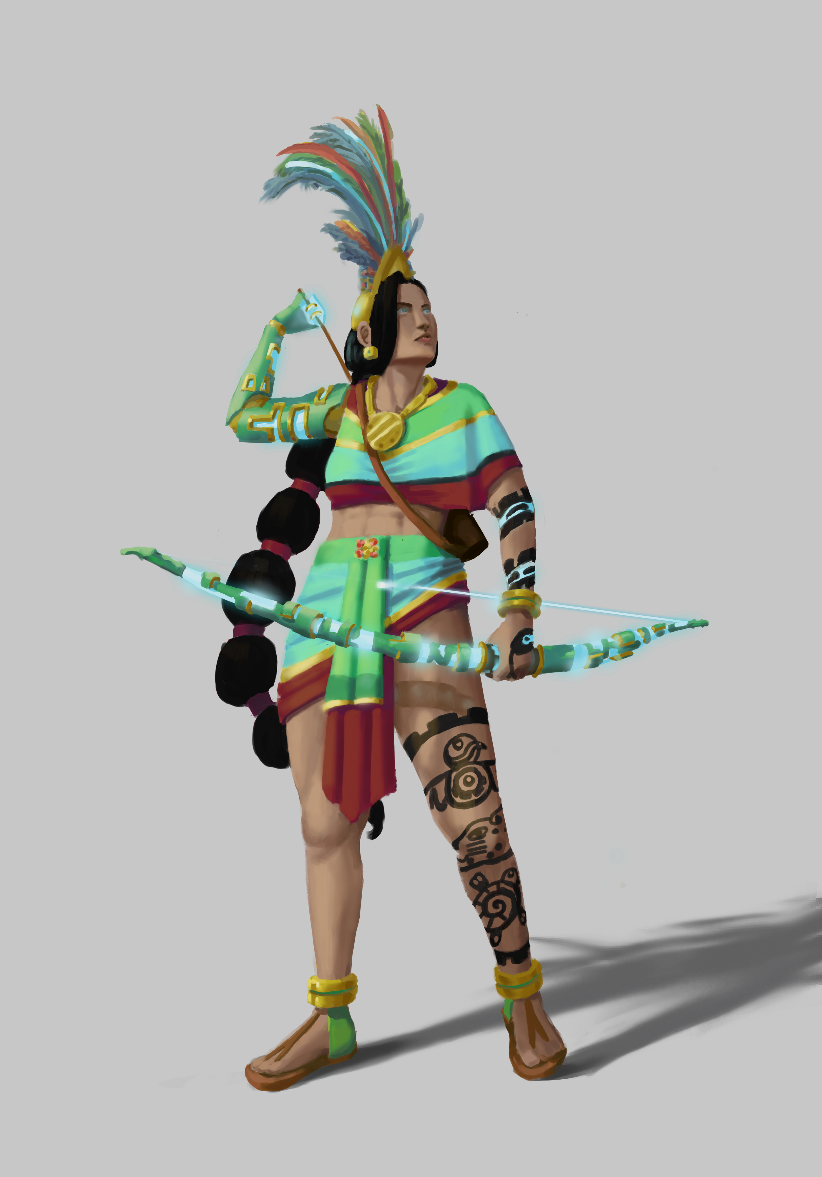
The room looks fantastic. Full and feels like there's more to the story. And your archer is fantastic, especially the bow and right arm design too.
Suggested Topics
| Topic | Category | Replies | Views | Activity |
|---|---|---|---|---|
| Scott P - Art School Journey (Term 1) | Art School | 7 | 642 | Feb '24 |
| Alex Zoinks - Art School | Art School | 75 | 7.0k | Mar '23 |
| The Dancing Tabaxi - Art journey | Art School | 5 | 1.6k | Nov '21 |
| Oscar - Art School Journey | Art School | 17 | 3.3k | Apr '21 |
| Nilrem - Art School Journey | Art School | 41 | 4.2k | May '24 |