Gave myself 5 days to do something. This is what I managed to do. I'm trying to get better at illustrations, but I have patience to work on something for 3 days maximum :(
Splash_Process.jpg5000x3140 2.21 MB
Splash_Process-6.jpg3896x2429 2.83 MB
concept list char copy.jpg5388x3000 1.7 MB
Day 4: Star Wars
May The 4th =]
Queen Padmé Amidala in my art style!
First time drawing her and I really enjoyed making this one!
Used watercolours, ink pen, acrylic markers and gold paint for accents on my Canson mix media sketchbook.
I hope you like it!
Thank you! I finally cleaned that up. Meanwhile started 3 more ..I have a habit of taking too long to finish a piece, then I lose interest in it and just start something else. I found 8 from recently i started and abandoned, that are decent enough to not delete, but not finished. There’s also been a number of drawings I felt I “outgrew” - became better before I finished them, and it would be easier to start from scratch than fix them. Anyone else thinking that?
Lady Death Fanart Collectible: Part 6 Polypaint and base
Hi, it’s time to share with you another part of the process to create this fanart piece.
Polypaint
As this is my first collectible fanart I didn’t have previous experience with polypaint so I tried my best and played a bit with it.I wanted to give a ghostly and eerie look to Lady Death, she is beautiful and deadly, but at the end of the day she is a woman that died and was reborn at hell as an avenging spirit, that’s why I gave her skin tone a bluish very cold tone.As you will see I gave myself some creative freedom to deviate from the traditional color scheme that this characater has in comics and illustrations.To add a bit of sensuality by painting some freckles on the face and the chest.
The dark nature of this character was the perfect excuse to gave her a kind of goth make up, very dark shadows around the eyes, blue lips and fingernails. I know that the original character includes sexy red lips but I wanted this girl to have a sexy but at the same time creepy look, that’s why we can see some thin veins emanating from her eyes.
The biggest chromatic change I did for this character is at the hair. Lady Death has a characteristic white weavy hair but in my fanart I decided to gave her a very saturated blue color.The reason behind this wasn’t only an aesthetic choice. I want that the face area strongly pulls the attention of the viewer so this area needed a stronger contrast. Another reason is that I want her to have a more modern look, as I mentioned before, I’m strongly attracted to women with goth/punk look.
I gave myself half an hour or more to analyse the work of experienced sculptors that create collectibles and I discovered that the use of darker values on the skin is often applied to create a greater sense of volume and three-dimensionality. I found that areas with heavy ambient occlusion are the perfect places to paint with darker colors in order to increase the separation between different forms.
Even though she has a bluish skin tone, I used a bit of warmer hues in areas that, in real life, tend to go towards red and pink, this is very obvious in the nose, cheeks, and knuckles. Thinking with a logical mind it’s completely absurd to have warmer tones on the body of a zombie like creature but I didn’t want to limit myself by using only blue tones, it looks boring and artificial. In real life these colors are created by blood vessels in areas where the skin is very thin.
**
Scythe
**for her weapon I applied a cool gray with some warmer variations, this color scheme is influenced by the work of H.R giger.
Base
I’d like to talk about the design for the base which, to be honest, I forgot to develop along with the character.My main idea with the base is to show that Lady Death inhabits a very sterile and arid land, at the end of the day she is at hell.You can see a that she walks over dirt and rocks, a sign that she’s surrounded by death and loneliness.
As part of the landscape we can see some bones and skulls to reinforce the idea of lack of living creatures, yet we can see three hands that try to reach her legs.This hands represent that all creatures are subordinated to her power and seek an evil blessing with a simple touch of the princess of the damned.1- The hand with skin burns represents the souls of those who are newcomers to hell, tortured souls that suffer for the sins comitted on earth.2- The hand with greenish rotten skin and pustules is the reminder of the decay that has infected the souls of those who have been trapped and have forgotten their humanity3- Last but not least, the hand of a demon shows that even dark creatures and entities bow before her presence.
The cherry on the top, at least in my vision, are the simese twins that emerge from the ground, this malevolent creatures remind us that in hell there’s only perversion and any trace of innocence is lost.
Thanks for reading till this pointI’m really happy to be very close to finish this creative journey, last but not least it’s mandatory to talk about splitting the sculpture in several pieces to be printed, this will be my last entry before showing the final rendered images.
See yaMay Zbrush be with you
memory
2min gartic phone, used ref
2m gartic, used ref for pose
2min gartic
2min gartic
2min gartic
2min gartic
memory
memory
memory
memory
study
memory
memory
memorymemory
memory
memory
memory
memory
memory
study
memorystudy
study stylized
left memory, right study
study
memory
memorymemory
memory
memory
memorymemory
memory, porportions r offmemory
memorystudystudy
memorymemorymemory
memory
memory memory
memory
memory
memory
memory, right leg is a bit broken
The feeling of only getting 1 - 3 likes on a social media post will never not be discouraging. But nothing is discouraging enough to make me quit drawing. I think the strategy of drawing a lot of stuff and waiting a while to post is good though rather than posting it immediately and then feeling that sadness on the next set of drawing
studies
studies
juri study
imagination, how I feel before a speech
imagination
imagination
study
something I drew for my presentation
also drew this for my presentation, didn't fix the one hand being bigger than the other
imagination + study
study
studies
study
study, I need to fix the face a bit
based on screenshot from anime but in my style
study. except for the eye
study
studies
studies
study. changed some things tho
imagination
imagination
imagination
study
studies, except top right samurai
based on anime screenshot
wolverine studies, changed some of the poses a lil, not very good at all, but first time i drew the character ever.
semi study
studies
study
imagination
imagination
imagination , for first time ever i tried to draw over 3d model for middle pose, I dont like the result tbh, but it makes it much easier than coming up with it from memory.imagination, except right figurestudies
imagination + studies, coming up with action poses r hard, these are not dynamic enough, I will redraw better ones in future.
imagination
, imagination
imagination
study, except for eye
imagination
imagination
imagination doodles except for the two chrollos
imagination storyboard thumbnail, idk if i ever shared this. my storyboards end up being a little detailed since i usually just draw in one layer.
To keep it short, I've been working on digital art for a while now, getting jobs here and there while I work a day job. My health has taken a hit and so did my mobility, which means that I can't count on my previous day job to get an income anymore. I've decided that I would stop shying away from pursuing my art career, and push myself to get a good portfolio. I would like to find professional work, so that I can get an income while accommodating myself to this new disability thing.
I'd appreciate any feed back on the pieces below, and what I will be posting here in the future. My aim is to work in collaboration with people creating Tabletop Games and Video Games. How can I give my stuff that extra push so that I get considered? Are there things that should appear in my portfolio that are not seen here?
I would love to help. I’m about to hit my weekend and can spend the time on a comprehensive dive on these to provide you a professional critique.
While you wait, I need some more questions answered to maybe help you with your professional goals.
Are there any techniques or theories you have struggled with before that you would like help with?
Or looking for Resources about?
Any specific painting of yours you just couldn’t figure out?
What is your bottle neck in your opinion?
Which clients are you trying to do work for goal wise?
Do you have a style guide to adhere too for certain clients?
I’ll start work on all of these and make sure to include paint overs and examples if necessary. When you answer these questions I’ll add them to the critique post. In the meantime please browse some of my other comprehensive critiques in this forum section. Laters
Hi brohawx, thank you so much for your reply! Apologies if some of my answers sound a bit wonky, english isn't my first language.
As of techniques that I've struggled with in the past: I'd say that my anatomy is a bit rusty lately, I should brush up on that. I think perspective and composition are the big two that I struggle the most with. It's not so much about knowing where to place stuff, but more how do I make it interesting. I feel like I'm missing some info on how to give my larger pieces a "wow factor". My work can look clean, but it's boring.
This ties into the type of paintings I struggled to finish in the past: pieces with multiple characters/elements, and a good point of view for those. If you have resources for this, especially book titles, I'd love that!
As of my bottleneck: If I understand correctly, this is which part of my process is the hardest for me? I'd say it's the part where I organize the composition and try stuff for it. The search for references is pretty quick, and once everything is in place and I've picked my colors, I can render somewhat fast. Thumbnailing is probably the most indecisive part for me. Again, composition.
For clients: Ideally, I would like to work with people creating for TTRPG, or making TTRPGs. Trading card games and fantasy video games would be nice, too. Realistically, I would like to test myself with indie developers and work my way up.
I'm fine with commission work for individuals, but with AI and the state of the economy right now, I feel like that's been harder to get. Like the market is hyper saturated for much less clients. This is why I was trying to look for something more professional. I know those factors also apply to multiple industries, but a contract would probably give me a higher pay and a stable position, even if just for a few weeks/months at a time.
I think what I need guidance on about this is: 1) Where to look for more serious projects, other than the obvious Artstation, Cara, and job searching sites? (Those seem out of my league with my lack of experience...) 2) How to present my work professionally? Depending on where I'm applying for, should there be a motivation letter? What should I know about contracts, rates, etc.? 3) How to get noticed better? I haven't kept up much with social medias in the past few years, and I feel like everything has changed and nothing is stable anymore. Are there "for sure" tips for that? I would love to go to some conventions, but I'm from a very rural region and I would need to travel for those... This isn't exactly in my budget at the moment.
Concerning style: I like to create images somewhere between realism and semi-realism. I personally prefer a full render with realism, but I've cut to strong lines with a rougher painterly rendering for clients on a budget before. Realism for me just means putting more time into the rendering. Examples of artists I really like: Ryan Pancoast, James Gurney, John William Waterhouse, Zdzisław Beksiński, Jakub Różalski, Alix Branwyn...
Don't worry, I misspell words all the time because I am completely a right brained artist lol.
I will post this today for you to chew on while I paint over your work and provide examples of the techniques you will need to utilize to make your images seem professional and designed with purpose.
Very observant. We will be covering this.
There are a couple of easy fixes we can throw at the problem with multiple figure composition right away before you have to read anything or buy a class online. One is to first decide if the image needs to be iconic or dynamic.
Is there motion or does strength need to be implied instead? Second is to design with abstract shapes like – big, medium, small – then goup the peoples, objects or actions into those iconic, or perhaps dynamic shapes onto your canvas.
Very interesting. I compare artists studying anatomy to doing mathematics homework, studying composition is like studying world history. Every country has its own past. Every type of composition has its own purpose.
As I started writing 'the big issue' on the (is she tiefling?) the girl with the horns I was able to tell this so I'm glad you recognize it as well and its not a shock.
First – Decide your focal point. Even if it is a multiple figure composition, a certain subject or figure in the composition will be very important compared to everything else in its detail and contrast of fundamentals of shape, value, edge and color. Since you are completing busts, portraits and full characters for table top art as assets it should be a pretty simple fix and I will get into that with the demonstrations.
Clint talks about visibility, mood, and energy. Kevin talks about the hierarchy of fundamentals. How each one can decide drawing shapes, value patterns, edge sharpness or blurriness, and color schemes and their pallets.
If you can count to nine, you can compose. I promise. Those above elements I listed are the building blocks of all of art in it's entirety. Think of them as the sliding scales in a character creator. I have a theory that I am working out that you should come back and check on my blog later – about combining two theories into a easy to remember symbol.
ILLUSTRATION AND FREELANCE
I would assume by what you have shown that you want to make the illustrations for their games. Interior Art, Cover Art, spot Illustrations, and Full-Page art.
Commendable course of action. Here are some of my observations on my own experience down that path.
The speed bump with small companies is where you will meet ones where the creative director, writer, and capital investor are sometimes also the owner. They have a real challenge to communicate to artists without knowing any of the language we speak. They have a hard idea about what they want, or they have no idea. And their idea will sometimes not make sense aesthetically for the application, or mood. Just part of the job. Decide if you want to do development work for them or not. They want an artist – you are an illustrator - but need development work.
Development work is much different. Concept art, mood boards, style guides, visual prototyping, key art, character design exploration, world building art, and iterative feedback. I did some of that but I didn't enjoy it. Those are hourly rates, project based fees, milestone payments, retainer agreements, licensing or royalty agreements.
The opportunity is there for artists in this area to design an entire game and get paid for it. Start thinking and reading some things in terms of Projects, project management and completing projects like a business person. Know where you fit into that aspect and what service you provide for their TTRPG. That is how they will speak and think and talk to you.
Know what adventure modules, source books, core rule books, encounter designs, game master tools, play testing, crunch, fluff, hex crawl, dungeon crawl and point of interests are. Your style is going to fit the Interior Art, Cover Art, spot Illustrations, and Full-Page art for those things.
When those small company types run into artists that know their stuff they will love to talk to you. They will take a lot of your time to communicate what they want, and want to understand the process. There is a lot of hand holding sometimes to make sure they know what they are asking for. So just expect that.
Draw up your own contracts for difference licensing rights – one time printing, exclusive (make that super expensive because you lose your art rights in exclusive) , digital rights (e-book) or marketing rights. They aren't paying for the art, they are buying these licenses. You own the art unless its exclusive rights they buy. Don't be afraid to ask about digital rights, licensing duration, and non-exclusive rights, you will just sound more professional.
Draw up a contract for day rates, and weekly rates and hourly rates. Sometimes clients are cool and loose they have capital to invest. Include in the contract STILL if the work is for one time printing – exclusive, non-exclusive etc. Companies with a bit more experience will just give you a contract and tell you what they want.
Ask them if they have an NDA, or recommend one where you can release the art you made on your social media – even if their project is not published.
Make it super easy for them to see what you cost, what they will get, and how long it takes. And have something ready for them to sign. Indie types will often ask how it works – because no one reads anymore - so you can explain, “you sign this contract, and we fill out the tax forms, then I work on it and give you updates, I finish, I show you pictures – you pay me – I send you your files.”
Hourly rates I typically used for when they had changes.
They will ask you how long the project will take – and you have to know how fast you are for the different assets. Communication took more time than art making and could totally derail you – so I had a cloud folder they could view to take away the email back and forth time – kept all the files super organized. And was available for calls. The communication is always a huge bottleneck everywhere. And non-artist types don't realize how long their requests take. So have that hourly rate ready, and expect changes and tilted heads for final pieces.
Guidance Questions and Passive Income
I'll touch on that in a second. But the simple answer is community discords for studios/companies. They utilize it for community engagement - and competitions and content generation.
But first on a side note -
Do you have a roll 20 account and sell assets there? You can start. Make and design your own projects and assets and sell them straight to the masses. Learn from making the marketing illustrations that you will make. Hell, make your own game! Big companies see that as a serious move. And would be interested in hiring to remove the competition you might create lol. https://marketplace.roll20.net/browse/search
This will be a great place for you to practice what type of assets you sell and make. Advertise Hand made, home grown farm to table no AI, full illustration artist supported characters. Lol whatever. But when you can make your own packets and assets for passive income on your down time it will be very important. All of these places below are other avenues of possible passive income. Make all the accounts and make the link tree. Once you read the secrets about your compositions I'm about to give you, you will be in the top tier. Print on demand sights instead of printing at home and investing your own capital.
But we should really look at these as the gig economy for artists these days. If we want the big roles – we have to go to where they are So lets get back to that.
I don't know where you are located – but regardless of that this is the place to be. This is where all of the heavy hitters are. If you are serious this is where you will want to attend every year and eventually get a table once you are popular enough. https://lightboxexpo.com/
They have a discord. Just effing go join it to keep up with everything. Be your professional self and instantly have all the contacts in the world. Post there and join other heavy hitter discords from studios on Artstation. Don't spam the famous people, or directors. Participate in community competitions if you have time - you'll get noticed. I'll see you there.
Just make it easy to see on artstation or your own website. If you have multiple projects or assets you offer to clients, make purpose driven portfolio's on your own website or artstation. No one wants to download huge files, or have to sign into google to see cloud files. Make them load fast, don't make them 10 million pixels. Make sure it looks good on mobile too. Look at it like a consumer would and make it how you would want to easily contact yourself.
If you go to conventions – make your ipad photos or folder -whatever -the only thing to click on the main screen when you unlock it, make it slide to unlock with no password for the day. Fast, prepared. Those people are all friends and networking. They meet you and see your stuff and want to go and show it to 'so n so' over at 'the other company'. Make it easy for them to just quickly do that. It shows that you think and plan ahead.
They want to find people and share it with their directors and co-workers quickly. You just need to have a blurb about yourself and have your contact VERY EASILY seen.
If you are trying to land a full contract job at a place that does – splash art for their games or what have you - to have a secure job (or high level contracts) The art speaks for itself. We talked about the contracts already, and you should know your rates, and not be afraid to ask for what the companies budget or rates are.
I applied for several companies that had an art test – to see if you could follow and prompt and a style guide, just for freelance art.
But mainly - They want to hire people who already make their style of art that they need. It might take you several weeks to work on a portfolio with their intellectual property as say – splash pictures, during your freelance downtime to boot. So it could take months. Include a few of your development sheets if you needed them to develop that portfolio. This is much better than any kind of motivation letter. It shows you are ready, practiced and up for it NOW.
I would use instagram, cara, bluesky, and artstation.
You have to look at these like beasts that need to be fed. The content on them isn't always 'good', they just want content forever and always. And you can always delete old stuff or edit it down for the portfolio folders – or project style folders. But if you utilize them for marketing – you don't want to be sucked into the “obligated” video content maker who just happens to be an artist.
Use one illustration that you are making for the month - and make nine Instagram reels about it – then post those three times a week for the month, or if you get savy – daily instagram stories that go away after 24 hrs. The key is about being consistent and casting a huge net if you need to be noticed.
Those same videos or content – post them on bluesky and cara however you can. You make a painting – record some of the drawing- record some of the set up – record some of the rendering – record some of the final close up moving camera shots.
Where people get caught up is trying to make new stuff every single time post and spending all day doing it and getting 30 likes – and those are the art scam bots.
I am not going to get into how people create their content with camera or phone, of course there are several different ways. Just make sure you use the trending music people use, and utilize every art piece you make like a marketing asset for social media content three times a week, so you don't over do it getting stuck making content for likes. Just make cool posts that grab people that can to go to your link tree in your profile. Use camera pans, or pan shots, or tracking shots that move over your piece – it creats interest that keeps people watching.
If you want a portfolio group file on your insta, or cara do that. This is for your passive income and follower marketing – who will buy your passive income content or ask for freelance work. Maybe you will get noticed bed a hiring director and company.
Just post the same content everywhere for the different audiences. These are also the people who will want to buy your products you might have for sale. They might absolutely love your stuff. Oh you have 20 cool stickers for sale and here's the link where I put in my credit card? Nice! Make it easy for them.
CONCERNING STYLE
Now I see. I was going to refer to this as a sort of comic style in my horned character's Overlay Markup.
I'll dive into some of your art gods there to see whats up but I'll get back to what I notice on your stuff.
I'll re-read this and probably edit something - but for now back to the markups and paintovers.
Open images in new tab, download for future reference.
I cannot fit as much work as I wanted to in one post. The rest of this week I will think on it and make notes, and attack the second part of the critique this coming weekend.
Disclaimer : Any examples I draw or paint over here are not what your art should look like. They are attempts are to show you a theory, tip, or hack to give you a brainwave and motivation to improve your skills. A white knuckled grasp at the next ladder rung. Only you can decide what your art should look like.
General Critique
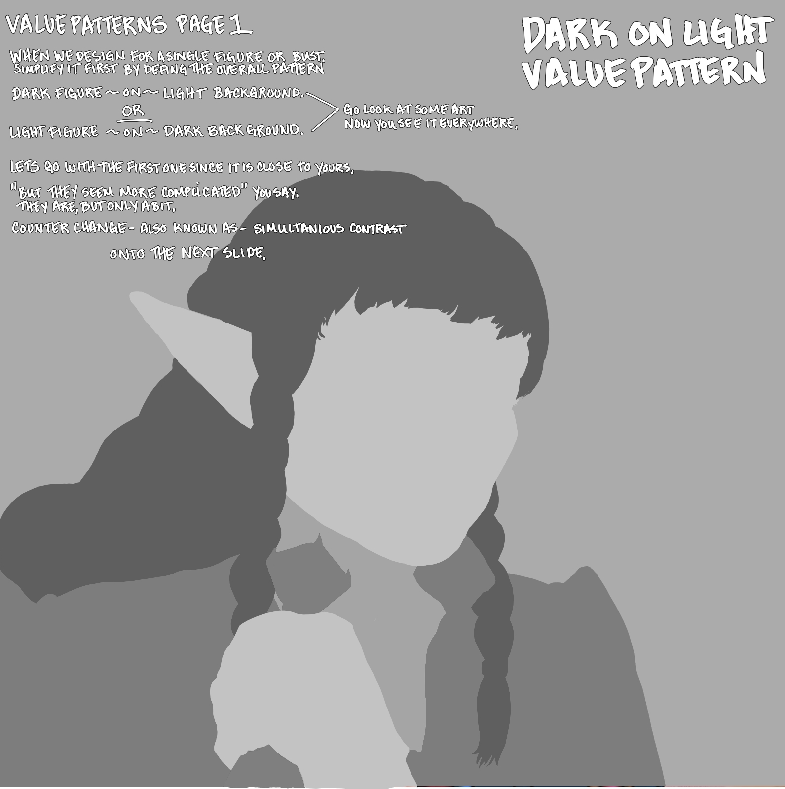
I think all of your design and characters are really cool. The mid-evil money squirrel is my new spirit animal. They are thought out and have personality. I am going to show you how to give some pop and wow to all of them using value pattern theory, and counter change. And also color counter change.
I want to do it with examples because I think it will be fun. It really seems to hit home when people see their own art pushed to something they didn't know to look for in the first place.
WHAT YOU KNOW YOU NEED - GO READ At first I thought it would be necessary to illustrate a certain point that you already mentioned - your composition and perspective. I am not going to cover perspective and composition theory since I referred you to those resources that can explain them faster and clearer than I can. I will also be referencing them from time to time - perhaps.
Remember this forever - THE MAGIC IS IN WHAT YOU ARE NOT DOING. (So go do that thing DUH)
SHADOWS Your composition and value patterns suffer the most. I dont know if the black lines are helping you with that - but more on that later. You are first and foremost not having a consistent key light source. The main light. It is all over the place on some of your surfaces as seen on the read head's portrait draw over about 'light value chaos'.
Your shadow area darks, are too dark when they don't need to be and do not take advantage of bounce light to make rich color. They are creating a contrast that is not helping the mood - which is what we want value to do - work for us with purpose.
PRINTING I mention this a couple of times. If we dont need the contrast in a certain area - bring it down a notch. All of these dark ass purples, black and blues are going to come out black on a color printer - unless you go to a twelve color printing service. Most people use four color printers at best. These will come out too dark for printing. You want to work in TTRPG, make sure that the CMYK mode is on and applicable to your printing needs. I dont care how you do it - just check it. Paint in RGB, then adjust in CMYK mode for clarity. If you do it the other way around you will not take advantage of screens to show a richness of a digital portfolio. So, do with that what you will.
If I think of anything else I will edit it in. So lets get on with it.
HORNED LASS The horned lass has got the sickest drip. I cant express to you how cool this fit is. I wish I could come up with that kind of stuff.
I am going to paint over the knees, the leather, and maybe the face and hair since I did the magic in the markup below. I will also redo the value counter change and color counter change as an example to give you a more pleasing illustration for a full character pose like this. For now here are the markup notes.
RED HEAD. Overall - very busy. Tons of potential though. She has a bit of a wonky eye, and the face cheek sort of rolls up into her nose with the way it is lit. This one has the craziest light sources every where going in every direction. Then some brown corners which I am really confused by.
I just kept going and going and going and ran out of weekend. I want to illustrate a point I think - and not really do much more of a demonstration on this one. I got to a point with the key light and composition theory and stopped myself so I could think on it more with what I want to show you - mainly that the value counter change method can be used with gradients. Then the way you keep a key light consistency using NOTAN theory. I have a few videos in mind I might edit in and post here to illustrate the theory more clearly. It is just a tool to help us design with 'cearly's mood' theory quickly and not get lost in the sauce of rendering.
That's all for now-I will update this post and a second one perhaps because these have the potential to show you some real differences with some simple tricks.
Alright! So I've decided to start by reworking the tiefling to put your critique into practice. I've opted to make it more painterly and to eliminate the lines later once I've settled on the colors and values. I'll be adding an actual background rather than just a colored block. Might as well make this a good portfolio piece if I re-make it!
First, I've fixed the horns and the jaw. Rings were added to the tail to balance the jewelry like mentioned. I'm noticing that the contrast may still be too strong on the tail, so I'll fix that in my next post. As for the feet "fuzz", I'll make this texture clearer once I get rid of the lines. I thought that hooves on a humanoid without a switch to some fuzz would look odd, so I was aiming to have some light fur covering this area and the tail. Do you think that I should make the fur longer?
I also redid all of the colors by keeping in mind to not overdo the darks. I've also tried to go in another direction for her spell and to make it into something more "tangible" to look at. Since I want this to be the focus, I also adjusted the values to put more contrast nearby the magic. For the light vs shadows, I've tried to keep it simple: A weak ambient light coming from the top right, its complementary shadow from the bottom left, and the strongest light coming from the spell.
About the jewelry in the hair and on her person that look like a "bad gold"; My goal was to make them glow with the same color as the spell, as if even her equipment is enchanted with the magic she's using. You were right though, this wasn't clear at all and the lighting on them was weird. I've added a bit more luminosity for them on the equipment to try and clarify that. Trying to find the balance between making this clear, and not stealing the attention away from the spell. I've also darkened her potion for this reason.
Thank you again for the detailed critique, I'll be waiting for your feedback!


 Mar 26